The network for creativity
Join 1.25M professional creatives like you
Connect with clients, get discovered, and run your business 100% commission-free
Creatives on Contra have earned over $150M and we are just getting started
Back to feedPost
A mark for a financial app spends most of its life very small: an app icon, a tab, a notification.
So the Keystone K is drawn on a strict grid, as one solid shape with no thin details to lose. It holds on a billboard and still reads at app-icon size.
Do you design the small version first, or the big one?
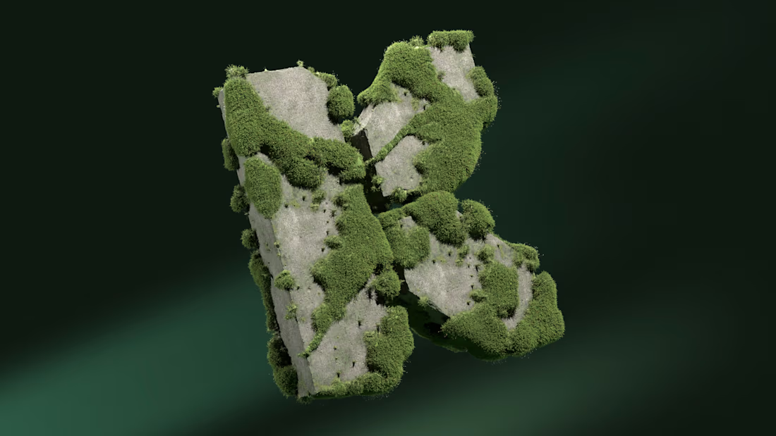
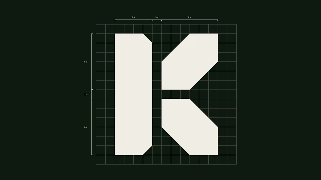

I usually start small, since a mark that holds at tab size rarely falls apart on a billboard. Did the mossy 3D version of the K change anything in the flat grid drawing, or did the flat one stay as first drawn?

It’s easier to handle sizing with geometric logos. It gets more challenging when the logos are more illustrative.
The 3D version is basically the exact same mark, just built in Blender, so nothing in the original drawing changed :)

Brutal logo mark. really like this direction
thank you, Mahmudul!
You are welcome Rustam
The network for creativity
Join 1.25M professional creatives like you
Connect with clients, get discovered, and run your business 100% commission-free
Creatives on Contra have earned over $150M and we are just getting started











Related posts


Spektra's founder had a practical question during the identity work: if the team needed green one day, would there be a green that belonged?
So I defined every color in the system, including green, with shades and pairings for each. When that day comes, the green is already there.
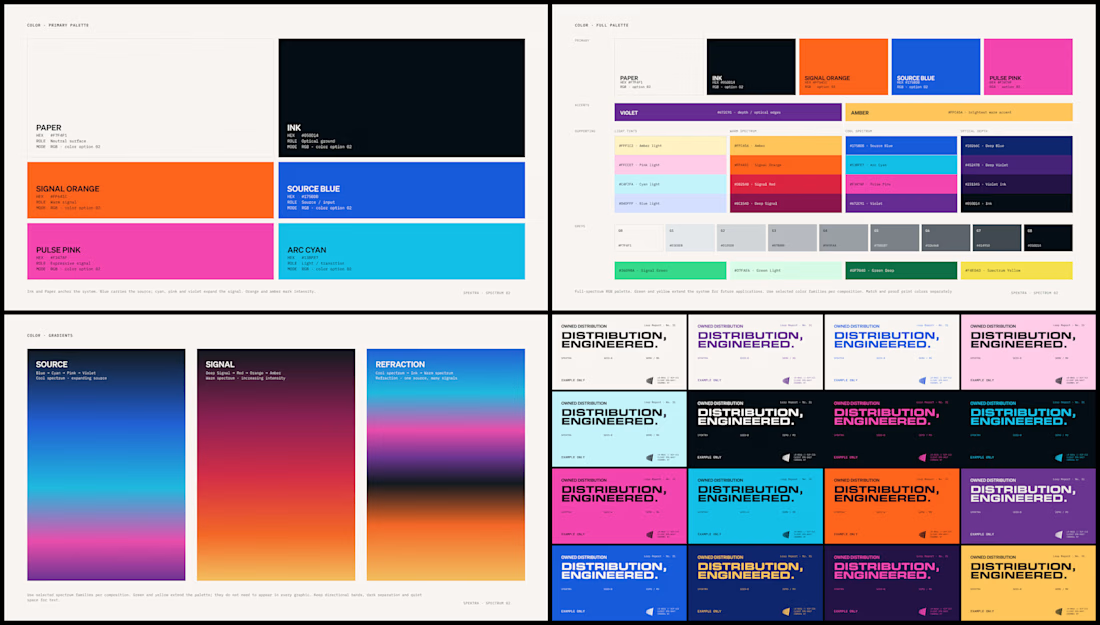


A little excerpt from the brand guidelines for a recent project

The APS mark built from the four small symbols reads like a map legend, which suits a psychology service. Nice that the guidelines page shows it on the dark teal, most would have played it safe on white.


One letter. Eight personalities. 🔤
I explored the letter S in 8 different directions: soft and rounded, sharp and angular, bold and blocky, and fast like a bolt.
Same letter, same white-on-black treatment. The only thing that changes is the character.
Each mark could suit a different kind of brand, from tech and sports to fintech and lifestyle.
Which S would you pick, and what kind of brand would it belong to? Drop the number below. 👇
Looking for a logo mark or a full brand identity? My services are on my profile.

S letter designs is the best ❤️
Great job Shahwaiz🔥🔥