The network for creativity
Join 1.25M professional creatives like you
Connect with clients, get discovered, and run your business 100% commission-free
Creatives on Contra have earned over $150M and we are just getting started
Back to feedPost
Here's my submission guys! It is a little app that lets users submit alerts if they lose their cat and communities to be on the loop and help finding them.
I used Gemini, Stitch and Google AI studio to build this complete prototype in just a day. Quite the testament of how powerful and accessible these technologies are.
Here's the Stitch prototype: https://stitch.withgoogle.com/preview/14318331383241817058?node-id=7d7c37f49cc1479dadea98ee3d100c8e
And the project: https://stitch.withgoogle.com/projects/14318331383241817058
The AI Studio Prototype (this was intended as a IOS/Android App so the layouts are based on mobile): https://tuti-747458282108.europe-west2.run.app/


Very few pieces hit like this — yours does.

Thanks so much Denis
The network for creativity
Join 1.25M professional creatives like you
Connect with clients, get discovered, and run your business 100% commission-free
Creatives on Contra have earned over $150M and we are just getting started







Related posts




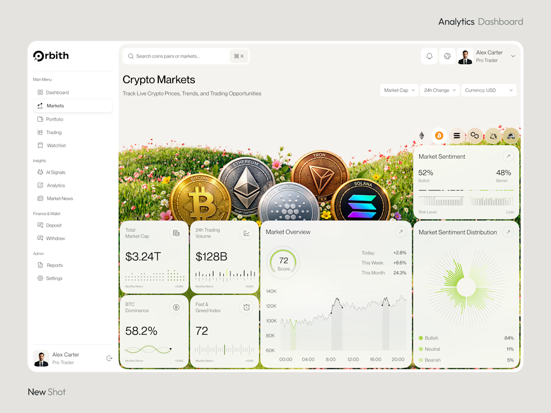
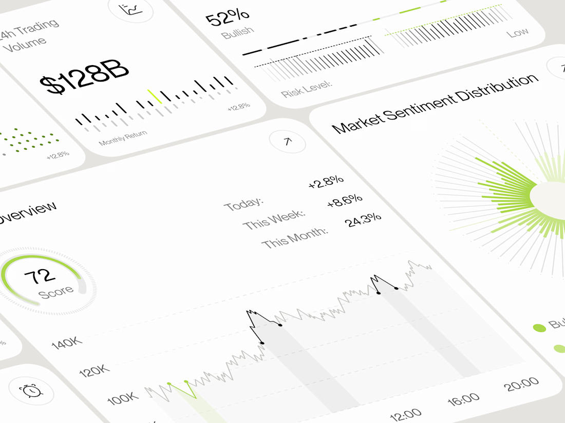
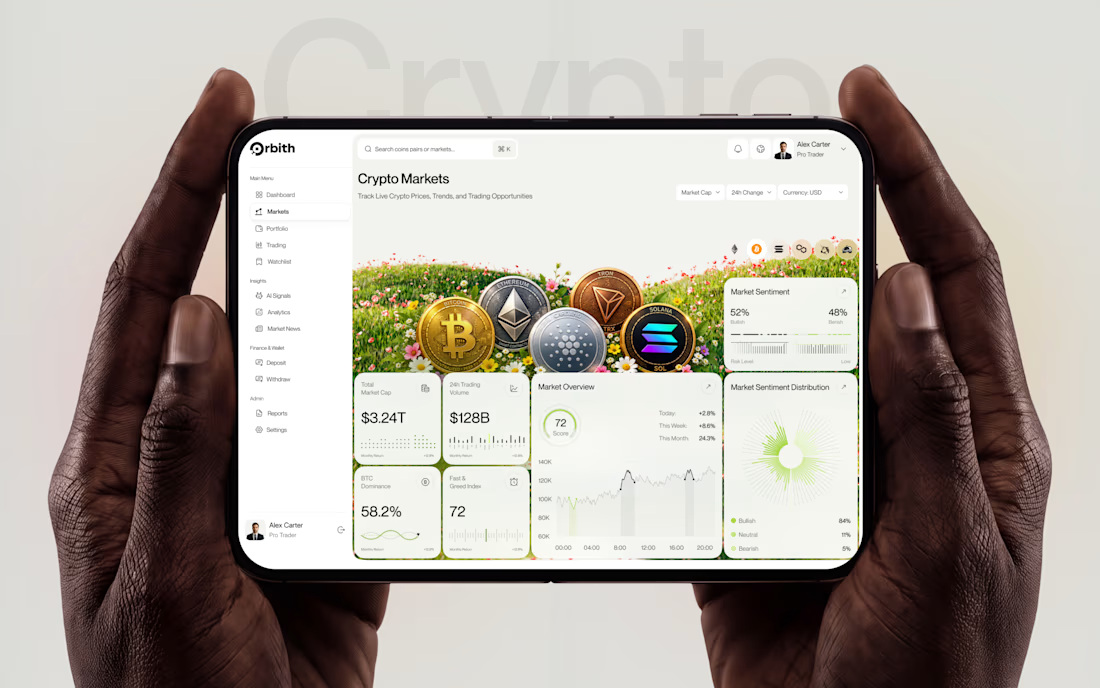
Most crypto dashboards show numbers. Great design turns those numbers into decisions.
Meet Orbit — a crypto analytics dashboard where real time insights meet a premium, data-driven experience.
Would you trust this interface with your next trading decision?
#UIDesign #DashboardDesign #CryptoTrading #FintechDesign #ProductDesign



Clean work


TOP!!