The network for creativity
Join 1.25M professional creatives like you
Connect with clients, get discovered, and run your business 100% commission-free
Creatives on Contra have earned over $150M and we are just getting started
Back to feedPost

My submission for the Wonder Challenge on Contra.
We've all had that moment—seeing a successful product and thinking,
"I had that idea years ago."
That question inspired Drafty.
The problem usually isn't a lack of ideas. It's that ideas get buried in notes, screenshots, voice memos, and unfinished drafts until they're forgotten.
The irony is that Drafty itself was one of my own forgotten ideas.
Using Wonder, I explored the concept, iterated through multiple product directions, refined the user experience, and transformed that idea into a complete product experience, including the branding, marketing website, and mobile app.
Wonder wasn't just where Drafty started. It became an essential part of how the product evolved. From brainstorming concepts to refining layouts and improving the user experience, it helped me iterate until every part of the product told one consistent story.
Drafty helps creators move from inspiration to execution by guiding ideas through their complete lifecycle:
• Capture new ideas
• Rediscover forgotten ones
• Develop them in a dedicated workspace
• Discover hidden connections
• Turn them into actionable plans
This submission includes a complete brand identity, marketing website, mobile app experience, and a walkthrough showing both the product and how Wonder became part of my creative workflow.
Because every great product starts as someone's first draft.
Drafty gave one of mine a second chance.
LinkedIn:
https://www.linkedin.com/posts/aqsaa-khalid_i-built-drafty-an-ai-powered-creative-companion-ugcPost-7479753532951183360-Fpm5/?utm_source=share&utm_medium=member_desktop&rcm=ACoAAEZi-pAB9ZlLL_xc_QCxLVaiZEUfqV09kuo
Wonder:
https://app.wonder.so/aqsa-khalid/files/019f3288-e1b0-75fb-b69c-2d409b537d2d


The network for creativity
Join 1.25M professional creatives like you
Connect with clients, get discovered, and run your business 100% commission-free
Creatives on Contra have earned over $150M and we are just getting started






Related posts

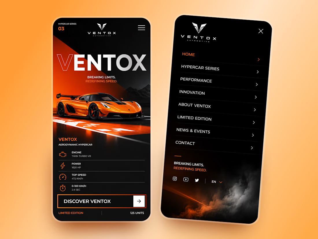
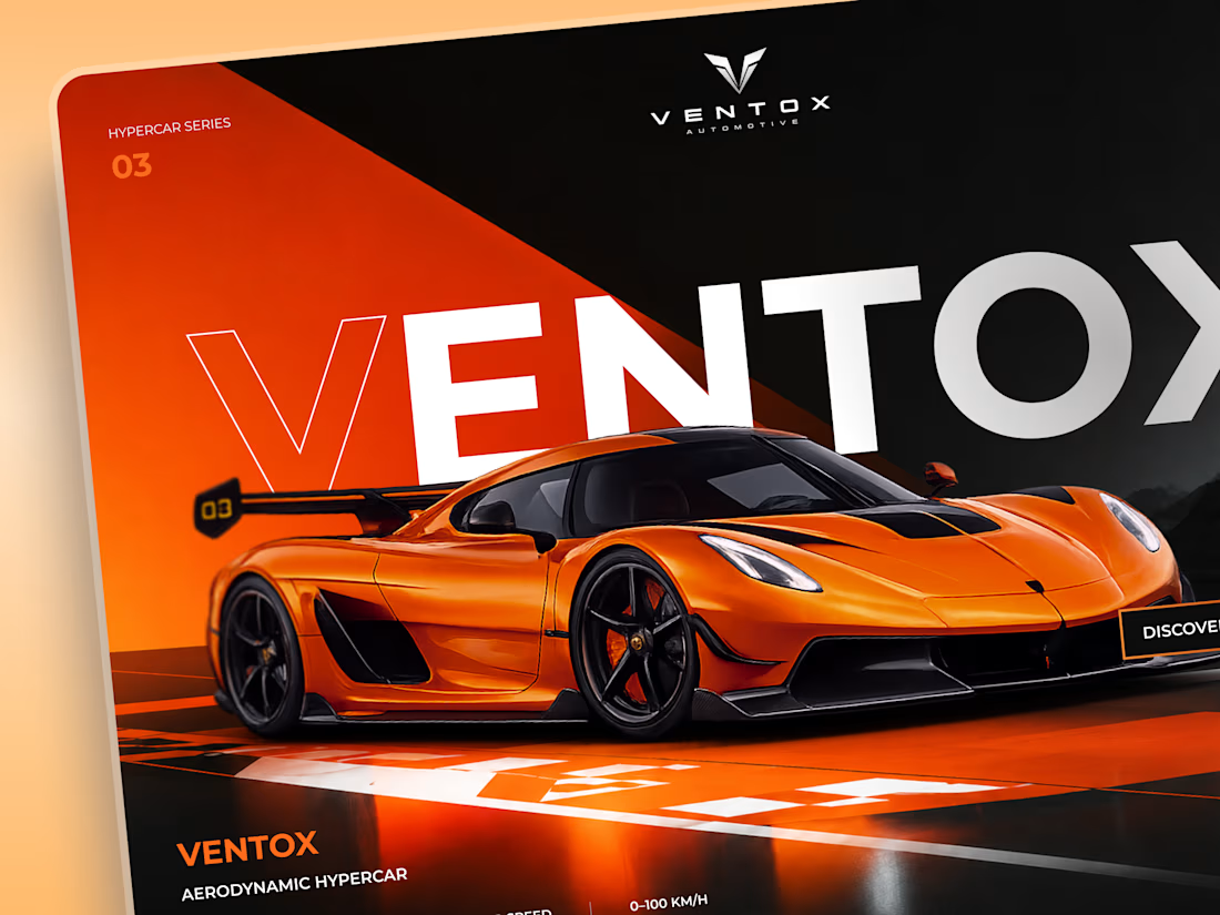
Ventox — Hypercar Landing Page 🏎️🔥
Ventox is a high-performance automotive landing page concept built around speed, exclusivity, and bold visual storytelling.
The design combines a striking orange hypercar, oversized typography, and a dramatic black-and-orange palette to create an immersive digital experience.
Special attention was given to:
A cinematic hero composition that puts the hypercar in the spotlight.
Oversized typography that reinforces the brand's identity.
Sharp geometric shapes and high-contrast colors inspired by speed.
Performance specifications presented in a clean, structured layout.
A prominent CTA that directs attention to the vehicle.
Responsive mobile layouts with simplified content and intuitive navigation.
The result is a bold automotive experience that brings together premium aesthetics, performance-focused storytelling, and clear navigation.
Looking to create a distinctive website for your automotive or luxury brand? Let's build something extraordinary. ⚡





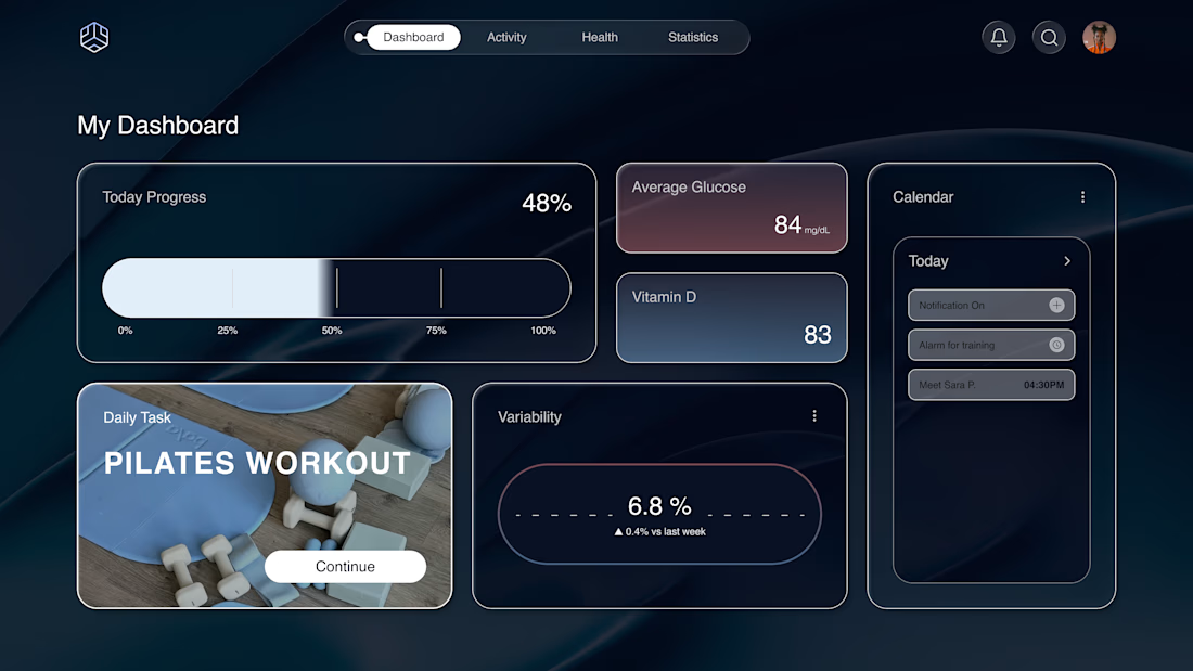
Why does a dashboard full of numbers still feel calm?
Bento grids are everywhere, and done right it's not a trend, it's information design. Each cell = one number, one meaning. The grid does the hierarchy for you.
Our three rules for a bento that works:
One idea per cell. Progress, glucose, one task. If a card needs two sentences, it needs two cards.
Mix the scale. One hero cell, a few mediums, one tiny stat, same gap everywhere.
One warm cell. A single card runs warm against the cool, dark screen; it carries the eye, and the rest stay quiet. No neon needed. Grids are calm. Content is loud. That's the whole trick.

Love the three rules. How do you handle this grid when it collapses to mobile without losing the hierarchy?

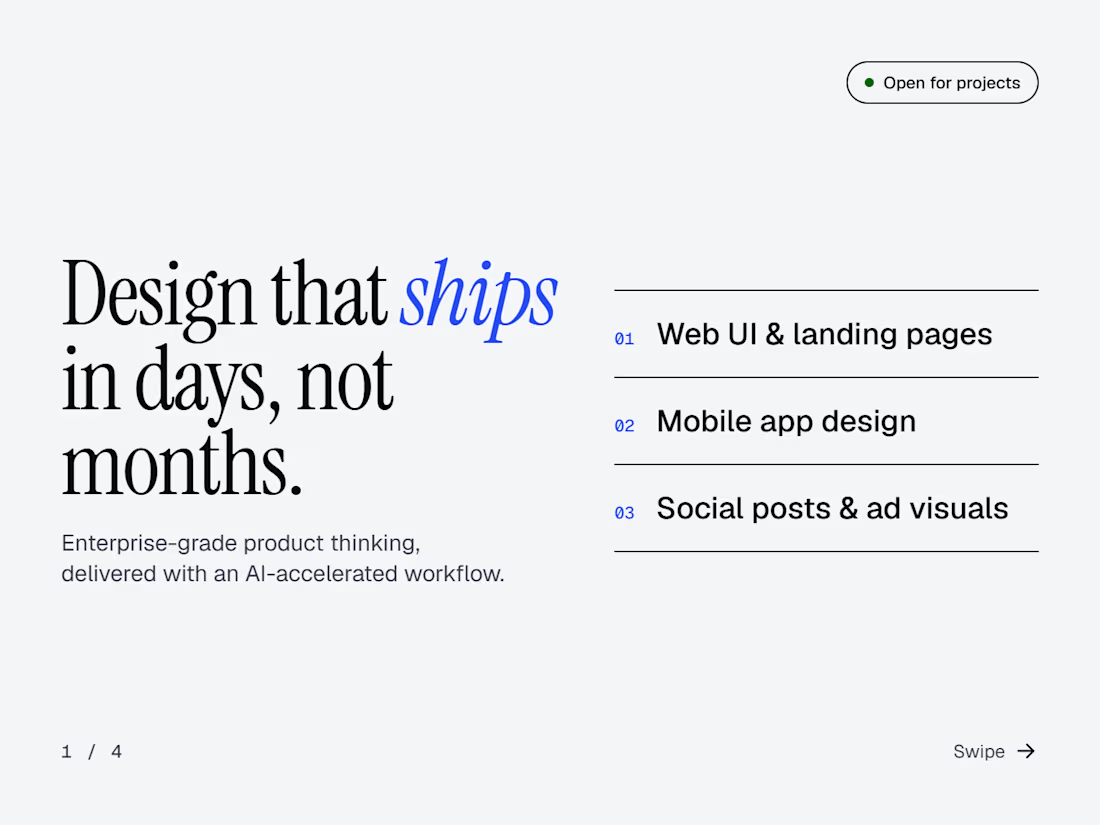
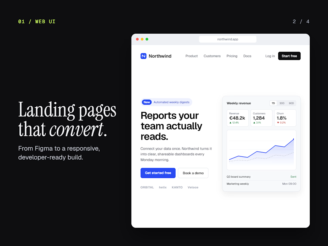
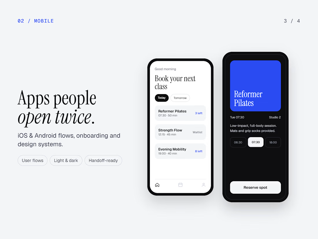
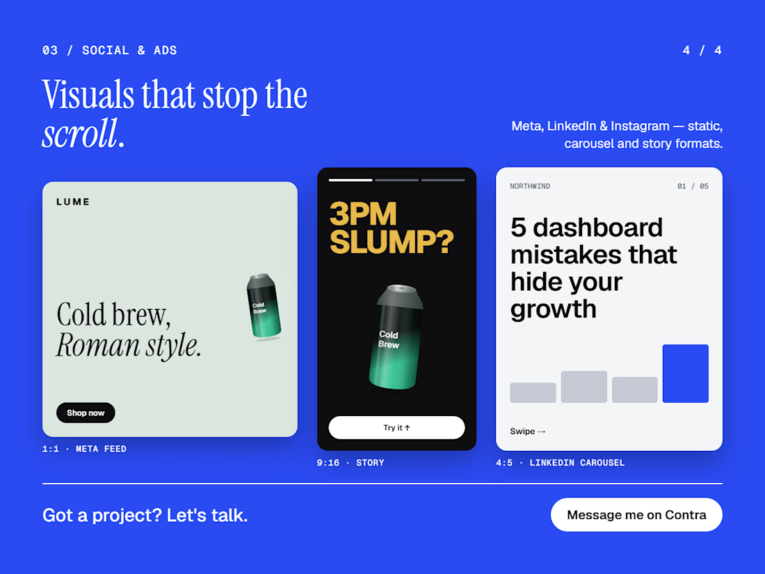
Design that ships in days, not months 👀
Web UI, mobile apps, social and ad visuals. Clear interfaces that make the next step obvious.
Open to new projects. What are you building?


Making the next step obvious is a useful goal. How do you check that before shipping?