The network for creativity
Join 1.25M professional creatives like you
Connect with clients, get discovered, and run your business 100% commission-free
Creatives on Contra have earned over $150M and we are just getting started
Back to feedPost


Why does a dashboard full of numbers still feel calm?
Bento grids are everywhere, and done right it's not a trend, it's information design. Each cell = one number, one meaning. The grid does the hierarchy for you.
Our three rules for a bento that works:
One idea per cell. Progress, glucose, one task. If a card needs two sentences, it needs two cards.
Mix the scale. One hero cell, a few mediums, one tiny stat, same gap everywhere.
One warm cell. A single card runs warm against the cool, dark screen; it carries the eye, and the rest stay quiet. No neon needed. Grids are calm. Content is loud. That's the whole trick.
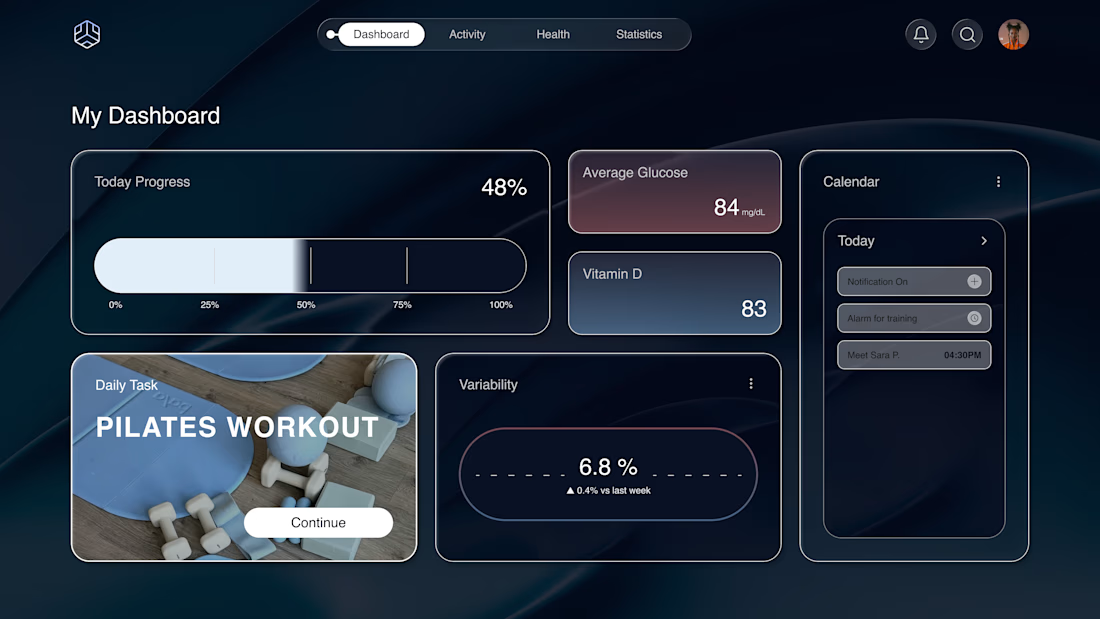

The one-idea-per-cell rule is so clear here—especially the deliberate scale mix between the hero metric and tiny stat. The warm task card gives the cool dashboard a great focal anchor.

One idea per cell really is the rule that makes this land. Every metric has space to breathe, and the scale contrast tells your eye exactly where to look first.

Love the three rules. How do you handle this grid when it collapses to mobile without losing the hierarchy?
The network for creativity
Join 1.25M professional creatives like you
Connect with clients, get discovered, and run your business 100% commission-free
Creatives on Contra have earned over $150M and we are just getting started

Challenges
View all


Related posts

Header section for a design studio. Renaissance art is always in style.


More Progress on the SILO web experience, now the generator power cut works and controls the real time lighting on the whole SILO


The power-cut interaction is a great way to make the lighting system feel tangible—the transition from the dark industrial baseline to the warm windows reads instantly. Nice restraint in the monochrome palette too; it lets the real-time light do the storytelling.


Launched this yesterday 🏈
Experience it for yourself: http://jjettas.com/


HIS VISOR IS A VIDEO WTFFFFFFFFF!
Someone call AWWWARDS