The network for creativity
Join 1.25M professional creatives like you
Connect with clients, get discovered, and run your business 100% commission-free
Creatives on Contra have earned over $150M and we are just getting started
Back to feedPost

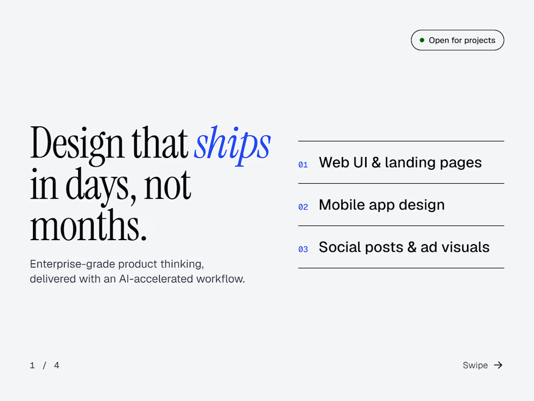
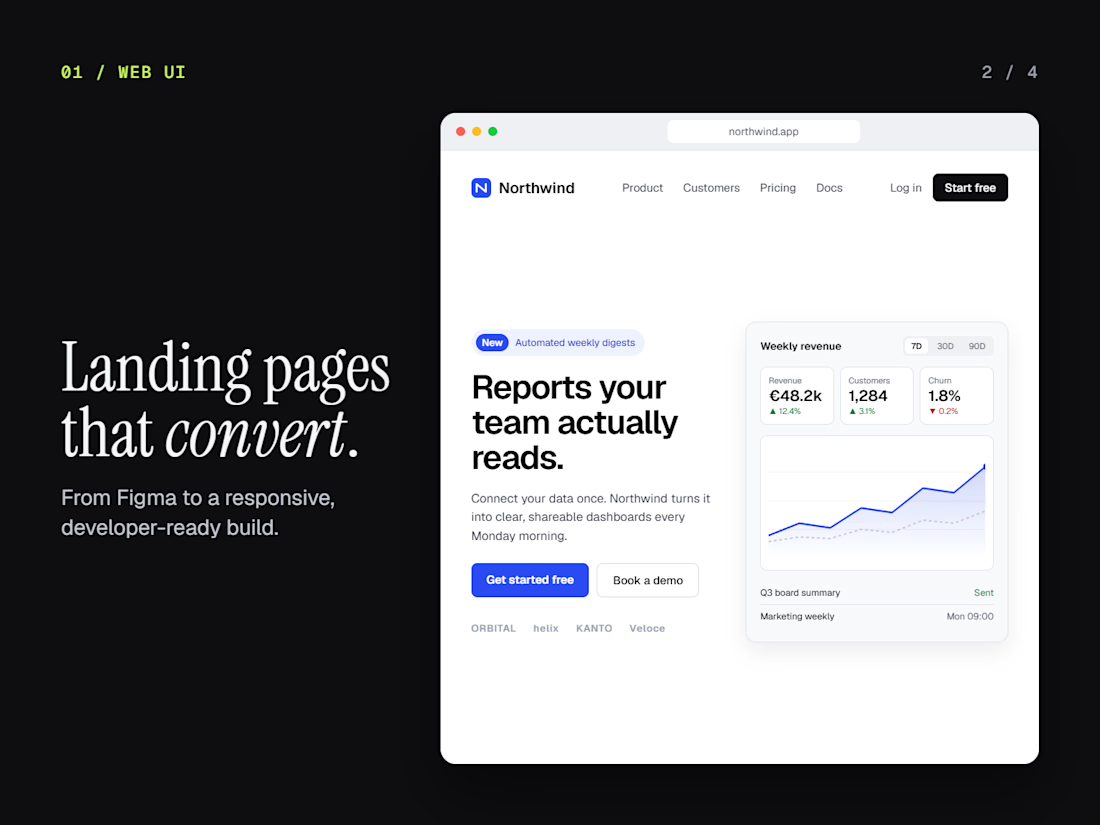
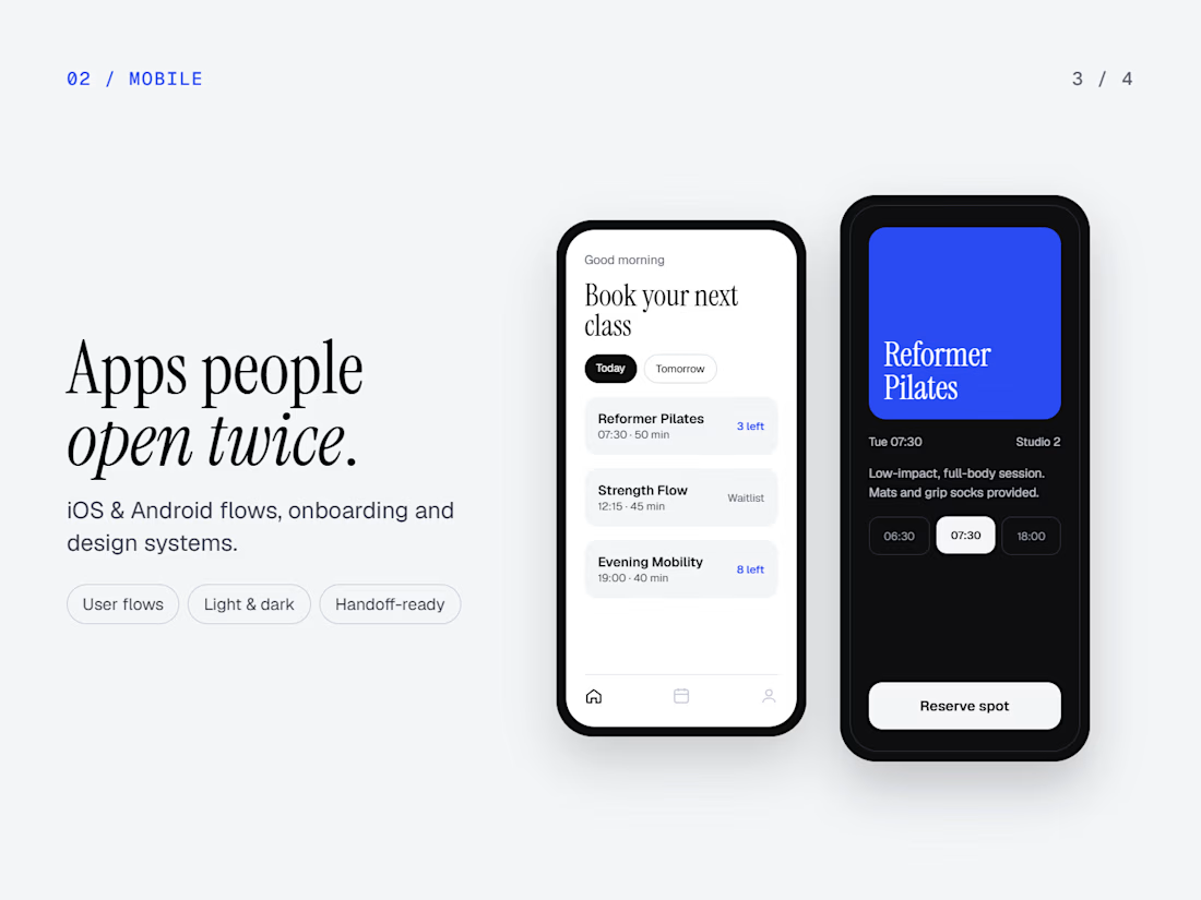
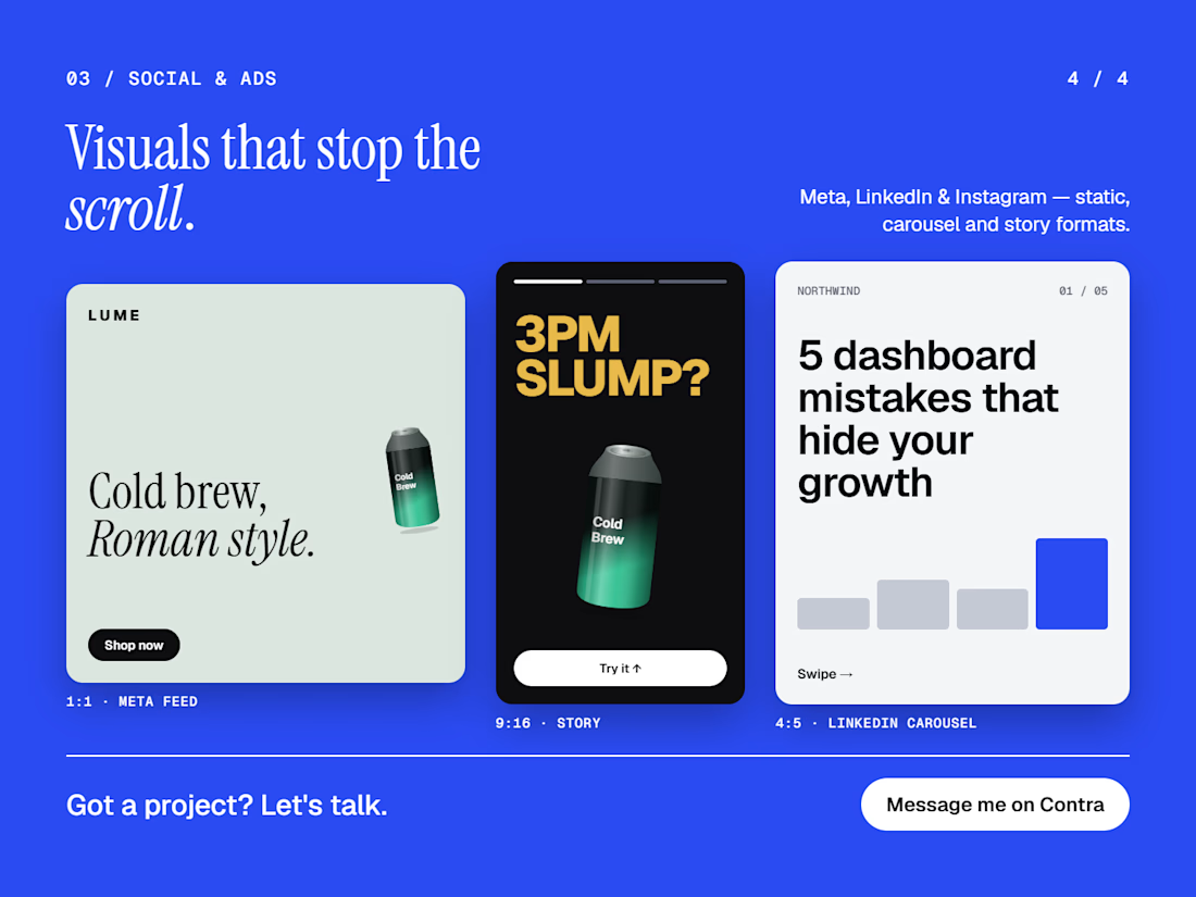
Design that ships in days, not months 👀
Web UI, mobile apps, social and ad visuals. Clear interfaces that make the next step obvious.
Open to new projects. What are you building?



Making the next step obvious is a useful goal. How do you check that before shipping?
Great question, I keep it simple:
I show the screen to someone for 5 seconds and ask what they'd click. Then I look at it in greyscale, because if the main button only stands out thanks to color, it isn't really standing out. And I always watch 2–3 people try one real task before...
I usually look at it from a motion perspective: can I guide the viewer’s attention to the right action without adding too many highlights or explanations?
If the flow still feels clear with minimal animation, the interface is usually doing its job well. I like your 5-second test though, it’s a smart and simple check.
I agree with you, it's all about user experience, the easier the better.
The network for creativity
Join 1.25M professional creatives like you
Connect with clients, get discovered, and run your business 100% commission-free
Creatives on Contra have earned over $150M and we are just getting started











Related posts


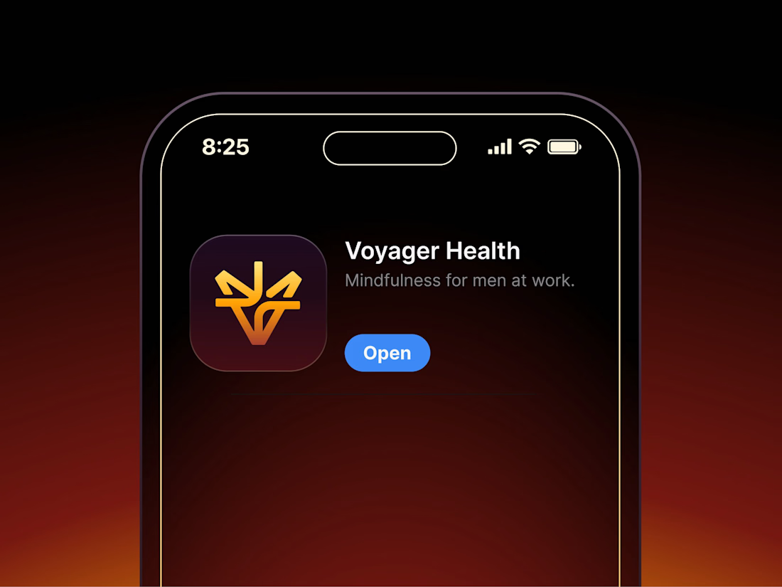

Aryna, that golden symbol pops so nicely against the plum background ✨

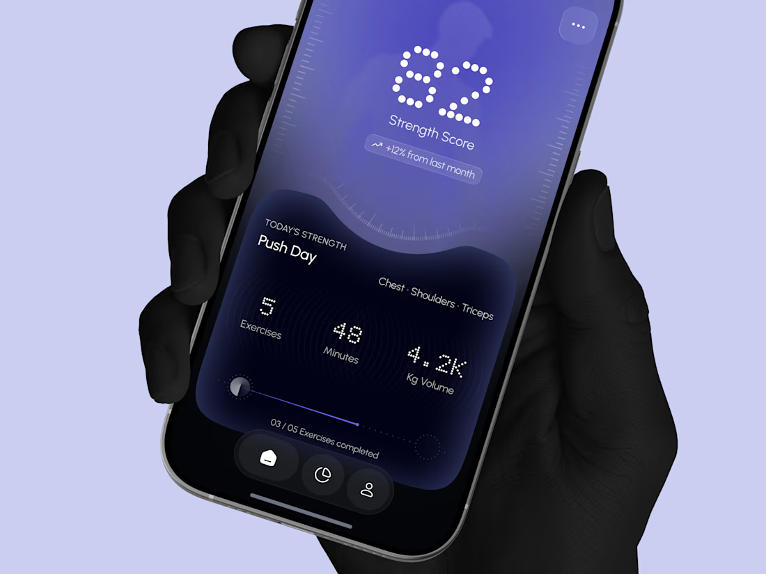
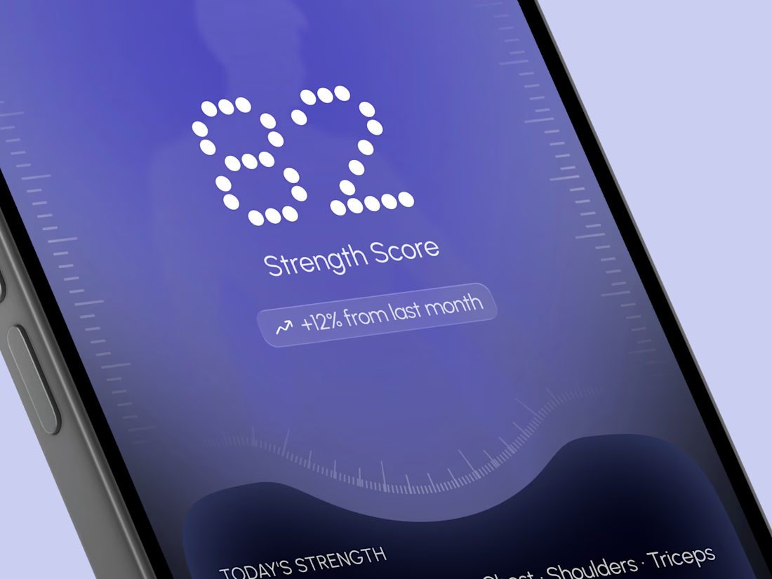
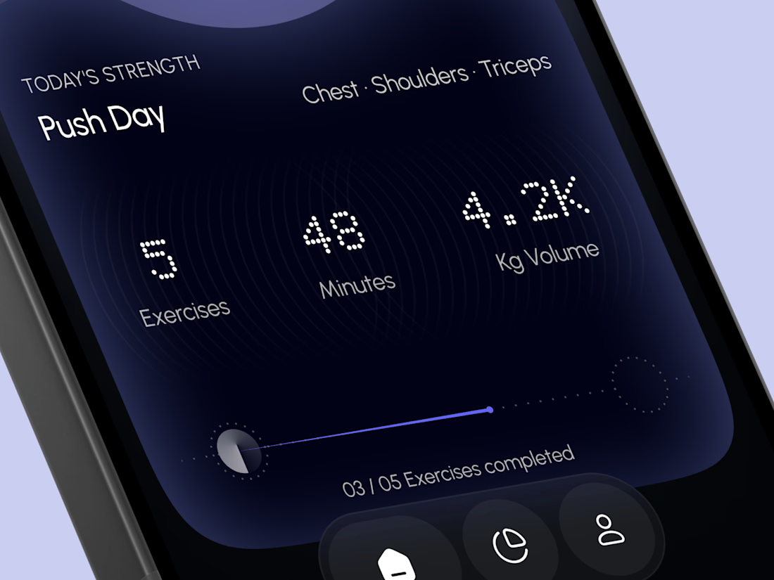
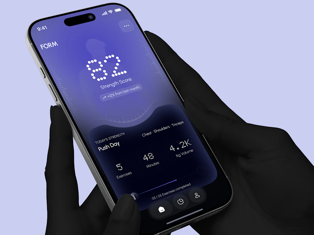
Designed a modern Strength Training Mobile App.
A deep indigo and violet gradient with a soft body silhouette and dotted display numbers for a bold and focused first impression.
A glowing strength score, a clear workout card with exercises, minutes, and volume, plus a simple progress bar make every training session easy to follow. A curved dark panel, fine tick marks, and a floating tab bar keep the whole app sleek, modern, and easy to use.



High end execution

Santa Monica Tile & Stone E-Commerce Design, 2025.
Buying tile online is mostly guesswork, so I designed a concept store where every page answers one buyer question. Shoppable rooms show how it looks, a coverage calculator tells you how much you need, and free samples let you see it first. Deep green, warm gold, and an AI tile scan that turns inspiration photos into products. Open for e-commerce and web design projects.
Full case study on my Contra Profile

TOP!!