The network for creativity
Join 1.25M professional creatives like you
Connect with clients, get discovered, and run your business 100% commission-free
Creatives on Contra have earned over $150M and we are just getting started
Back to feedPost

Road signs exist for one reason: to keep you alive. "Signs of life" is also the phrase we use for the first proof that someone survived something.
The Human by Design moment Twelve road-sign-style concepts were explored for the core mark. Eleven were rejected on camera, each for a specific reason.
The two clearest rejections:
• Emoji-style road signs (cute faces, cartoon expressions on the sign itself) — rejected. It undermines the one rule this system cannot break: every sign shown must be legible as a real, correct Canadian road sign. A funny face on a stop sign is a joke a new driver could actually mistake for real signage. Cute cannot come at the cost of literacy — that defeats the entire premise of a road-sign-literacy campaign.
• Crash/blood imagery for the hero video open — rejected. Fear-based road safety ads get scrolled past; the WHO and Transport Canada's own tone (calm, informational, "toward zero") supports warmth over shock. Kept direction: real consequence stated in plain, quiet type — not illustrated in gore.


Thank you!! 😊
The network for creativity
Join 1.25M professional creatives like you
Connect with clients, get discovered, and run your business 100% commission-free
Creatives on Contra have earned over $150M and we are just getting started




Related posts

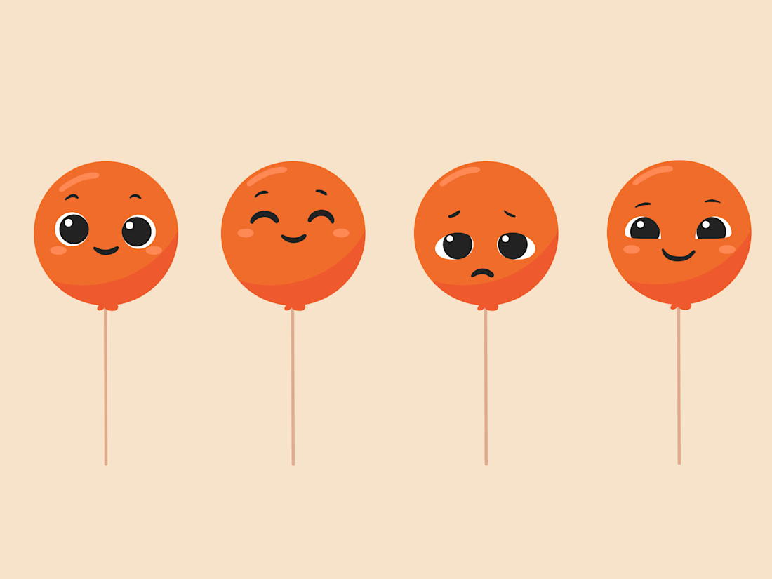
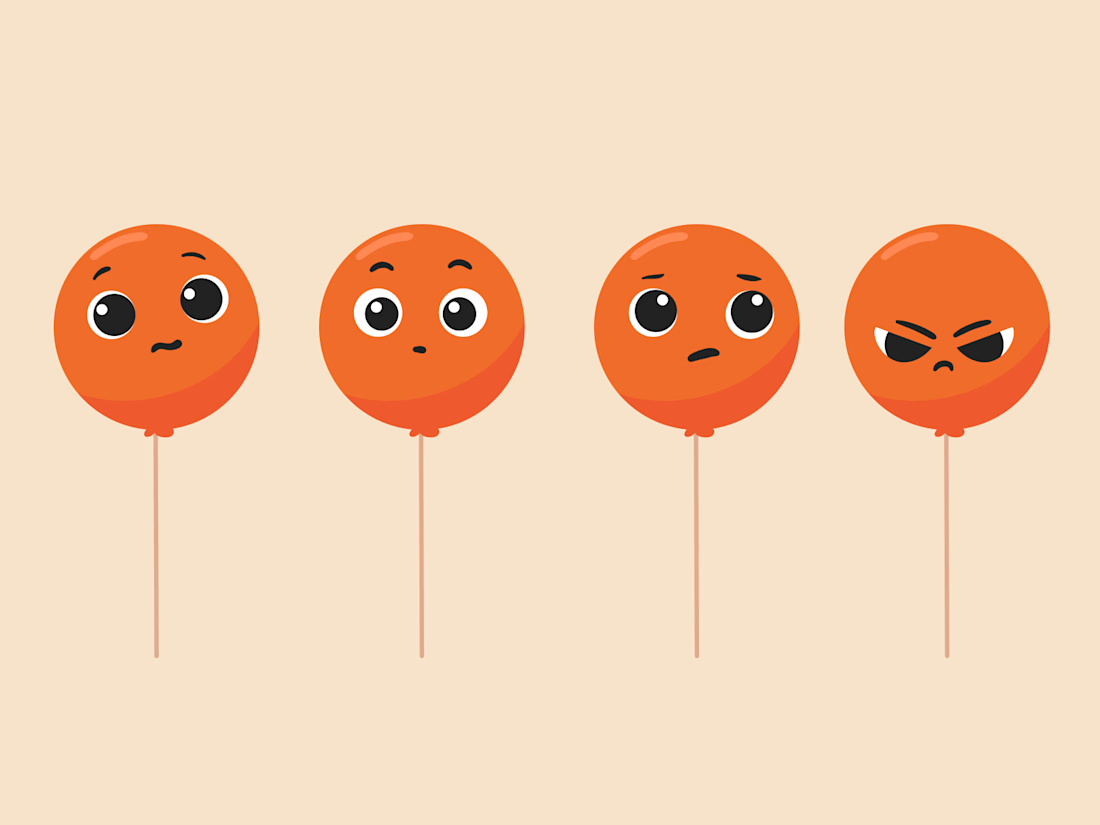
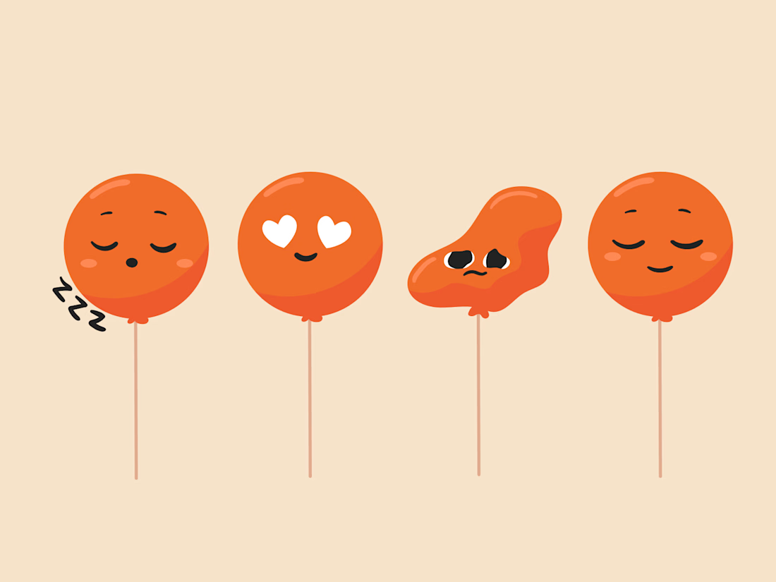
Balloon Mascot expression ranges
Illustrations by @Mary Delaney

I really love coming across this project in this space

A brand built on the daily walk.
For Patta, a Brazilian pet-lifestyle brand, the wordmark leans like a pair walking side by side, and dog-tag shapes frame everything from packaging to Barkz, its collectible charms.
Pet brands: cute, or bold enough to wear?



I like it!🔥 Best one since morning.
One pixel grid. A whole brand.
For Appy, a London product studio for impact-driven startups, the wordmark, icons, 3D smile and Appy Pixel, its custom typeface, all come from the same grid.
Appy Pixel won Typography at the Online Design Awards.
Type first or symbol first: where do you start a rebrand?


thats so nice, i loveee