The network for creativity
Join 1.25M professional creatives like you
Connect with clients, get discovered, and run your business 100% commission-free
Creatives on Contra have earned over $150M and we are just getting started
Back to feedPost

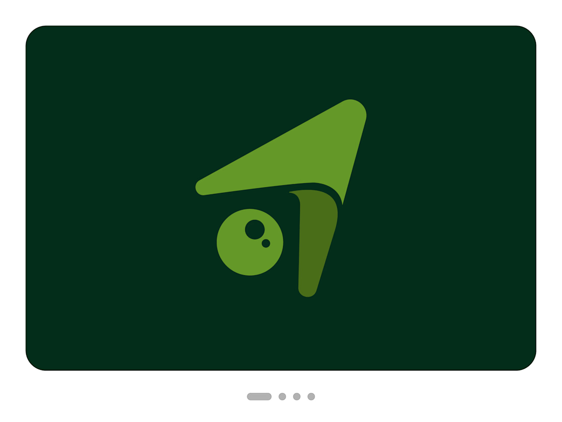
Nouca. A mark for the hardest road.
The trousers sit a little looser. The neighbour says, "You look great, have you lost weight?" Then one sentence in a doctor's office, and the same person is sitting in the car outside their own house, not knowing how to tell the children. Later, at the kitchen table, his wife has cooked his favourite meal. He manages three bites. She says, "Just eat a little." He hears, "You're giving up."
Nouca, formerly Nutrilotse, supports cancer patients over 65 through chemotherapy with nutrition, movement and psychological care. Its target markets are Denmark, Norway, Spain and Romania. Many patients lose muscle strength, often before they are even diagnosed, and only about three in ten receive any supportive care at all.
People first, then form
Before I touched a single shape, I wrote 15 pages about the people behind the brief: five stages of the journey and four composite characters. Ingrid from Aarhus reads studies all night and knows less and less about what is true. Olav from Bergen can no longer manage the steps down to his boat, and that hits him harder than anything his doctor says.
They all share one feeling: I am losing control of my own life. That defined the brand's role, and my benchmark came from blind running. Athlete and guide are joined only by a short tether. The guide sees the track but may neither pull nor push, and the medal belongs to the athlete.
The challenge
The mark must not promise what no one can keep. It could not suggest healing, feel cold, look spiritual or read as a nutrition brand. And it speaks to a generation for whom showing weakness feels like failure.
I also wasn't starting from zero. The managing director brought her own drafts. The navigation arrow captured the idea but looked like a GPS app. She also liked the image of a guardian angel, but didn't want a religious symbol.
Why the symbol looks the way it does
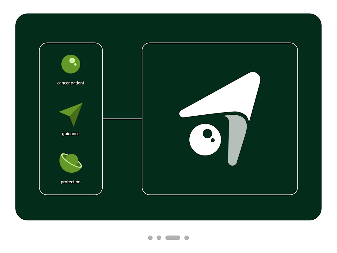
The derivation starts with four pictograms: patient, navigating, caring, guardian angel.
The circle is the person. It stands free, touched by nothing. Its two points of light bring it to life and sit in the direction the arrow points.
The arrow is the companion. It knows the way. I took away its hard corners so that technology becomes closeness.
The dark form is the support. Released from the arrow, it settles beside the person like a hand on a bicycle saddle, steadying without holding on.
The distance carries the message. No form touches another. Closeness comes from the arrangement alone, and the person stays themselves.
The angel remains a hint. The upper form can be read as a wing, but it doesn't have to be.
The wordmark is lowercase, softly rounded and leans forward. It moves along without raising its voice.
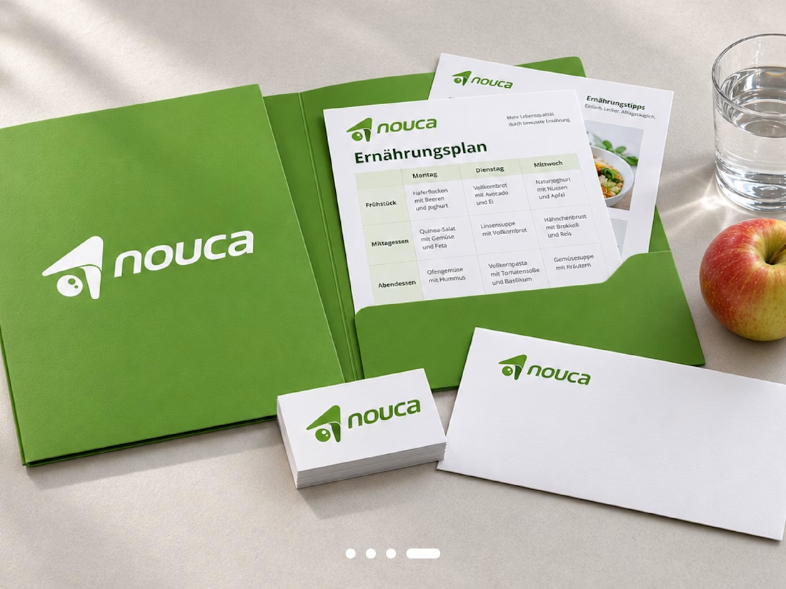
The result is a logo system in three colour variants, with a colour system checked for legibility for older eyes and a usage guide. The essence behind it all: Your strength. Your path. We walk with you.
Nouca. A mark for the hardest road.
The trousers sit a little looser. The neighbour says, "You look great, have you lost weight?" Then one sentence in a doctor's office, and the same person is sitting in the car outside their own house, not knowing how to tell the children. Later, at the kitchen table, his wife has cooked his favourite meal. He manages three bites. She says, "Just eat a little." He hears, "You're giving up."
Nouca, formerly Nutrilotse, supports cancer patients over 65 through chemotherapy with nutrition, movement and psychological care. Its target markets are Denmark, Norway, Spain and Romania. Many patients lose muscle strength, often before they are even diagnosed, and only about three in ten receive any supportive care at all.
People first, then form
Before I touched a single shape, I wrote 15 pages about the people behind the brief: five stages of the journey and four composite characters. Ingrid from Aarhus reads studies all night and knows less and less about what is true. Olav from Bergen can no longer manage the steps down to his boat, and that hits him harder than anything his doctor says.
They all share one feeling: I am losing control of my own life. That defined the brand's role, and my benchmark came from blind running. Athlete and guide are joined only by a short tether. The guide sees the track but may neither pull nor push, and the medal belongs to the athlete.
The challenge
The mark must not promise what no one can keep. It could not suggest healing, feel cold, look spiritual or read as a nutrition brand. And it speaks to a generation for whom showing weakness feels like failure.
I also wasn't starting from zero. The managing director brought her own drafts. The navigation arrow captured the idea but looked like a GPS app. She also liked the image of a guardian angel, but didn't want a religious symbol.
Why the symbol looks the way it does
The derivation starts with four pictograms: patient, navigating, caring, guardian angel.
The circle is the person. It stands free, touched by nothing. Its two points of light bring it to life and sit in the direction the arrow points.
The arrow is the companion. It knows the way. I took away its hard corners so that technology becomes closeness.
The dark form is the support. Released from the arrow, it settles beside the person like a hand on a bicycle saddle, steadying without holding on.
The distance carries the message. No form touches another. Closeness comes from the arrangement alone, and the person stays themselves.
The angel remains a hint. The upper form can be read as a wing, but it doesn't have to be.
The wordmark is lowercase, softly rounded and leans forward. It moves along without raising its voice.
The result is a logo system in three colour variants, with a colour system checked for legibility for older eyes and a usage guide. The essence behind it all: Your strength. Your path. We walk with you.
Nouca. A mark for the hardest road.
The trousers sit a little looser. The neighbour says, "You look great, have you lost weight?" Then one sentence in a doctor's office, and the same person is sitting in the car outside their own house, not knowing how to tell the children. Later, at the kitchen table, his wife has cooked his favourite meal. He manages three bites. She says, "Just eat a little." He hears, "You're giving up."
Nouca, formerly Nutrilotse, supports cancer patients over 65 through chemotherapy with nutrition, movement and psychological care. Its target markets are Denmark, Norway, Spain and Romania. Many patients lose muscle strength, often before they are even diagnosed, and only about three in ten receive any supportive care at all.
People first, then form
Before I touched a single shape, I wrote 15 pages about the people behind the brief: five stages of the journey and four composite characters. Ingrid from Aarhus reads studies all night and knows less and less about what is true. Olav from Bergen can no longer manage the steps down to his boat, and that hits him harder than anything his doctor says.
They all share one feeling: I am losing control of my own life. That defined the brand's role, and my benchmark came from blind running. Athlete and guide are joined only by a short tether. The guide sees the track but may neither pull nor push, and the medal belongs to the athlete.
The challenge
The mark must not promise what no one can keep. It could not suggest healing, feel cold, look spiritual or read as a nutrition brand. And it speaks to a generation for whom showing weakness feels like failure.
I also wasn't starting from zero. The managing director brought her own drafts. The navigation arrow captured the idea but looked like a GPS app. She also liked the image of a guardian angel, but didn't want a religious symbol.
Why the symbol looks the way it does
The derivation starts with four pictograms: patient, navigating, caring, guardian angel.
The circle is the person. It stands free, touched by nothing. Its two points of light bring it to life and sit in the direction the arrow points.
The arrow is the companion. It knows the way. I took away its hard corners so that technology becomes closeness.
The dark form is the support. Released from the arrow, it settles beside the person like a hand on a bicycle saddle, steadying without holding on.
The distance carries the message. No form touches another. Closeness comes from the arrangement alone, and the person stays themselves.
The angel remains a hint. The upper form can be read as a wing, but it doesn't have to be.
The wordmark is lowercase, softly rounded and leans forward. It moves along without raising its voice.
The result is a logo system in three colour variants, with a colour system checked for legibility for older eyes and a usage guide. The essence behind it all: Your strength. Your path. We walk with you.


The network for creativity
Join 1.25M professional creatives like you
Connect with clients, get discovered, and run your business 100% commission-free
Creatives on Contra have earned over $150M and we are just getting started
Related posts

Rofella - Brand Expressions



The serif wordmark against that warm, textured paper feels so confident and timeless, and the deep burgundy gives the whole identity real character. Beautifully restrained work, keep going! Did the paper texture come from a real scan or did you build it digitally?

Are you still designing Brand Guidelines presentations from scratch?
I created this Mini Brand Guidelines template as a modular, editorial-style system built to help designers and studios present brand identity work with structure and clarity in no time.
Whether you’re delivering a new identity to a client or documenting internal brand assets, this template provides a confident, consistent framework.
Tap the link above to get it.

Clean and smooth, love it

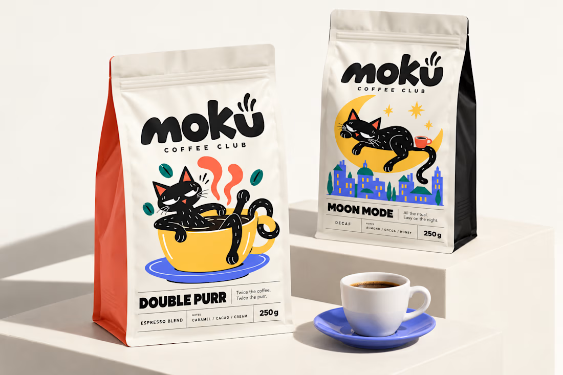
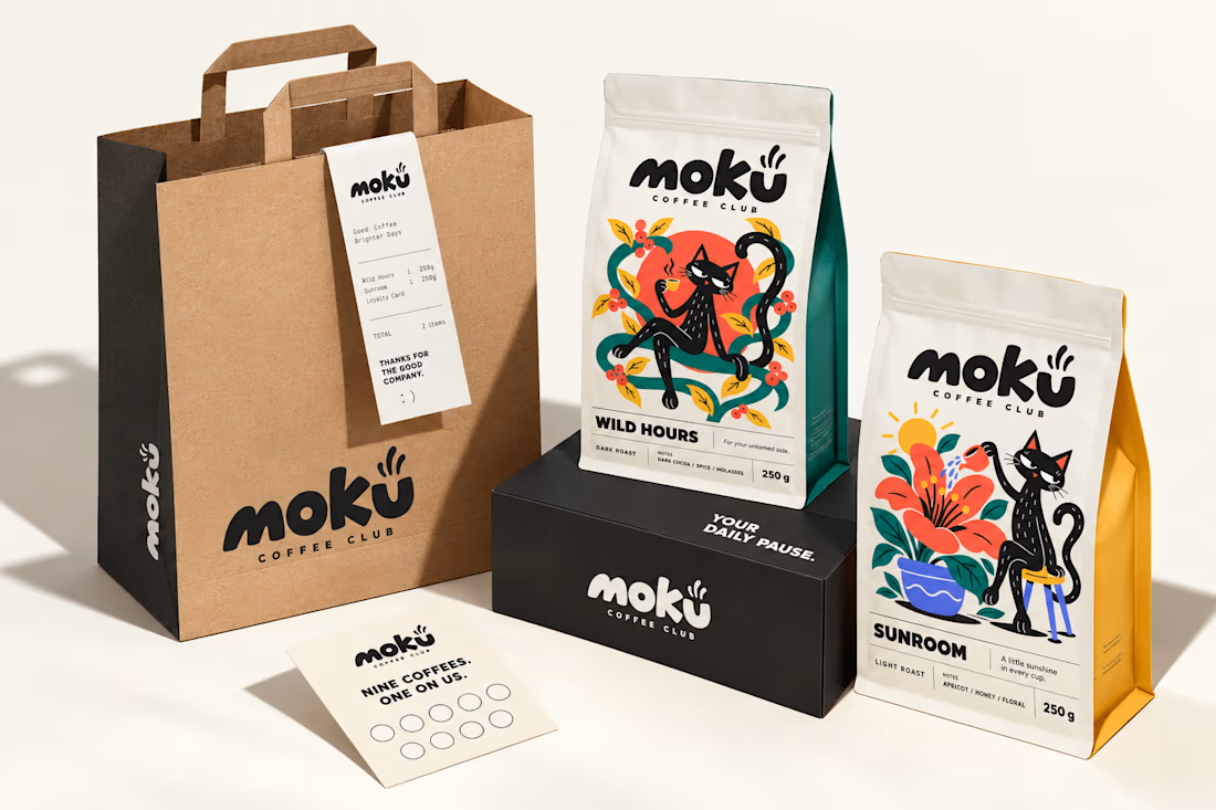
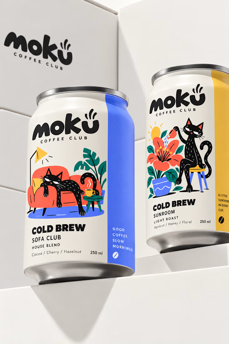
What if coffee packaging had a personality? 🐾
I designed Moku’s whole world, from bags and cold brew cans to drip packs and cups, around a cat who’s always having a better day than you.
See the full project and let me know what you think!

Woow Jerin that's stunning🔥🔥
The colors was so vibrant that's unbelievable