The network for creativity
Join 1.25M professional creatives like you
Connect with clients, get discovered, and run your business 100% commission-free
Creatives on Contra have earned over $150M and we are just getting started
Back to feedPost
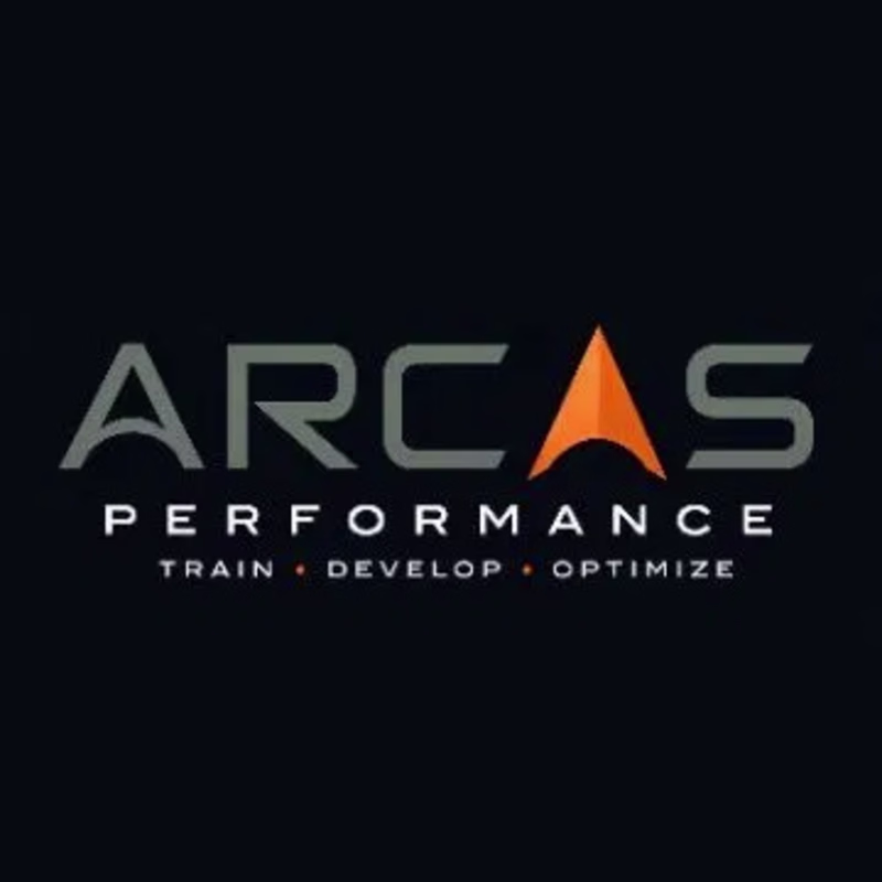
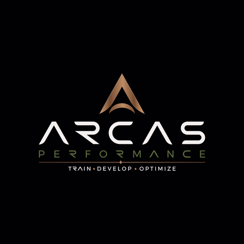
Taste Test
Which one says "train, develop, optimize" to you, the sharp orange or the golden mark? ⚡
🔶 Arcas - The Orange Mark
Bold orange on dark navy. Sharp, modern, built for speed.
🏆 Arcas - The Gold Mark
Bronze gradient on black. Premium, commanding, built for legacy.
Same words. Completely different power. 💥
4 voted
17%
19 voted
83%
23 votes
Closed
Gold Mark for me. The bronze gradient adds weight the orange version doesn't quite have, and for a brand called "Arcas Performance" that legacy feel matters. Orange reads faster but gold reads stronger.
To me this Arcas gold mark really stands out. The effort and thought behind it are obvious, and it shows in the final result. Keep pushing like this, you're building something remarkable.
The gold looks cooler 😎
Going with the Gold Mark
Going for the Arcas Gold mark
Will go for the Gold
ig orange looks good imo
Amazing!
The network for creativity
Join 1.25M professional creatives like you
Connect with clients, get discovered, and run your business 100% commission-free
Creatives on Contra have earned over $150M and we are just getting started
Related posts
Today's design exploration started with a Dribbble inspiration piece.
Rather than copying it directly, I challenged myself to reinterpret the concept and experiment with a completely different visual direction.
The original inspiration uses vibrant blue and orange colors to create an energetic feel, while my version leans into a darker, more premium aesthetic.
A great exercise in studying design principles and then applying them through your own lens.
Question:
Which version do you prefer?
🟠 The colorful Dribbble-inspired version
⚫ My dark interpretation
22 voted
47%
25 voted
53%
47 votes
Closed
Dark mode always
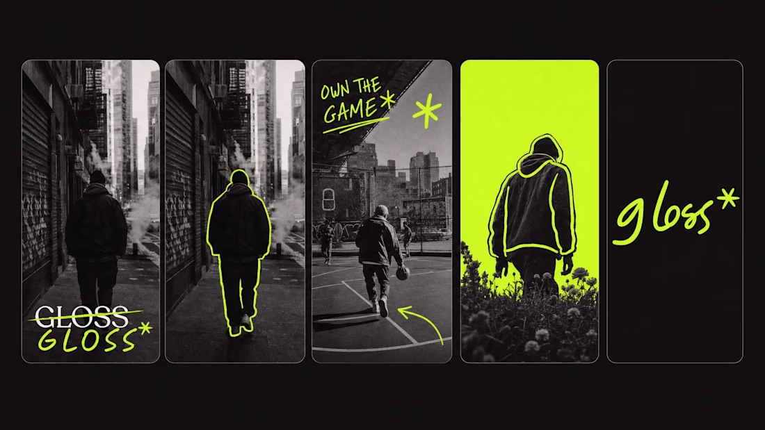
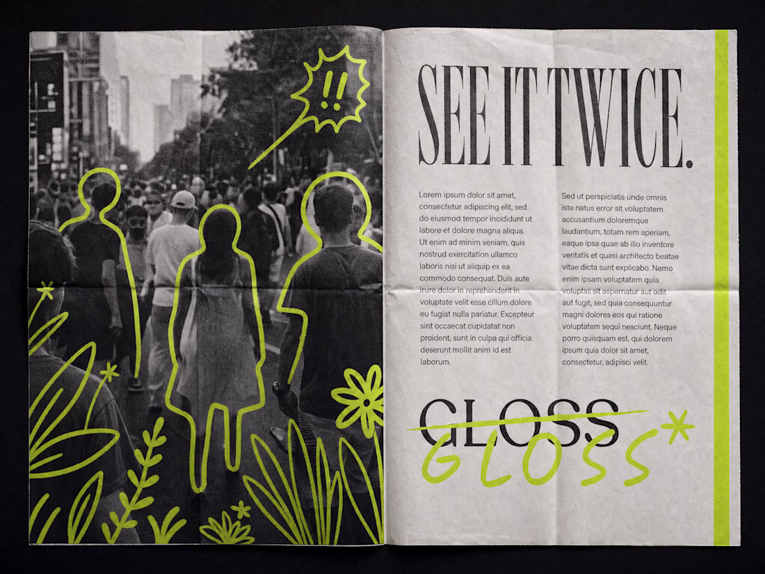
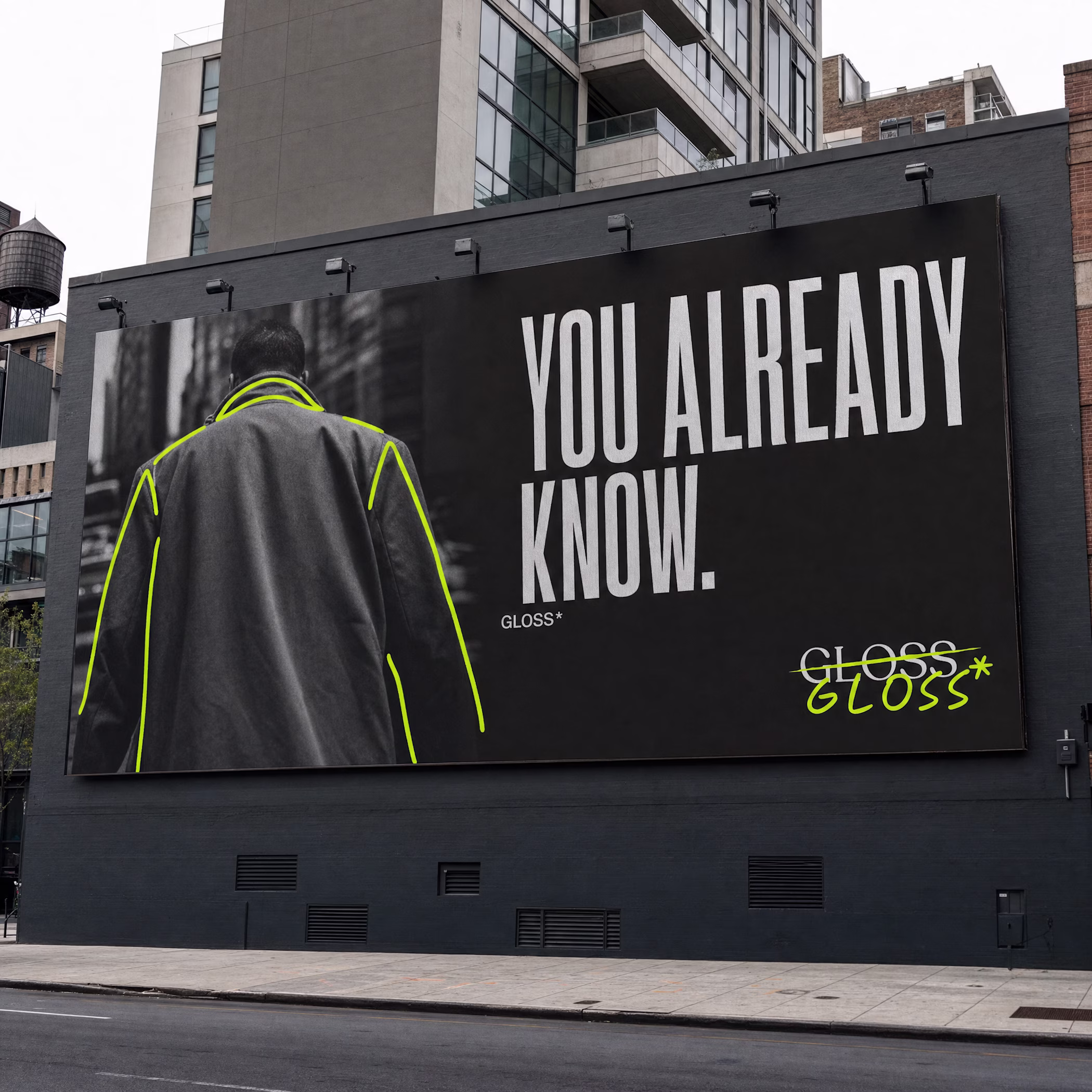
built a brand that sees the world twice.
once as it is.
once as it could be.
GLOSS* drops soon.
Great work mate!
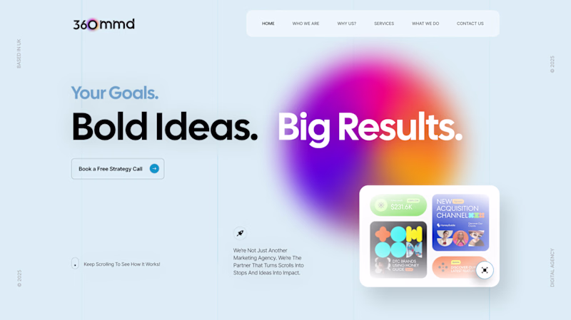
🚀 Design Direction Poll
I've been exploring two hero concepts for a digital marketing agency, both built around the same message:
"Your Goals. Bold Ideas. Big Results."
But each direction tells a very different story.
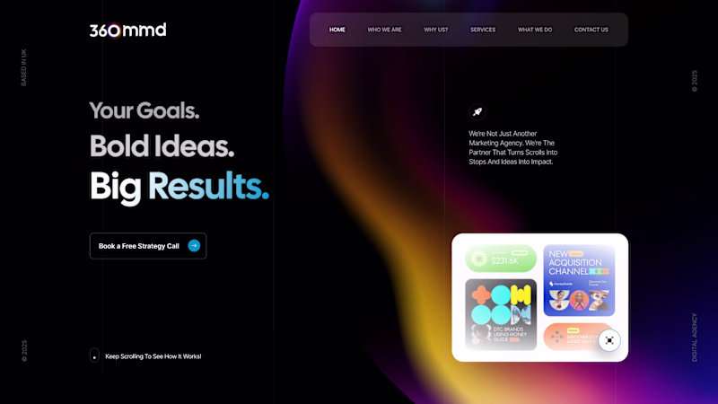
🌑 Concept A (Dark Mode)
A bold, high-contrast experience designed to feel premium, confident, and impactful.
☀️ Concept B (Light Mode)
A brighter, more energetic direction that feels approachable, innovative, and forward-thinking.
Vote below and share what influenced your decision—emotion, branding, trust, or overall visual appeal. 👇
27 voted
63%
16 voted
37%
43 votes
Closed
both are lovely, but i went with the light concept–– it goes just a bit better with that little box you've got near the lower right corner, plus i think the shape + bold gradient it holds against the background is a really in-tune connection to how the subconscious mind (well,...
Challenges
View allTrending
Claude
Claude has entered the design space. How are you using Claude Design?
Contra University
Learn from expert creatives how to earn more using next-gen AI tools.
MagicPath
The canvas is infinite, and exploration is becoming the workflow. How are you using MagicPath?
creativeaiflow
Creative AI workflows are evolving. What tools do you use, and what are their strengths and weaknesses?
freelancerlife
Freelancer life is wins, pivots, and everything in between. What’s yours right now?