The network for creativity
Join 1.25M professional creatives like you
Connect with clients, get discovered, and run your business 100% commission-free
Creatives on Contra have earned over $150M and we are just getting started
Back to feedPost

Hello, Contra creatives👋
I'm Xhesika — a brand identity designer with eight years behind me, most of it spent shaping identities for cultural institutions and heritage-rooted brands.
Just shared three case studies here: a fragrance house, a craft guild, a publisher's mark. Different worlds, same instinct — restraint over ornament, and identity built to last, not to trend.
I'm also building something of my own right now: Ajkê Studio, an independent practice for brands with real roots.
New here and genuinely curious — what got you into design, or onto Contra?
The network for creativity
Join 1.25M professional creatives like you
Connect with clients, get discovered, and run your business 100% commission-free
Creatives on Contra have earned over $150M and we are just getting started

Challenges
View all


Related posts

Brand Identity for Propane
Propane is an experience-led platform firm that helps organizations sell and scale complex offerings. We operate between traditional agencies and large
consultancies: strategic, but accountable to what actually gets built.
The brand identity for Propane is built as a disciplined, scalable system that
reflects its role as an experience-led platform firm operating between agencies and consultancies. Positioned at the intersection of human-centered thinking and industrial-grade complexity, the identity resolves this tension with calm confidence—balancing precision, systems logic, and usability without leaning into coldness or superficial warmth.
View full project and more structured context on the link above or my profile.
Feel free to share your constructive feedback ⚡

Yooo this visual language is great🔥

30+ pages, 3 weeks, and honestly one of my favorite projects in a while.
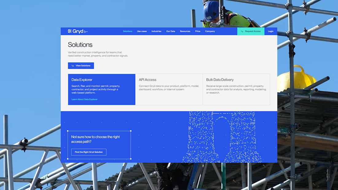
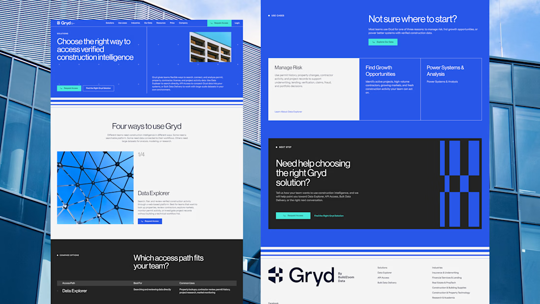
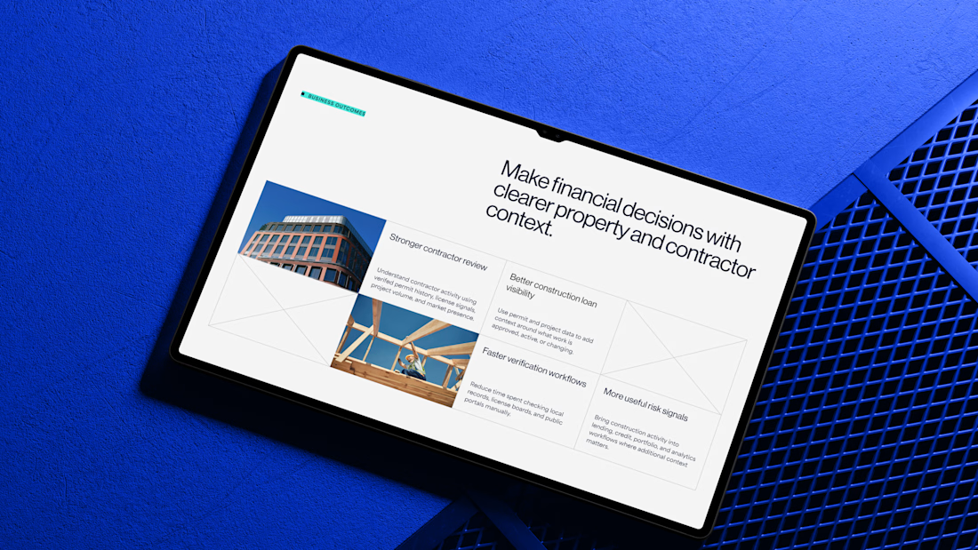
I'd been wanting to design something more tech-driven for a long time, and Gryd, a platform turning construction permit data into intelligence for insurers, lenders, and real estate teams, was exactly that.
Wireframes first, then UI across every page, fully responsive, with animation on the key screens, all built inside the brand the client had already set.
Case study's on my profile.

Clean design 😍

Most real estate brands look like they were designed not to offend anyone. Arcova was designed to be impossible to ignore.
Electric lime. Forest green. A house mark that owns a building facade as confidently as it owns a tote bag. "Build where others only look." "What we build today is what stands tomorrow."


