The network for creativity
Join 1.25M professional creatives like you
Connect with clients, get discovered, and run your business 100% commission-free
Creatives on Contra have earned over $150M and we are just getting started
Back to feedPost

2x new patients. 51% higher conversion rate. 29% lower bounce rate. 🚀
That’s the impact my redesign had for a telehealth weight loss brand. Here’s what I changed 👇
Before ❌
- Weak hero with no highlighted treatments and no trust signals
- Generic brand with no memorable visual identity
- Broken composition that felt overwhelming
- Limited social proof, and testimonials that felt AI-generated
After ✅
- Clearer content hierarchy, so users find the right treatment in seconds
- Real social proof and outcome-focused visuals placed at the decision point
- A distinctive visual style that feels premium, not clinical
Want results like this for your brand? DM me 📩
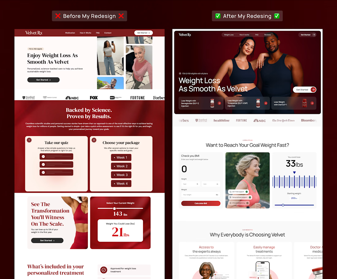

2x new patients is a great result. Adding highlighted treatments and trust signals right in the hero is such a simple fix that so many health sites still miss.
The network for creativity
Join 1.25M professional creatives like you
Connect with clients, get discovered, and run your business 100% commission-free
Creatives on Contra have earned over $150M and we are just getting started





Related posts

Designed Oculus, a crypto dashboard where every tile is double-outlined, flat and unapologetically colorful.
Warm paper canvas, ink black anchors, mono micro-type, and an eye that follows your cursor.
Built with GSAP + Framer Motion. Light mode only, on purpose.
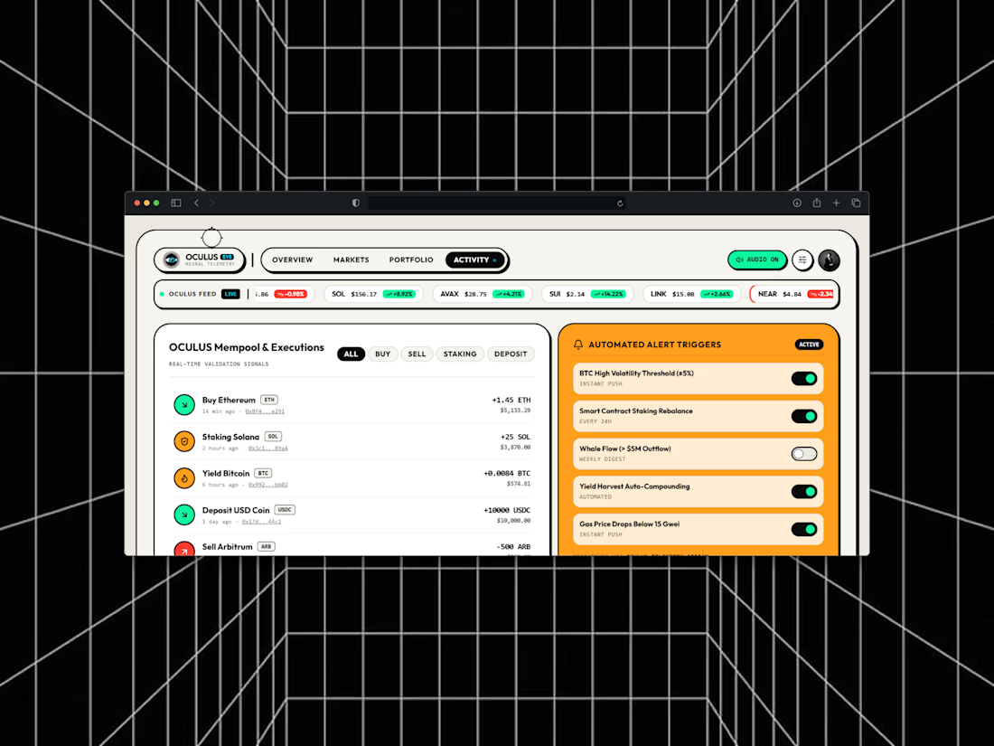
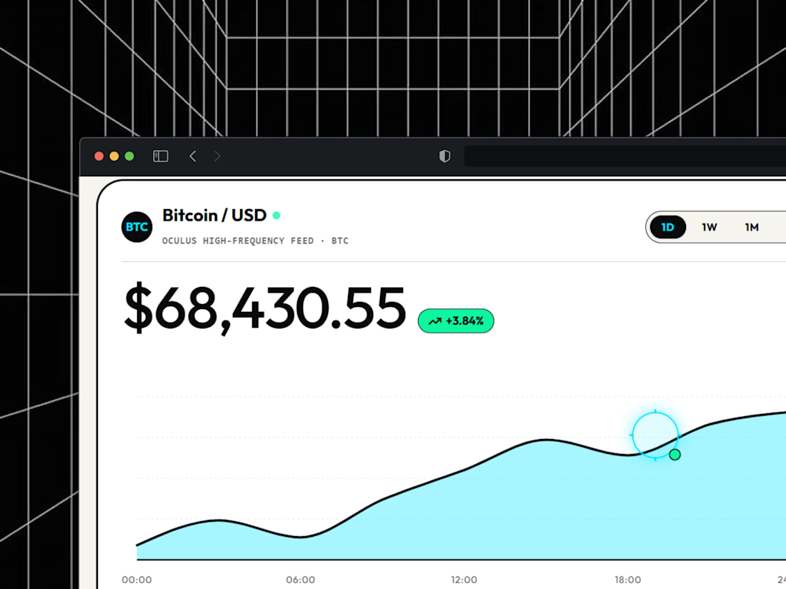
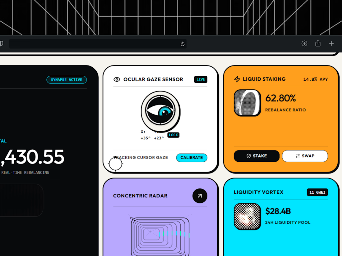

light mode only, on purpose. respect.

Saltline - A Coastal Brand Experience
Saltline is a digital concept built around the spirit of the ocean, combining a distinctive visual identity with a clean, immersive web experience.
The goal was to create a brand that feels modern, adventurous, and effortlessly premium, with a strong visual direction and an interface designed to make the experience feel as memorable as the brand itself.
Built with Base44


Woow , warmth and premium


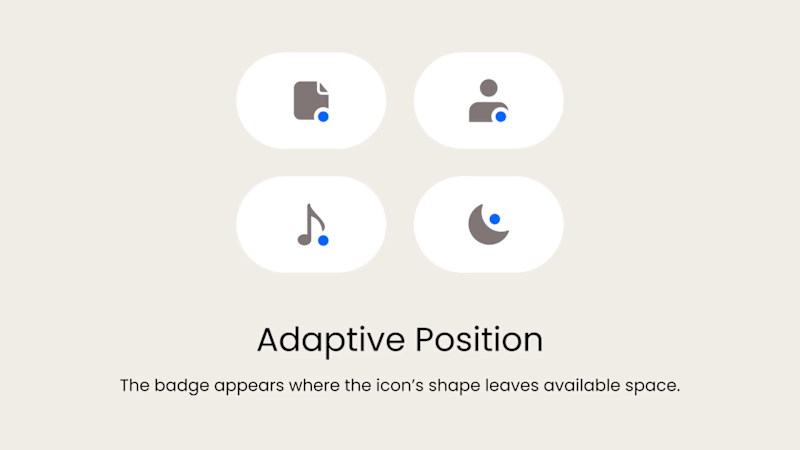
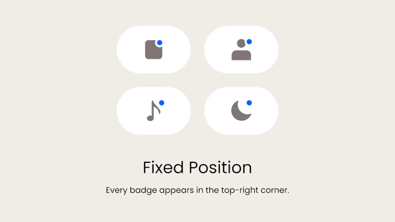
Badge Placement: Consistency or Visual Balance?
Even a small indicator can change how the entire interface feels
Adaptive Position
The badge placement changes depending on the icon’s shape and available space. The result feels more visually balanced but requires individual adjustments.
Fixed Position
The badge always appears in the top-right corner. This creates a consistent and predictable system, but on some icons it may feel disconnected or awkwardly placed.
What matters more in a design system: consistency or optical balance?
17 voted
43%
23 voted
57%
40 votes
Closed

Fixed for me. In a system, people learn where to look. I'd tweak the odd icons before breaking the rule.