The network for creativity
Join 1.25M professional creatives like you
Connect with clients, get discovered, and run your business 100% commission-free
Creatives on Contra have earned over $150M and we are just getting started
Back to feedPost

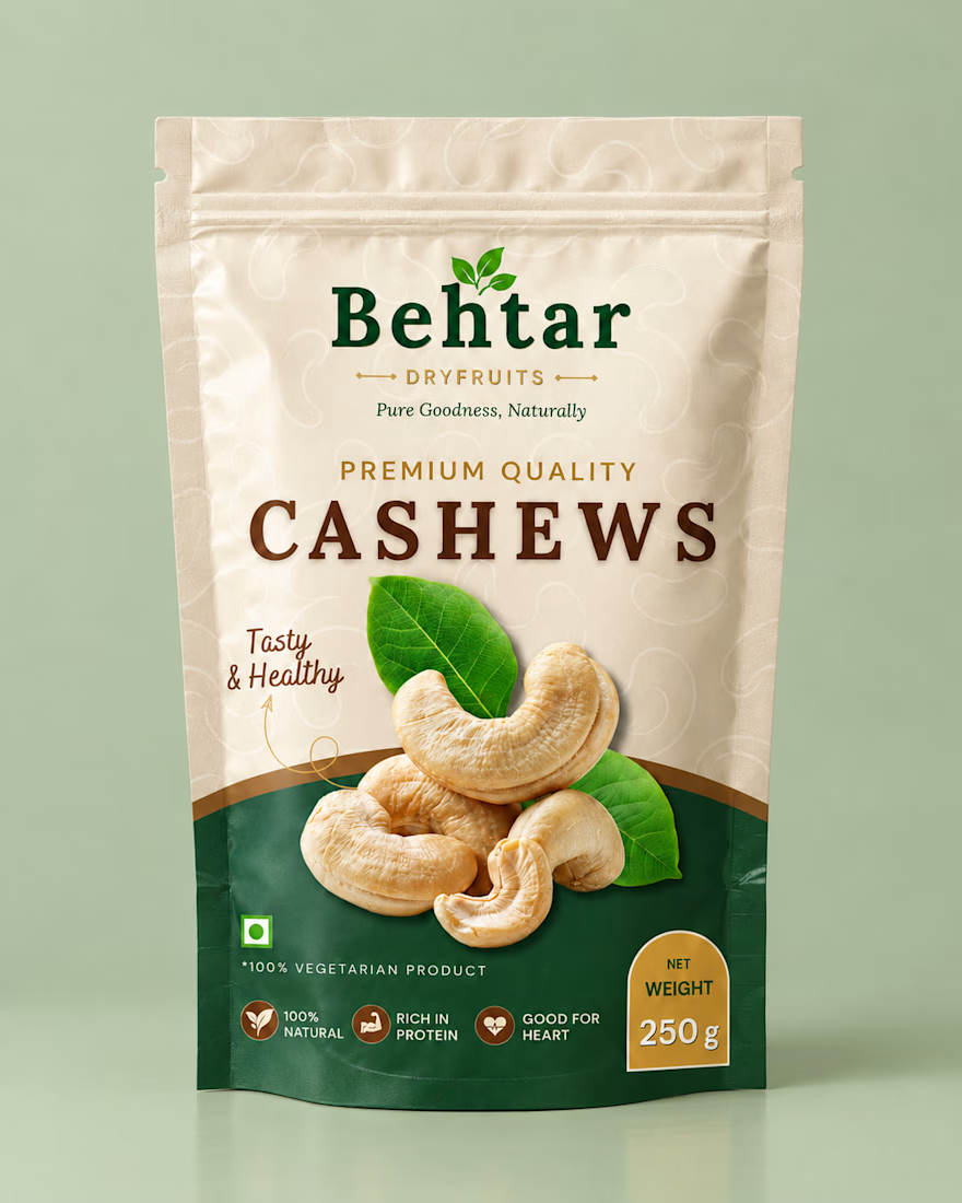
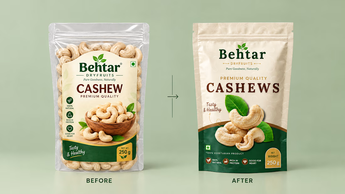
A self-initiated packaging redesign concept for a 250 g cashew stand-up pouch.
The original pack had a small label and low shelf impact, so I focused on making the product name and hero image impossible to miss.
What I changed:
A bold, oversized product name for instant recognition
A large hero cashew image overlapping the color divide for depth
Cream and deep green contrast with gold accents for a premium feel
A clear weight badge and three benefit icons
A subtle cashew line pattern as background texture
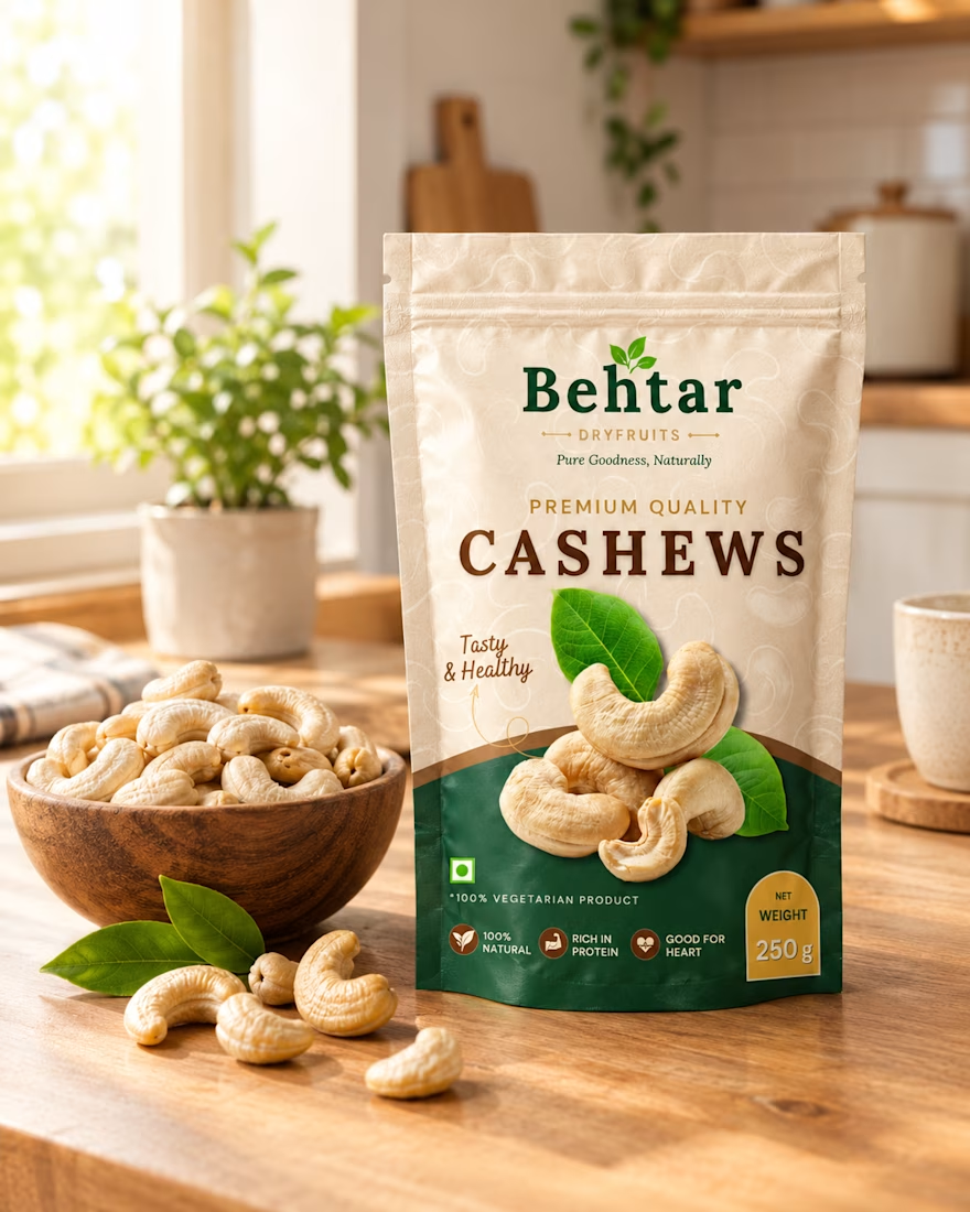
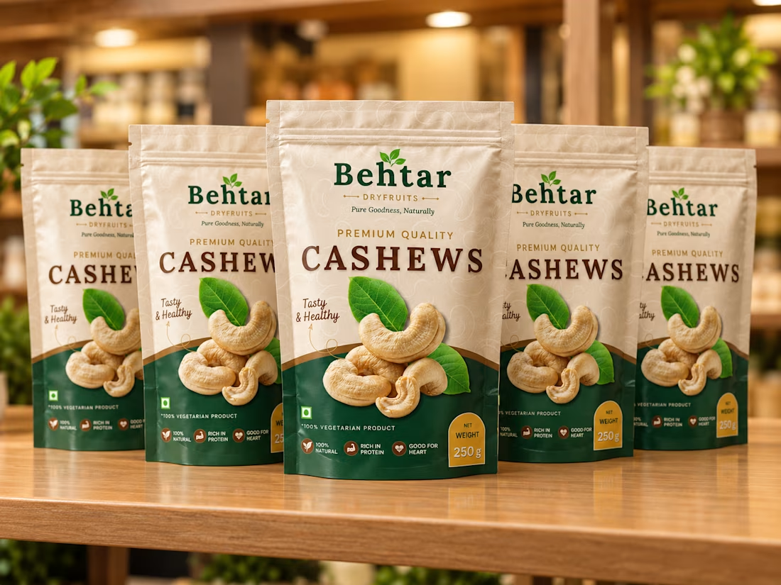
Designed in Canva. Mockups created with AI tools.
Unsolicited concept redesign, not affiliated with Behtar Dry fruits.
Full case study on Behance 👇
https://www.behance.net/gallery/256770853/Behtar-Cashews-Packaging-Redesign-Concept


The network for creativity
Join 1.25M professional creatives like you
Connect with clients, get discovered, and run your business 100% commission-free
Creatives on Contra have earned over $150M and we are just getting started



Related posts


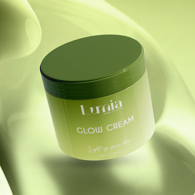
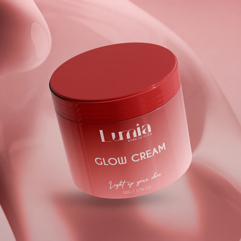
Which packaging color catches your eye first?

6 voted
46%
7 voted
54%
13 votes
Closed

The green version catches my eye first: the dark olive lid gives the lighter jar a clear focal point. I would also test the small white label text at thumbnail size, since the soft lighting reduces its contrast in both versions.

Amazing!

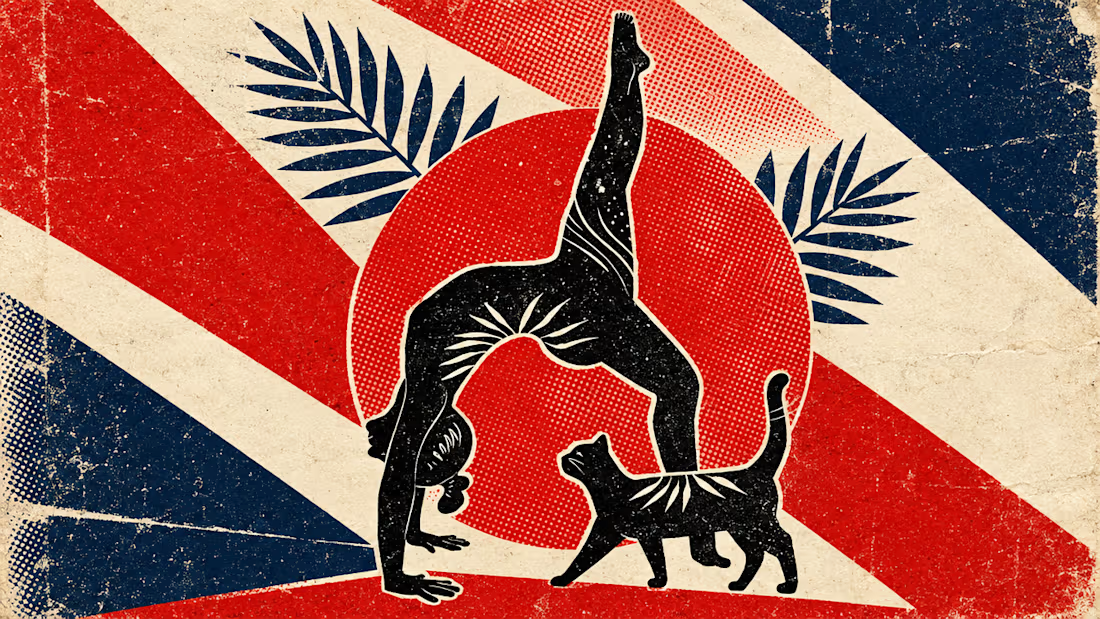
What happens when propaganda designed to erase the self gets pointed at the self instead?
Soviet propaganda spent 70 years trying to erase the individual soul in favour of the collective machine. I pointed that exact visual language at the thing it was built to suppress.
I kept...




LUMINA - Premium Skincare Cream Packaging & Label Design
Minimalist and elegant cosmetic jar label design created for a luxury skincare brand. Focused on clean typography, premium branding, and aesthetic product presentation.

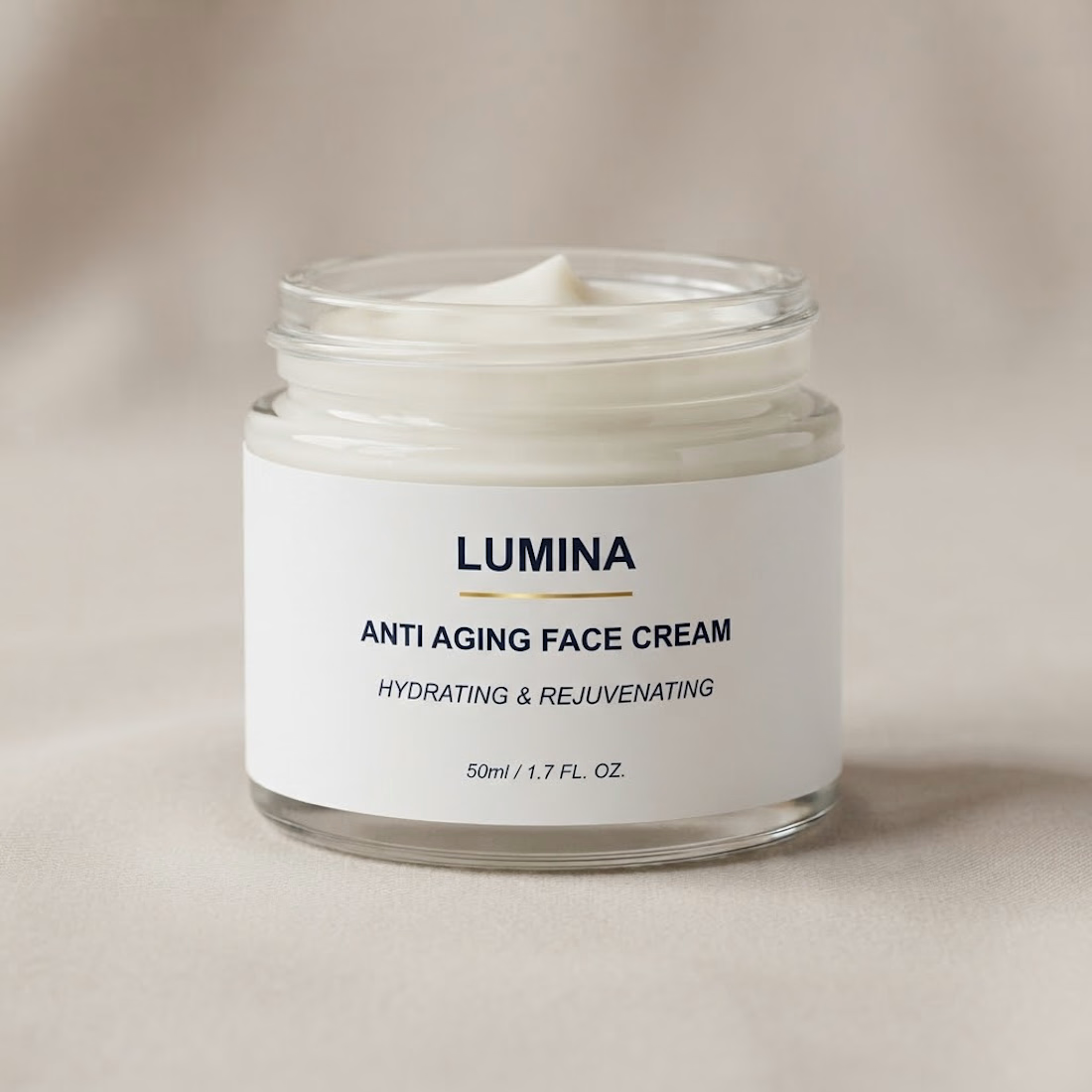

The gold rule under the wordmark does a lot of work on a label this restrained. Did you try the claim line in a lighter weight, so the product name and descriptor separate a bit more?