The network for creativity
Join 1.25M professional creatives like you
Connect with clients, get discovered, and run your business 100% commission-free
Creatives on Contra have earned over $150M and we are just getting started
Back to feedPost

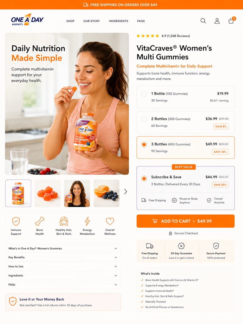
Your Add to Cart button isn't the hardest part to optimise. Getting the customer ready to click it is.
A shopper landing on a PDP is quietly asking the following:
Is this for me?
Will it actually help?
Which option should I buy?
What happens if I don't like it?
That’s why I built this PDP around reducing decision friction.
The hero immediately communicates the product and its main benefits.
The 1, 2 and 3 bottle options make the buying decision easier instead of forcing shoppers to calculate value themselves.
Then subscription savings, free shipping, secure checkout and the money back guarantee remove more perceived risk before the CTA.
Even the supporting sections are structured around questions customers naturally have.
The goal isn't to add more information.
It's to give customers fewer reasons to hesitate.
What part of your Shopify PDP do you think creates the most hesitation?


The network for creativity
Join 1.25M professional creatives like you
Connect with clients, get discovered, and run your business 100% commission-free
Creatives on Contra have earned over $150M and we are just getting started
Trending
retrofuturism
Share your favorite designs from the past exploring the distant future. Or your own take on the aesthetic 🚀
halftone
Dots. Texture. Grain. Let's see your designs using the halftone technique.

Midjourney
Creatives are showing off what they're making with Midjourney.
colorgrade
Video editors sound off: How do you enhance the mood of your video in color grading?





Related posts


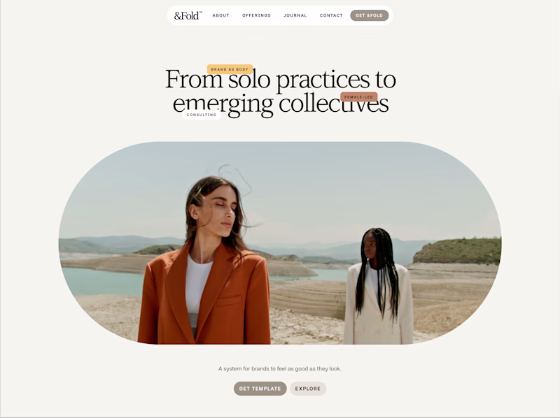
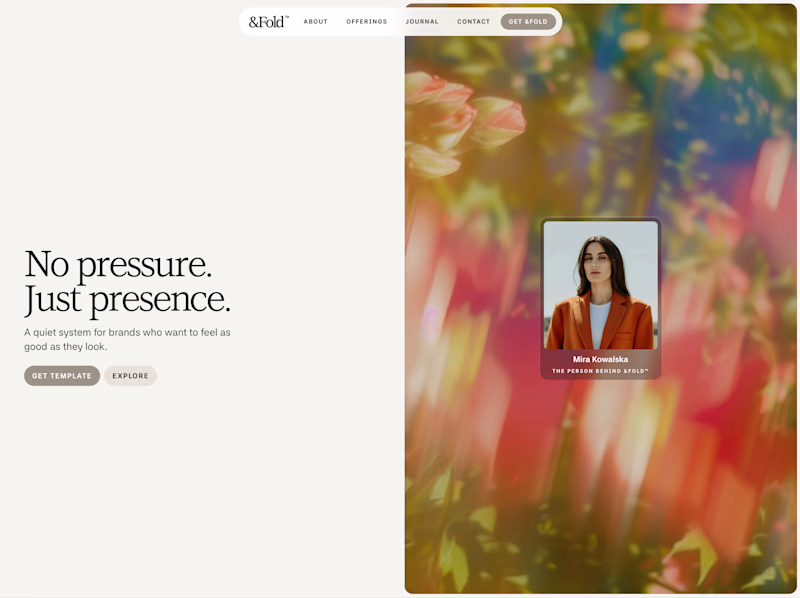


expressive, no hesitation




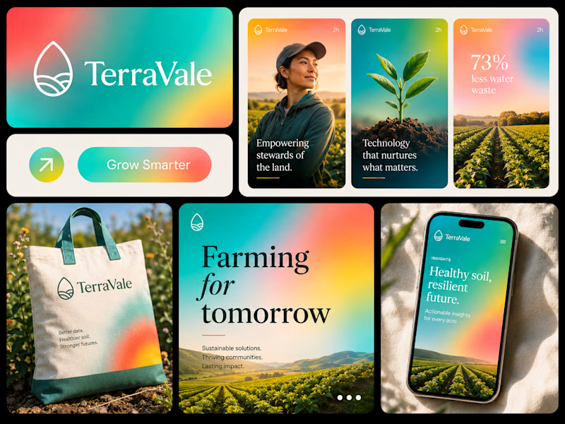
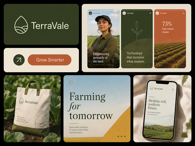
Two directions. One brand. 👀
I explored the same brand in two completely different visual styles — one vibrant & energetic, the other soft, minimal & refined. Now I want your honest opinion:
Which one would you choose?
🟢 Vibrant & Bold
🤍 Soft & Minimal
Curious to see which direction wins. 👇


37 voted
43%
50 voted
57%
87 votes
Closed

Option two feels more organic!