The network for creativity
Join 1.25M professional creatives like you
Connect with clients, get discovered, and run your business 100% commission-free
Creatives on Contra have earned over $150M and we are just getting started
Back to feedPost
Taste Test


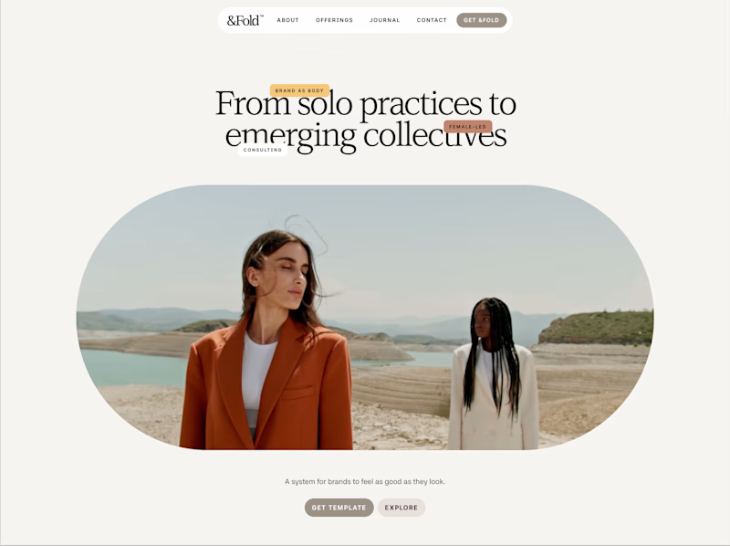
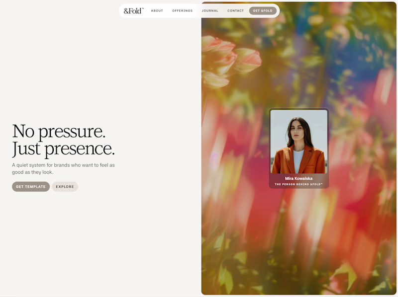

Minimal has it

I’d pick Expressive


expressive, no hesitation


agreed with this

Minimal does it better for me


Expressive 👍

Expressive, for me, that floral texture against no pressure, just presence actually lands the message instead of just decorating it. What pushed you toward testing two such different directions instead of refining one?

Minimal by all means

Minimal

2nd one

The 'Expressive' direction feels more refined due to its strategic use of white space.

Minimal🔥

The minimal feels better

Strong elements in both designs but the "minimal" design is actually busier in my opinion 😂 Those tags ruin it for me. Take that out and it's the winner for me. Even the shape of the image runs in line with the overall aesthetic. I can imagine the tags flying around or that...

I believe the minimal what users used to see from “personal website” perspective and that will help users to understand it easier and faster.
Expressive felt odd to me, not used to see this style that’s why I didn’t prefer

minimal look unique design, expressive seems simple

Minimal for me — the beach photo already carries warmth, so the headline is free to do structural work ("solo practices to collectives") instead of competing for mood. Expressive's copy and image are both reaching for the same feeling and start to crowd each other.

Minimal 🙌

expressive is clean

I’d go with the second one. The first is visually striking, but a lot of its impact comes from the image itself, while the layout feels a bit less cohesive. The second feels more intentional as a whole. The hierarchy is clear, the composition is balanced, and all the elements work together rather than competing for attention.


Minimal

minimal wins

'Expressive' for me.
Mmm, it looks like I'm in the minority here. 🥲

Minimal💯

MINIMAL

Love the 50/50 design! 🔥

Minimal

The network for creativity
Join 1.25M professional creatives like you
Connect with clients, get discovered, and run your business 100% commission-free
Creatives on Contra have earned over $150M and we are just getting started











Related posts

Hey everyone! 👋
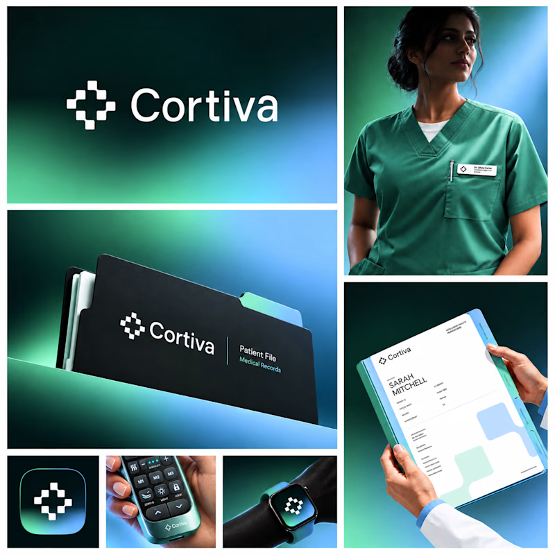
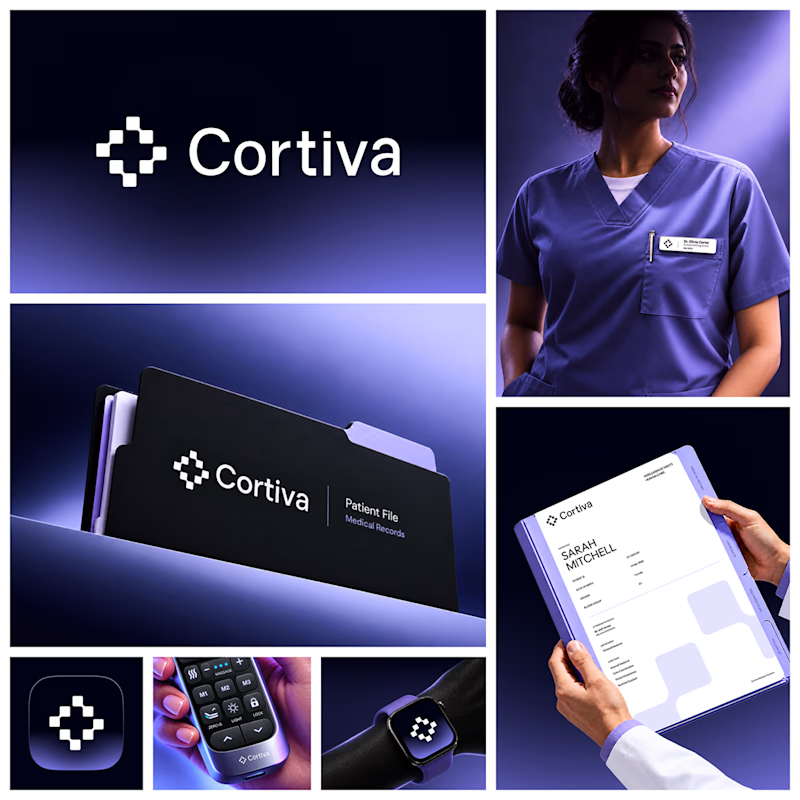
Working on Cortiva, an AI-first hospital branding project.
I've already finalized the color direction, but I thought it would be fun to explore two different moods.
Option 01💚 or Option 02? 💜
Both have their own personality, and I'm curious to see which one you prefer!
Let's see which one wins! 👀
5 voted
33%
10 voted
67%
15 votes
Closed

Both directions are strong, but I'm leaning towards Option 01. The green feels instantly like "care" and trust, which is perfect for a hospital. Option 02 looks more techy and premium. Curious, which mood are you aiming for - clinical and calm, or friendly and modern?

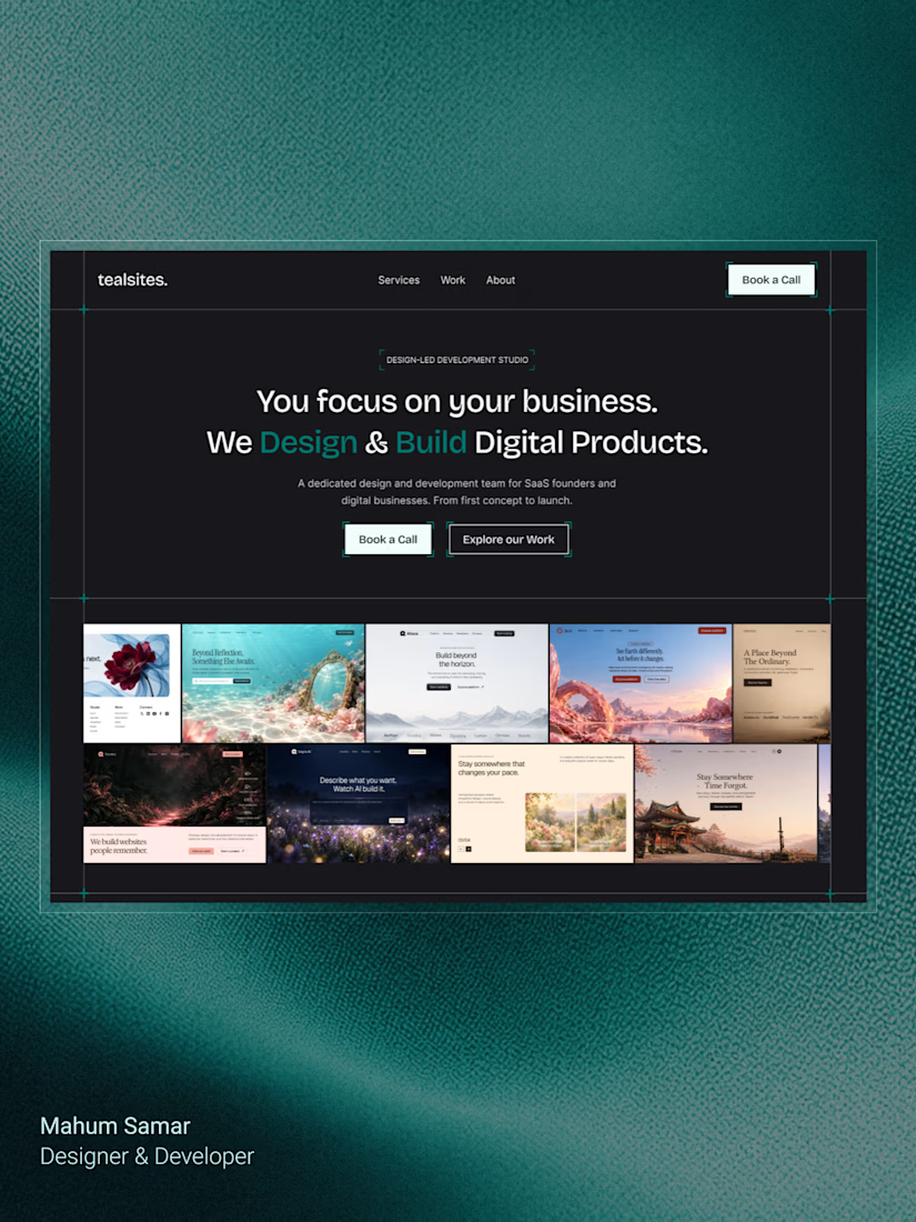
Final hero section for TealSites, a web design & development agency.
Designed in Figma.
The thinking behind the design was simple:
Clear messaging that communicates the agency's value right away.
A project showcase directly below the headline, letting the work speak for itself.
Subtle grid lines, corner brackets, and teal accents to create a distinct visual identity.
Two clear CTAs, one for potential clients ready to connect and another for those who want to explore the work.
The goal was to balance visual appeal with clarity, structure, and usability.
Clean design, thoughtful details, and a clear purpose behind every element.
What do you think?

Excellent

Brand Expressions -- Olivir




Thats so crazy!!!!!! Seeing this I feel we humans are still far better than AI