The network for creativity
Join 1.25M professional creatives like you
Connect with clients, get discovered, and run your business 100% commission-free
Creatives on Contra have earned over $150M and we are just getting started
Back to feedPost
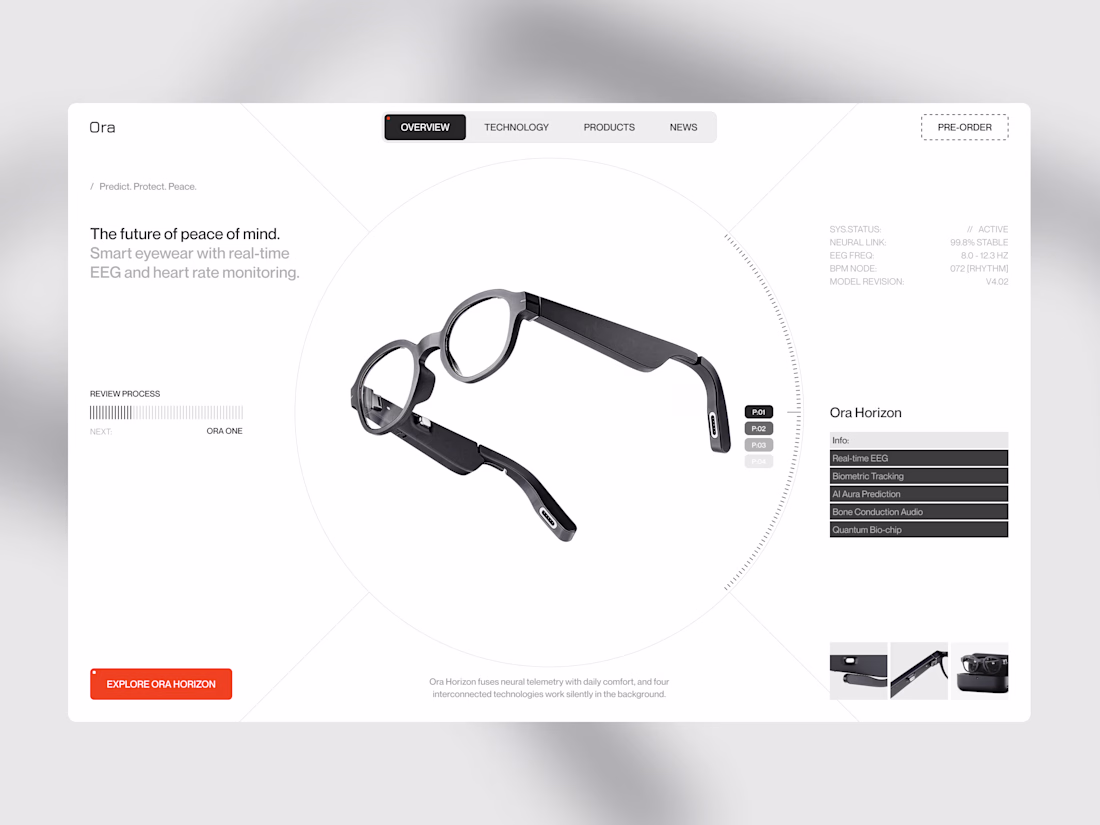
Where smart interfaces lose their users
When I designed this layout for Ora Horizon, the biggest challenge was handling a massive amount of complex bio-data without creating cognitive overload. Most deep-tech startups think that dumping raw data onto the screen proves their technology works. It doesn't.
Good product design means displaying only what matters. It requires absolute discipline.
Here is exactly how I structured their interface to keep it clean:
• I placed the hardware and the core value on the left so the physical product dominates the screen to establish immediate focus.
• I pushed the technical data to the right: Metrics like EEG frequencies and model revisions are grouped quietly using a subtle font weight so they don't distract.
• I tightly contained the micro-navigation: Interactive features like the preview carousel and categories are strictly isolated to keep the main flow entirely uncluttered.
When you cut the visual noise, you immediately change how expensive the product feels. My goal was to move this from a messy lab screen to a clean, premium experience.
If you are building a data-heavy application or hardware platform, stop making your users think so hard.
Drop a link to your product below or send a DM, and let’s clean up your interface.
The network for creativity
Join 1.25M professional creatives like you
Connect with clients, get discovered, and run your business 100% commission-free
Creatives on Contra have earned over $150M and we are just getting started
Related posts
Another project wrapped up! 🙌
I recently designed this homepage with a focus on simplicity, clarity, and creating an engaging user experience. It's always exciting to see ideas evolve into polished interfaces.
Would love to hear your thoughts!
New resource: Auria AI Rebuild Prompt ✦
I turned the complete Auria homepage into one detailed prompt for Codex and Claude Code.
Auria is a luminous Framer template created for modern service businesses, wellness brands, and productized offers.
Usually $19. Free for anyone who supports Auria on its Framer Marketplace page.
Get the prompt:
https://startfrom.co/templates/auria
Created with Framer, Midjourney, Claude Code, and Codex.
Rebuilding a whole landing page with just one prompt is such a cool experiment, Alex! Did Claude Code manage to handle the Framer-specific layout structure well on the first try?
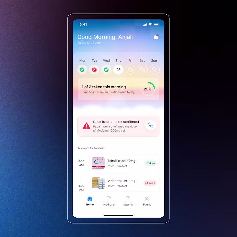
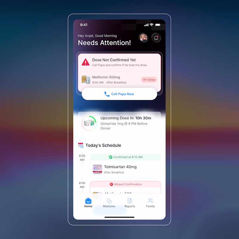
I’m designing an alert feature to help users monitor their parents' medication adherence. The goal is to notify children when a dose is missed, while also allowing them to view upcoming schedules, all without feeling too alarmist.
How would you balance this sense of urgency with a supportive, clear UI? I’d love to hear your thoughts on this design direction!
8 voted
40%
12 voted
60%
20 votes
Closed
B look organised
Trending
Claude
Claude has entered the design space. How are you using Claude Design?
Contra University
Learn from expert creatives how to earn more using next-gen AI tools.
creativeaiflow
Creative AI workflows are evolving. What tools do you use, and what are their strengths and weaknesses?
freelancerlife
Freelancer life is wins, pivots, and everything in between. What’s yours right now?