The network for creativity
Join 1.25M professional creatives like you
Connect with clients, get discovered, and run your business 100% commission-free
Creatives on Contra have earned over $150M and we are just getting started
Back to feedPost

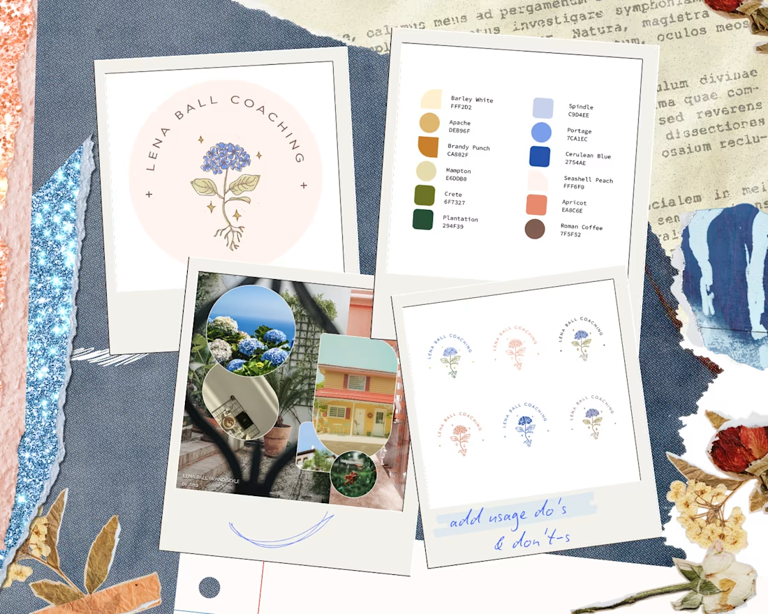
Posted my first case study on contra, a few more to go 🤩🙋🏻♀️✨


Professional work

super well done, i love how you found the roots of power in those gentle colors.
The network for creativity
Join 1.25M professional creatives like you
Connect with clients, get discovered, and run your business 100% commission-free
Creatives on Contra have earned over $150M and we are just getting started





Related posts


The motion is so cool! Great idea to reveal each line of text and transform it into an image.

Hits different when people told you freelancing wouldn’t work. 🤫📉
Hit $25K earned on Contra (a couple weeks ago) and turned 22. 🎂💸 Honestly feels surreal, but I’m proud of it.
Next stop $50K. 🚀 We’re just getting started.

Huge achievement at 22! 🎉 Your consistency is paying off. Wishing you even more success on the way to $50K! 🚀

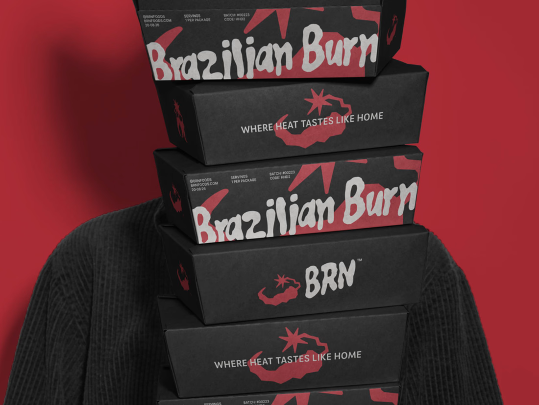
Brazilian Burn translates the warmth of Brazilian cooking into a brand identity built around fire, flavour and belonging.
The project connects brand strategy with a visual language rooted in the ember. Expressive lettering, a compact BRN signature and a palette of ember red, bone white and charcoal carry that idea across packaging, campaigns and digital applications.
The full case study is now on Contra, documenting the strategic foundation, creative direction and design decisions behind the identity.
Explore the full Brazilian Burn case study below

The raw, expressive brush lettering on 'Brazilian Burn' brings out that authentic wood-fired, smoky grit instantly. Pairing charcoal black boxes with ember red and bone white accents gives the takeaway packaging serious shelf presence!