The network for creativity
Join 1.25M professional creatives like you
Connect with clients, get discovered, and run your business 100% commission-free
Creatives on Contra have earned over $150M and we are just getting started
Back to feedPost

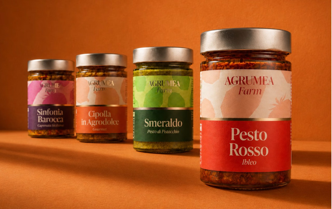
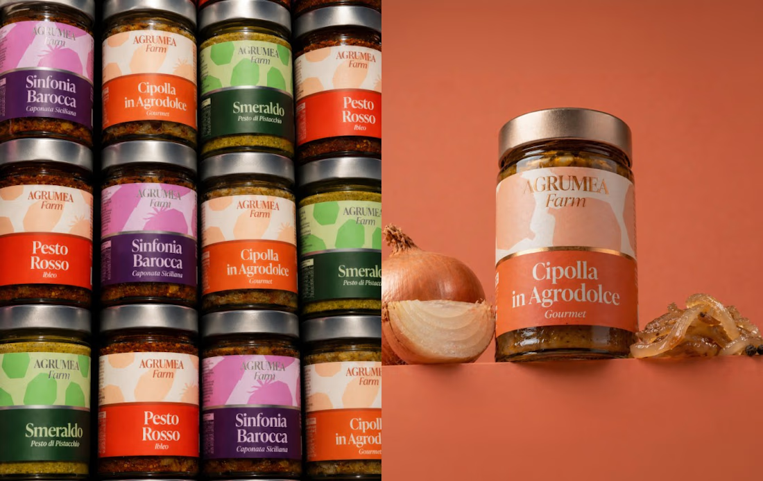
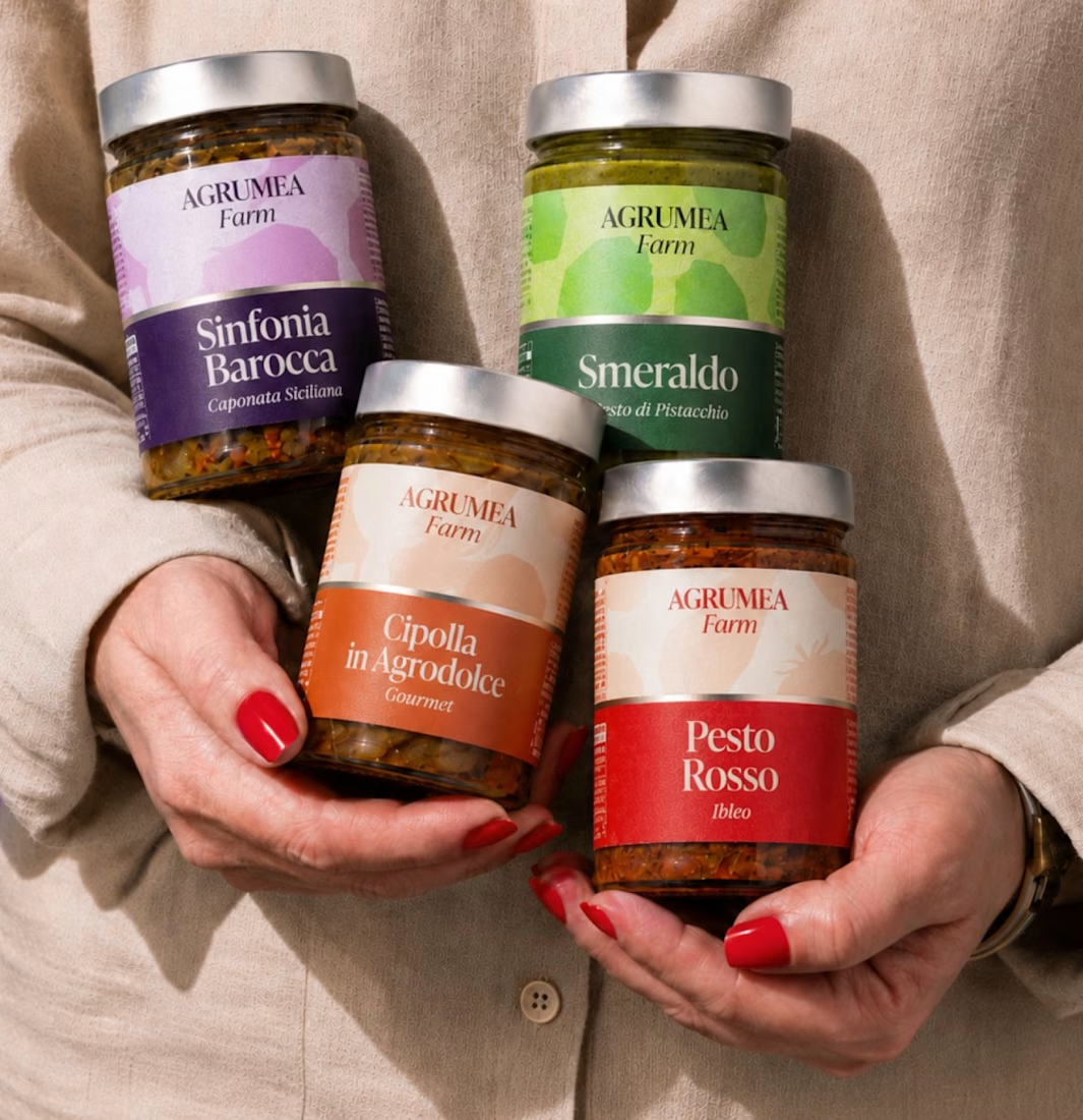
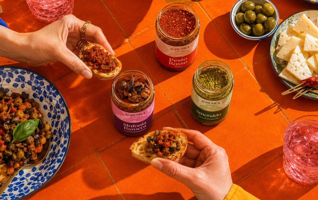
This image showcases a premium food packaging design for AGRUMEA Farm, featuring a collection of gourmet sauces and pesto products in transparent glass jars. Each jar has a metallic gold-colored lid and a beautifully designed paper label with elegant typography, colorful backgrounds, and a refined artisanal aesthetic.
The composition uses a warm burnt-orange background and matching tabletop to create a cohesive, luxurious atmosphere. The largest jar is positioned in the foreground, while three smaller jars are arranged behind it to create depth and perspective.
Design style: Premium Food Packaging, Minimalist Branding, Gourmet Product Photography, and Luxury Product Mockup.
Key Design Elements
Packaging: Transparent glass jars with metallic gold lids.
Label design: A combination of cream-colored upper sections and bold, colorful lower sections.
Typography: Elegant serif fonts for product names, paired with smaller italic text for product descriptions.
Color palette: Burnt orange, cream, red, green, purple, and gold.
Lighting: Warm studio lighting with realistic reflections on the glass and metallic lids.
Composition: Multiple products arranged at different distances, with the largest product in the foreground.
Background: A seamless orange studio backdrop with a matching surface and soft shadows.




The network for creativity
Join 1.25M professional creatives like you
Connect with clients, get discovered, and run your business 100% commission-free
Creatives on Contra have earned over $150M and we are just getting started







Related posts

How can branding make people feel part of a community?
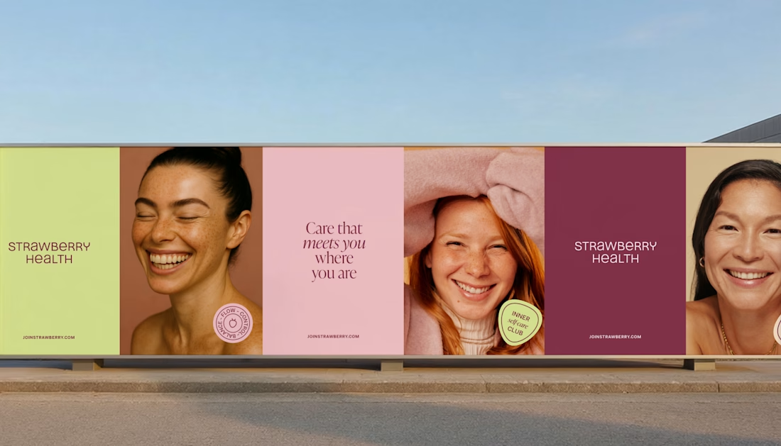
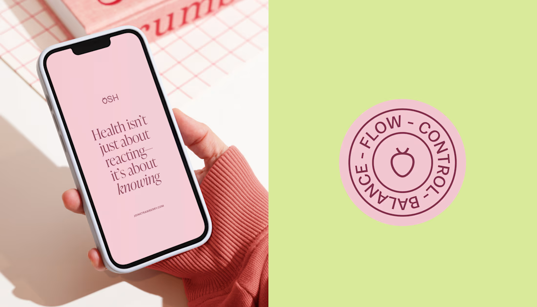
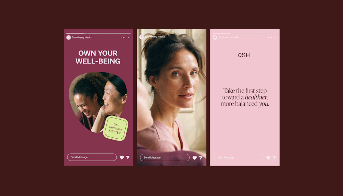
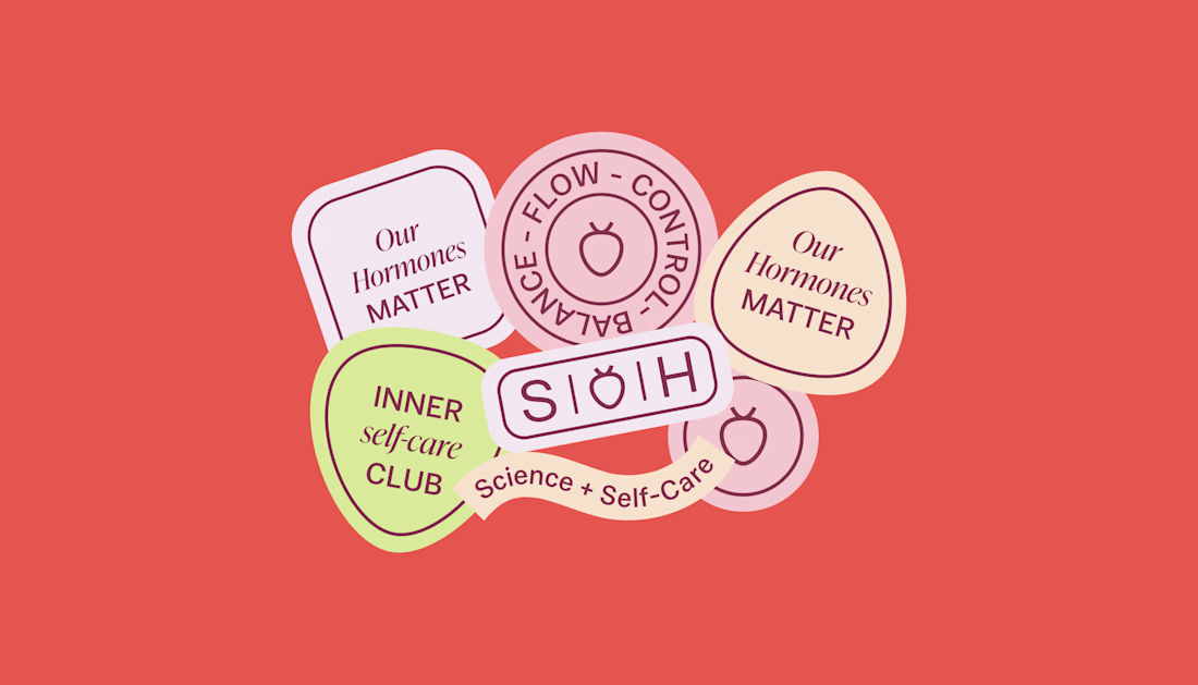
When working on Strawberry Health, we explored how visual identity could make women’s health feel more approachable and collective.
One of the ways was through supporting brand elements: stickers, badges and phrases that could live beyond the logo and become expressions of belonging.
These elements turned the identity into something people could interact with, share and make their own.
It’s a small detail, but I think it’s an important part of building brands around communities: the identity shouldn’t only identify the brand. It should give people something to identify with.

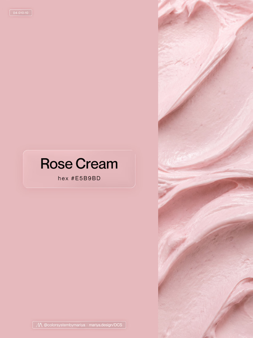
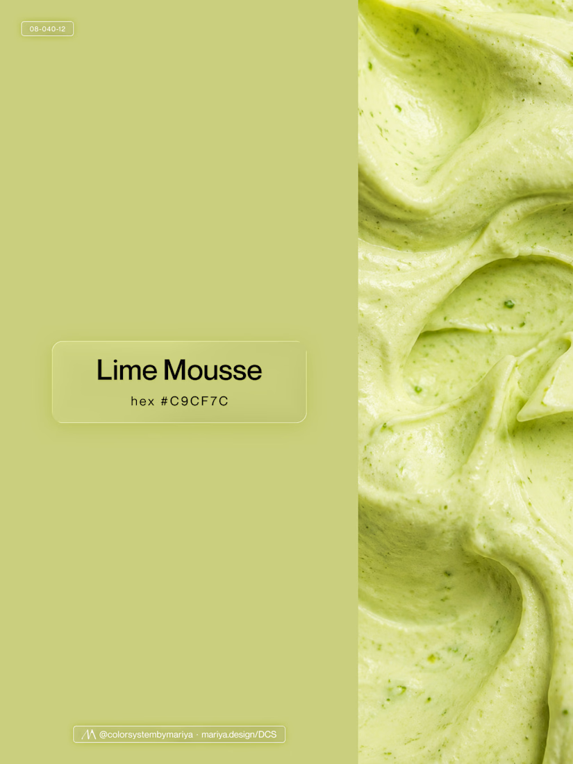
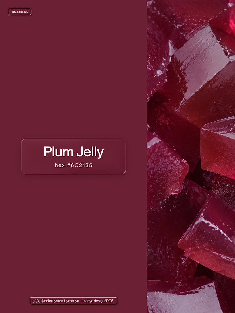
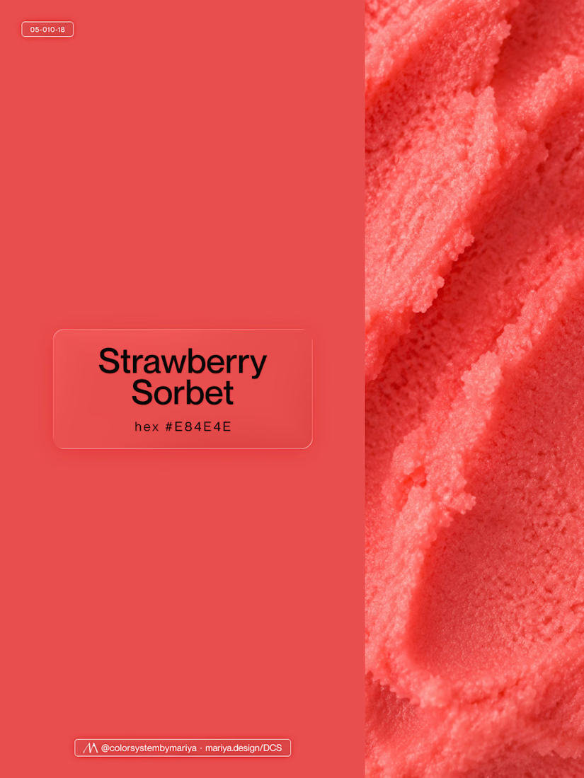
Love, love, love the colors. My mind goes: Rose Cream, Lime Mousse and Plum, hmmmm, which Plum... Plum Jelly. And of course, Strawberry Sorbet.
Let me match the vibe using my delicious swatches 😊

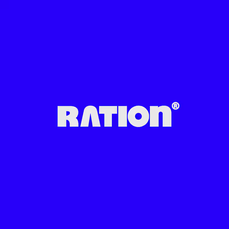
I’ve been working on a bold, modern-retro logotype and can’t decide between these two options.
🆘 Which one feels more aesthetically pleasing to you?

11 voted
26%
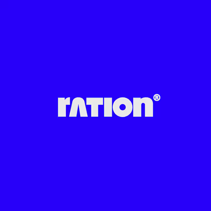
31 voted
74%
42 votes
Closed

CAPITAL is great but SMALL is unique great job Nawras 🔥🔥


Working on a new brand project: Pace Theory. ✦
Exploring two different directions for the visual identity and brand presentation.
Which variation do you prefer — Left or Right? 👀
I’d love to hear your thoughts on the layout, composition, and overall brand feel.
Drop your pick in the comments 👇
5 voted
33%
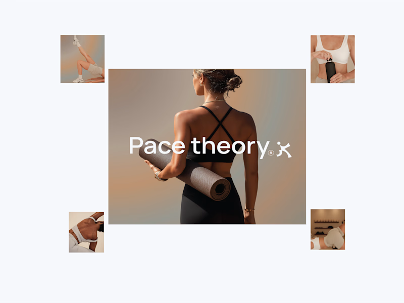
10 voted
67%
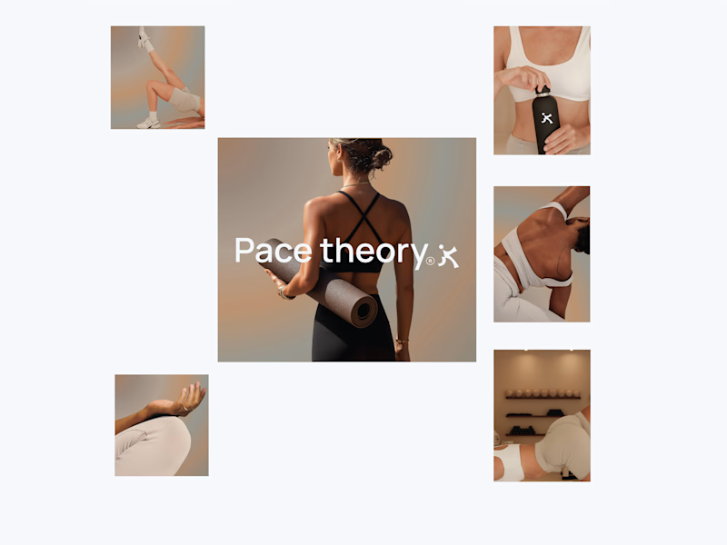
15 votes
Closed
Left variation is more practical ❤️
great job Shivan🔥🔥