The network for creativity
Join 1.25M professional creatives like you
Connect with clients, get discovered, and run your business 100% commission-free
Creatives on Contra have earned over $150M and we are just getting started
Back to feedPost

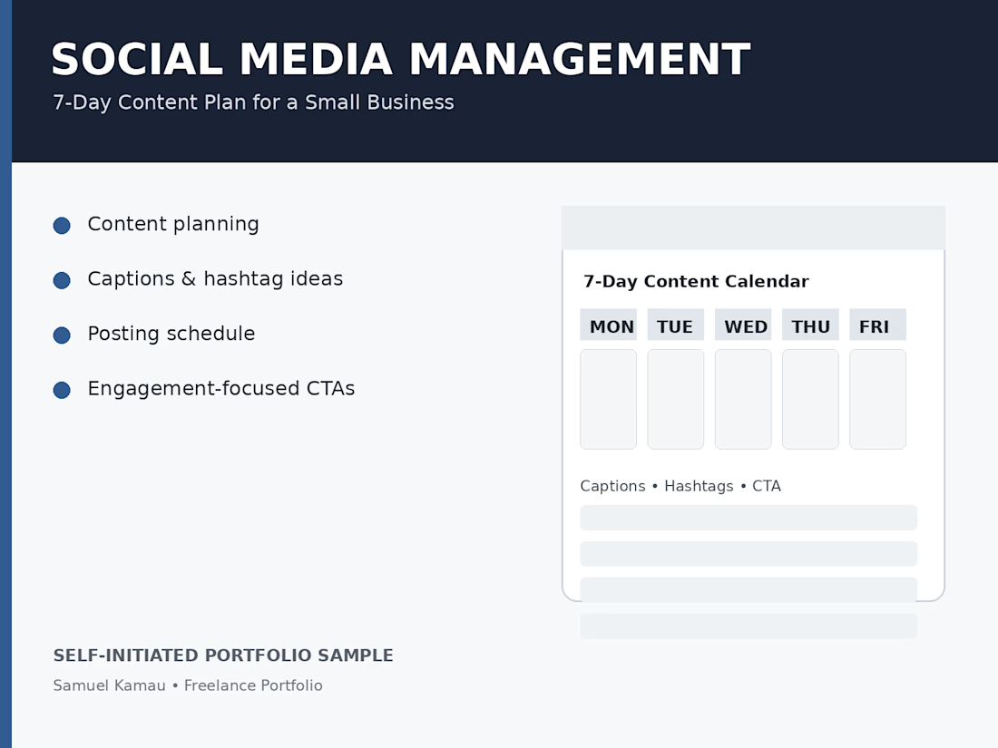
7-Day Social Media Content Plan for a Small Business

The network for creativity
Join 1.25M professional creatives like you
Connect with clients, get discovered, and run your business 100% commission-free
Creatives on Contra have earned over $150M and we are just getting started
Related posts


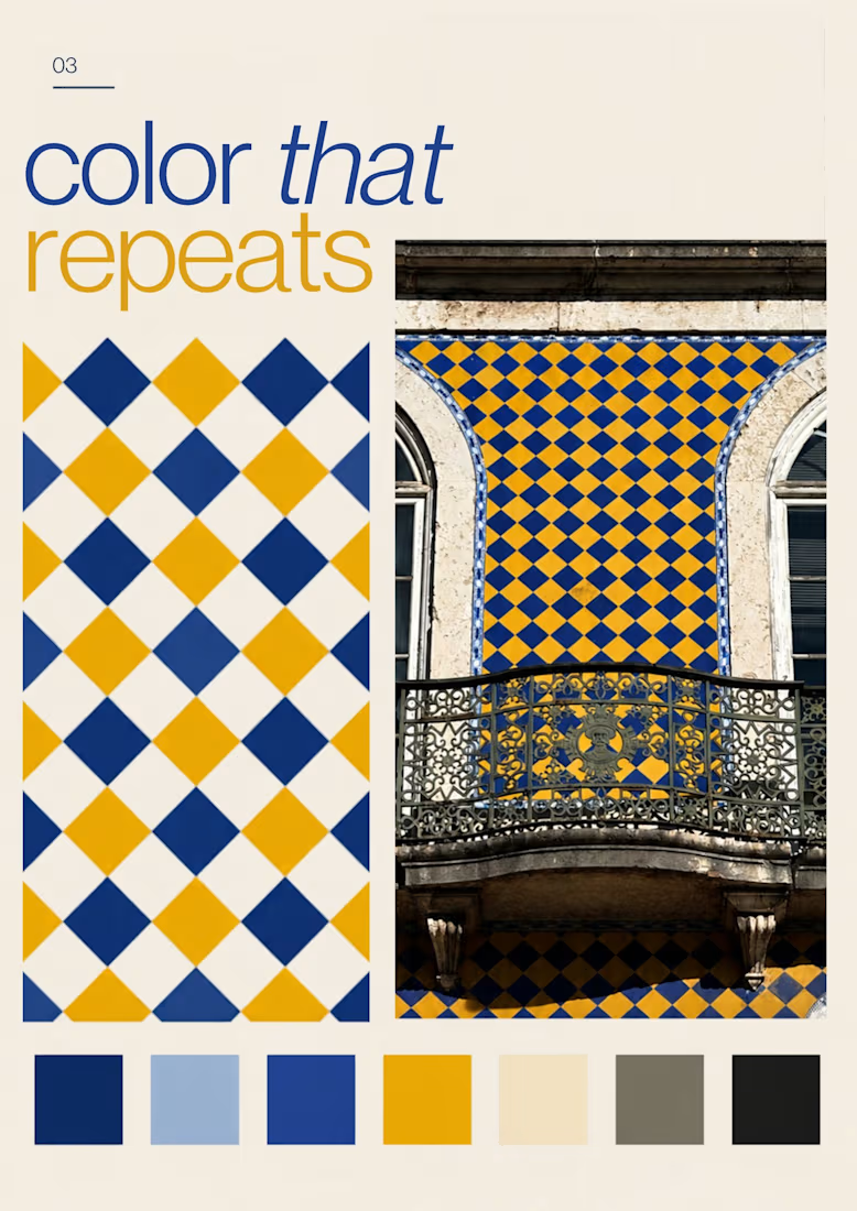
Turning the colors I notice around Lisbon into a series of posters, each inspired by a different photograph.
01 [Blue in Detail] started with the blue Portuguese tiles, exploring their intricate patterns, ceramic tones, and small details.
02 [Color on Repeat] explored the rhythm of blue and yellow tiles, using repetition as the starting point for the design.
I sampled colors from my photographs and used Canva Craft to explore layouts, typography, and graphic elements. Then I refined the designs by hand, adjusting the colors, spacing, and text.



Real estate client for Mumbai - Ran Facebook Ads for luxury flats. Generated 89 qualified leads in 28 days, closed 3 deals worth 1.2Cr revenue at $3.45 CPL.


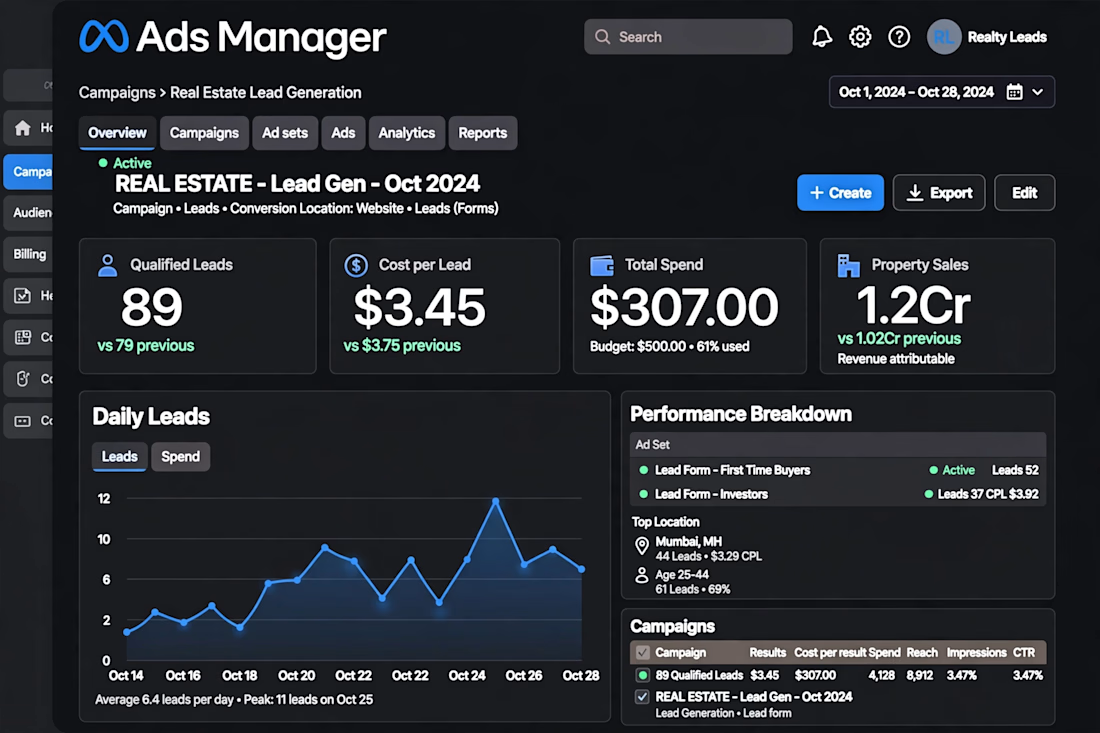

The dashboard view makes the funnel easy to follow. For luxury flats, which creative angle pulled the cheapest leads: lifestyle shots or the location and price hook?

A Few Months Back, Everything Changed. 🚀✨
A few months back, a client reached out to me, frustrated with how their Instagram was performing.
They had the content, the passion, and the vision, but their growth wasn't reflecting the effort they were putting in.
I took a closer look and realized the problem wasn't how often they posted. It was the strategy behind the content.
So, I got to work.
I revamped their visual identity, refined their content strategy, optimized their profile, and focused on creating content that truly connected with their audience.
Fast forward a few months, and the transformation was incredible.
📈 2X growth in Instagram engagement!
But beyond the numbers, their page finally had the professional presence and consistency they had always wanted.
The lesson? Sometimes your brand doesn't need more content. It needs the right strategy.
And that's exactly what I help brands achieve. 💚
Sample client story | Illustrative results
#SocialMediaStrategist #InstagramGrowth #SocialMediaManagement #ContentStrategy #BrandTransformation


