The network for creativity
Join 1.25M professional creatives like you
Connect with clients, get discovered, and run your business 100% commission-free
Creatives on Contra have earned over $150M and we are just getting started
Back to feedPost

New study: Swerve — a portfolio that never scrolls. Built fully in Framer, no code in the design, all content editable in the CMS.


The network for creativity
Join 1.25M professional creatives like you
Connect with clients, get discovered, and run your business 100% commission-free
Creatives on Contra have earned over $150M and we are just getting started





Related posts

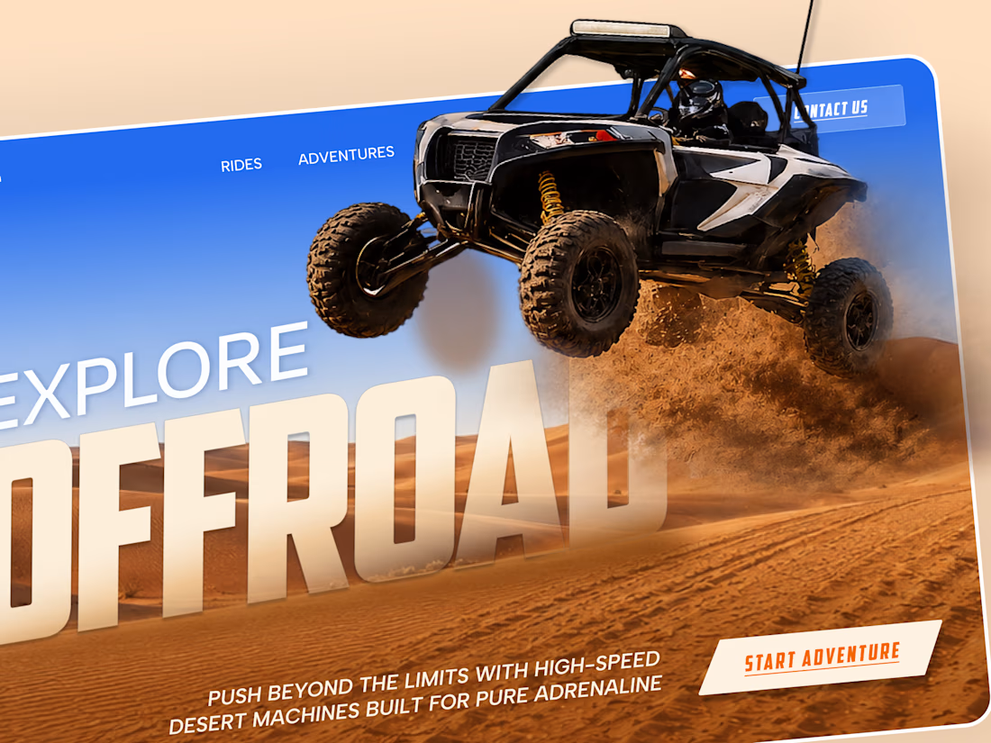
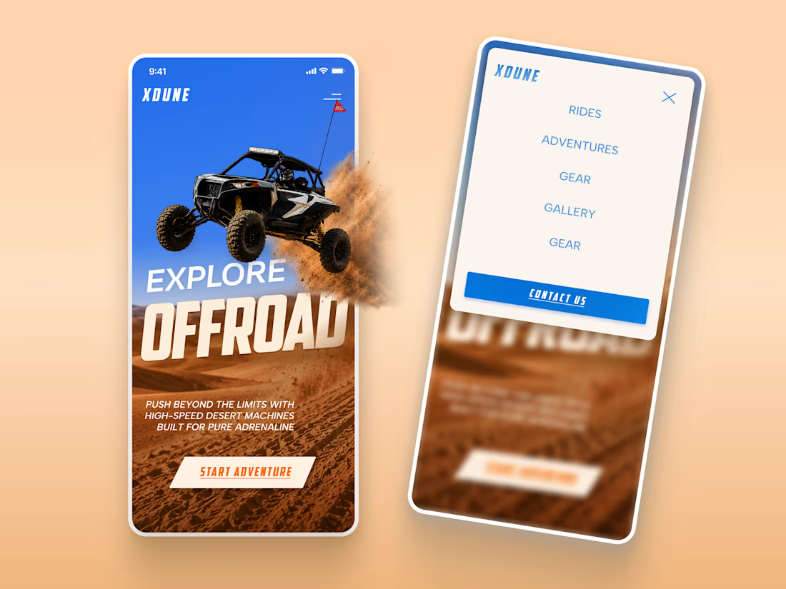
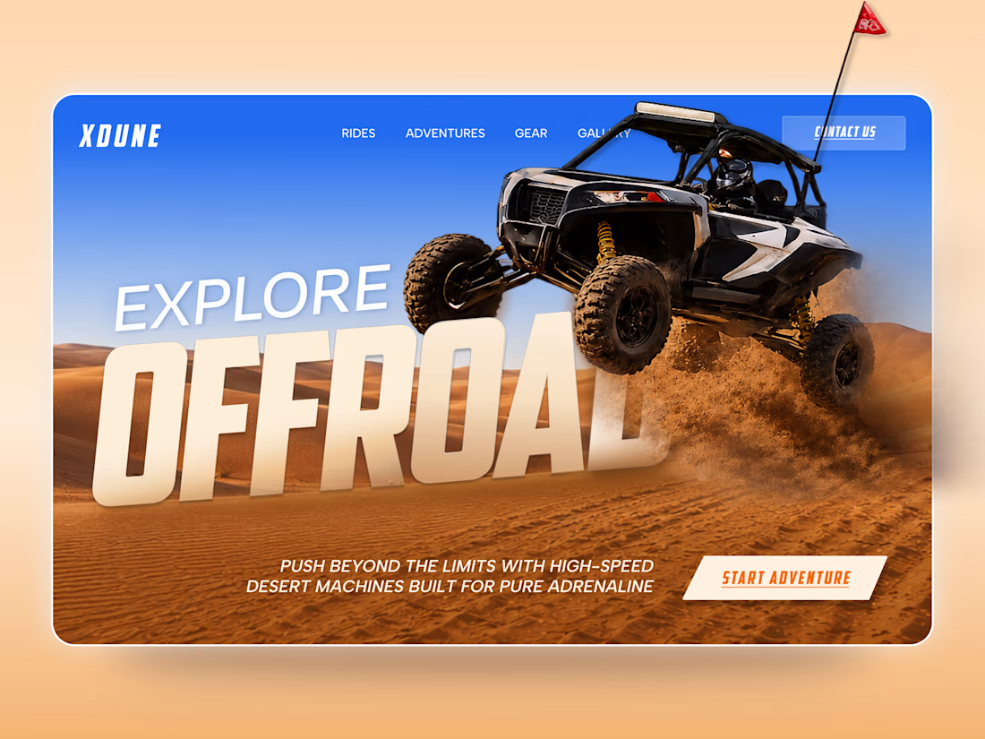
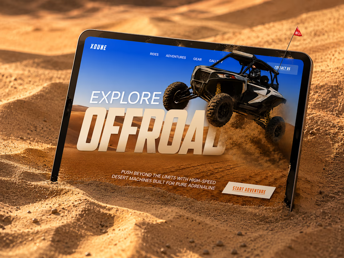
XDUNE — Off-Road Adventure Landing Page
A bold landing page concept built around speed, freedom, and off-road adventure 🔥
The visual direction combines desert landscapes, oversized typography, and a dynamic vehicle composition to make the experience feel energetic from the first screen
Special attention was given to:
• Strong action-focused hero composition
• Bold typography and clear hierarchy
• Desert-inspired visual atmosphere
• Adventure-focused CTA
• Responsive mobile experience
• Simple and clean navigation
The result is a high-energy landing page that feels fast, adventurous, and made for people who want to get off the road
Looking to create a bold website for an automotive, outdoor, or adventure brand? Let’s connect 🚀


love the vibe


Bringing 200+ integrations, workflows and AI agents together in one clean, animated experience. We'd love to hear your thoughts!


$10K earned on Contra. 🎉💸
Grateful for every client who took a chance on me. This is just the beginning. More great products, more real partnerships, more milestones to hit. 🙌
Thank you to everyone who's been part of it. Onward. 🚀
#10k #contraearnings #Freelance #Webflow #Framer #Webdesign


Congratulations nice job 🎉🎉

