The network for creativity
Join 1.25M professional creatives like you
Connect with clients, get discovered, and run your business 100% commission-free
Creatives on Contra have earned over $150M and we are just getting started
Back to feedPost
A useful way to evaluate a brand identity: place the business card, packaging, and social posts side by side.
Do they feel like they belong to the same business—even when the logo isn’t prominent?
That’s what I look for in a visual system. Typography creates hierarchy. Color builds recognition. Patterns and layout give the brand a character that can carry across different formats.
For business owners reviewing a new identity, ask your designer to show how it works in the places your customers will actually encounter it. Those applications can reveal more than a logo presentation alone.
Which touchpoint is hardest to keep consistent in your brand?

Hardest to keep consistent: the unglamorous ones nobody presents, invoices, email signatures and the 404 page. My contrarian add: the test of side by side belonging works, but a business owner should also run it in reverse. Remove the logo from every touchpoint and see if a...

Exactly! A strong brand should be recognizable even without its logo. That’s when you know the visual system is really working.

That's great visuals and motion graphics Great job Mohammed
Thank you so much! Really appreciate your kind words!
Pardon ❤️
The network for creativity
Join 1.25M professional creatives like you
Connect with clients, get discovered, and run your business 100% commission-free
Creatives on Contra have earned over $150M and we are just getting started





Related posts

Next intelligence. A brand you can feel.
Ice blue, deep black and refracted glass bring texture, depth and a sense of touch to an invisible technology. An identity designed to be recognised. And felt.
Brand identity and visual direction for Niwos, a platform that brings AI agents together as a digital workforce.
Five modules. One W. A simple idea at the heart of the identity: working as one.
I’ve really enjoyed working on this project with Muhammed. His trust in my design judgement and openness to new ideas gave me the creative freedom to explore fully.
Here’s hoping this is just the first chapter of an exciting journey with him and his team.


👍 nicely done

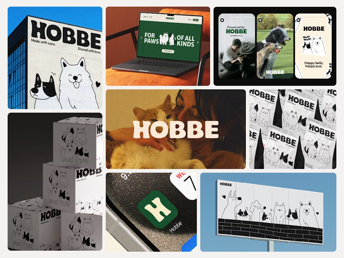

Like the branding and illustrations


The thing I keep relearning: a design is never finished because someone ran out of ideas. It's finished because someone decided to stop. Knowing when to stop is the hardest part.
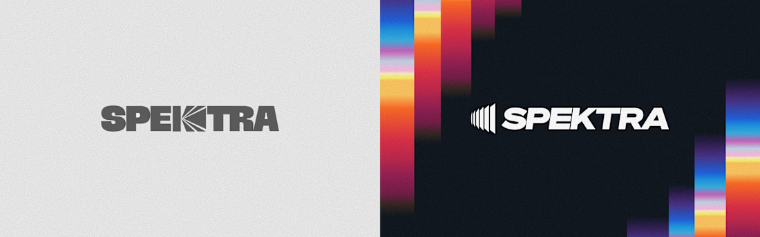


Damn.... Crazy colors 👏😍