The network for creativity
Join 1.25M professional creatives like you
Connect with clients, get discovered, and run your business 100% commission-free
Creatives on Contra have earned over $150M and we are just getting started
Back to feedPost

This poster project was created for the annual concert organised by the French National Britannic Orchestra of2024. The visual is very organic to represent the artist playing on their instrument. The poster is very colorful due to the music theme: the 4 seasons by Max Richter , they represent the diversity of colors from the freshness of spring (pink blue green) to the warlth of summer (deep red), the decay of autumn (pale yellow) and the coldness of winter (cold grey hands).


The network for creativity
Join 1.25M professional creatives like you
Connect with clients, get discovered, and run your business 100% commission-free
Creatives on Contra have earned over $150M and we are just getting started



Related posts

This is the kind of campaign that makes me want to explore a city.
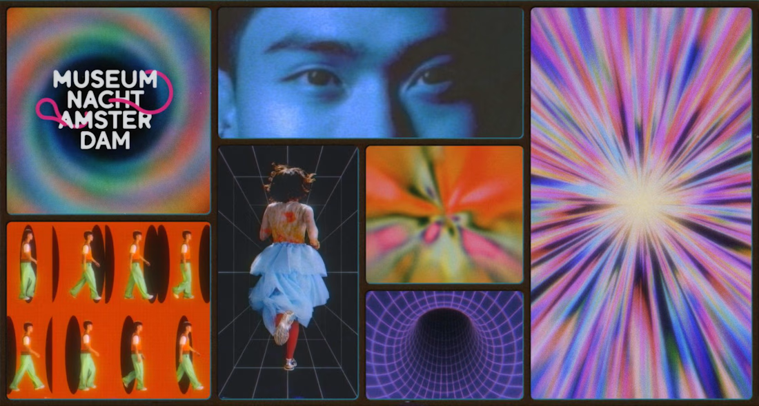
Rotterdam-based studio From Form created this year's visual identity for Amsterdam Museum Night, and it's wonderfully strange.
Instead of typical museum posters with artworks and event information, they've created a surreal world inspired by 17th-century dioramas, floating objects, distorted perspectives, and the mystery of wandering around at night.
The animations are built from photographs, which gives everything this unusual dreamlike quality.
What I really like is how the visual concept reflects the experience itself. You're not just being told to visit museums. You're being invited to get lost and discover something unexpected.
More cultural campaigns should feel like this.


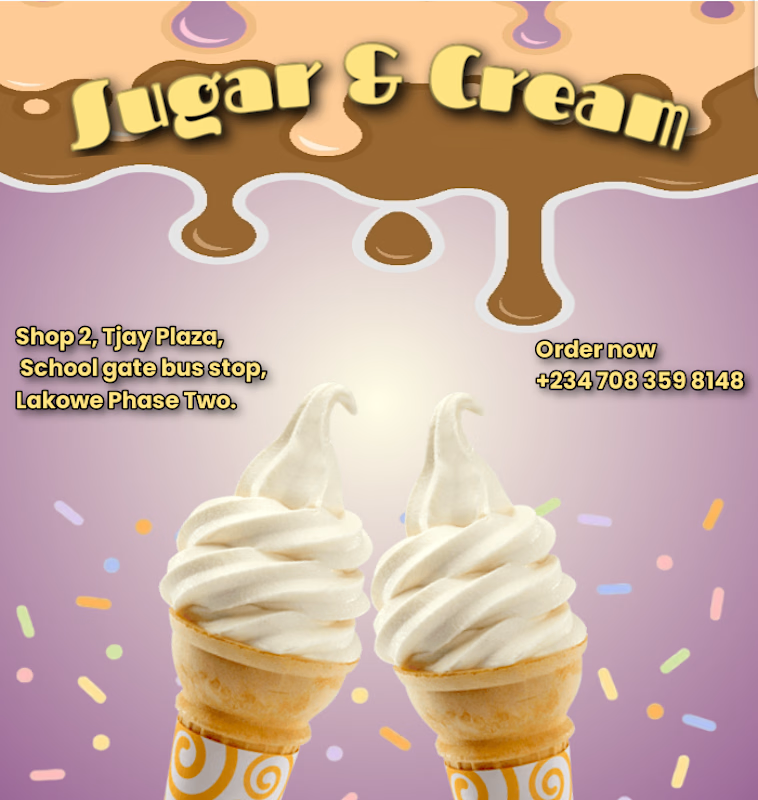

The chocolate drip header and the two cones make you want ice cream right away. The yellow address text on the purple is a bit thin, a darker outline would help it read on a phone.

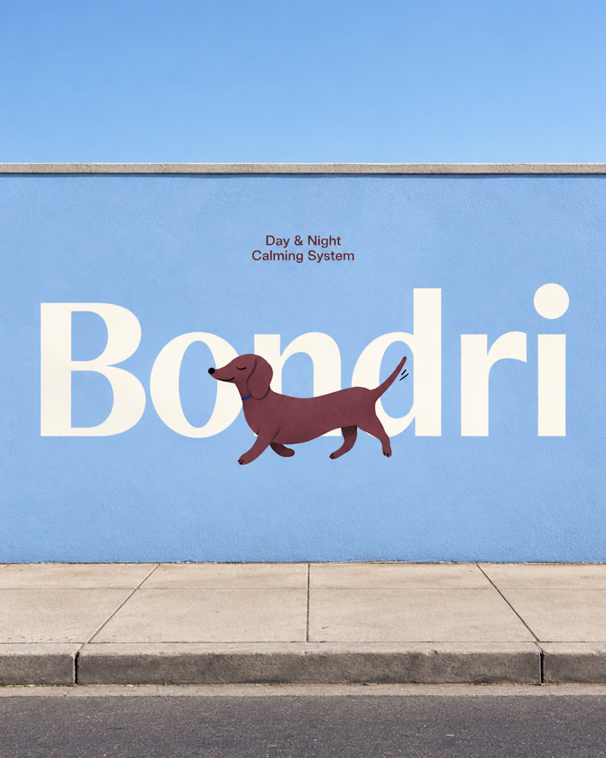
Bondri has been featured by 6 different curators in the past month and I’m still a bit in disbelief.😮
I put a lot of care into every detail of this one, from the illustrations to the packaging to how the day and night variants talk to each other. Seeing it recognized like this means a lot.
What makes you stop and really look at a project when you’re scrolling?
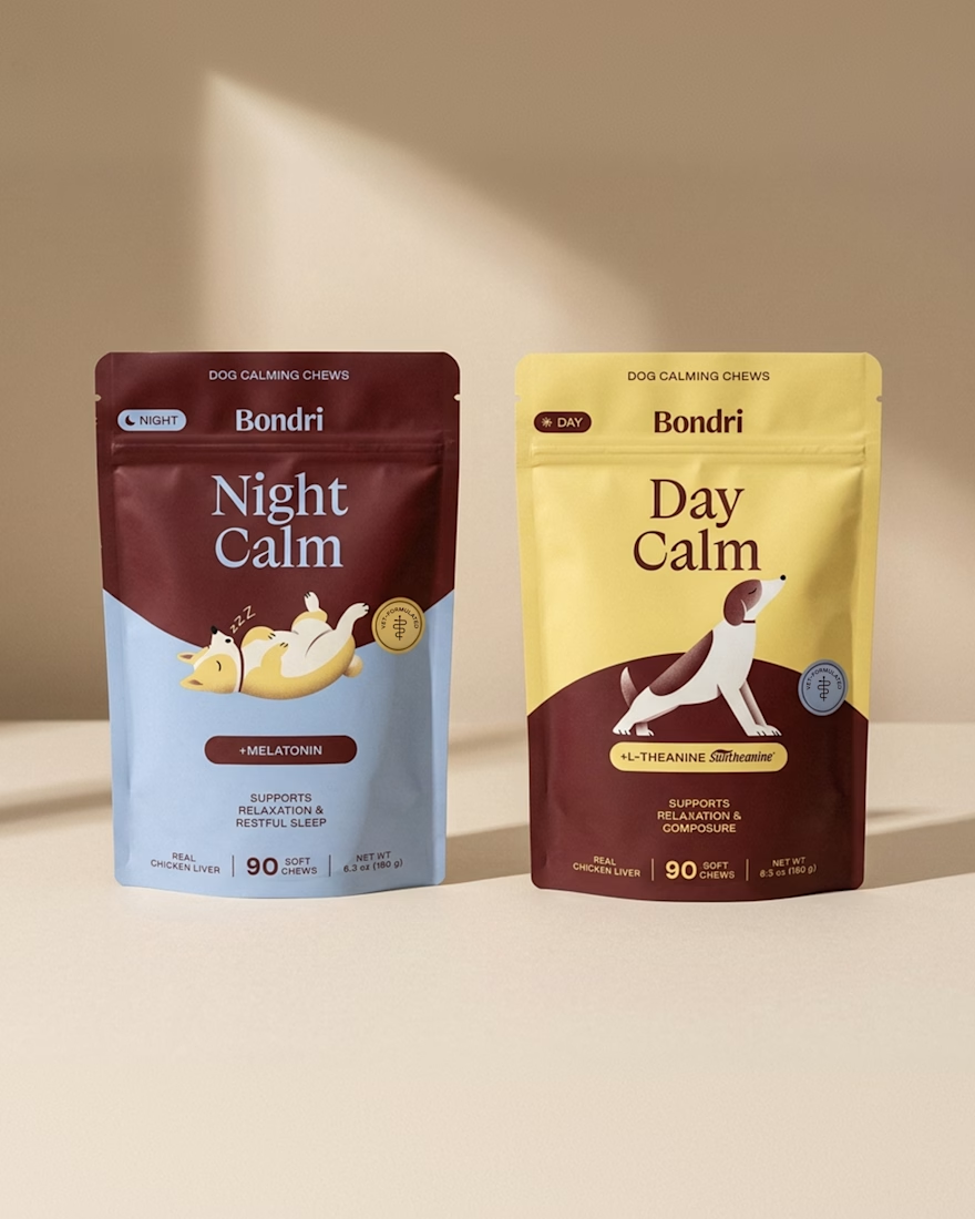
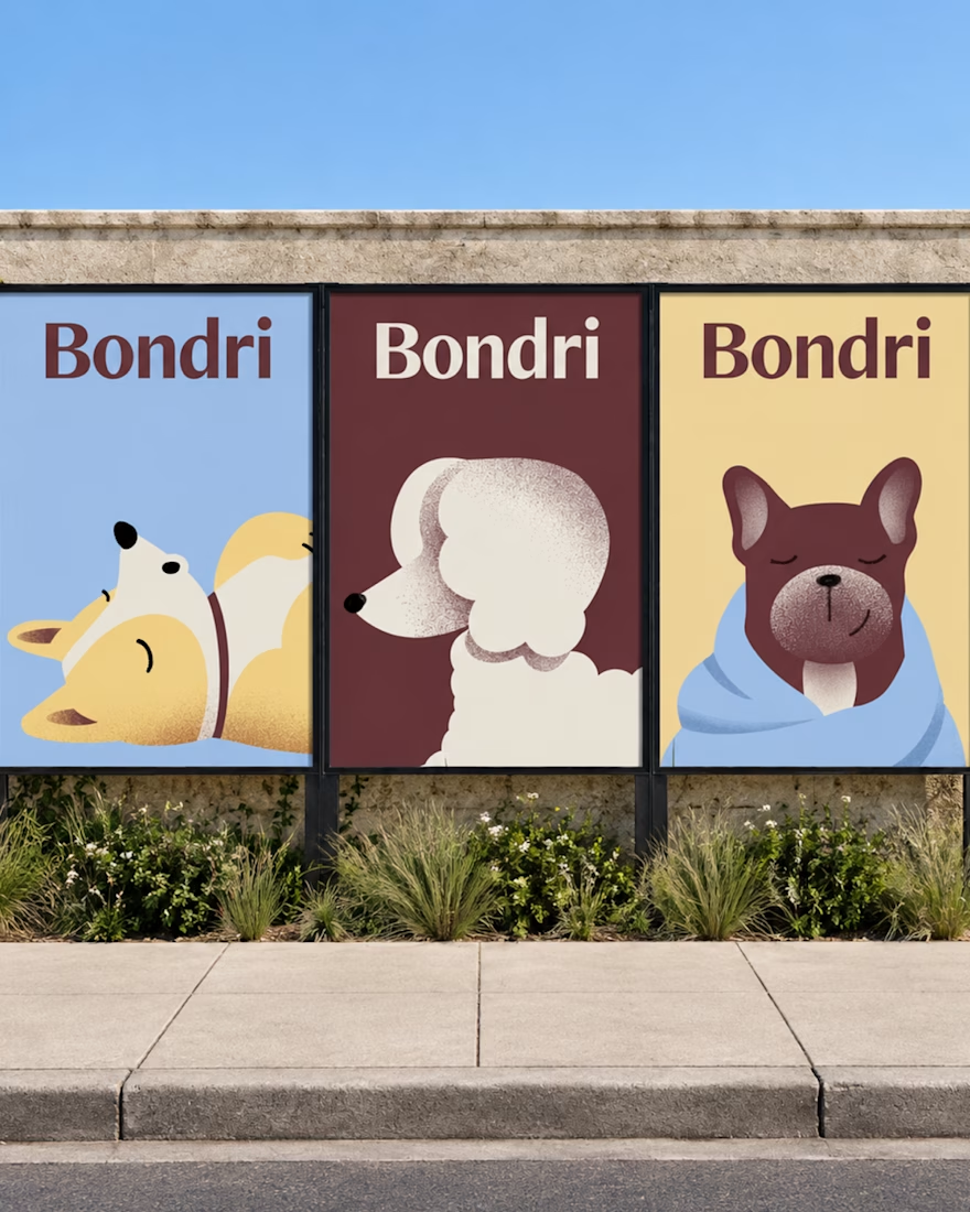

I think it’s the little details that make a project stand out. When everything feels intentional and tells a story, it naturally makes you want to stop and take a closer look. Love how much thought went into this! 👏
Well-done Chantal