The network for creativity
Join 1.25M professional creatives like you
Connect with clients, get discovered, and run your business 100% commission-free
Creatives on Contra have earned over $150M and we are just getting started
Back to feedPost


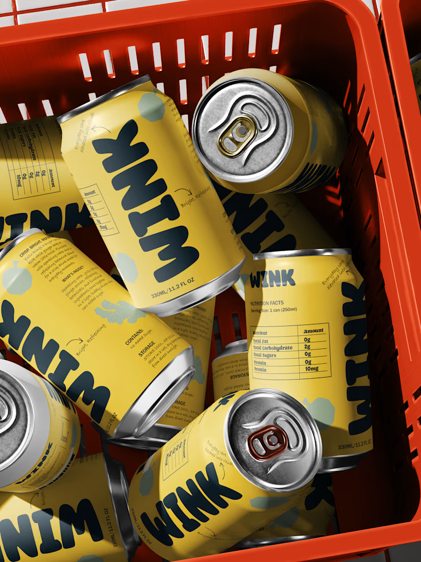
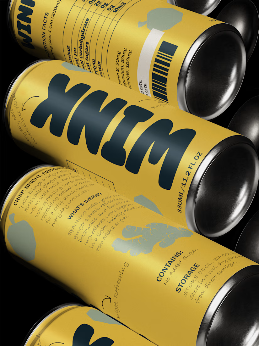
A question for founders building food, beverage and consumer brands:
If someone saw your product on a shelf for just 5 seconds, would they understand what makes it worth buying?
Not just what the product is, but why they should choose yours over the 10 other options sitting beside it.
I've been thinking about how much packaging influences that first decision.
So I'd like to try something.
Drop your brand or product below (website, Instagram or packaging photo). I'll pick a few and share what I think could be improved from a branding and packaging perspective.
No generic feedback. I'll look at positioning, visual hierarchy, differentiation and how well the packaging communicates the product.
If you're preparing to launch or considering a rebrand, I'd love to see what you're building.
The network for creativity
Join 1.25M professional creatives like you
Connect with clients, get discovered, and run your business 100% commission-free
Creatives on Contra have earned over $150M and we are just getting started


Related posts

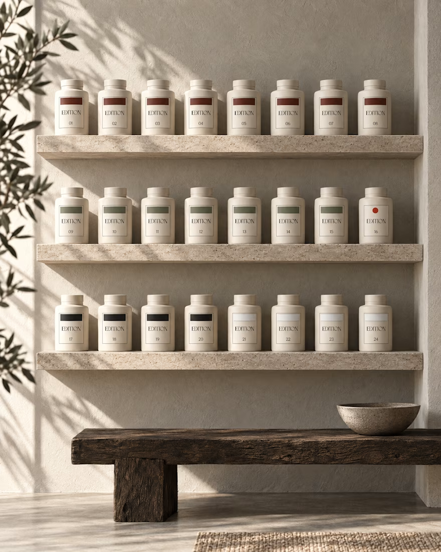
Ever signed for a pack of pasta? Soon you will.
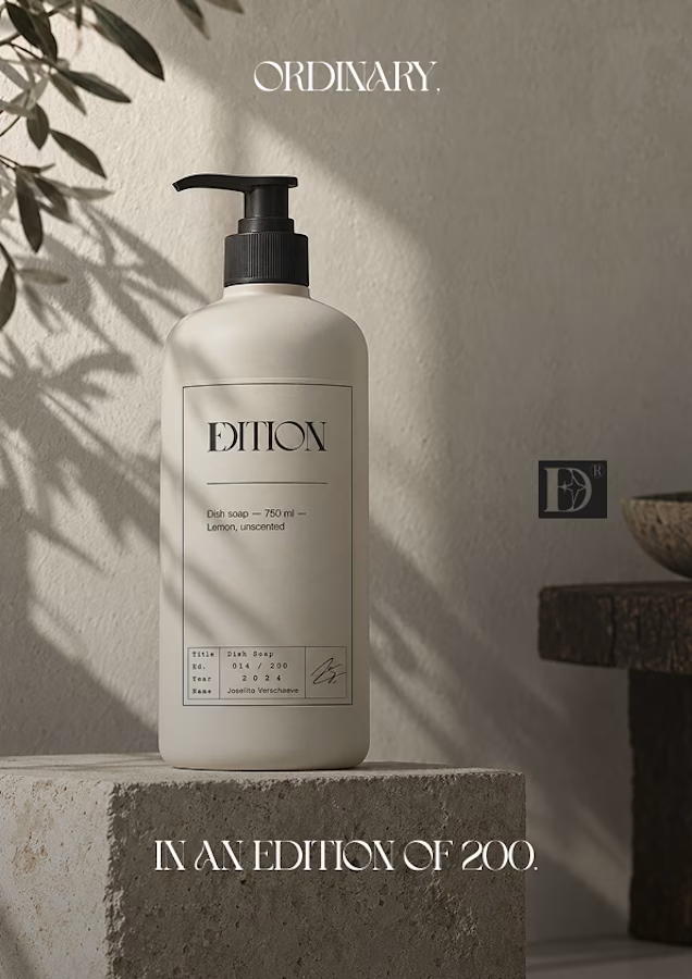
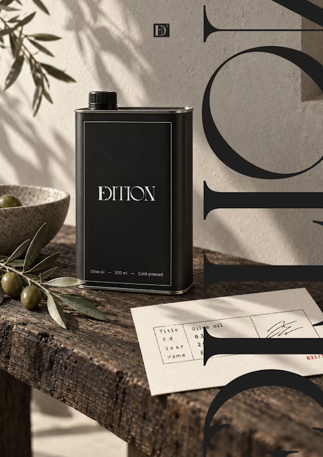
EDITION is a brand where nothing is decorative and everything is numbered.
Case study landing very soon.


How far can you take a logo beyond the first draft?
I started with Recraft's Logo Maker and a fictional idea: Bibu's Paws, a cosy little dog rescue and adoption shelter.
I wanted the identity to feel warm, homely and full of character, so I explored a few logo directions before settling on the little dog tucked inside a house.
From there, I took the idea further, building out the visual identity with an earthy colour palette, typography, illustrations and a few real-world applications: the shelter space, dog merchandise and an adoption welcome kit.
I enjoyed seeing how a small starting point could grow into a brand with its own personality and world.
Now I'm curious: if you were building a brand around this logo, what would you create next?






It turned out so cozy, you did great

My latest branding project for the Atlanta Museum of Paleontology.
Check out the full project at maximjungle.com


A T-rex drawn in one thin outline is such a good mark 🦖 I'd happily visit that museum.