The network for creativity
Join 1.25M professional creatives like you
Connect with clients, get discovered, and run your business 100% commission-free
Creatives on Contra have earned over $150M and we are just getting started
Back to feedPost


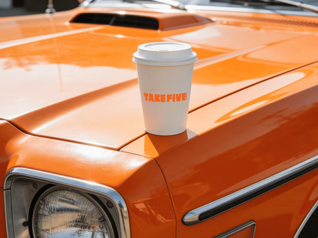
Let’s TAKE FIVE ☕️
A fresh identity for a coffee brand, from logo and coffee packaging to merch, social content, and promotional banners.
Built to feel as good as that first cup.

Great work!!!

Premium Branding :)


Beautiful branding with strong attention to details

Thats pretty cool!


packaging looks great

That checkered border against the punchy color blocking gives it such a strong retro diner feel, really fun packaging. Curious what the client's first reaction was when they saw the full system together, packaging, merch and social all at once?

This packaging is so vibrant! The retro typography and bright color palette give the brand such an energizing feel. Awesome work!


Good work🔥👏👏

Goated.

Nice work, typography is so goated!

Nice Work

That's awasome
The network for creativity
Join 1.25M professional creatives like you
Connect with clients, get discovered, and run your business 100% commission-free
Creatives on Contra have earned over $150M and we are just getting started

Challenges
View all




Related posts

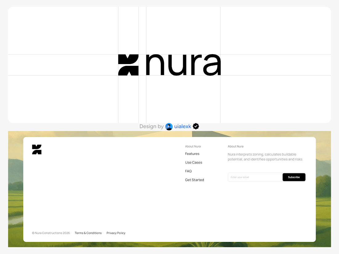
Branding design and Framer Development for an AI real estate tool
See full Case study


amazing work!🚀


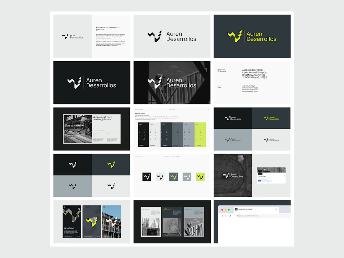
Not every direction makes it to the final brand.. this was one of the directions we explored for Auren Desarrollos, a new construction and development company we’re currently working with on its branding and website.
I’ll be sharing the final result soon, and I think the difference will be interesting to see.
What do you think?



Great!

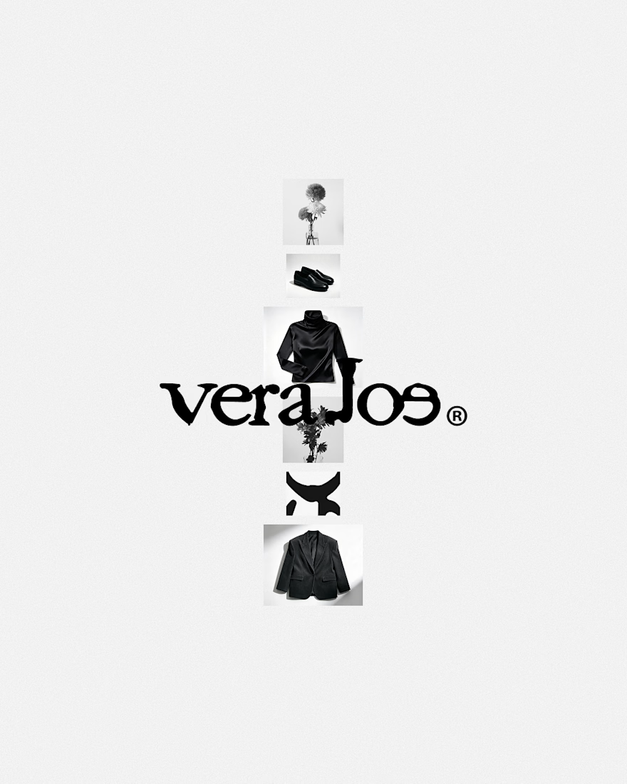
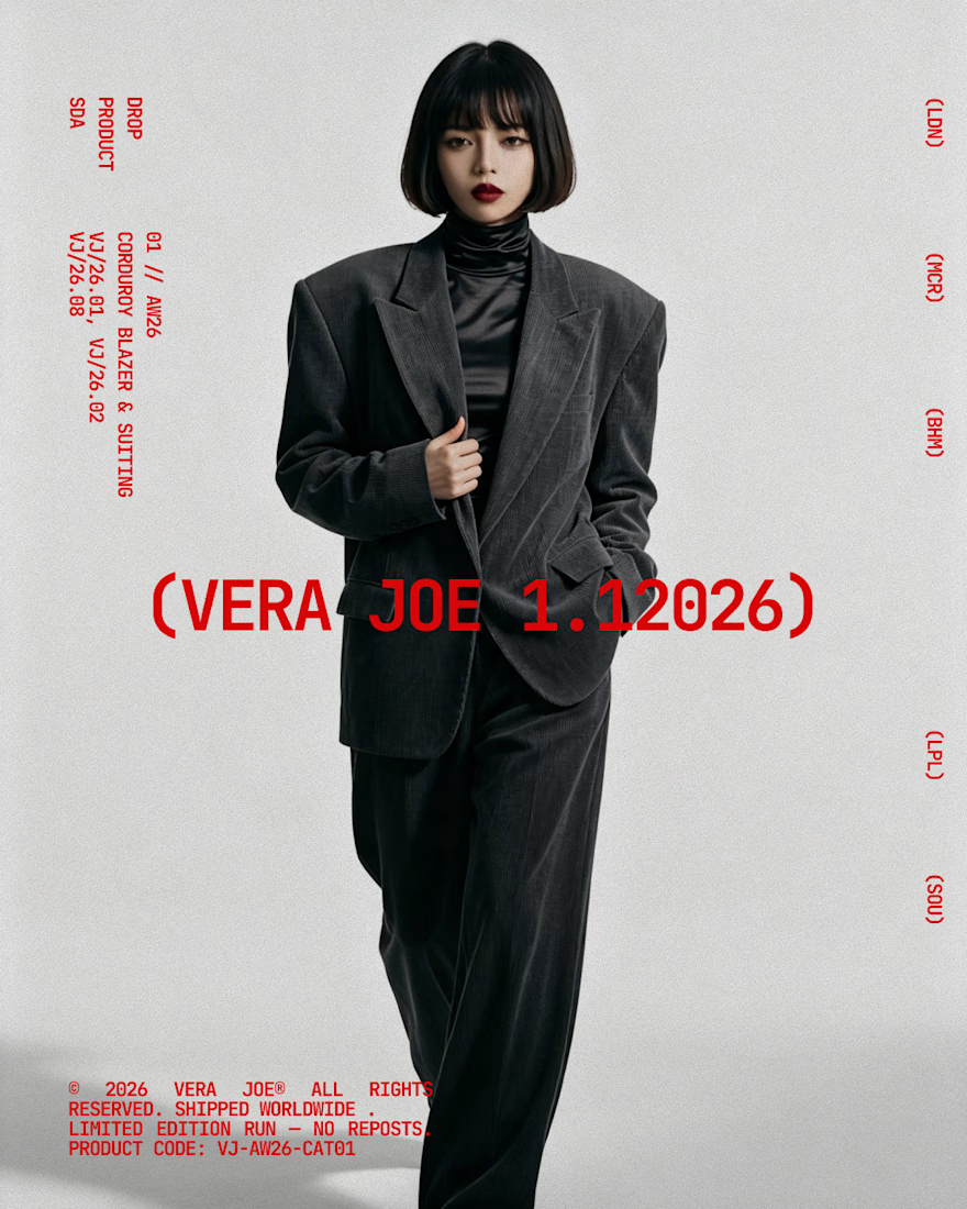
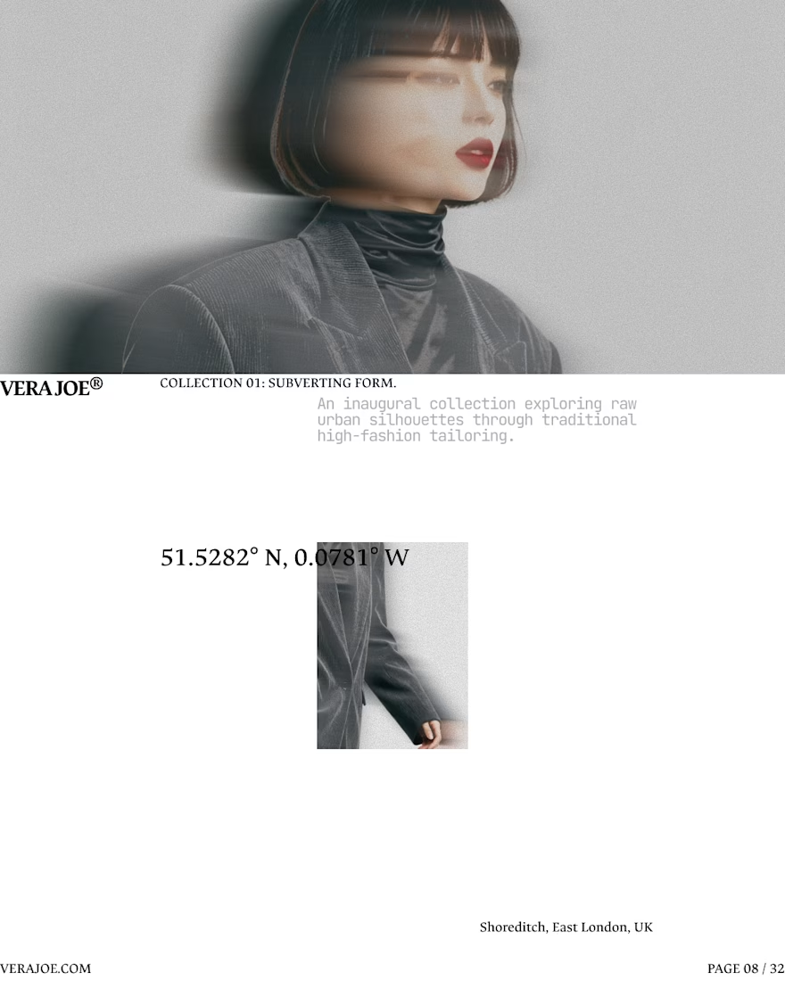
An editorial exploration for VERA JOE® Autumn/Winter 2026.
Exploratory Brand Identity & Visual Campaign.


Like the art direction