The network for creativity
Join 1.25M professional creatives like you
Connect with clients, get discovered, and run your business 100% commission-free
Creatives on Contra have earned over $150M and we are just getting started
Back to feedPost
Taste Test

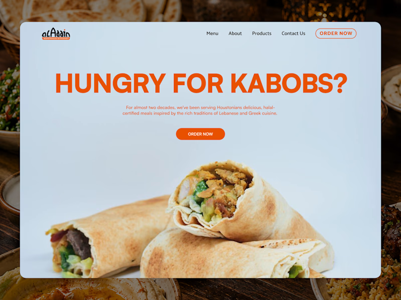
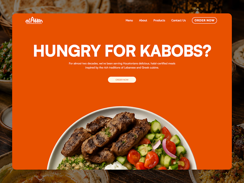
I’m exploring two homepage hero directions for an Aladdin Mediterranean restaurant concept and testing which one feels stronger.
Both versions use the same core message, but the visual direction changes the feel of the brand a lot.
Direction 1 feels lighter, cleaner, and more minimal.
The soft blue background gives it a fresher feel, and the large wrap image keeps the focus on the food.
Direction 2 feels bolder, warmer, and more appetite-driven.
The full orange background creates more energy, and the plated food image feels more intentional and polished.
That’s the tradeoff I’m thinking through:
Direction 1: clean, fresh, approachable
Direction 2: bold, warm, memorable
Which direction feels stronger for a Mediterranean restaurant website?

6 votes
Ends in 1d

Direction 2

Direction 1 beats all time, the feeling alone says it all
The network for creativity
Join 1.25M professional creatives like you
Connect with clients, get discovered, and run your business 100% commission-free
Creatives on Contra have earned over $150M and we are just getting started
Related posts

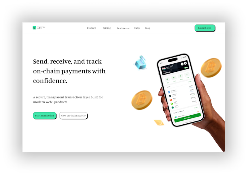
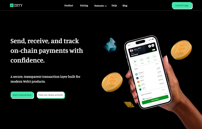
Designed a simple hero section for a decentralized On-chain Bank app. Which do you prefer? A or B?
#herosection #productdesign
2 voted
40%
3 voted
60%
5 votes
Closed
Light mode obviously


Hi Everyone!
Zlotan Speaks is a character based interactive experience built in Rive, where the self proclaimed greatest footballer of all time becomes your personal World Cup oracle.
Players step up to choose a category, and ask a question, and Zlotan gazes into his crystal ball to deliver the answer with facts, flair, and far too much confidence. Every response blends real World Cup history with his signature ego, turning trivia into a mystical audience with a living legend.
The piece is driven by a Rive state machine, each tap moves you through category, question, and answer with the character reacting at every step.
We created the character experience with original illustration, bold typography, and a loud color palette, along with audio and interactive touches.
Link to Project: https://thelittlelabs.com/work/zlotan
Thank you!


really inspiring work


I got tired of two things: the nightly "what should I watch?" paralysis across a dozen streaming apps, and rating systems where a single score doesn't really tell you enough about a film.
So I built Quartile (quartilefilm.io), a film discovery and rating platform. The core idea: instead of one ambiguous score, every film is broken into the five elements that actually matter — Plot, Acting (Narration for docs), Cinematography, Novelty, and Ending — each scored on a 1–4 scale: Well Below Average, Below Average, Above Average, Well Above Average. There's deliberately no neutral "average" middle — it forces you to actually take a position on each category instead of lazily defaulting everything to the middle, which keeps the ratings honest.
Those five combine into a consistent score out of 10, but you can also see what each category scored, which helps you understand why a film is rated what it is. Sometimes a movie is really good but the ending or the acting is terrible, so the overall score isn't that high — and without the Quartile system you'd have no way to know that, because a single number can't tell you. That's exactly why I built it: I wanted to know why a film was rated what it was. Essentially it's a formula and some real quality control for how a film gets rated.
The coolest part is it lets you filter in really cool ways. You can filter by Top in any category — so Top Cinematography shows only films rated Well Above Average (4) there. Top Novelty is one of my favorites, and one of the most unique filters we offer. You can also stack these with genre — so Top Novelty in horror, or Top Cinematography in sci-fi — which is where it gets genuinely useful for finding something specific to your mood.
On top of the rating system you can log films you've seen, build and share playlists, and follow other users to see what they're watching. The same way you follow friends with good taste in music to find new songs on Spotify, film is a matter of taste too — you can follow friends with good taste in certain genres to find movies you'll actually like.
It's in beta right now. Would love feedback from this crowd and general thoughts. Of course I'd be stoked if you made a profile and started rating movies and building playlists too — I'm going to grandfather in the first active users and give them something really cool on their profile eventually to mark that they were one of the first Quartile users.



How do the five categories mathematically combine into the final score out of 10. Is it a straight average, or are certain elements weighted higher?








Trending

Claude
Claude has entered the design space. How are you using Claude Design?

Contra University
Learn from expert creatives how to earn more using next-gen AI tools.
fifaworldcup2026
The World Cup is here and the whole world's watching. How are you designing for the world stage?
creativeaiflow
Creative AI workflows are evolving. What tools do you use, and what are their strengths and weaknesses?
freelancerlife
Freelancer life is wins, pivots, and everything in between. What’s yours right now?