The network for creativity
Join 1.25M professional creatives like you
Connect with clients, get discovered, and run your business 100% commission-free
Creatives on Contra have earned over $150M and we are just getting started
Back to feedPost
Taste Test
Which jersey design is your favourite? 👀
A or B?
I first designed in Adobe Illustrator and then created the mockups using Adobe Firefly, exploring different layouts, patterns, and details inspired by Canada and my own creative style.
If you're curious about the process, you can watch the full walkthrough here: Designing my own Jerseys 🇨🇦⚽


12 voted
30%
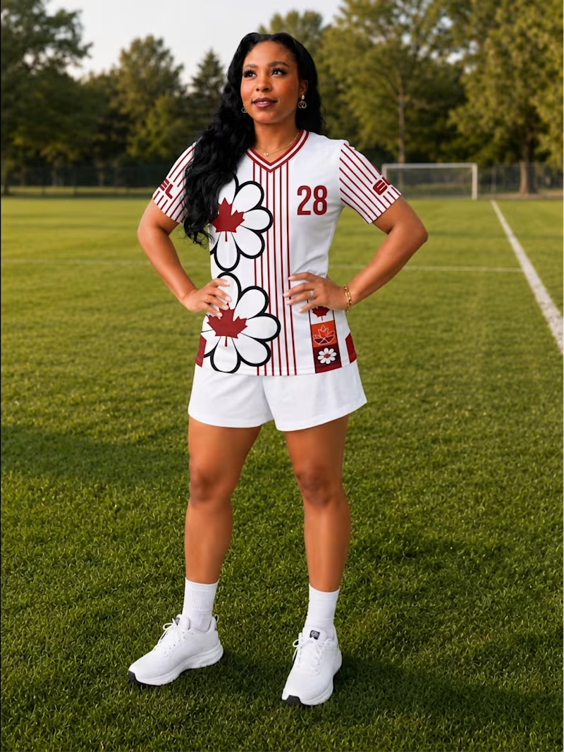
28 voted
70%
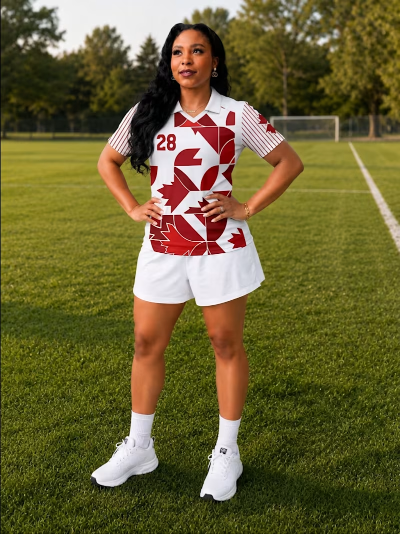
40 votes
Closed

B


I love B😍

Thanks, yes the pattern is fun! 😊

Lisette both are great
Thanks kindly! 😊


For sure B


We align on this

Both look great, but B caught my eye. The pattern feels a bit more unique and gives it extra personality. Nice work! 🔥
Thanks a ton! 🙌 😊
Was B card game inspired?
Both are official football jersey game inspired, but with my own creative style twist 😊


nice one

i love the B. the graphics and everything is so beautiful
😊 😊 ahh! Thank you!


B looks good

Amazing


I'd go with B. The geometric pattern creates a stronger visual identity while still keeping the jersey clean and recognizable from a distance. What often gets underestimated is that sports apparel needs to be memorable in motion, not just in mockups. Which design do you think would stand out more on the field during a match?
B would stand out more in a match! Both however were inspired by my own creative style 😊


The network for creativity
Join 1.25M professional creatives like you
Connect with clients, get discovered, and run your business 100% commission-free
Creatives on Contra have earned over $150M and we are just getting started

Challenges
View all


Related posts

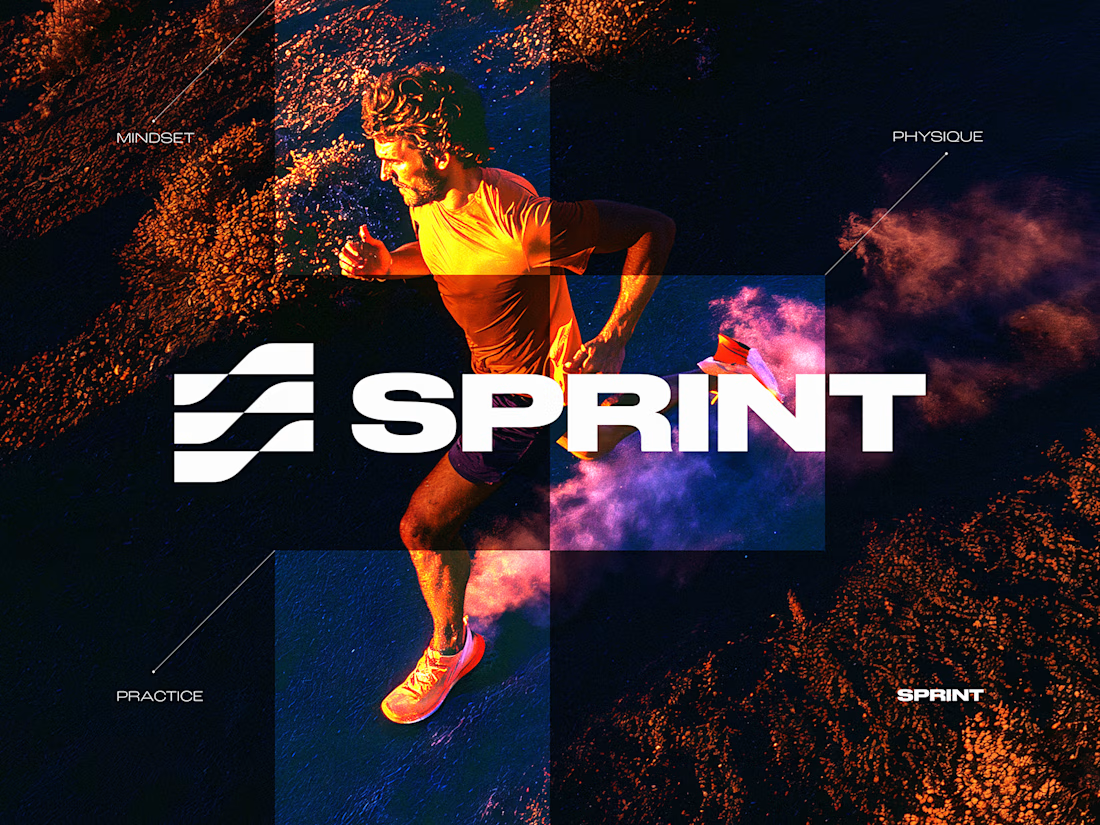
SPRINT — Experimental Brand Visual
A visual experiment built around an unused logo concept from a recent branding project.
The design was created manually, while exploring how AI-driven aesthetics are increasingly influencing contemporary visual language, even when AI itself isn’t part of the design process.
Logo design, art direction and visual exploration.



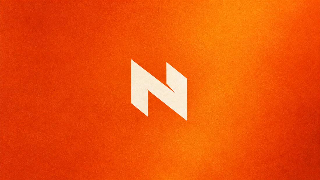
My Top Featured Projects on @Contra Labs 🔥
⚡| NEXVOLU
⚡| HYDRUM VEIL
⚡| NOIRÉ
Each project explores a different direction, but the goal stays the same: build brands that stand out.
Which project is your favorite?
Drop the name below 👇


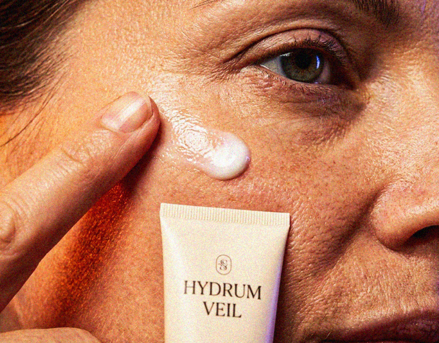
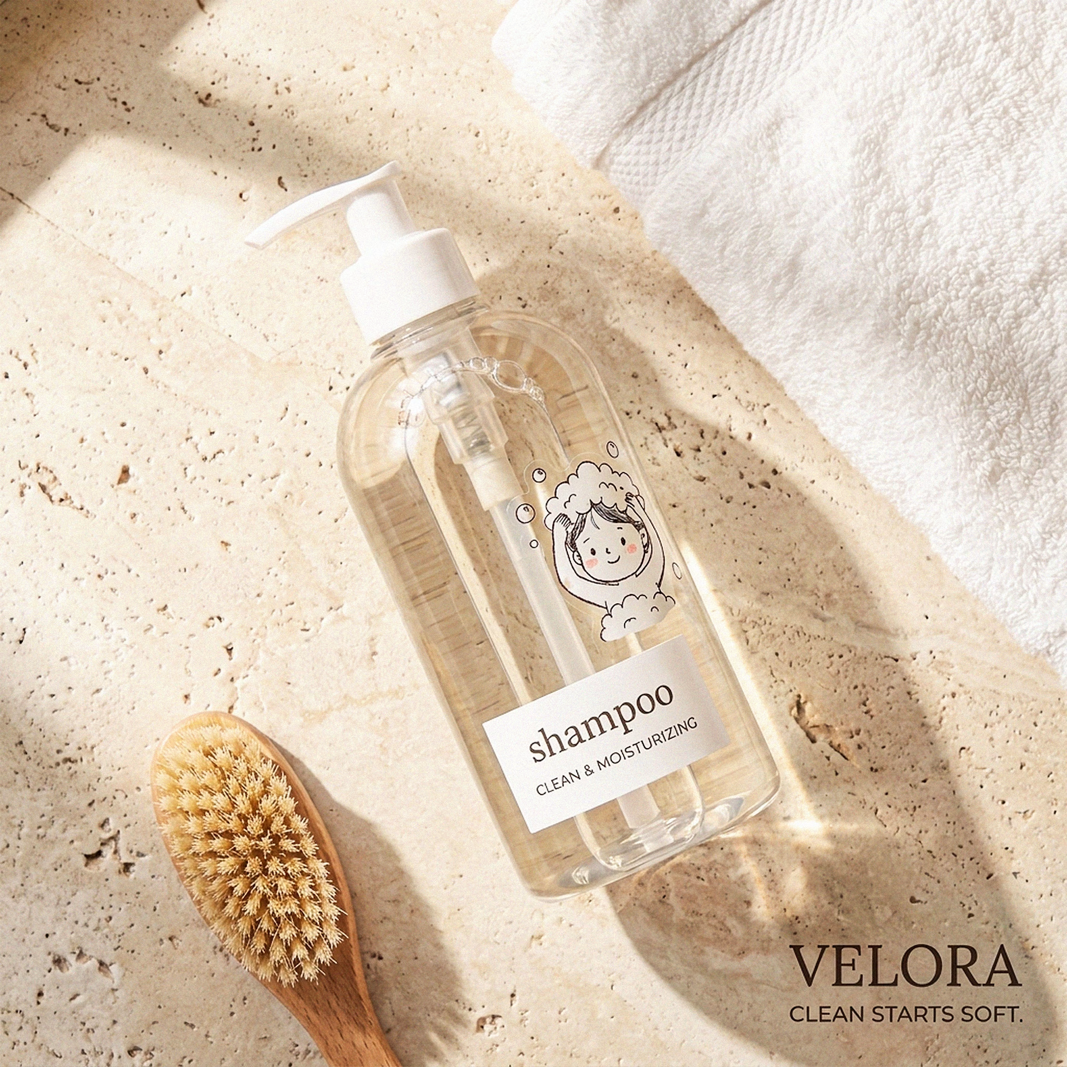
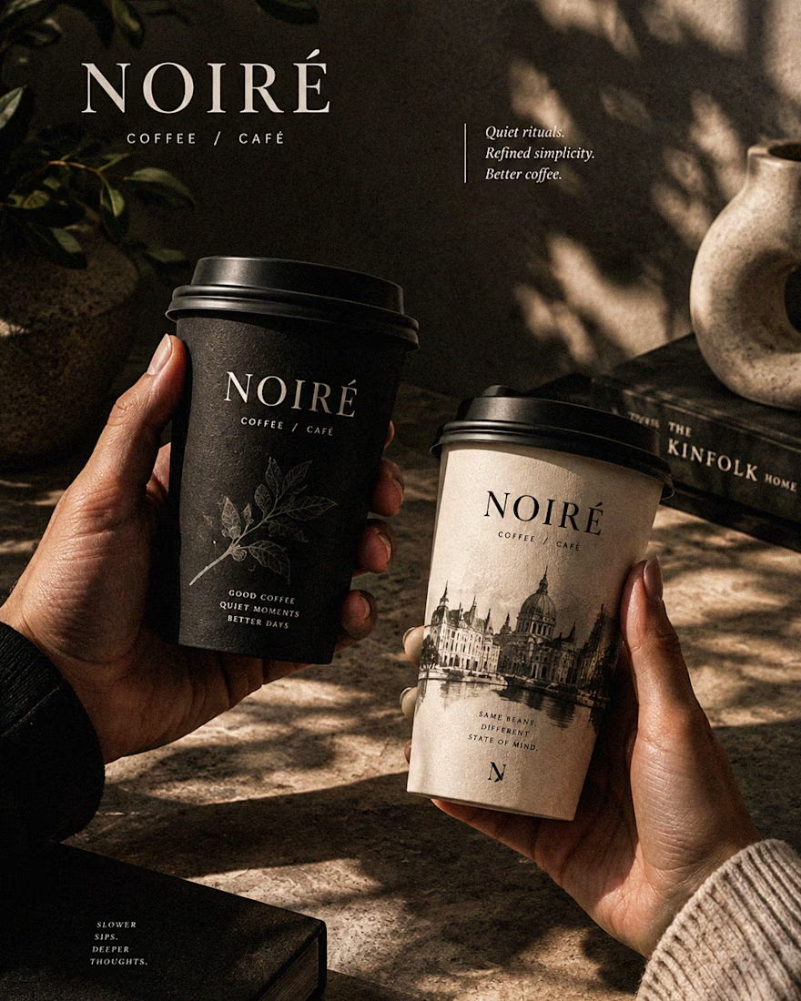

These are 🔥 Mine are all fav 🙌
Congo for Featured on @Contra HQ & @Contra Labs ... 😍

Luxury Lighting E-commerce Website Design for Modern Home Decor
A modern luxury lighting e-commerce website concept crafted to showcase premium statement pieces through a refined, immersive, and editorial-inspired digital experience. The design combines warm ambient lighting, bold typography, cinematic imagery, and clean minimalist layouts to create a sophisticated online presence for a high-end home decor brand. Every element is thoughtfully designed to enhance product storytelling, improve user engagement, and deliver a seamless shopping experience across all devices.

really nice design