The network for creativity
Join 1.25M professional creatives like you
Connect with clients, get discovered, and run your business 100% commission-free
Creatives on Contra have earned over $150M and we are just getting started
Back to feedPost
Taste Test
My Recent Works!
Which One Would You Watch Again? 👀
1 voted
50%
1 voted
50%
2 votes
Closed

3D Style is more demanding but Cinematic action shows more movements and details

Appreciate it! Glad you noticed the movement and details in the cinematic piece 🙌

Thank you! Glad you liked them 🙌

Great taste! 🙌
The network for creativity
Join 1.25M professional creatives like you
Connect with clients, get discovered, and run your business 100% commission-free
Creatives on Contra have earned over $150M and we are just getting started



Related posts

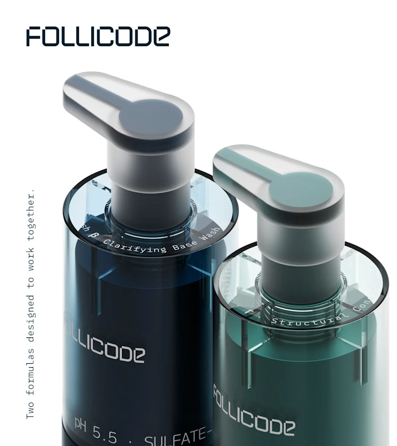
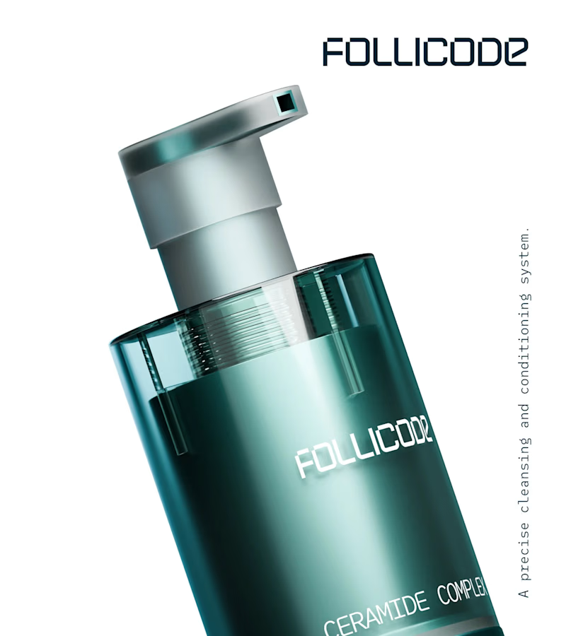
Choose your product hero shot
2 voted
29%
5 voted
71%
7 votes
Closed

Option 2 for me. The single bottle has room to breathe and the FOLLICODE branding reads instantly — it feels like a proper hero. Option 1 is nice for showing the system, but the two bottles compete with each other and the label gets a bit lost in the dark. I'd run Option 2 as...


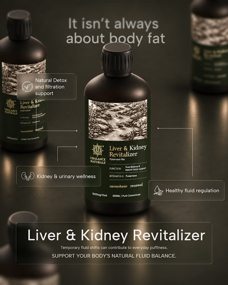
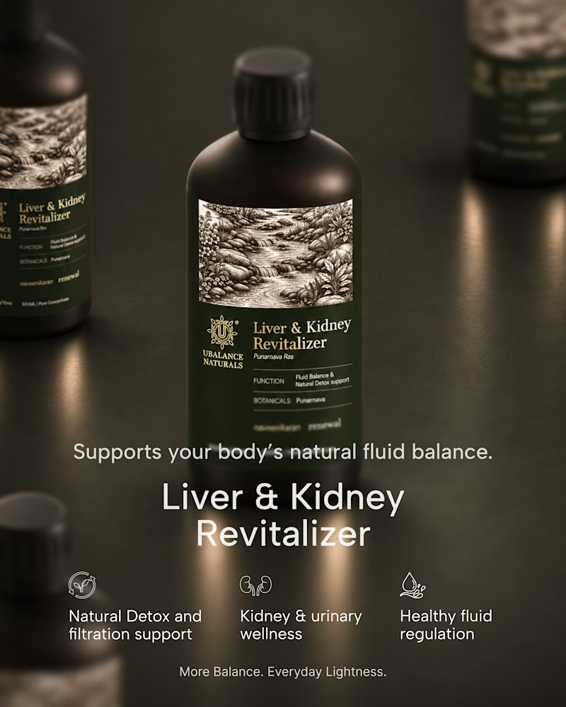
A quick exploration of two different directions for a wellness product ad.
One focuses on the product, while the other brings more attention to the product information.
These are early explorations, just to get a feel for the brand and its visual direction.
I’d love to hear your honest thoughts. Which direction feels more effective, and what would you improve?
1 voted
50%
1 voted
50%
2 votes
Closed
Honest take: the information-first direction wins for me. "It isn't always about body fat" is a proper hook — it speaks to the actual worry behind the product, so it stops the scroll. The product-first shot is gorgeous, but it reads more like a product page image than an ad. One...

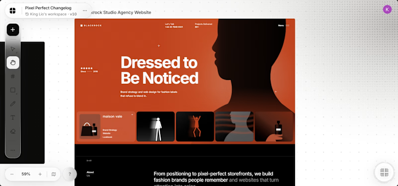
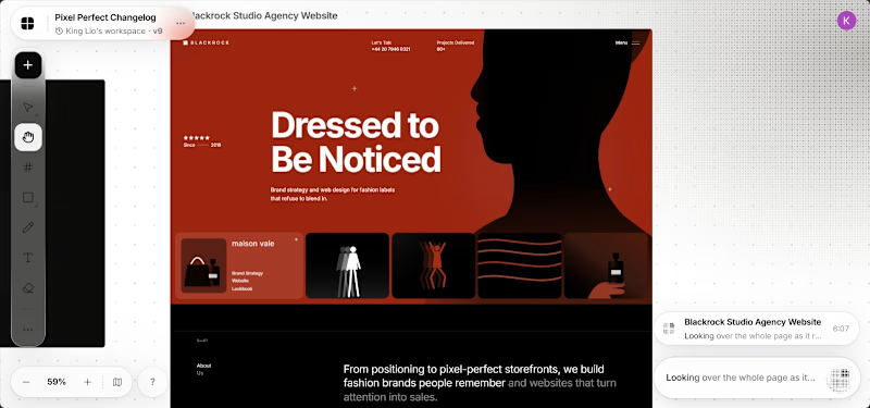
These designs were made by the AI in my upcoming design tool for designers.
I don't know which is better, help me decide.
For those wondering where the remaining designs are, I'll drop it in my next post.
2 voted
40%
3 voted
60%
5 votes
Closed

It's the red one for me... Passed the message a lot better than the Orange