The network for creativity
Join 1.25M professional creatives like you
Connect with clients, get discovered, and run your business 100% commission-free
Creatives on Contra have earned over $150M and we are just getting started
Back to feedPost

iRAD — Brand Identity & Website
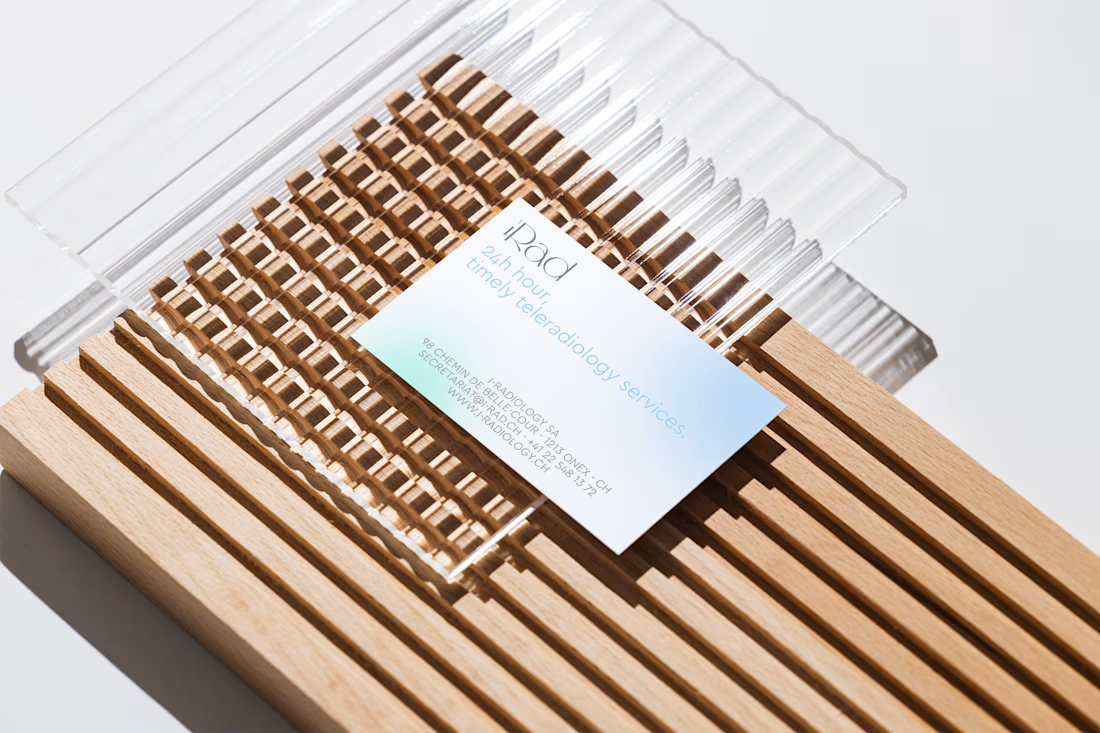
iRAD is a Swiss teleradiology company providing specialist radiological reporting and support to hospitals, clinics and medical centres.
The goal was to build a visual identity that could communicate expertise and reliability without relying on the cold, clinical aesthetics traditionally associated with healthcare.
Starting from the brand identity, I developed a softer and more contemporary visual language through a distinctive colour palette, refined typography, generous whitespace and rounded graphic elements. The visual direction balances the precision of a highly technical service with a more human and approachable personality.
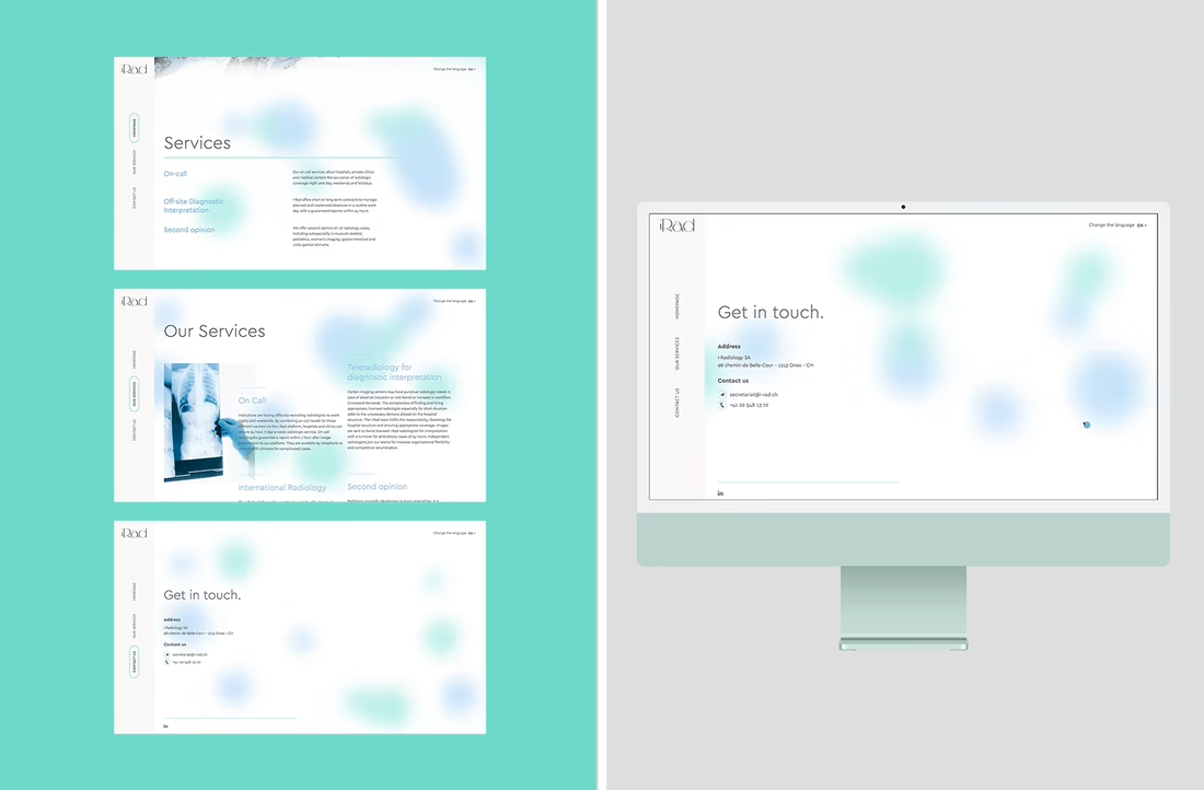
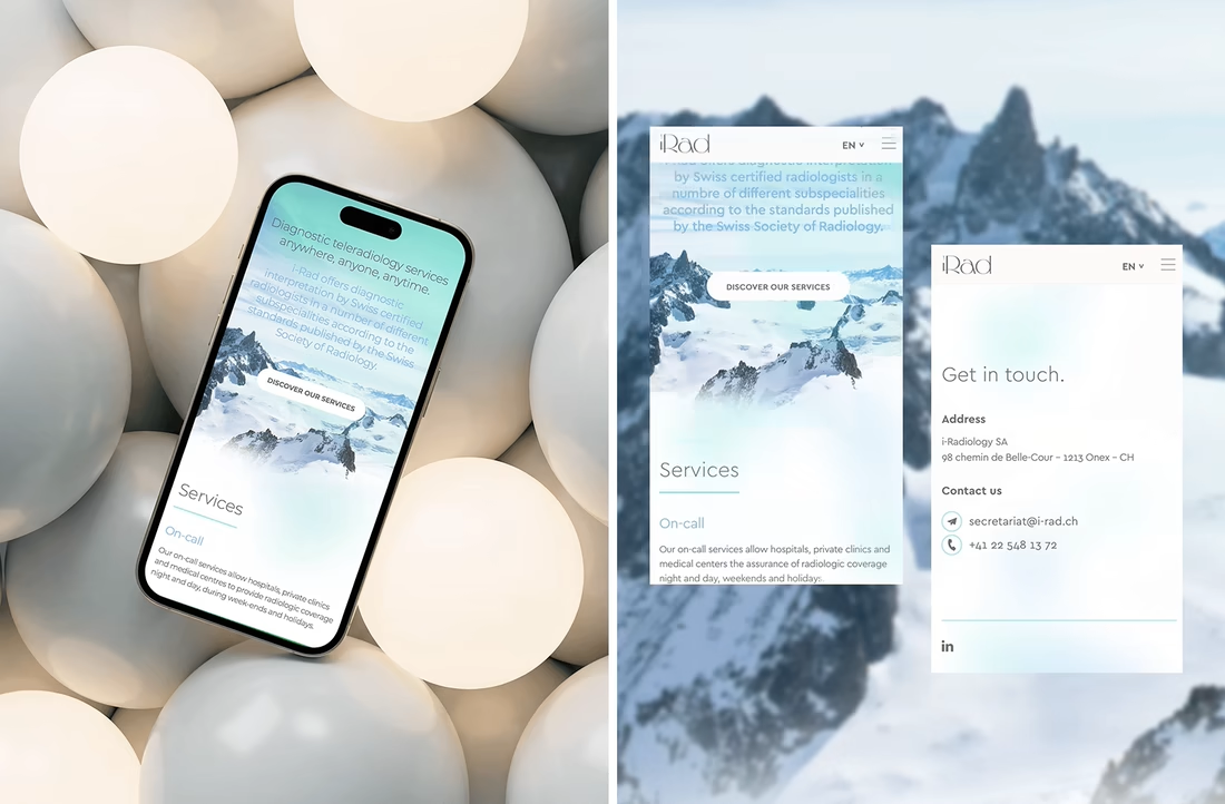
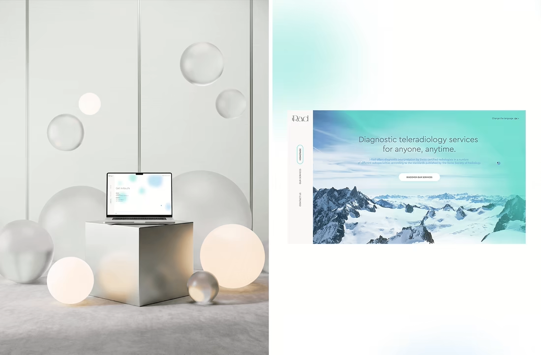
This language was then translated into a bespoke website, designed from scratch around iRAD’s content, audience and positioning. Subtle motion and graphic details add personality while maintaining a clear and intuitive experience across desktop and mobile.
The result is a brand that feels professional and credible, while deliberately moving away from the conventional visual codes of the medical sector.
Scope: Brand Identity · Logo Design · Art Direction · Website Design · Digital Art Direction


The network for creativity
Join 1.25M professional creatives like you
Connect with clients, get discovered, and run your business 100% commission-free
Creatives on Contra have earned over $150M and we are just getting started







Related posts

A little design exploration for practice ✨
This time, I’m working on a concept for a lighting brand.
Which direction do you prefer?
74 voted
70%
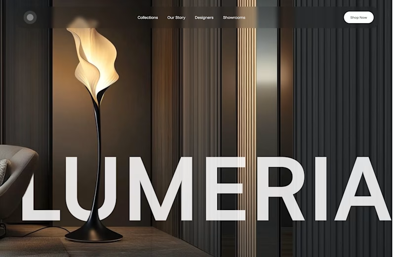
31 voted
30%
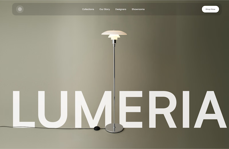
105 votes
Closed

Atmospheric, for a lighting brand it feels almost unfair not to show the product actually doing its job in a real room. The minimal version reads more like a furniture catalog to me. Is Lumeria leaning toward a specific price point or market that would push this one way or the other?

I think 1 image design was great!


Color Changes Everything
Sometimes, all it takes is a change in color – and the exact same design can feel completely different.
The light version, with soft pink tones and natural textures, feels fresh, light, and airy. It creates a sense of calm, natural beauty, and a closer...
128 voted
66%
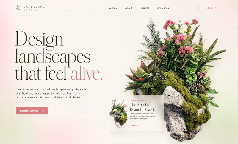
66 voted
34%
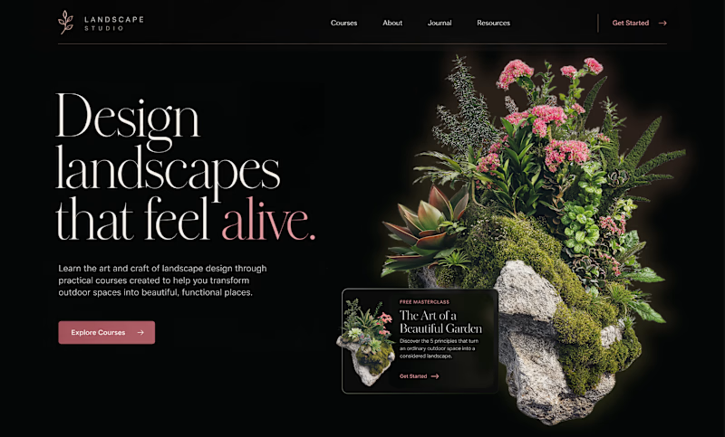
194 votes
Closed

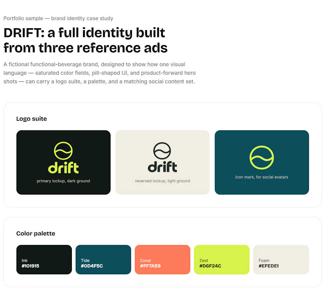
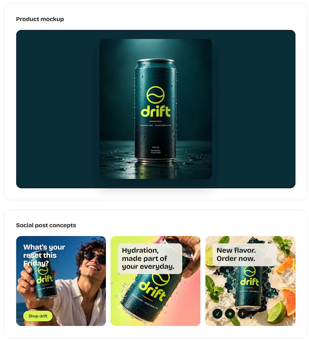
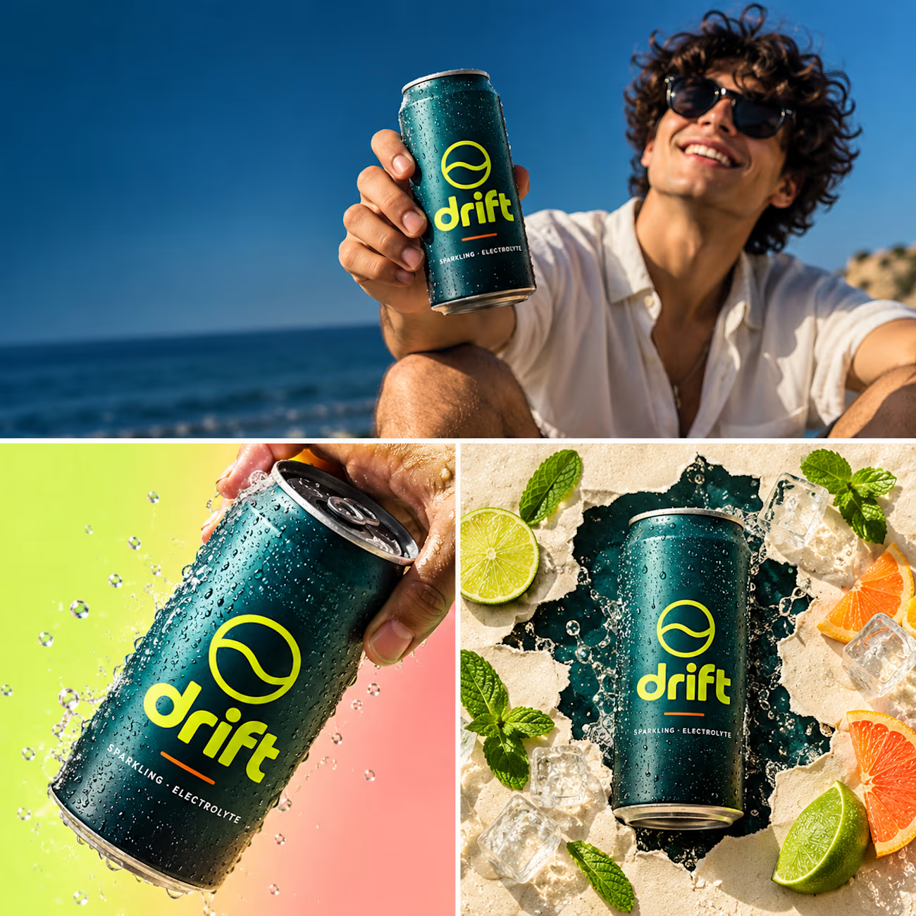
Just wrapped a full brand identity for DRIFT, a functional beverage brand.
logo suite, palette, type system, packaging and a social content set, all built around one bold visual language. 🌊

Really Nice Visual Direction.