The network for creativity
Join 1.25M professional creatives like you
Connect with clients, get discovered, and run your business 100% commission-free
Creatives on Contra have earned over $150M and we are just getting started
Back to feedPost

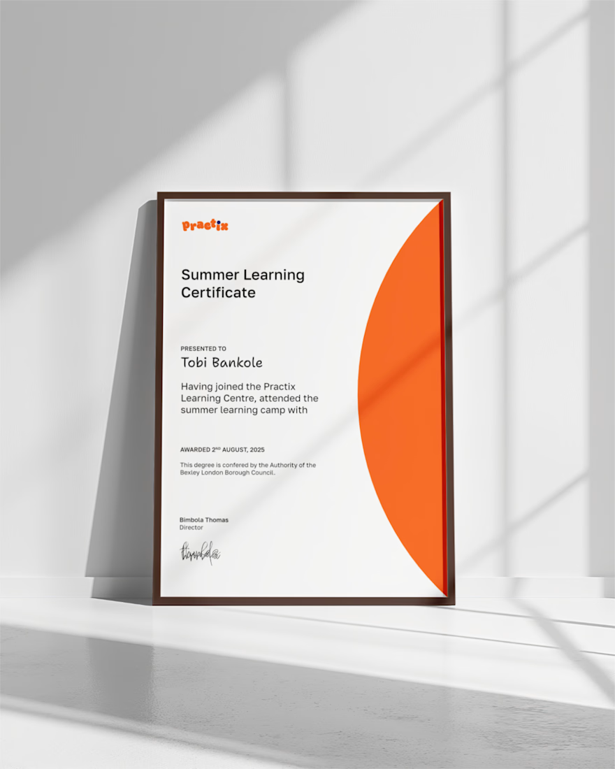
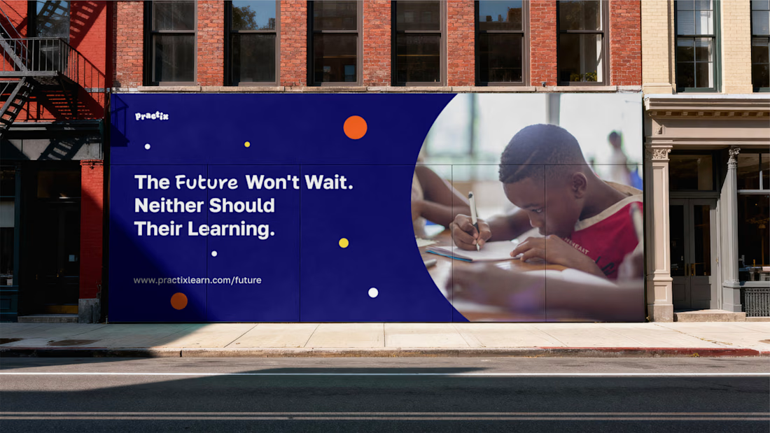
Brand identity for Practix, a UK-based supplementary learning centre helping students deepen their academic knowledge while building the character and confidence to thrive beyond the classroom. The challenge was to build a brand that could hold two ideas at once, rigorous enough to produce real academic results, warm enough that students actually want to be there, without one undermining the other.
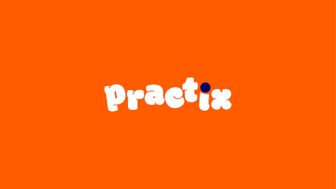
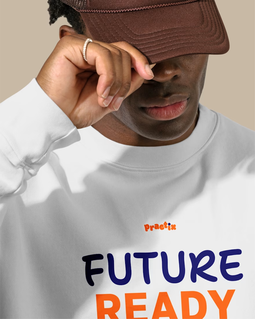
I was commissioned to develop the full identity, built around a central concept: Future Ready. Every element of the system was designed to carry both registers simultaneously. The logotype uses weight to signal academic seriousness, paired with a staggered arrangement that introduces deliberate playfulness.
The dot above the "i" was designed as a small device encoding the brand's core belief, that learning should be enjoyable. Two typefaces work in tandem, one carrying professionalism and authority, the other adding warmth and energy, so the identity never tips into purely corporate or purely informal. The palette of orange and blue, creativity and trust, is extended with a set of vibrant secondary colours, giving the system room to flex across applications without losing coherence. The result is a brand as ambitious as the students it serves, one that communicates seriousness and joy in equal measure.


The network for creativity
Join 1.25M professional creatives like you
Connect with clients, get discovered, and run your business 100% commission-free
Creatives on Contra have earned over $150M and we are just getting started








Related posts

Which ZVEZRA logo direction do you prefer? 👀
I’ve been exploring two variations of the wordmark. Both follow the same visual direction, but each has its own character.
Vote below!
I’d love to hear your thoughts! 👇
39 voted
53%
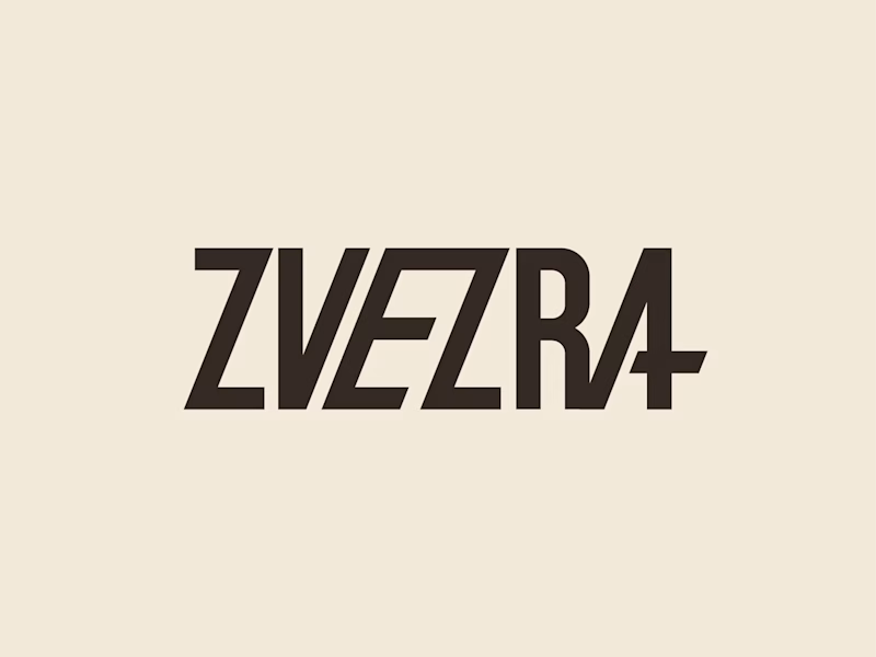
34 voted
47%
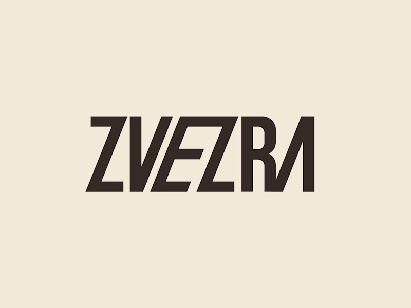
73 votes
Closed

Option 1 for me, it has a bit more personality. Both are strong though, tough call




Professional work. Keep it up.

Interactive AI Analytics Dashboard | SaaS Product Design
A modern, animated AI-powered eCommerce analytics dashboard designed to help businesses track sales performance, monitor revenue, understand customer behavior, and make data-driven decisions.
The design combines a clean SaaS interface, intuitive data visualization, interactive dashboard elements, and smooth animations to create a more engaging user experience. Every section is designed to make complex analytics easier to understand while maintaining a professional, scalable, and user-friendly layout.


Super clean work!