The network for creativity
Join 1.25M professional creatives like you
Connect with clients, get discovered, and run your business 100% commission-free
Creatives on Contra have earned over $150M and we are just getting started
Back to feedPost

I have updated my design portfolio.
Which design do you like more? Please share your thoughts in the comments.
Someone recently told me that a design shouldn't just be beautiful- it needs to be meaningful.


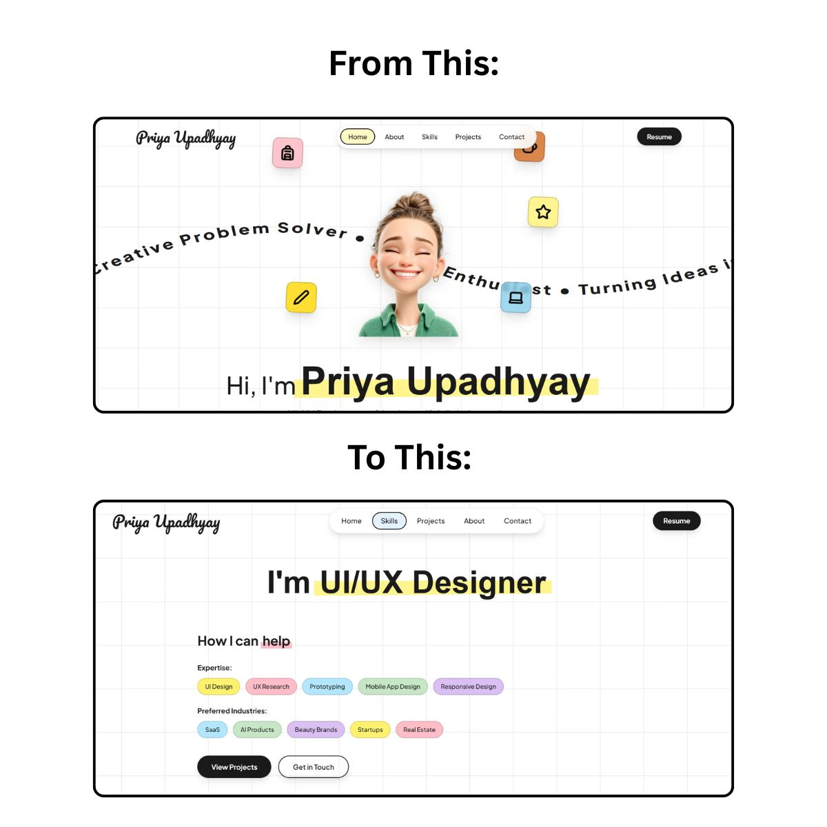

I really like how clean and thoughtful these designs feel. I agree that good design should go beyond looking beautiful, it should solve a problem and create a clear experience. Great work. 👏
thanks a lot Mary.

Absolutely — aptly said. Good design should always have a purpose beyond aesthetics.

Meaningful design can still be beautiful, and you nailed both here. ❤️
thanks a lot @mhmanik02
welcome mate❤️
The network for creativity
Join 1.25M professional creatives like you
Connect with clients, get discovered, and run your business 100% commission-free
Creatives on Contra have earned over $150M and we are just getting started

Challenges
View all


Related posts

A or B? 😇👈
Which design delivers the better luxury feel and overall visual experience?

3 voted
17%
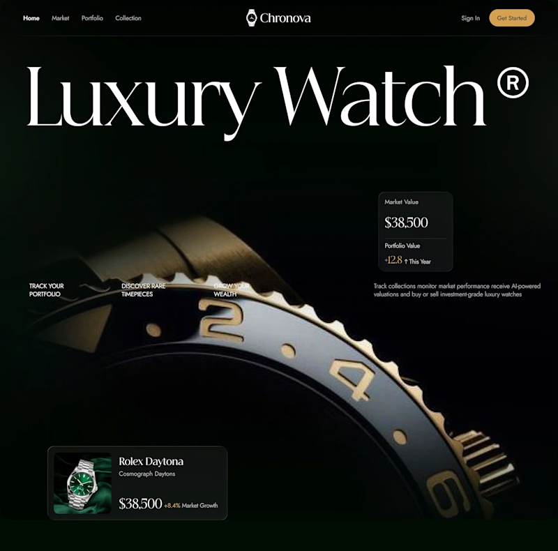
15 voted
83%
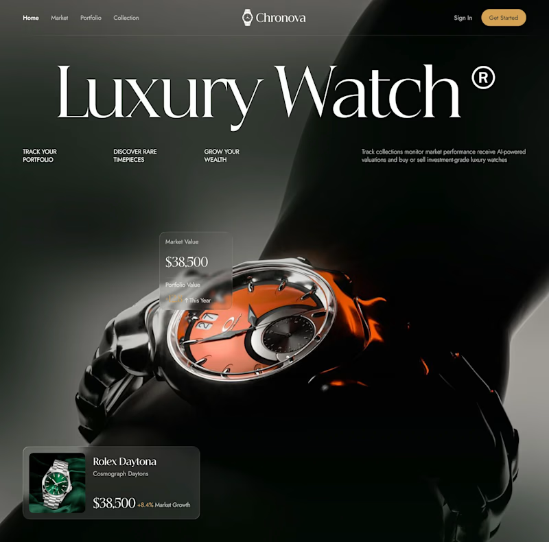
18 votes
Closed

Option B feels more luxurious to me—the watch gets a clearer hero moment and the warmer accent adds just enough energy against the dark field. The typography and product scale also make the comparison feel polished.


Engaging website for a New York–based architecture and construction studio, balancing bold typography, immersive imagery and a minimal editorial layout.


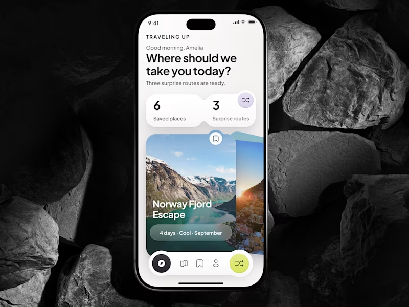
🎴 TASTY TEST 06/30: Which travel discovery experience would you choose?
Traveling Up is probably my first mobile concept outside client work in almost three years. It was inspired by a trip where not knowing the destination was part of the fun.
Same app. Same destination. Two ways to discover it.
🤍 A Clean Carousel
Calmer, lighter, more familiar.
💚 B Immersive Deck
Bigger imagery, stronger overlap, more tactile navigation.
Which one makes you want to swipe and see where the app takes you next?
A or B? 👇
#MobileAppDesign #TravelApp #MobileUX #UIDesign #ProductDesign #AsolDesign
23 voted
49%
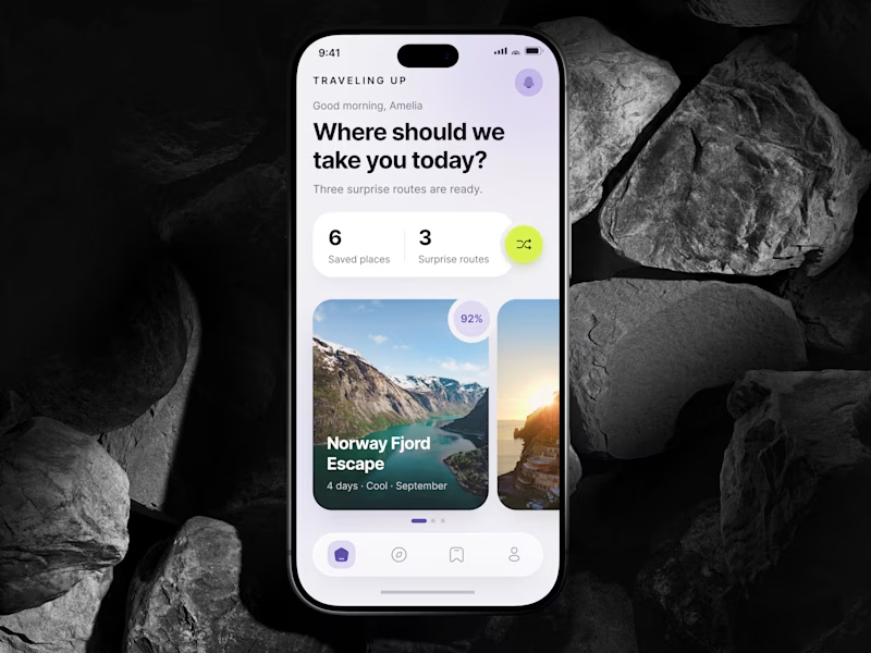
24 voted
51%
47 votes
Closed


