The network for creativity
Join 1.25M professional creatives like you
Connect with clients, get discovered, and run your business 100% commission-free
Creatives on Contra have earned over $150M and we are just getting started


The network for creativity
Join 1.25M professional creatives like you
Connect with clients, get discovered, and run your business 100% commission-free
Creatives on Contra have earned over $150M and we are just getting started
Related posts

AREA — Minimal Brand Identity
AREA’s identity began with a simple idea: structure can make a brand more distinctive.
We explored it through bold typography, geometric forms, and a restrained monochromatic palette, bringing clarity and consistency to every touchpoint.
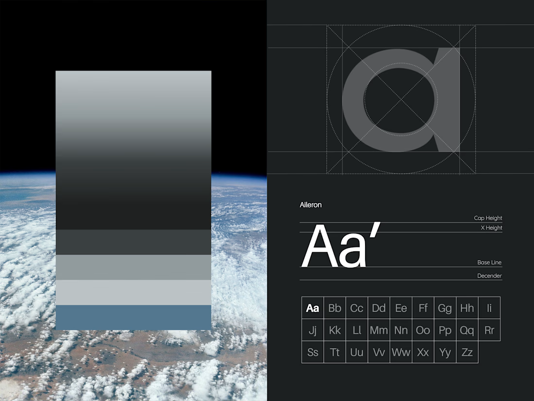
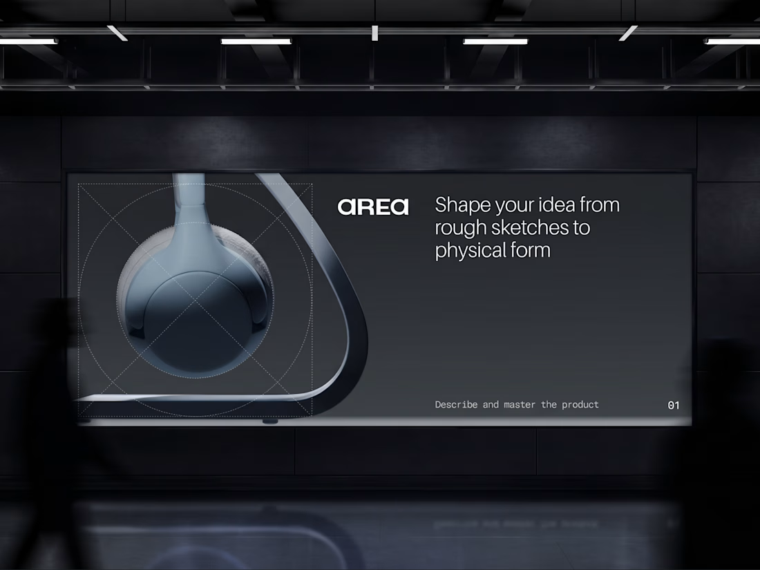

Monochrome can feel cold, but the big type keeps this sharp. Did you start with the type or the shapes?


A great website should do more than look good, it should make choosing a business feel easy.
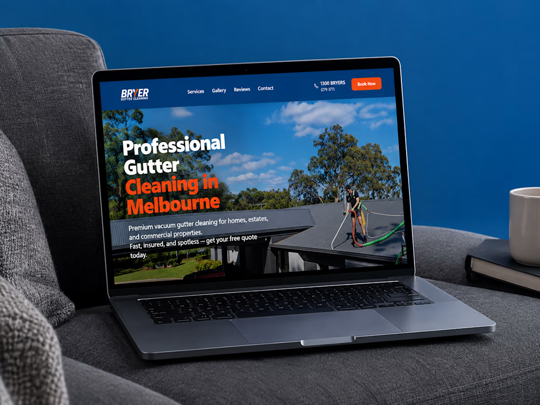
I recently completed a website project for Bryer, a Melbourne-based gutter and solar panel cleaning business.
The goal was to create a clean, professional online presence that communicates their services clearly, builds trust, and makes it easier for potential customers to request a quote.
Now, I’m curious:
When you visit a service-based business website, what matters most to you, the design, the information, or how easy it is to get in touch?
Let’s hear your thoughts! 👇
#WebDesign #Webflow #UXDesign #WebDevelopment #WebsiteDesign #Contra



this is amazing work

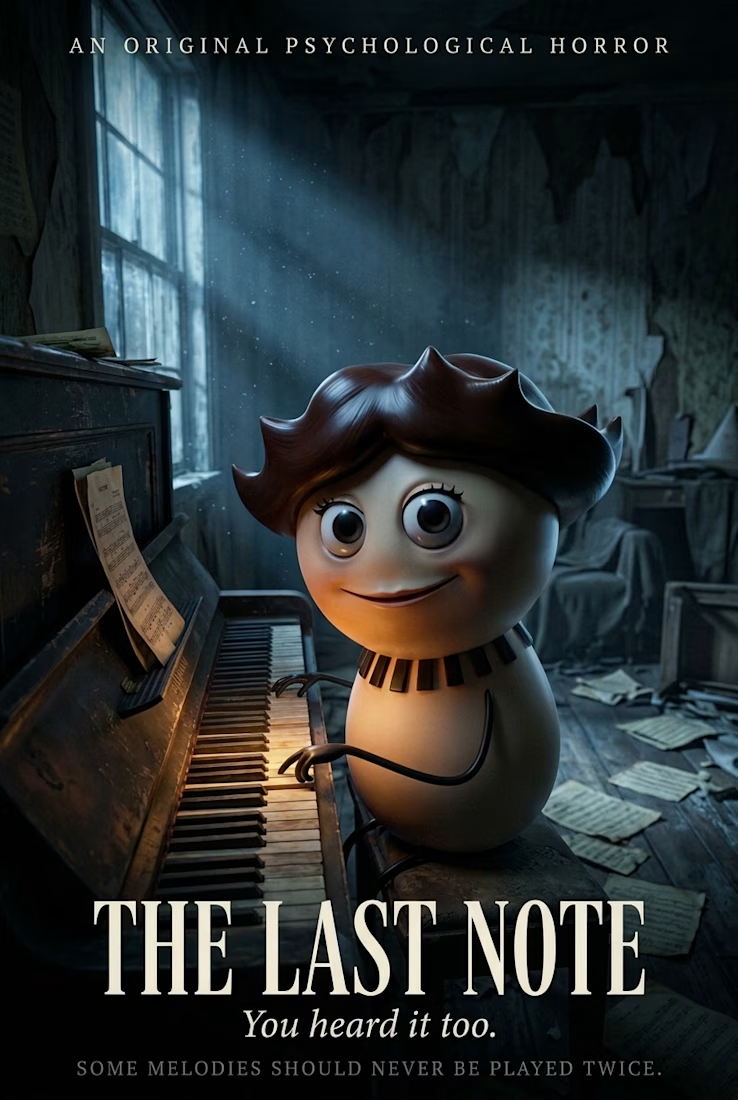
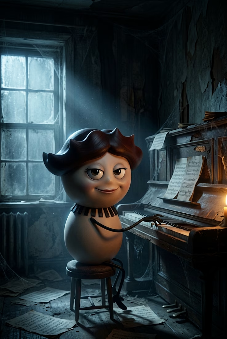
The Last Note — Halloween-Themed Character Design & Horror Poster
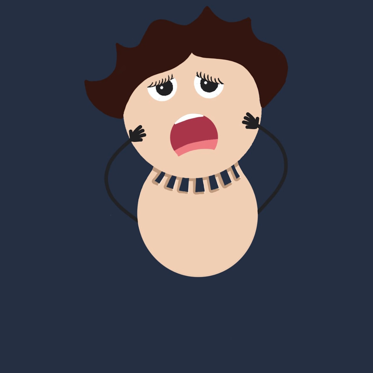
I first drew this character as a simple 2D illustration, then transformed it into a 3D character using AI. Its unusual appearance, brown hair, and piano-key collar inspired me to take the concept in a darker direction.
For this project, I wanted to create a Halloween-themed psychological horror concept. Since the character has a love for music but also has an unsettling presence, I developed The Last Note as a cinematic horror poster.

Outstanding!