The network for creativity
Join 1.25M professional creatives like you
Connect with clients, get discovered, and run your business 100% commission-free
Creatives on Contra have earned over $150M and we are just getting started
Back to feedPost

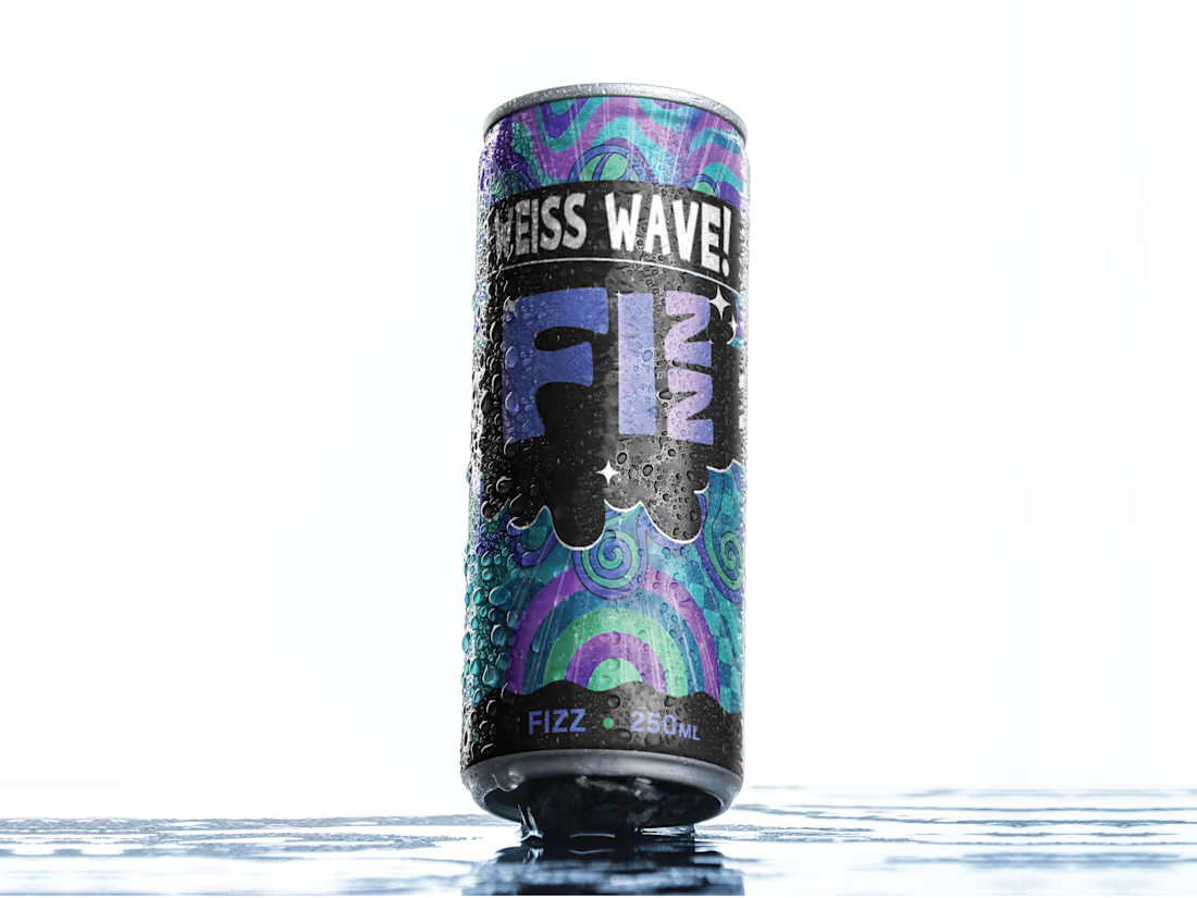
One thing I kept coming back to with this can: it had to look as energetic as the drink is supposed to feel.
This is FIZZ, a beverage packaging exploration built around a louder, more expressive shelf presence.
The direction combines psychedelic wave graphics, aqua and purple tones, heavy black contrast, and a playful type system to give the can a more youthful, slightly chaotic personality.
What I wanted to avoid was the usual “clean but forgettable” beverage look.
The can needed to feel:
Cold
Fizzy
Playful
A little weird
Easy to spot from a distance
The black band became important because it gives the artwork somewhere to breathe and keeps the whole thing from turning into visual noise.
Still deciding how far I would push the system across multiple flavours.
Curious what you’d do:
Keep this direction as-is, or simplify the graphics for stronger shelf readability?
Would love to hear how other designers would approach it.
And if you’re building a beverage or CPG brand and need the packaging to have more presence, feel free to reach out.
#PackagingDesign #BeverageBranding #BrandIdentity #CPGDesign


The network for creativity
Join 1.25M professional creatives like you
Connect with clients, get discovered, and run your business 100% commission-free
Creatives on Contra have earned over $150M and we are just getting started



Related posts


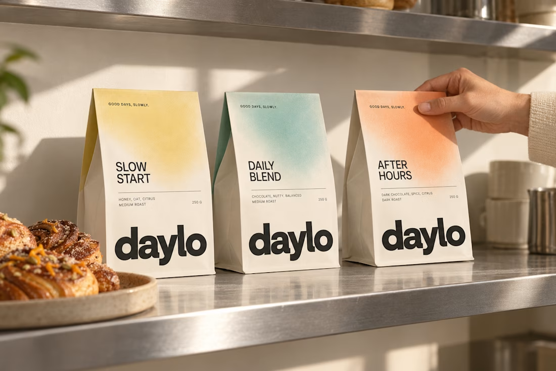
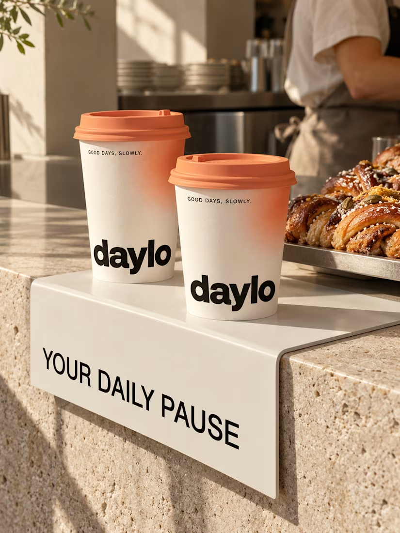
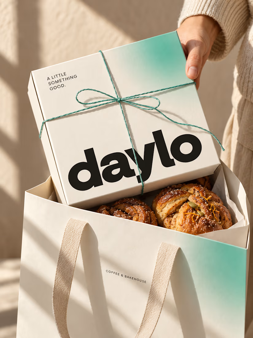
☕ Meet DAYLO - A minimalist coffee branding concept featuring bold typography, warm neutrals, and soft colors designed to make every cup feel a little more special. 🤎
Explore the full project on my Contra profile and let me know your thoughts!


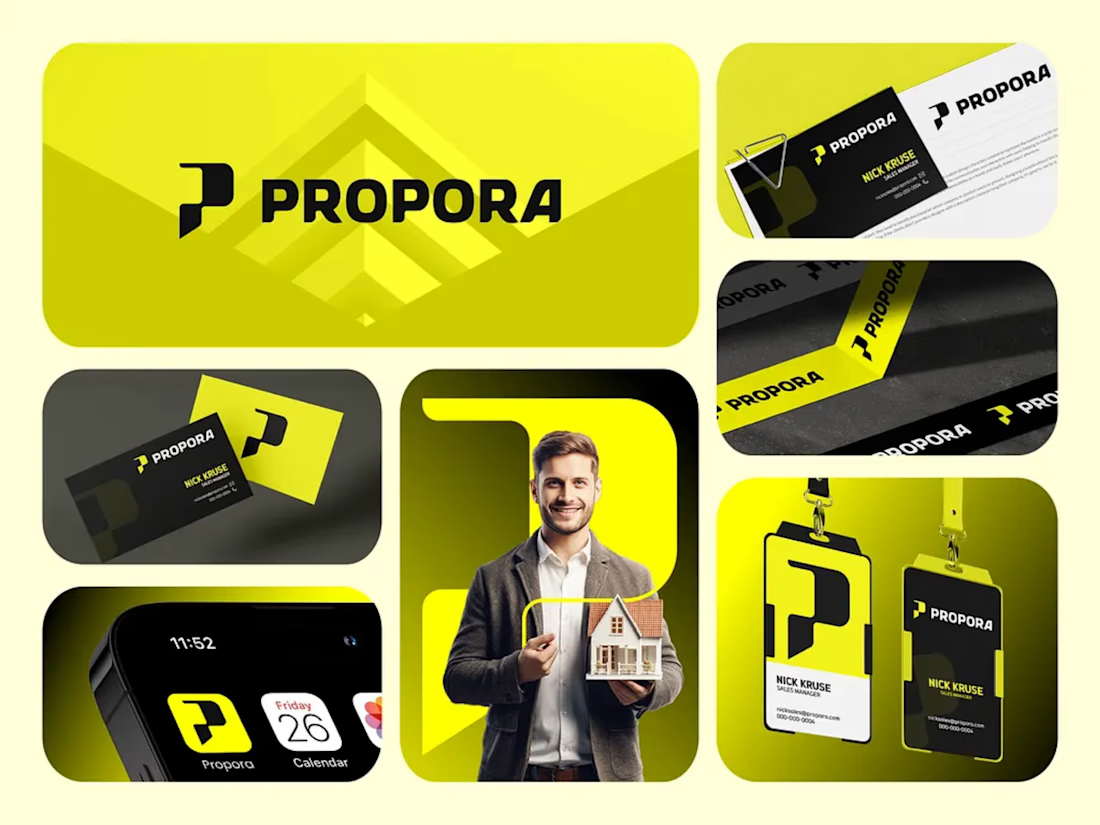
Propora: Brand Identity for a Modern Real Estate Company
Propora is a real estate brand built to feel confident, modern and trustworthy. I designed a complete visual identity that helps it stand out in a market full of safe blues and generic house icons.
The concept
The logo mark is a bold, geometric "P" with a notch cut into its stem. It reads as a rooftop, a doorway and a forward arrow at once, suggesting property, access and progress. It is paired with a heavy, wide wordmark that feels strong and approachable.
Color and tone
Electric yellow-green brings energy and optimism, and makes the brand instantly recognizable.
Deep black adds authority and contrast, so the yellow always pops.
White keeps layouts clean and professional.
What I delivered
Primary logo, icon mark and app icon
Color palette and typography guidelines
Business cards and stationery
Employee ID badges and lanyards
Branded packaging tape
Mobile app icon and home screen mockup
Social and marketing visuals
The result
A flexible, high-contrast identity that works across print, digital and physical touchpoints, and gives Propora a distinctive presence from a business card to a phone screen.
Tools: Adobe Illustrator, Photoshop, Figma, Corel Draw
Tip for your Contra post: Add a one-line tagline at the top, like "A bold identity for a real estate brand built on trust and momentum." Lead with your best mockup, which is the large logo on the yellow background.
I can also write a shorter version for your bio or a client-facing case study if you'd like. Brand design and pakeging Design Product Design


Wow, I love the design and the color combination. Amazing work 😍