The network for creativity
Join 1.25M professional creatives like you
Connect with clients, get discovered, and run your business 100% commission-free
Creatives on Contra have earned over $150M and we are just getting started
Back to feedPost


DentistryX: a website template for dental clinics. The first screen shows a smile and a rating before any service.

Great work, Kazi...So good.
The network for creativity
Join 1.25M professional creatives like you
Connect with clients, get discovered, and run your business 100% commission-free
Creatives on Contra have earned over $150M and we are just getting started






Related posts


Nice work, Miguel!!


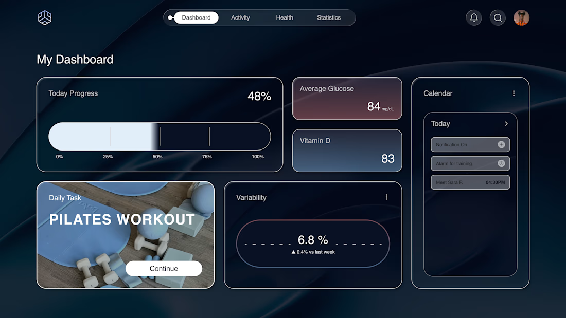
Why does a dashboard full of numbers still feel calm?
Bento grids are everywhere, and done right it's not a trend, it's information design. Each cell = one number, one meaning. The grid does the hierarchy for you.
Our three rules for a bento that works:
One idea per cell. Progress, glucose, one task. If a card needs two sentences, it needs two cards.
Mix the scale. One hero cell, a few mediums, one tiny stat, same gap everywhere.
One warm cell. A single card runs warm against the cool, dark screen; it carries the eye, and the rest stay quiet. No neon needed. Grids are calm. Content is loud. That's the whole trick.

Love the three rules. How do you handle this grid when it collapses to mobile without losing the hierarchy?

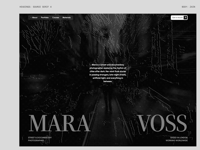
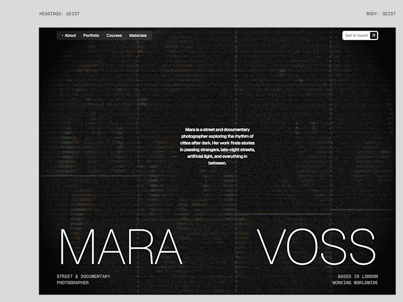
I tried experimenting a little with my previous design. I changed the fonts and background a bit. Which version do you like better?
22 voted
73%
8 voted
27%
30 votes
Closed

New design for sure. The distressed texture in the type makes it feel like actual street photography lives inside the letters. The previous version is clean but this one has grit.