The network for creativity
Join 1.25M professional creatives like you
Connect with clients, get discovered, and run your business 100% commission-free
Creatives on Contra have earned over $150M and we are just getting started
Back to feedPost
A general counsel doesn't compare your brand to other SaaS tools. They compare it to the letterhead on their desk.
That's what killed my first direction on this one.
It's a spec project for a legal AI product, the kind that reviews and redlines contracts on its own. We're talking uncapped liability clauses here. The stakes are real even if the client isn't yet.
The brief called for institutional grade security, structured layouts, the whole Swiss thing. So my first instinct was a grotesque sans, tight grid, cold precision. Felt right for about a day.
Then I actually thought about who's using this. A GC isn't sitting there comparing your brand to other SaaS tools. They're comparing it to the letterhead already on their desk. A grotesque reads fintech infrastructure. It doesn't read trust the way a lawyer defines trust.
So I kept a serif instead. Restrained, low contrast, nothing decorative. Closer to what an actual firm would print on a contract.
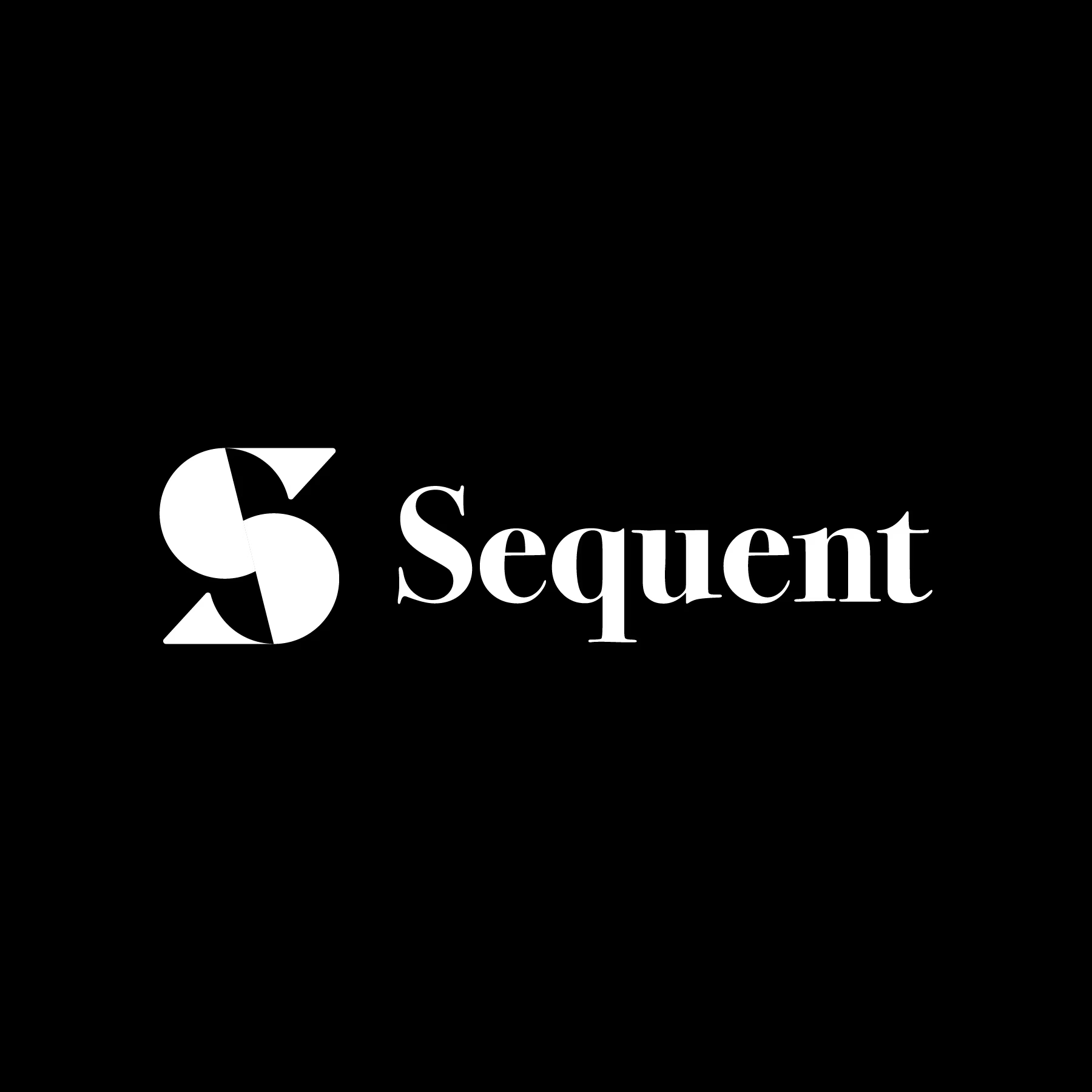
The logomark carries the AI side of the story, grid-built, deterministic, nothing improvised. The wordmark carries the other half, already dressed like it's earned your trust.
Trust is borrowed before it's built. You just have to know who you're borrowing it from.

Amazing work

thank you 😃
The network for creativity
Join 1.25M professional creatives like you
Connect with clients, get discovered, and run your business 100% commission-free
Creatives on Contra have earned over $150M and we are just getting started





Related posts


Marigold was a one-day concept for a design challenge. I set the direction in real photography before generating anything.
That order matters more than people think. If you generate first, you're negotiating with whatever the model offers. If you shoot or choose real references first, you've set a standard the rest of the work has to meet.
The tool didn't set the taste. It matched a bar that already existed.


Great work!, love the colors

🔥 New addition to my portfolio 🔥
Previously I had an SVG mask of my logo in the center with my showreel behind it, but this had a couple of issues. So yesterday I pushed it further and I created a 3D variation, video playing inside it, glass refraction and it's even more beautiful when you click into it.
Take a look; www.grilledpixels.com


the glass refraction on the 3d mark is a cool touch. did you build the interaction with three.js?

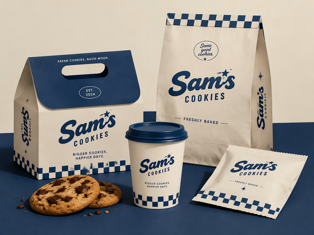
Turning a simple cookie into a memorable brand experience.
A packaging concept created to combine strategy, nostalgia, and a timeless American feel.
#BrandIdentity #PackagingDesign #FoodBranding #CreativeDirection

Beautiful design 😍