The network for creativity
Join 1.25M professional creatives like you
Connect with clients, get discovered, and run your business 100% commission-free
Creatives on Contra have earned over $150M and we are just getting started
Back to feedPost


The network for creativity
Join 1.25M professional creatives like you
Connect with clients, get discovered, and run your business 100% commission-free
Creatives on Contra have earned over $150M and we are just getting started




Related posts

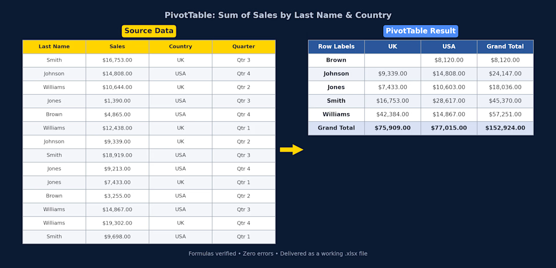
Excel PivotTable — Sales Summary
Client had raw sales data (14 rows across UK/USA, split by quarter) and needed it turned into something actually usable. I cleaned it up and built a PivotTable that breaks total sales down by rep and country, with grand totals for both.
What I did:
Structured the raw data into a proper table (consistent headers, currency formatting)
Built a PivotTable summarizing Sum of Sales by Last Name and Country
Used SUMIFS so the totals update automatically if the source data changes — nothing hardcoded
Checked every formula for errors before delivery
Delivered as a working .xlsx file, ready to plug into a bigger report or dashboard.
If you've got messy sales/ops data sitting in a spreadsheet and need it turned into something you can actually read at a glance, this is exactly the kind of thing I can help with.

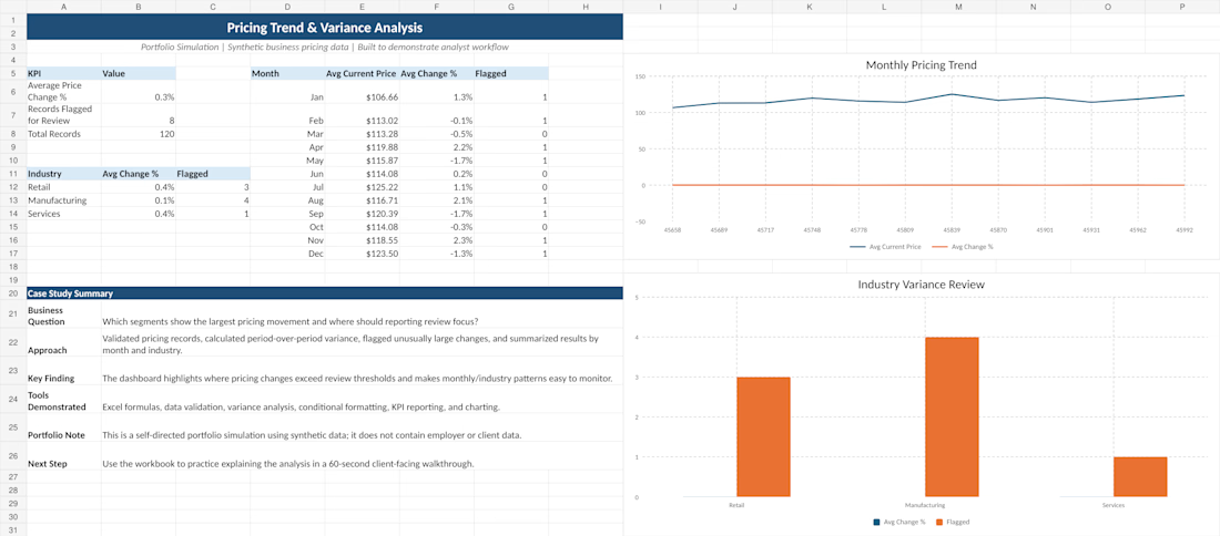
Built a pricing trend and variance analysis using synthetic business data to demonstrate my approach to data validation, trend analysis, anomaly review, and KPI reporting.
I analyzed month-over-month pricing changes, flagged unusual movements, compared performance across industries, and summarized the results in a clear Excel dashboard designed to support business review and decision-making.
Tools used: Excel, data validation, variance analysis, KPI reporting, and data visualization.
This is a self-directed portfolio project created to demonstrate an end-to-end analytical workflow.

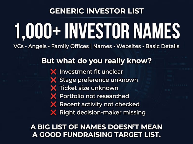
Investor research is not the same as an investor database.
A founder can have 1,000 investor names and still struggle to know who is actually relevant.
That’s where targeted research makes the difference.
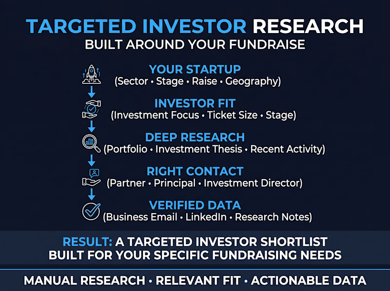
Instead of simply collecting investor names, I research:
• Sector & investment focus
• Funding stage
• Typical ticket size
• Geography
• Relevant portfolio companies
• Recent investment activity
• Decision-makers
• Verified business contacts
The result is a research-backed investor list built around the company’s actual fundraising criteria.
I also offer a small sample first, so the quality and relevance can be reviewed before starting a larger project.

0 voted
0%
3 voted
100%
3 votes
Closed