The network for creativity
Join 1.25M professional creatives like you
Connect with clients, get discovered, and run your business 100% commission-free
Creatives on Contra have earned over $150M and we are just getting started
Back to feedPost
Taste Test

Same brand. Two completely different directions.
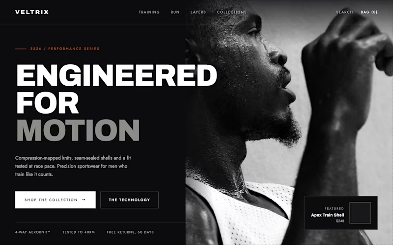
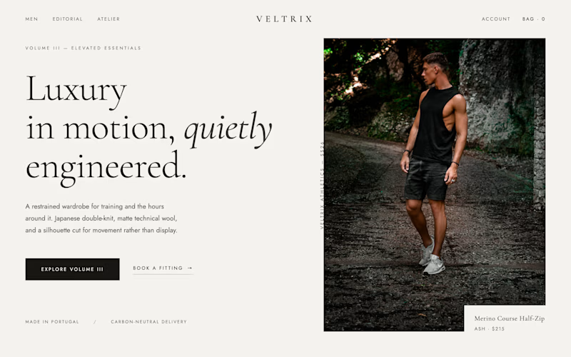
For VELTRIX, I explored:
1: Bold, technical, performance-first
2: Minimal, editorial, luxury-first
The goal wasn’t just to make both look good. It was to see how design changes the way a Shopify brand is perceived.
Which direction works better: 1 or 2?
8 voted
89%
1 voted
11%
9 votes
Closed

Going with One. A name like VELTRIX already reads technical, so the bold dark layout backs up what the name is promising. Two is beautiful but it could pass for a dozen other minimal lifestyle brands.
Exactly. That’s what I like about One too. The visual language feels much more aligned with the VELTRIX name, while Two could fit a lot of premium lifestyle brands.

dark one is looking more elegant..
Agreed. The dark direction feels more distinctive and gives the brand a stronger premium-performance look.


Nice design !
Thanks! Glad you liked it.

Black one
Thanks! Glad you liked it.

Looks like the bold direction is winning so far. 6 out of 7 votes went to option 1.
I can see why too. The darker design gives the brand a stronger performance-focused identity.
The network for creativity
Join 1.25M professional creatives like you
Connect with clients, get discovered, and run your business 100% commission-free
Creatives on Contra have earned over $150M and we are just getting started





Related posts

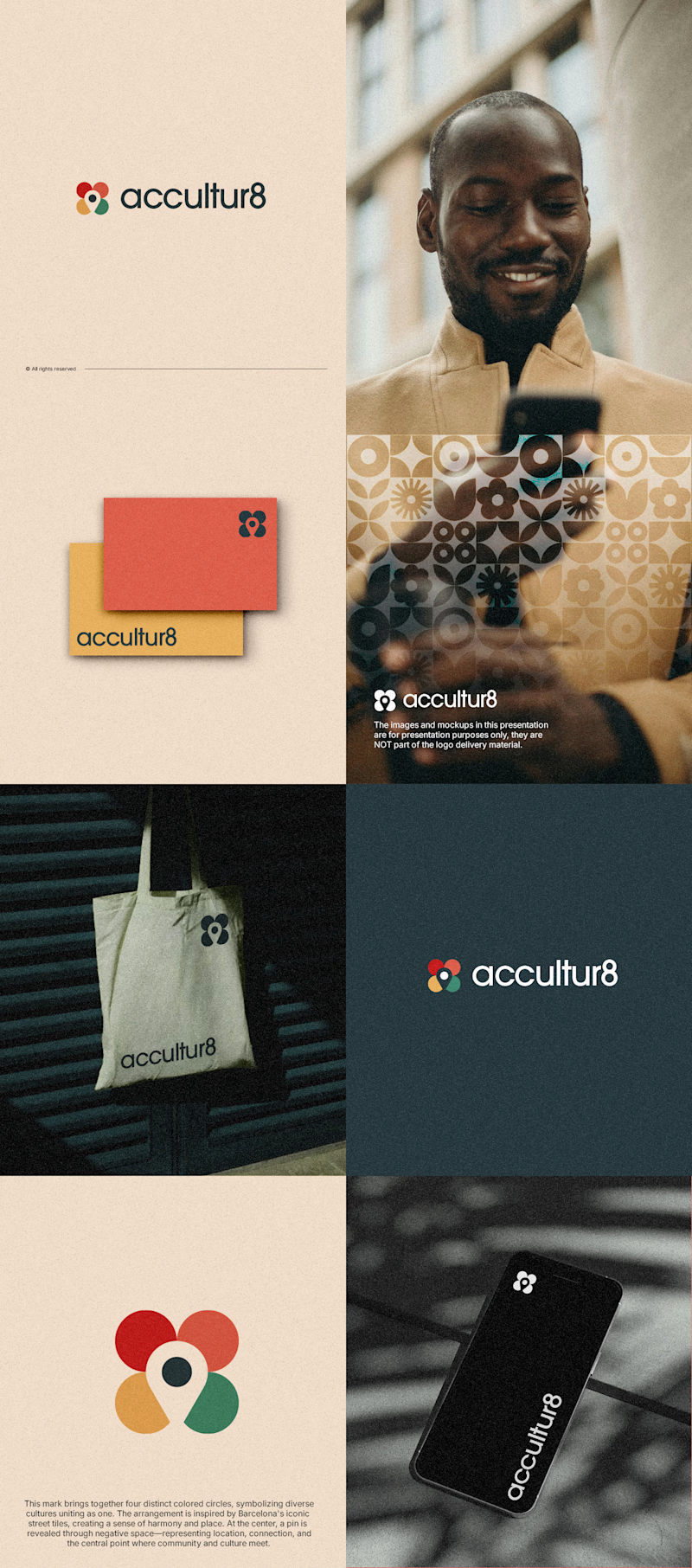
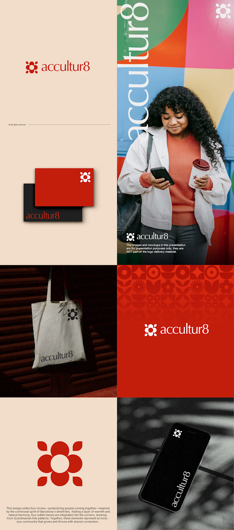
The client really liked Barcelona typical floor tiles, so I presented these logo options. Which one you liked the most?
4 voted
13%
26 voted
87%
30 votes
Closed

Love option 2, which one do you like most ?

Two color directions for an AI governance explainer. A draft AI use policy becoming the questions nobody can answer yet.
20 voted
77%
6 voted
23%
26 votes
Closed

blue for sure 💯

i create a 3D cube component for a Framer website to add creativity. which one is better dark or light? Check the live preview here
22 voted
51%
21 voted
49%
43 votes
Closed

Snap to the position in the last will feel more real