The network for creativity
Join 1.25M professional creatives like you
Connect with clients, get discovered, and run your business 100% commission-free
Creatives on Contra have earned over $150M and we are just getting started
Back to feedPost

Mr. Viet chips ad. Scripted with Claude, filmed with AI.


The network for creativity
Join 1.25M professional creatives like you
Connect with clients, get discovered, and run your business 100% commission-free
Creatives on Contra have earned over $150M and we are just getting started








Related posts


Same brand. Same palette. Two completely different proposals for a real estate developer.
A: An isotype built from blocks. Geometric, precise, the language of construction. It says we build.
B: Custom lettering with movement. Warmer, more editorial. It says we build places you’d want to live in.
36 voted
51%

35 voted
49%

71 votes
Closed

My vote is B, Milagros. Custom lettering with movement has real editorial warmth, which suits a developer selling places people actually want to live in.

The Good Times website is live 👀
Most app sites start with a phone mockup and a list of features. This one starts with the problem, so you can see yourself in it first. The app shows up after that, as the answer.
https://goodtimestimer.com/
Built with Astro.


Great concept

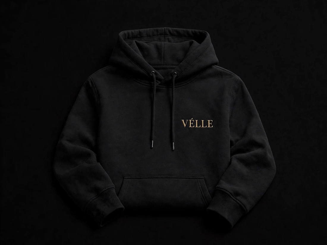
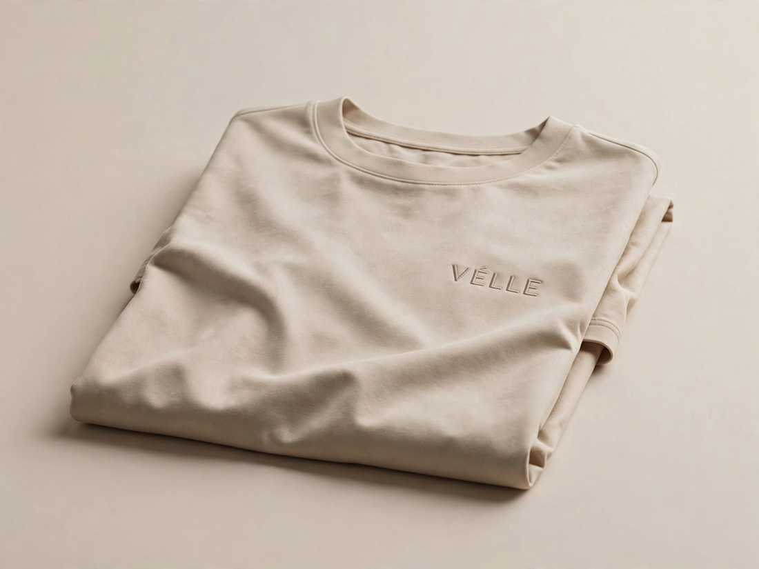
VÉLLE - Minimal Luxury Fashion Brand Identity
A conceptual fashion brand built on quiet luxury and timeless essentials.
What I did:
→ Logo Design (Primary + Secondary)
→ Brand Identity & Color System
→ Product Mockups (T-Shirt, Cap, Tote Bag)
Concept: Less is more. Clean serif typography with subtle accent for premium feel.
Palette: Beige #E8DDD0 / Black #0A0A0A
Full case study on Behance: behance.net/gallery/257321557
Open for freelance projects - DM for fashion branding.


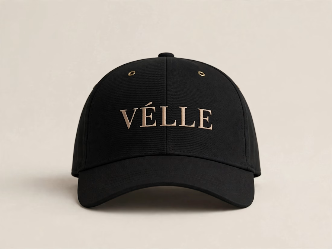
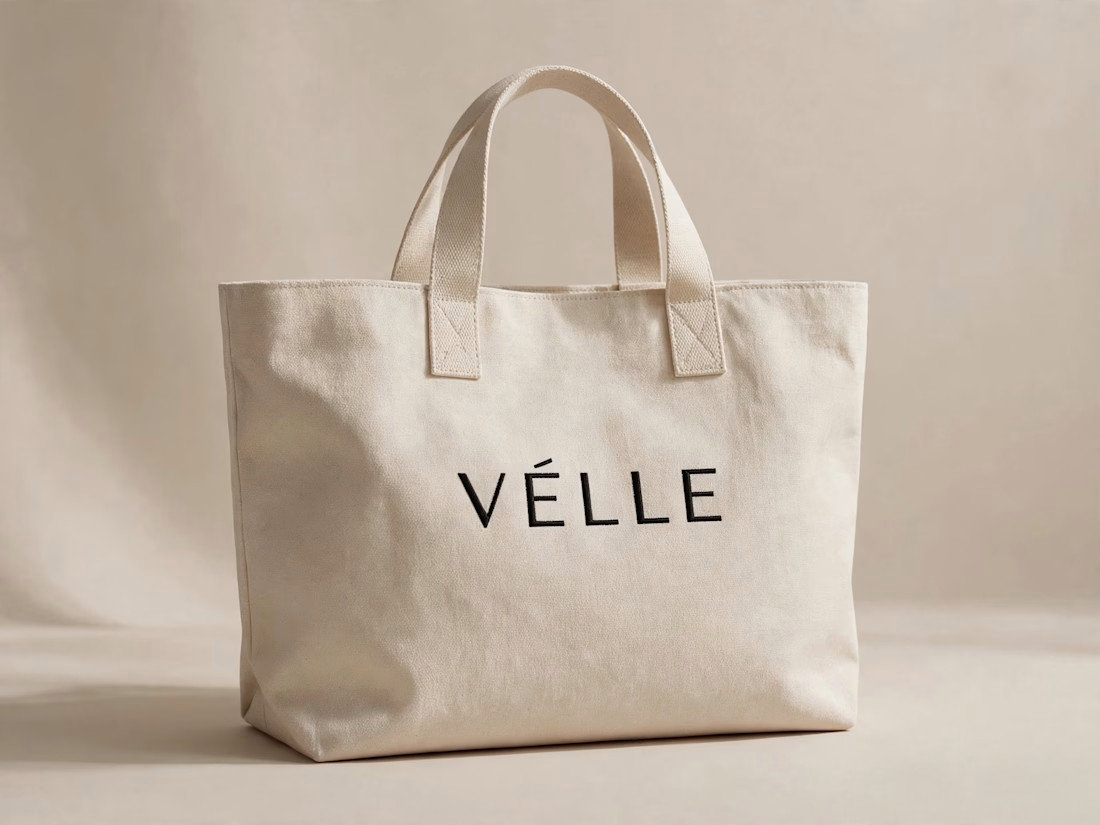

love the minimal direction on this. VÉLLE feels expensive but not loud, the tote and cap mockups are so good