The network for creativity
Join 1.25M professional creatives like you
Connect with clients, get discovered, and run your business 100% commission-free
Creatives on Contra have earned over $150M and we are just getting started
Back to feedPost
Is minimalist design actually simple, or just harder to get right?
Across all my skincare packaging projects, the approach is the same. Minimal does not mean empty. It means every detail works twice as hard. Constraints are what make the design work.
Most of the work happens in what you barely notice. Adjusting typography so it feels editorial, not generic. Letting spacing create hierarchy and make reading effortless. Removing anything that does not serve the product. If it is decorative, bye. 👋🏼
When everything is reduced, every decision becomes visible. There is nowhere to hide.
What is the first thing you remove to make a design feel cleaner?
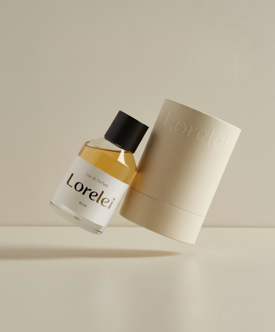
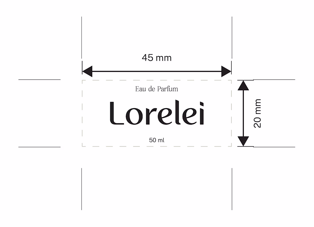
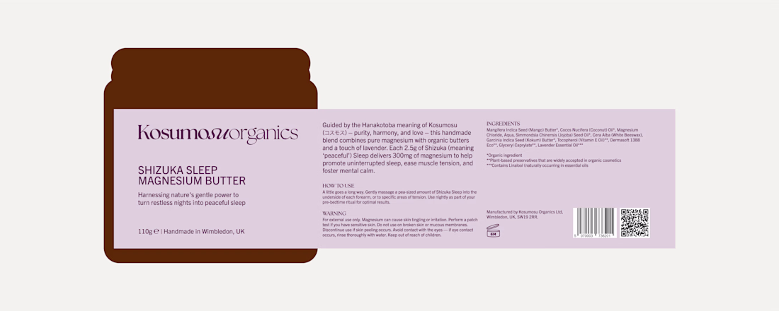
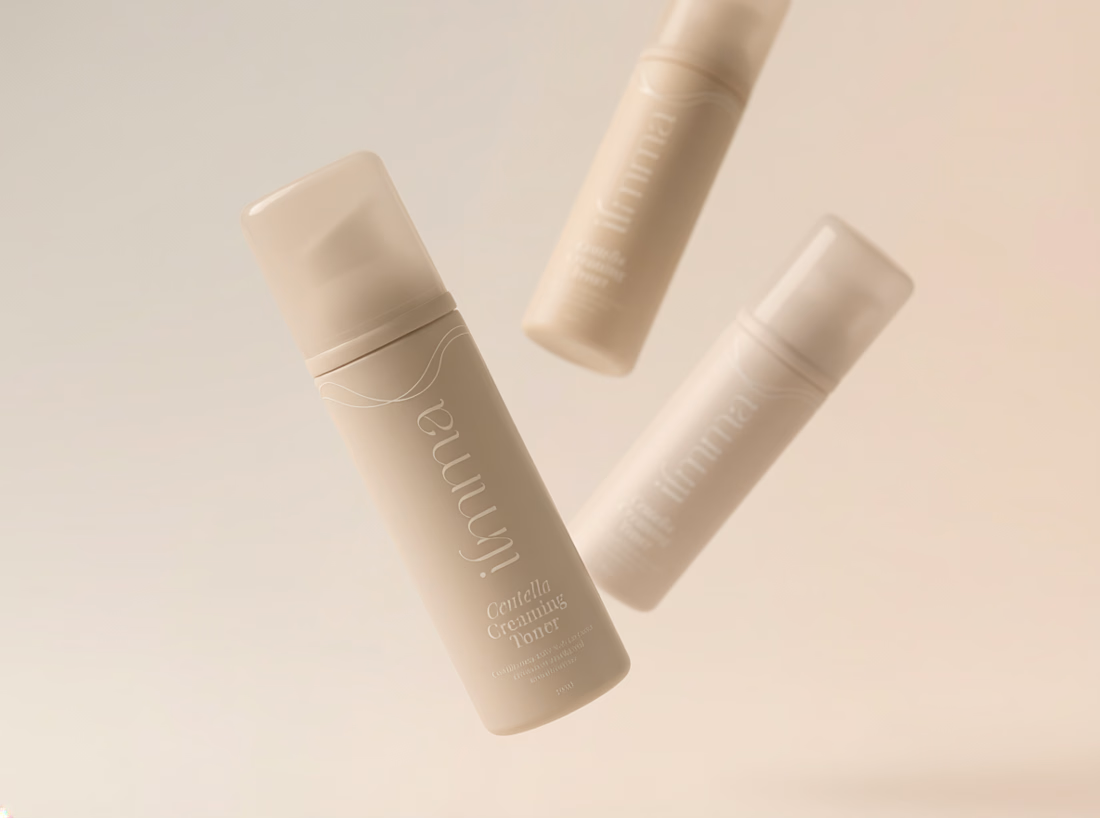
Minimalist done right is actually the hardest skill. Everything here earns its place on the label
Right? Also I feel during design process that everything looks empty, but it's just ENOUGH.
Love those colors!
I appreciate it!
Now, that's what I call premium branding
Thank you!!
Beautiful product design
Nice work
That label is doing so much with so little. Harder to get right than it looks, always. Great work @Anita Autorino
Thank you so much!
The network for creativity
Join 1.25M professional creatives like you
Connect with clients, get discovered, and run your business 100% commission-free
Creatives on Contra have earned over $150M and we are just getting started
Related posts
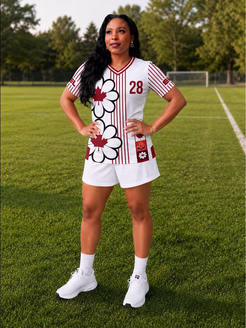
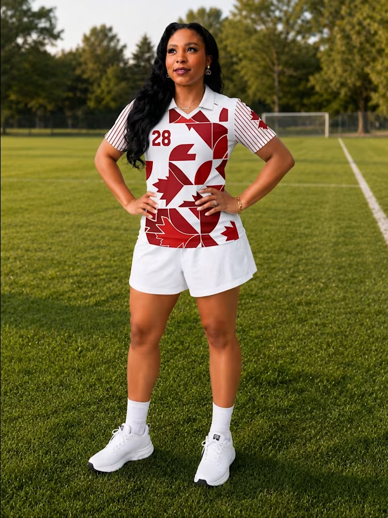
Which jersey design is your favourite? 👀
A or B?
I first designed in Adobe Illustrator and then created the mockups using Adobe Firefly, exploring different layouts, patterns, and details inspired by Canada and my own creative style.
If you're curious about the process, you can watch the full walkthrough here: Designing my own Jerseys 🇨🇦⚽
12 voted
30%
28 voted
70%
40 votes
Closed
B
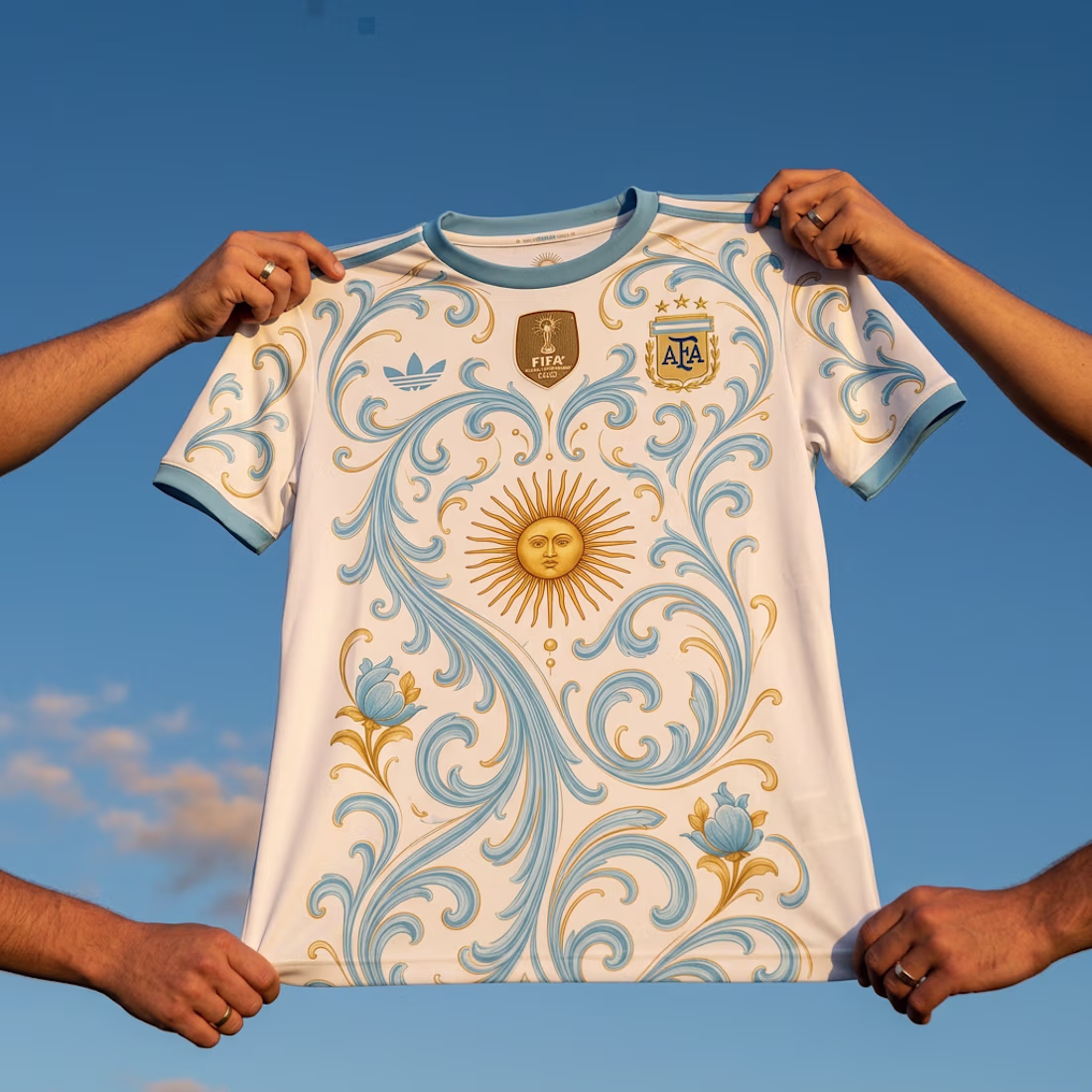
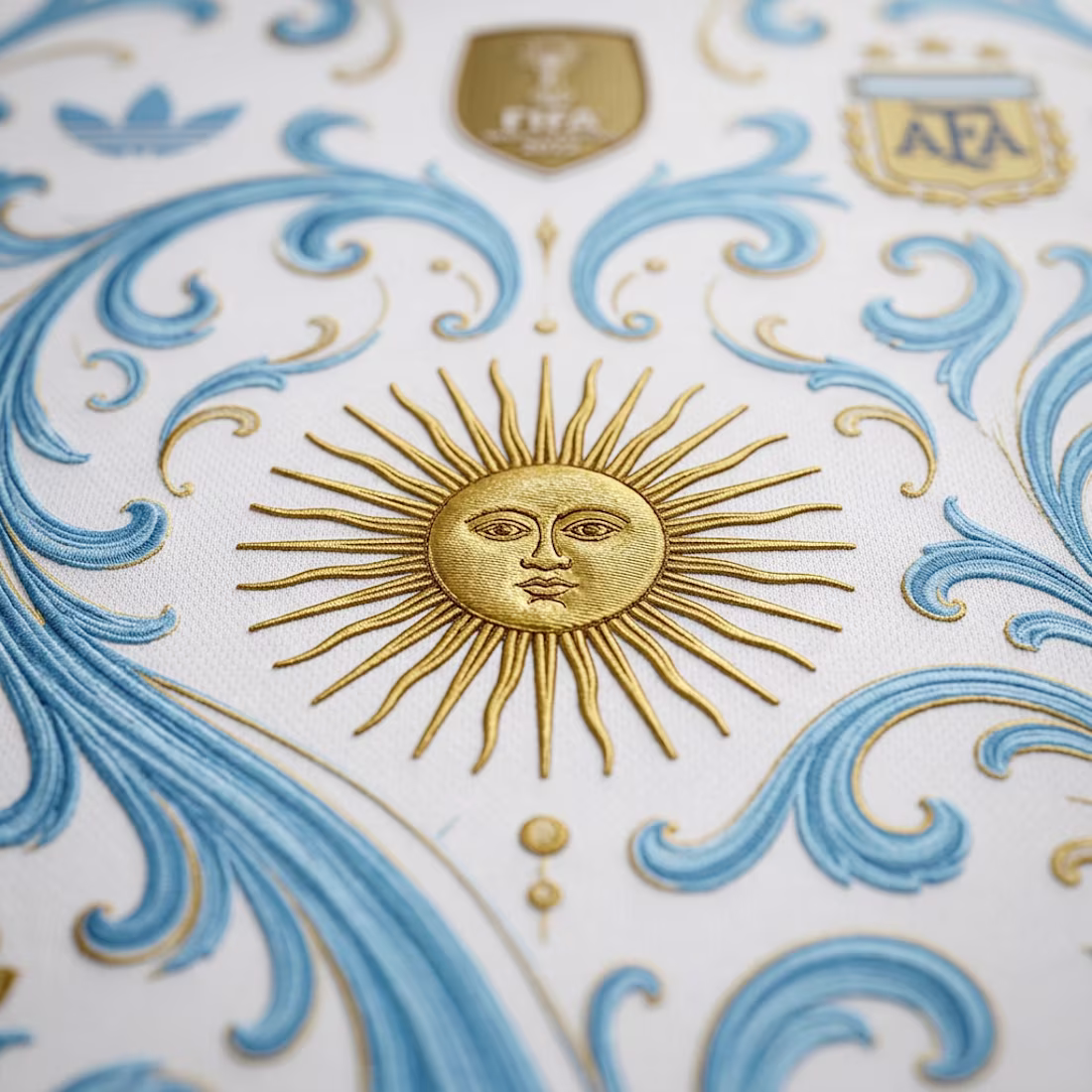
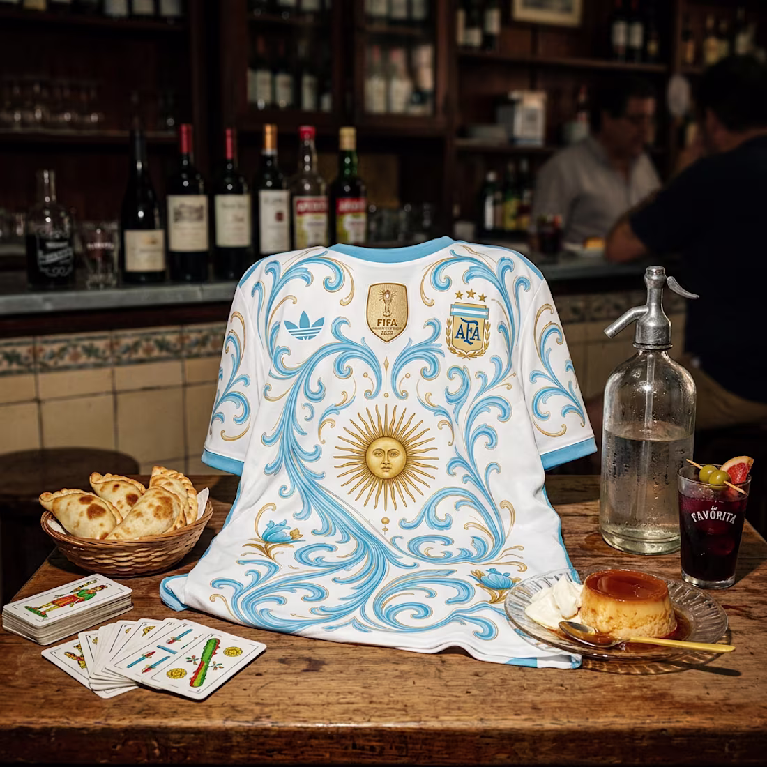
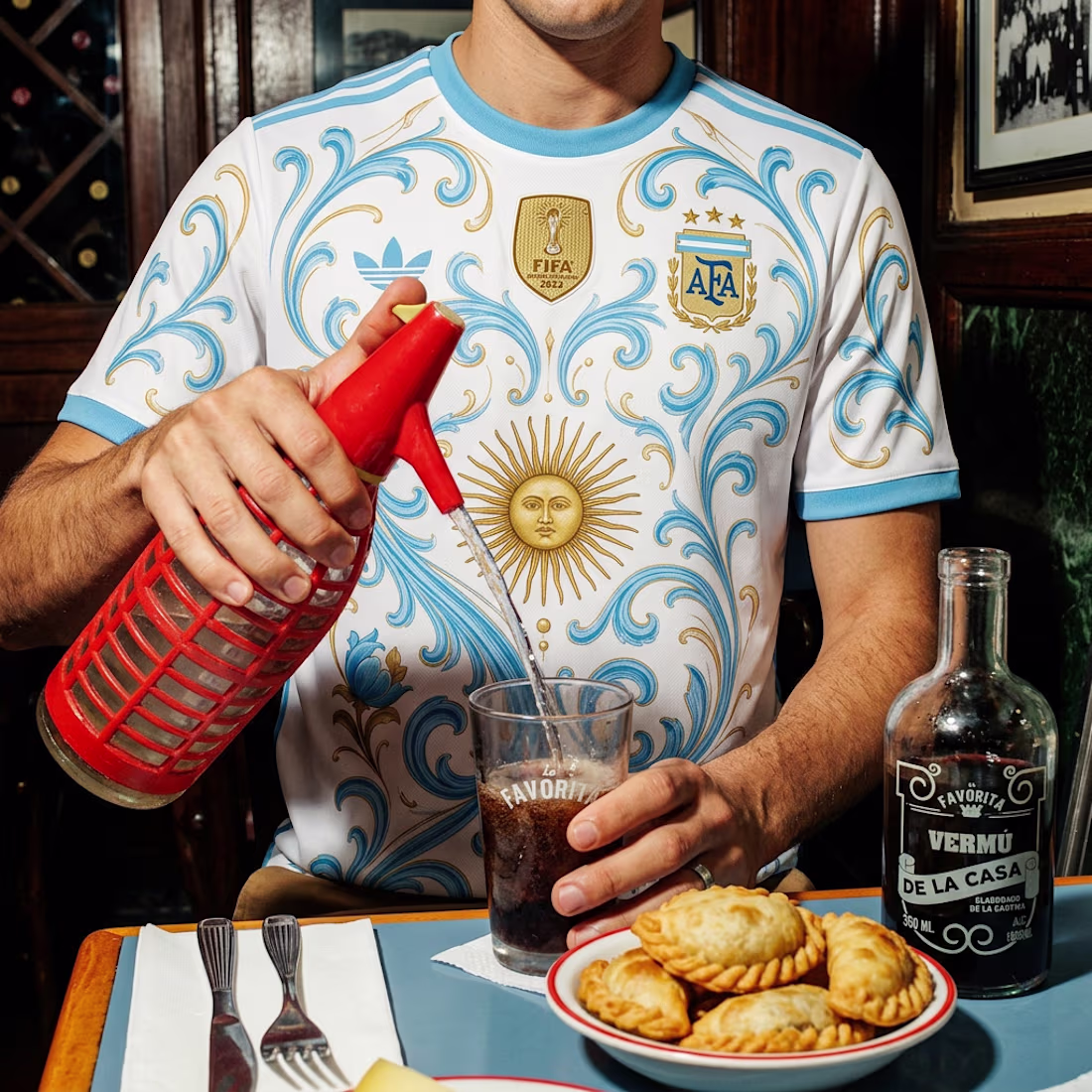
After yesterday's heart attack of a match... 😅🇦🇷 I couldn't resist redesigning Argentina's World Cup jersey.
I took inspiration from fileteado porteño, the Sol de Mayo, and placed the kit in some of the most Argentine settings I could think of, from a classic bodegón to everyday scenes that feel like home.
Football is part of our identity, so why shouldn't our design be too?
Esooo! 🩵🤍🩵 Nice work 😊
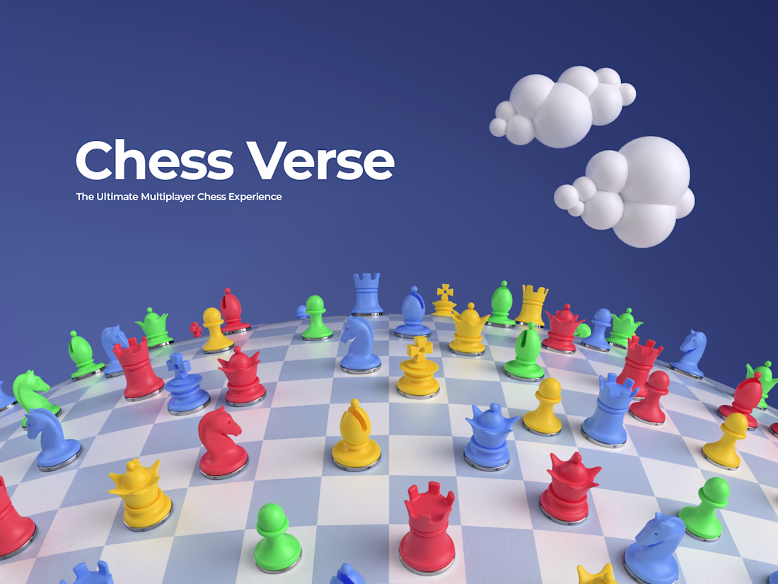
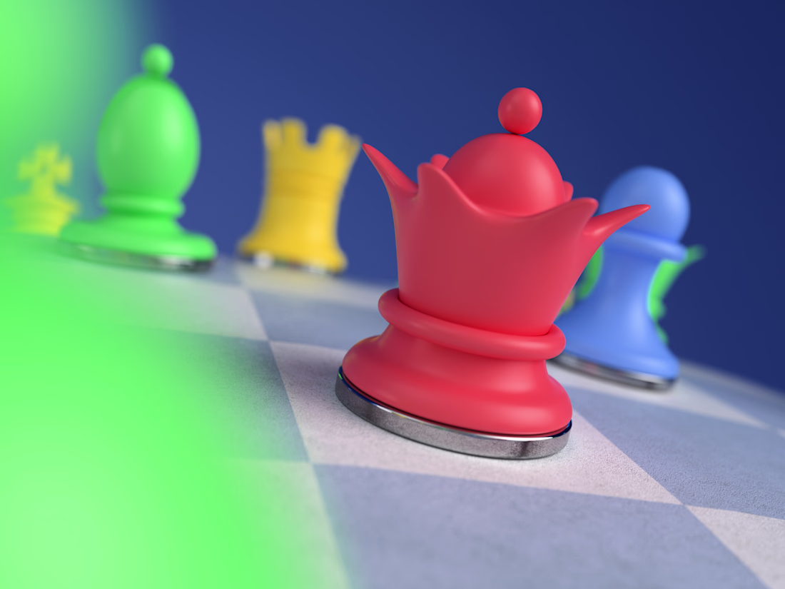
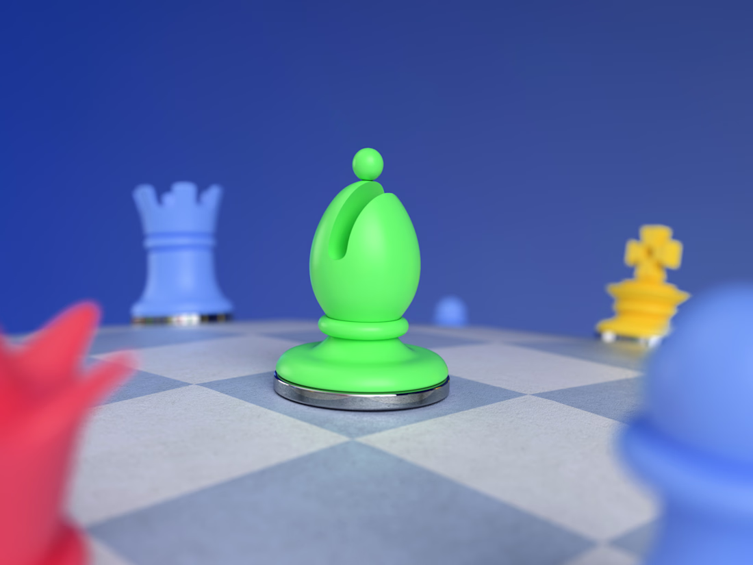
I created complete chess set and website visuals for Chess Verse.

So cute!
Challenges
View allTrending
Claude
Claude has entered the design space. How are you using Claude Design?
Contra University
Learn from expert creatives how to earn more using next-gen AI tools.
fifaworldcup2026
The World Cup is here and the whole world's watching. How are you designing for the world stage?
creativeaiflow
Creative AI workflows are evolving. What tools do you use, and what are their strengths and weaknesses?
freelancerlife
Freelancer life is wins, pivots, and everything in between. What’s yours right now?