The network for creativity
Join 1.25M professional creatives like you
Connect with clients, get discovered, and run your business 100% commission-free
Creatives on Contra have earned over $150M and we are just getting started
Back to feedPost

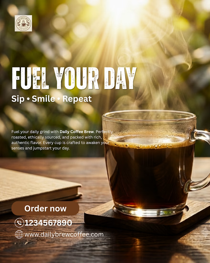
Here is the Design Breakdown:
1. Strong Visual Hierarchy
The first thing viewers notice is the bold headline "FUEL YOUR DAY."
2. Strategic Product Placement
The coffee cup is positioned on the right side, following the design rule.
3. Lighting Creates Emotion
Warm golden sunlight instantly creates a cozy morning atmosphere.
4. Color Psychology
• Rich coffee brown- represents coffee
• Warm golden yellow- represents energy
• Soft white typography- represents maximum readability.
5. Background Blur
It removes distractions while adding depth, making the coffee cup visually pop from the composition.
6. Call-to-Action
The "Order Now" button uses a rounded brown shape that feels approachable and blends naturally with the coffee theme.
📩Good advertising sells emotions before products.
✅Your brand deserves visuals that leave a lasting impression. Let's work together.
The network for creativity
Join 1.25M professional creatives like you
Connect with clients, get discovered, and run your business 100% commission-free
Creatives on Contra have earned over $150M and we are just getting started
Trending
retrofuturism
Share your favorite designs from the past exploring the distant future. Or your own take on the aesthetic 🚀
halftone
Dots. Texture. Grain. Let's see your designs using the halftone technique.

Midjourney
Creatives are showing off what they're making with Midjourney.
colorgrade
Video editors sound off: How do you enhance the mood of your video in color grading?
Related posts

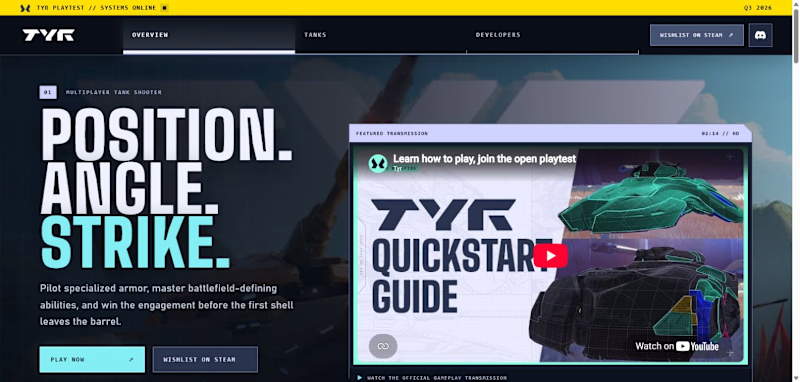
I’ll share more, but I’m creating a promotional site for a game. Which one do you think is instantly more appealing?
5 voted
45%

6 voted
55%
11 votes
Closed

Upgoating the new Version

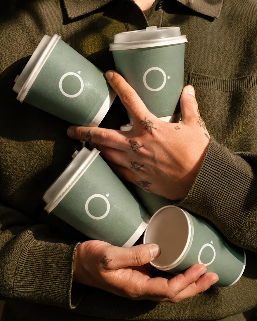
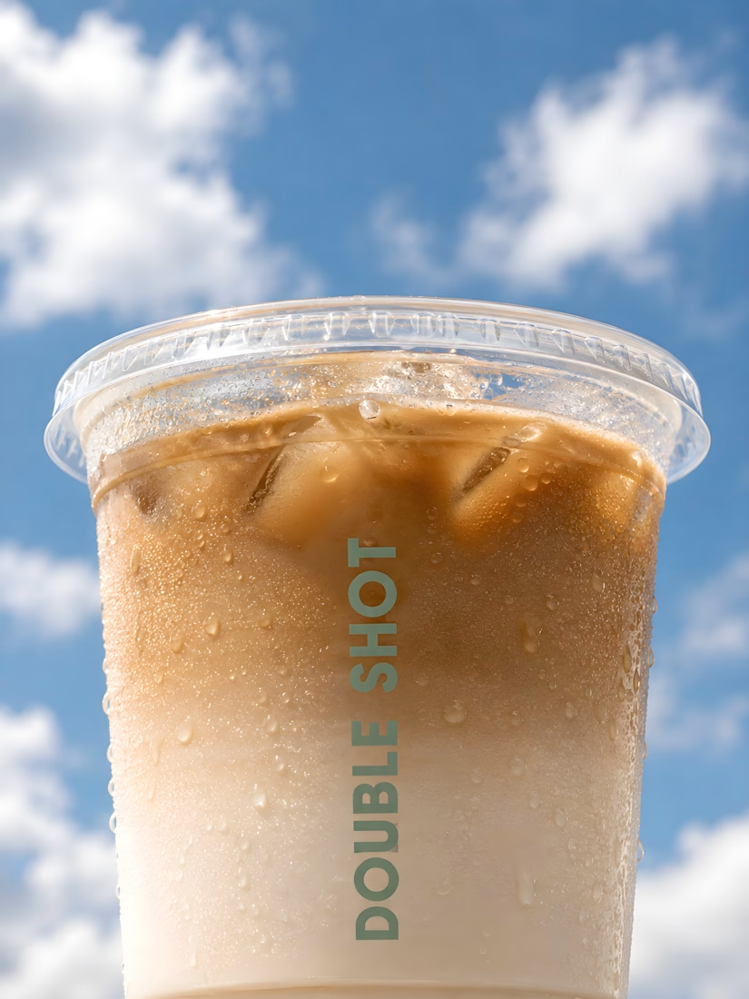
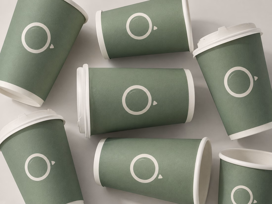
Created a modern coffee brand for Double Shot, featuring minimalist packaging, premium mockups, and photorealistic marketing visuals.


Super work, Umar

Beauty deserves more than a display. it deserves a story in motion. Great product design doesn't just showcase beauty, it makes people feel it. Every frame is crafted with purpose.

such a refreshing energy to this, nice!