The network for creativity
Join 1.25M professional creatives like you
Connect with clients, get discovered, and run your business 100% commission-free
Creatives on Contra have earned over $150M and we are just getting started
Back to feedPost


WUP — Keep Moving Up. ↑
A bold identity built around a simple idea: progress.
The upward symbol represents growth, ambition, and the constant drive to move forward.
The minimal form keeps the logo clean, modern, and instantly recognizable.
Every detail is designed to communicate confidence, direction, and momentum.
WUP isn’t just a logo. It’s a visual reminder to keep moving forward.
Looking for a distinctive identity for your brand? DM me and let’s build something memorable.


The network for creativity
Join 1.25M professional creatives like you
Connect with clients, get discovered, and run your business 100% commission-free
Creatives on Contra have earned over $150M and we are just getting started











Related posts



Aryna, that golden symbol pops so nicely against the plum background ✨

It’s been a minute since my last post here on Contra.
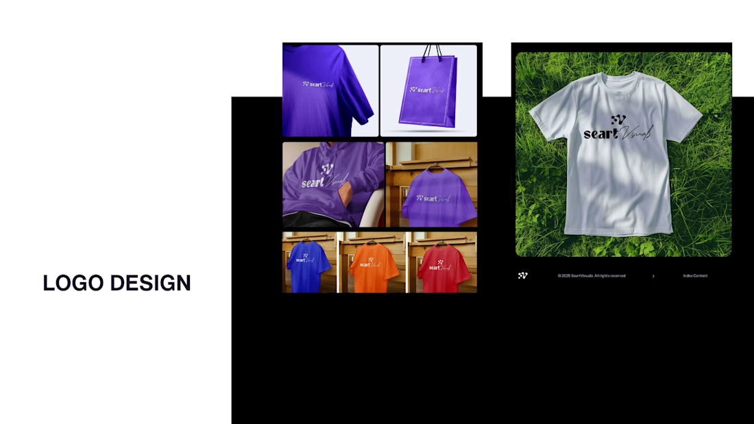
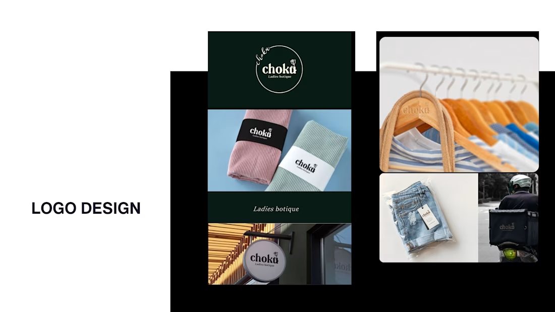
While my main focus usually lives in photo editing and digital design, I was digging through the archive recently and thought it’d be fun to share a couple of branding projects from the past:
Slide 1: Seart Visuals apparel & merchandise branding (1 year ago)
Slide 2: Choku Ladies Boutique identity and mockups (2 years ago)
Brand identity isn't my everyday lane, but tackling projects like these taught me a lot about visual consistency across different mediums. I’d love to hear your thoughts or see any feedback from fellow designers. Great to connect with the community again.


That's really great typography logo design❤️❤️

Behind the scenes of the Treal Studio brand film.
Built in one week, from creative direction to sound design.


Love the overall feel, looks amazing 👌🏼