The network for creativity
Join 1.25M professional creatives like you
Connect with clients, get discovered, and run your business 100% commission-free
Creatives on Contra have earned over $150M and we are just getting started
Back to feedPost
Taste Test
👀 Before vs After — Which UI would you choose?
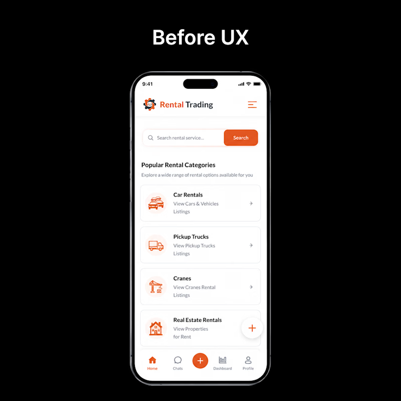
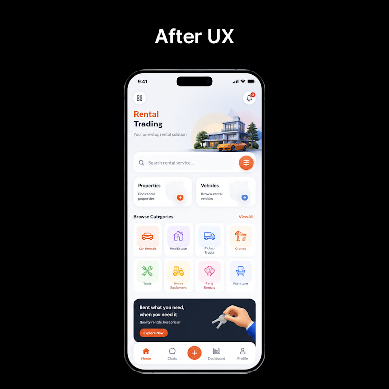
Every redesign is more than just a visual upgrade—it's about creating a smoother, faster, and more intuitive experience.
🅰️ Before: Functional, but cluttered and harder to navigate.
🅱️ After: Cleaner layout, improved hierarchy, better usability, and a modern visual style.
If you were using this app for the first time, which version would you prefer?
👇 Vote in the comments:
❤️ BEFORE or 🔥 AFTER

1 voted
4%
24 voted
96%
25 votes
Closed

Clean Approach! Great

Thanks 🙌

so nice!
Thank you!!

Pure design bliss.
Thank you!

AFTER, no contest. The before version crams categories, a promo banner and a listings feed into one screen with no breathing room. The after version gives the hero image space to actually sell the destination first.

After!!!!

After definitely has a clear direction and strong UX

Both look clean, but I slightly prefer the second design. The visual hierarchy feels stronger, and the layout makes the important information easier to scan. Nice work! 👏

Thank you!!


We always love to see more color 😃

I'll go with the After.
The layout is well organized and user friendly
Thank you!

Nice work @Gopi UI/UX + AI
Thank you!!


I love the new design
Thank you so much! I'm really glad you love the new design. 😊

Amazing one
Thank you!

I'd choose After. The stronger visual hierarchy makes the interface easier to scan, which is where usability really improves. What often gets underestimated is that good UI isn't about adding more elements it's about helping users make decisions with less effort. Which user pain point had the biggest influence on this redesign?

Love this
Thank you!

After for sure. It feels much easier to navigate🔥

Definitely the After.
The network for creativity
Join 1.25M professional creatives like you
Connect with clients, get discovered, and run your business 100% commission-free
Creatives on Contra have earned over $150M and we are just getting started
Trending
retrofuturism
Share your favorite designs from the past exploring the distant future. Or your own take on the aesthetic 🚀
halftone
Dots. Texture. Grain. Let's see your designs using the halftone technique.

Midjourney
Creatives are showing off what they're making with Midjourney.
colorgrade
Video editors sound off: How do you enhance the mood of your video in color grading?


Related posts

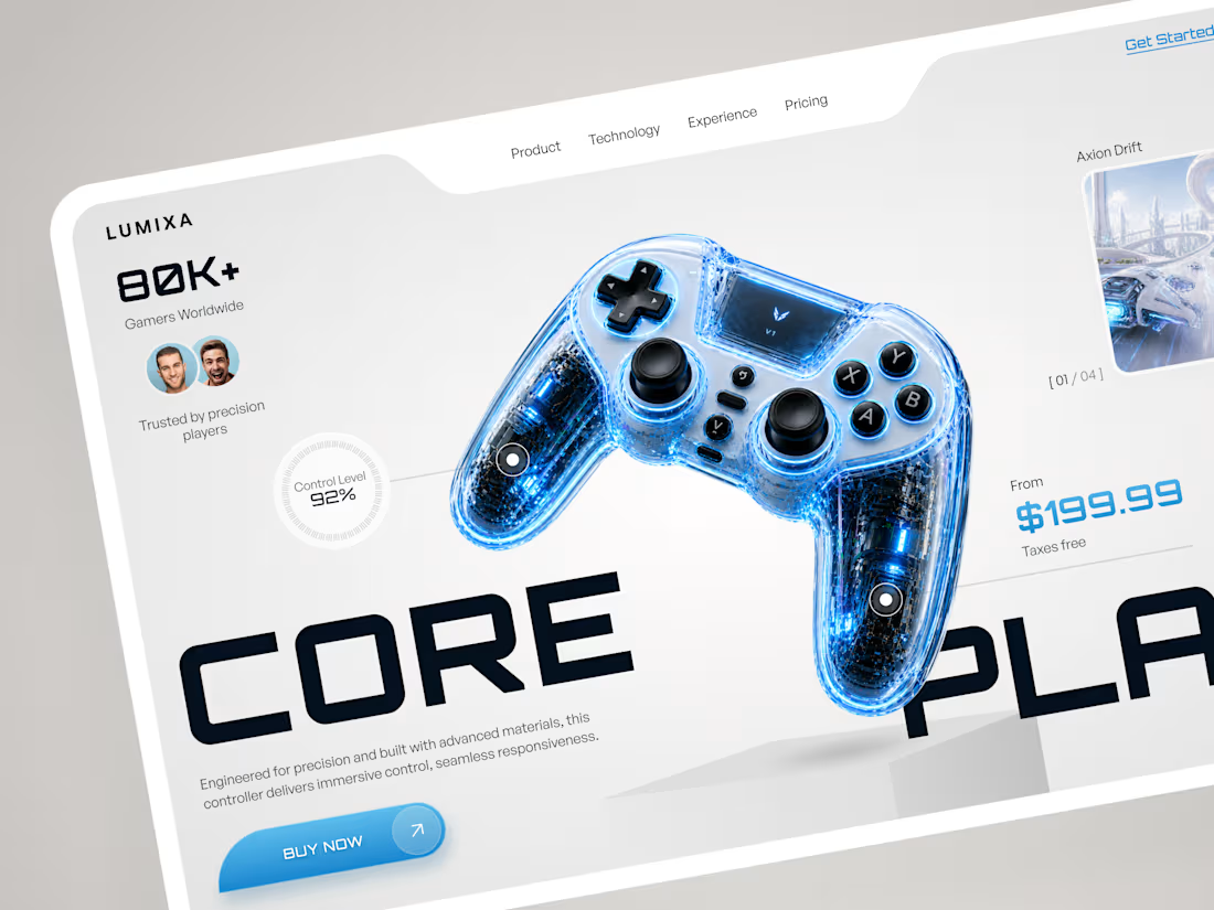
LUMIXA — Gaming Controller Product Landing Page 🎮⚡
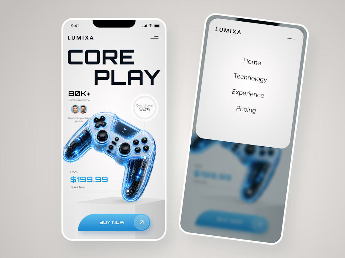
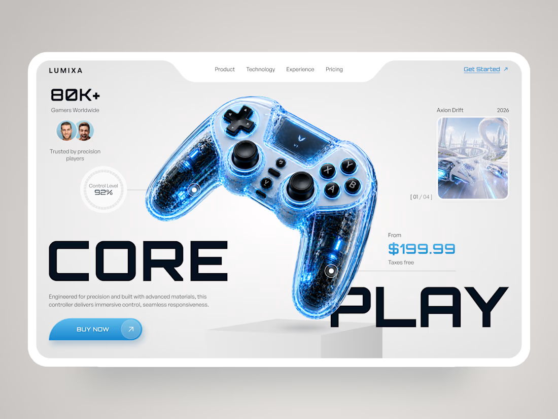
LUMIXA is a futuristic product landing page concept created for a premium gaming controller built around precision, performance, and immersive play.
The goal was to make the product itself the center of the experience while giving the interface a clean, high-tech character. A minimal white canvas, electric blue accents, oversized typography, and detailed 3D product visuals create a strong gaming aesthetic without making the page feel overloaded.
Special attention was given to:
• a product-first hero section with the controller as the main visual focus;
• bold typography and asymmetric composition to create a sense of movement;
• key product information like pricing, control level, and social proof placed directly within the buying journey;
• interactive-style product hotspots that emphasize the controller’s technology and features;
• gaming imagery integrated into the interface without distracting from the product;
• a clear Buy Now CTA designed to stay visually prominent;
• a responsive mobile experience that keeps the same futuristic identity on smaller screens 📱;
• a simplified mobile navigation for quick access to technology, experience, and pricing.
The result is a sharp, product-focused eCommerce experience that combines gaming energy with premium product presentation — designed to make the controller feel as advanced as the technology behind it. ✨
Looking to launch a gaming or tech product with a digital experience that actually feels like the product? Let’s build it. 🚀



Looks amazing! 🔥


"I'm watching everything" sounds like "I'm watching you" 😊 😂
Great design!

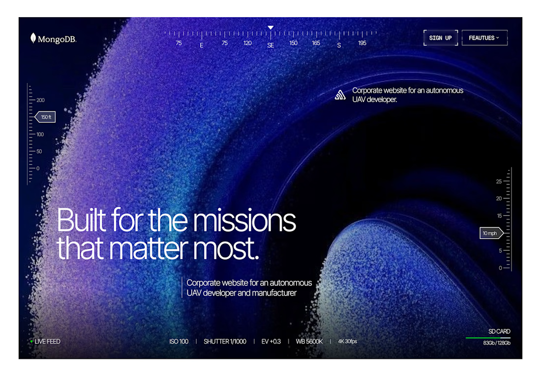
Hero exploration in framer



beautiful work, this is enrapturing!