The network for creativity
Join 1.25M professional creatives like you
Connect with clients, get discovered, and run your business 100% commission-free
Creatives on Contra have earned over $150M and we are just getting started
Back to feedPost
I built this website using Claude Design, but I don’t want polite feedback.
The goal was to create a premium, editorial-style website for Always Published, a boutique podcast management company.
Instead of using the typical bright “tech agency” look, I focused on:
• a dark, luxury visual direction
• strong typography
• clear service packages
• a simple path to booking a discovery call
• an experience that feels more like a premium brand than a standard podcast agency
Here’s a short preview of the website.
What was your honest first impression?
Does it feel premium and trustworthy, or is there something you would change first?

The dark editorial direction feels much more fitting for a boutique podcast studio than the usual bright SaaS look. Which part of the layout do you think still needs the toughest critique?

I’m curious how you would improve this design using Claude Design. Is it possible to add any plugins or MCP servers that could help Claude create better designs? I’d also love to learn how to write more effective and precise prompts to achieve even better results.
The network for creativity
Join 1.25M professional creatives like you
Connect with clients, get discovered, and run your business 100% commission-free
Creatives on Contra have earned over $150M and we are just getting started
Related posts

S32 Went Live.
Just built their site. typography-led micro-interactions, clean as their investment thesis. They back a small number of founders and go all in. The site had to say the same thing without saying it.
Live site: https://www.s32.com/



Nice work👏👏


Editorial Pitch Deck System is almost ready!
Both versions will be available.. but which one do you prefer?
15 voted
63%
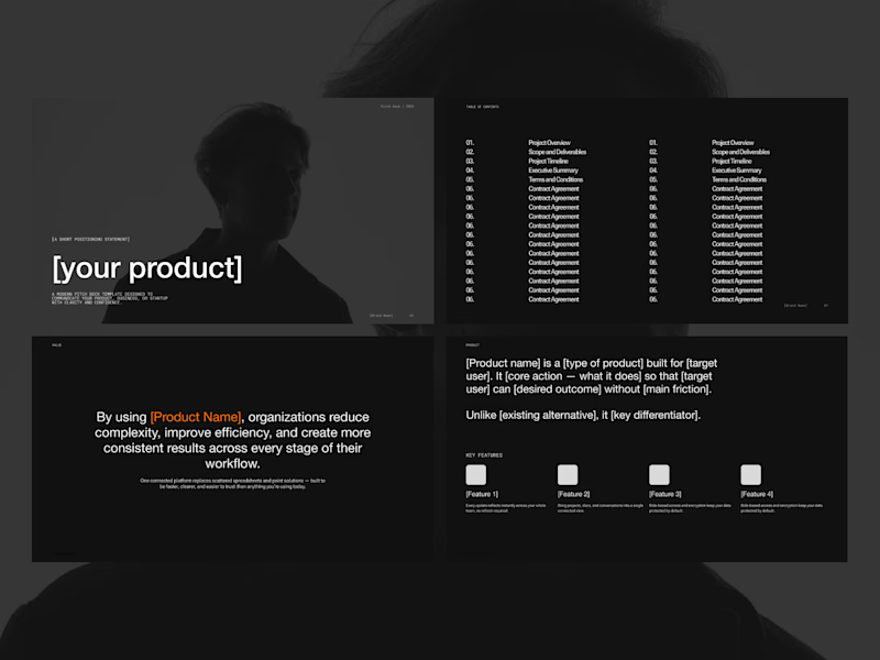
9 voted
37%
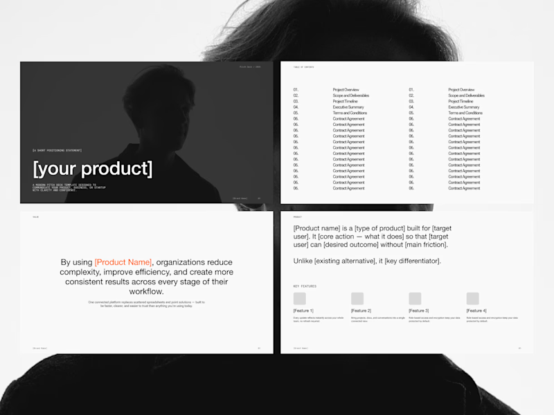
24 votes
Closed

Both are good Milagros

I recently designed a Landing Page for Zitro Digital Banking for the liquidation of Assets.
Which mode is better? White or Dark?
5 voted
33%
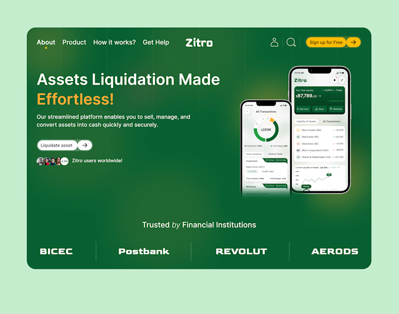
10 voted
67%
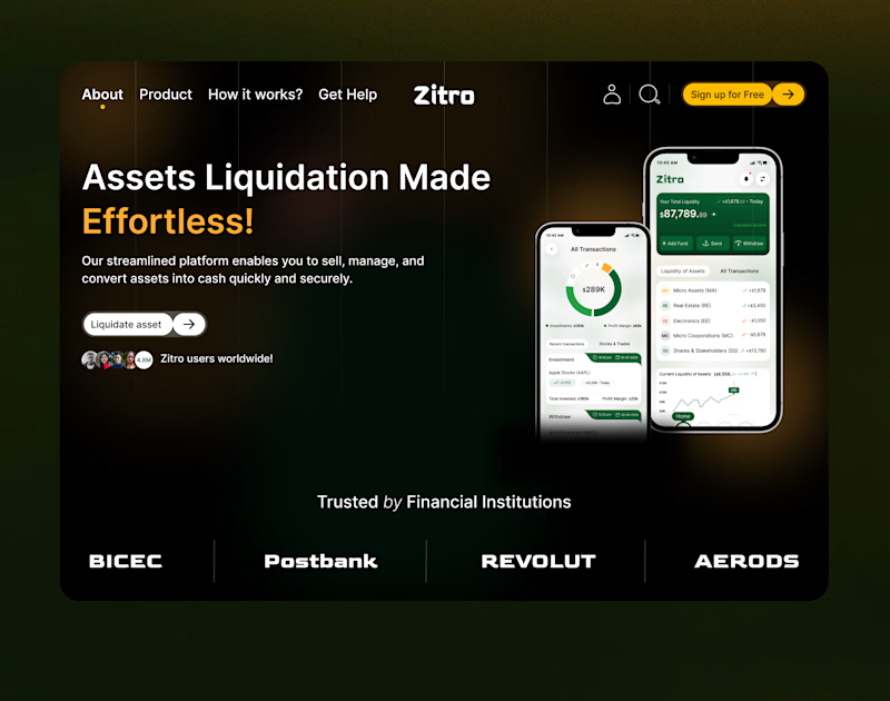
15 votes
Closed

Dark mood












Trending

Claude
Claude has entered the design space. How are you using Claude Design?

Contra University
Learn from expert creatives how to earn more using next-gen AI tools.
creativeaiflow
Creative AI workflows are evolving. What tools do you use, and what are their strengths and weaknesses?
freelancerlife
Freelancer life is wins, pivots, and everything in between. What’s yours right now?