The network for creativity
Join 1.25M professional creatives like you
Connect with clients, get discovered, and run your business 100% commission-free
Creatives on Contra have earned over $150M and we are just getting started
Back to feedPost
I built this website using Claude Design, but I don’t want polite feedback.
The goal was to create a premium, editorial-style website for Always Published, a boutique podcast management company.
Instead of using the typical bright “tech agency” look, I focused on:
• a dark, luxury visual direction
• strong typography
• clear service packages
• a simple path to booking a discovery call
• an experience that feels more like a premium brand than a standard podcast agency
Here’s a short preview of the website.
What was your honest first impression?
Does it feel premium and trustworthy, or is there something you would change first?


The dark editorial direction feels much more fitting for a boutique podcast studio than the usual bright SaaS look. Which part of the layout do you think still needs the toughest critique?

I’m curious how you would improve this design using Claude Design. Is it possible to add any plugins or MCP servers that could help Claude create better designs? I’d also love to learn how to write more effective and precise prompts to achieve even better results.
The network for creativity
Join 1.25M professional creatives like you
Connect with clients, get discovered, and run your business 100% commission-free
Creatives on Contra have earned over $150M and we are just getting started

Challenges
View all


Related posts


30+ pages, 3 weeks, and honestly one of my favorite projects in a while.
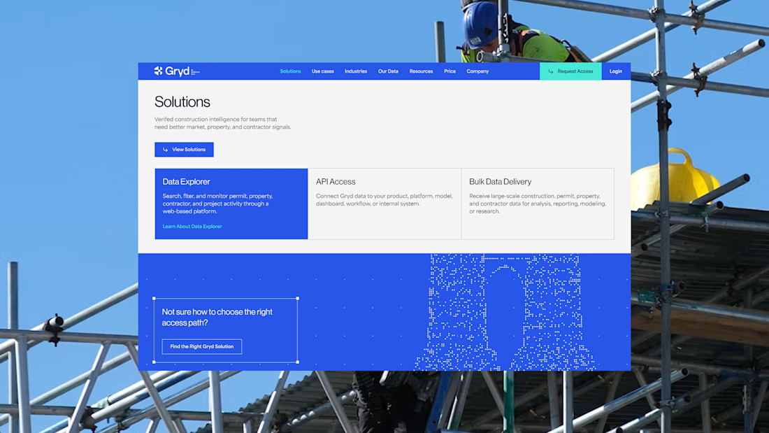
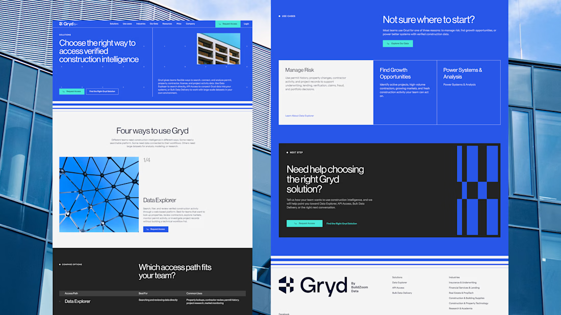
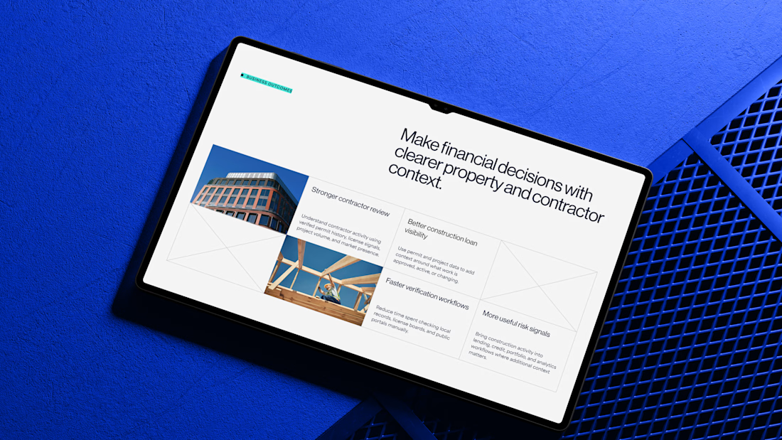
I'd been wanting to design something more tech-driven for a long time, and Gryd, a platform turning construction permit data into intelligence for insurers, lenders, and real estate teams, was exactly that.
Wireframes first, then UI across every page, fully responsive, with animation on the key screens, all built inside the brand the client had already set.
Case study's on my profile.

Clean design 😍


You spend 6 figures on a brand tracking agency. They spend three months "running the wave." You get a 100-page slide deck that tells you what happened in Q2 while you’re already halfway through Q3.
That’s a post-mortem, not a strategy.
We built the identity and product framing for Timelaps to represent the opposite: continuous visibility.
Research-grade data from 4,000+ consumers, flowing in real-time. No "waves", no dusty decks, just an always on dashboard that shows you if your marketing is actually landing before the budget is gone.
If you’re still waiting 90 days to see if your brand is growing, you’re flying blind.


I have to say, You leave an ipression everytime you appear in my feed. You have got great taste Daniel💪