The network for creativity
Join 1.25M professional creatives like you
Connect with clients, get discovered, and run your business 100% commission-free
Creatives on Contra have earned over $150M and we are just getting started
Back to feedPost
Taste Test

Design isn't just about making something look good it's about making people stop, pay attention, and take action.
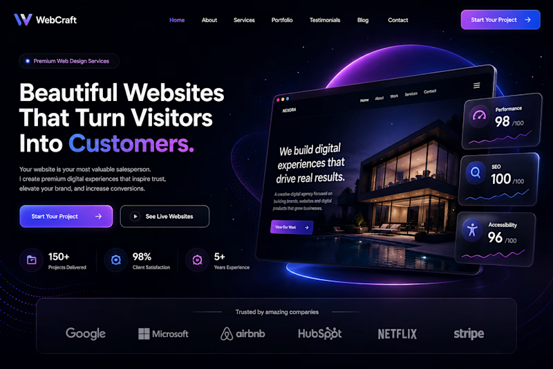
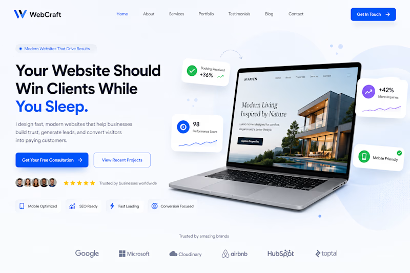
I'm currently designing a new website, and I've created two different hero section concepts. Before I move forward, I'd love to hear what you think.
Which one would make you stay on the page longer?
1️⃣ Light & Clean
2️⃣ Dark & Premium
Don't just vote; tell me why. Is it the layout, typography, colors, spacing, or overall feel?
Your feedback will help shape the final design, and I'm genuinely curious to see how designers and business owners view these two directions.
👇 Drop 1 or 2 in the comments and let me know what influenced your choice.
1 vote
Ends in 1d

A. The case-study screen has more contrast, and the proof numbers sit close to the main promise. I’d keep that structure even if you soften the purple.
The network for creativity
Join 1.25M professional creatives like you
Connect with clients, get discovered, and run your business 100% commission-free
Creatives on Contra have earned over $150M and we are just getting started
Trending

Claude
Claude has entered the design space. How are you using it?

Contra University
Learn from expert creatives how to earn more using next-gen AI tools.
Brand Design
The best brand designers are on Contra. Scroll to see what's trending in brand design. What are you building?
creativeaiflow
Creative AI workflows are evolving. What tools do you use, and what are their strengths and weaknesses?
freelancerlife
Freelancer life is wins, pivots, and everything in between. What’s yours right now?





Related posts


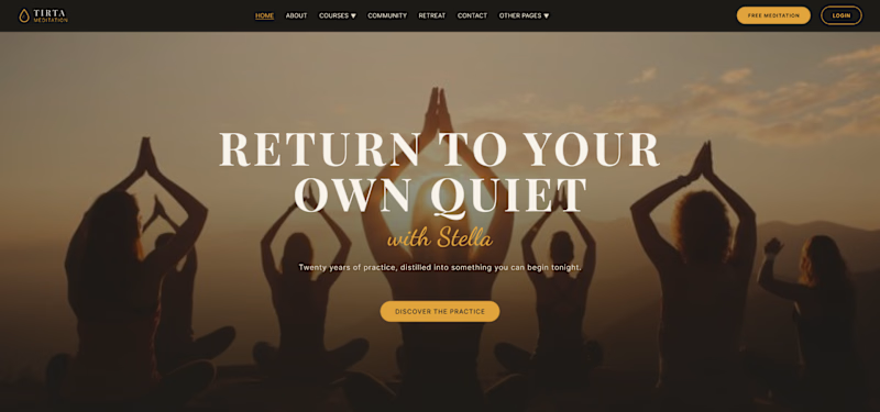
Static or video? The hero section decides in three seconds. Same layout, same headline, same colors. Only the background changes.
01 Static. Loads instantly. Keeps the focus on typography. Nothing competes with the message.
02 Video. Sells the atmosphere before a single word is read. You don't read about the retreat, you're already there.
The trade-off is real: video costs loading time and can pull attention away from the CTA. Static is safer, but safer isn't always stronger.
For a wellness brand built on atmosphere, which one would you pick: 01 or 02?👇


12 voted
22%
42 voted
78%
54 votes
Closed

I feel more focused on landing page rather than just scrolling to the next section

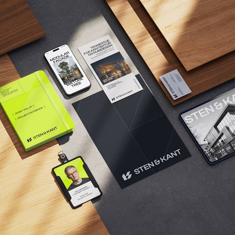
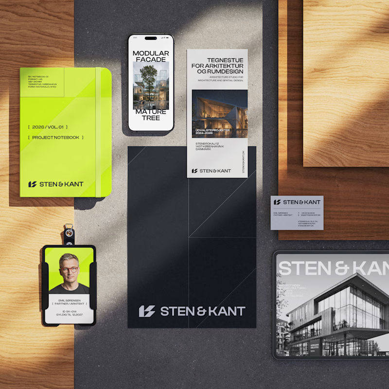
I was working on the stationery for Sten & Kant, an architectural identity project, and couldn’t decide between these two mockups. The designs are identical, but the camera angles create a completely different feel!
Which one do you prefer? Feedback is always appreciated.


45 voted
61%
29 voted
39%
74 votes
Closed

Angled looks good

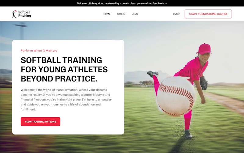
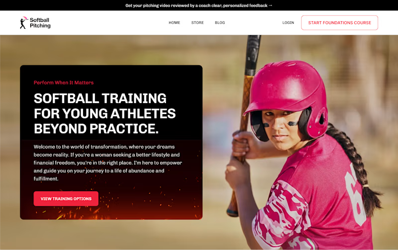
Testing hero sections for a softball training Kajabi site- which one hits harder?
.
.
I’m on X too, mostly thinking out loud ideas, problems, and good people to follow https://x.com/rightnextstep?s=11
14 voted
52%
13 voted
48%
27 votes
Closed