The network for creativity
Join 1.25M professional creatives like you
Connect with clients, get discovered, and run your business 100% commission-free
Creatives on Contra have earned over $150M and we are just getting started
Back to feedPost
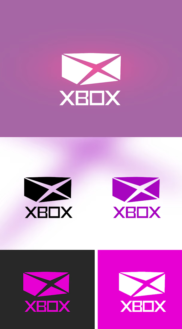
Case Study Xbox Logo Redesign
The Box Concept: This redesign challenges the long-standing circular Xbox emblem by reconstructing the mark into an actual three dimensional box or a cube shape aligning the visual identity directly with the brand name itself.
Design Rationale:
The Current Xbox logo is sphere a green circular orb with a swoosh. While iconic there's a fundamental disconnect: the brand is called "Xbox" yet its a symbol has actually represented a box. a Sphere communicates motion, energy, and continuity but not the literal geometry the name promises.



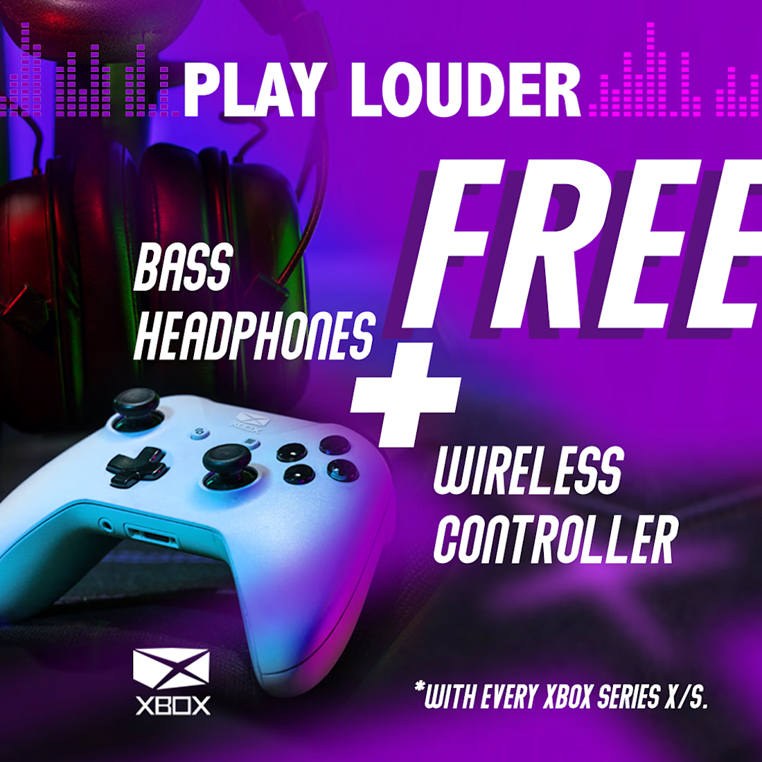
social media post for x box

The name-geometry argument is a fair one, but a sphere has a quality a cube doesn't: it reads the same from any angle, which is why it survived twenty years of being animated, embossed and stamped on controllers. Once the mark is a box in perspective, every application has to...
rotational neutrality isn't the only reason the sphere lasted twenty years — it also had massive installed-base inertia. A new mark doesn't carry that, so the comparison isn't perfectly symmetric. But that doesn't invalidate the core point; it just means the cube needs to earn...
The network for creativity
Join 1.25M professional creatives like you
Connect with clients, get discovered, and run your business 100% commission-free
Creatives on Contra have earned over $150M and we are just getting started





Related posts

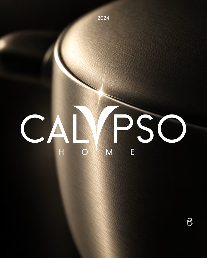
Calypso Home ✦ Logo, 2024
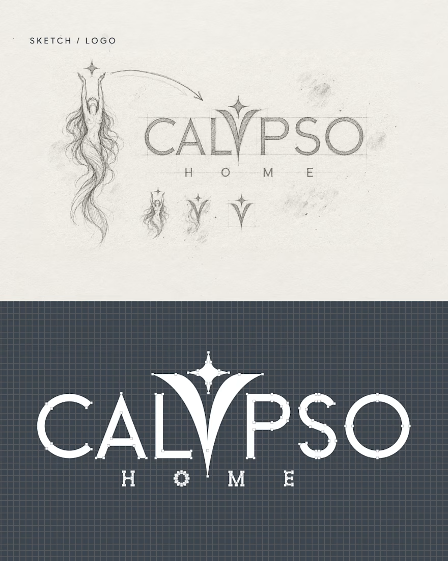
In myth, Calypso was the nymph who welcomed travelers home. Her raised arms became the "Y", holding a star.
One custom letter, built to survive metal, glaze and leather.
Full case study in my portfolio.
The last project from 2024, just added to my refreshed portfolio.
Got a project ? Let's talk about it.
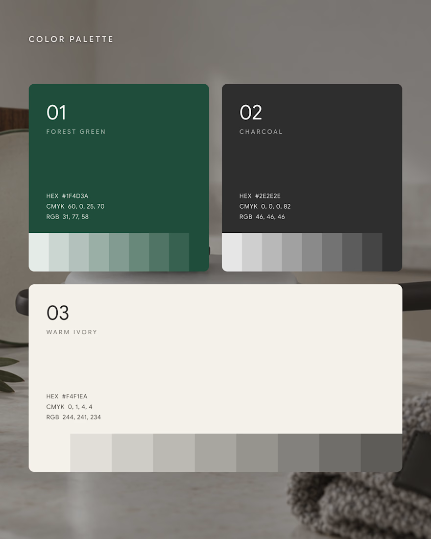
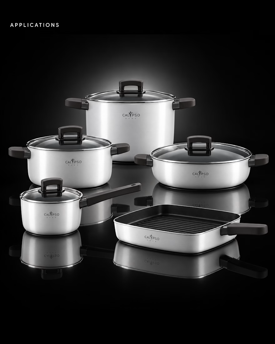

Turning Calypso's raised arms into the Y holding a star is the kind of story that makes a logo stick, the myth is baked right into the letterform. Built to survive metal, glaze and leather shows you designed for the real product, not just the deck. Beautiful mark.

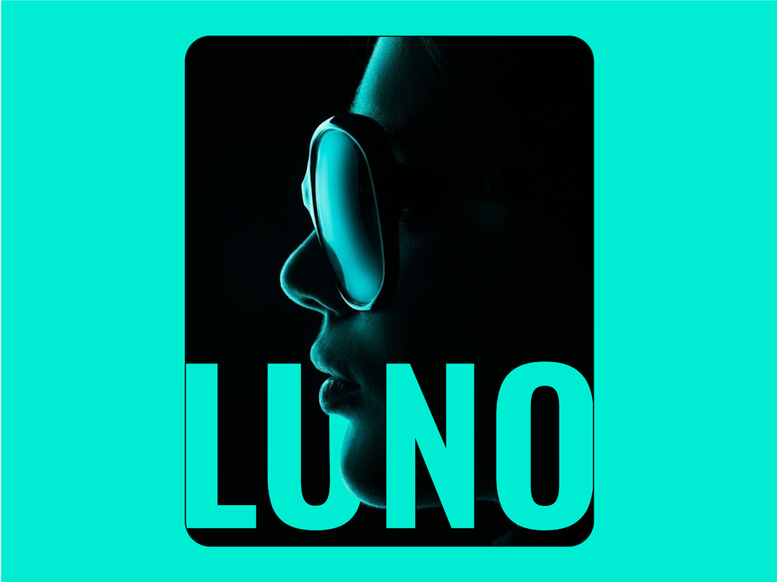
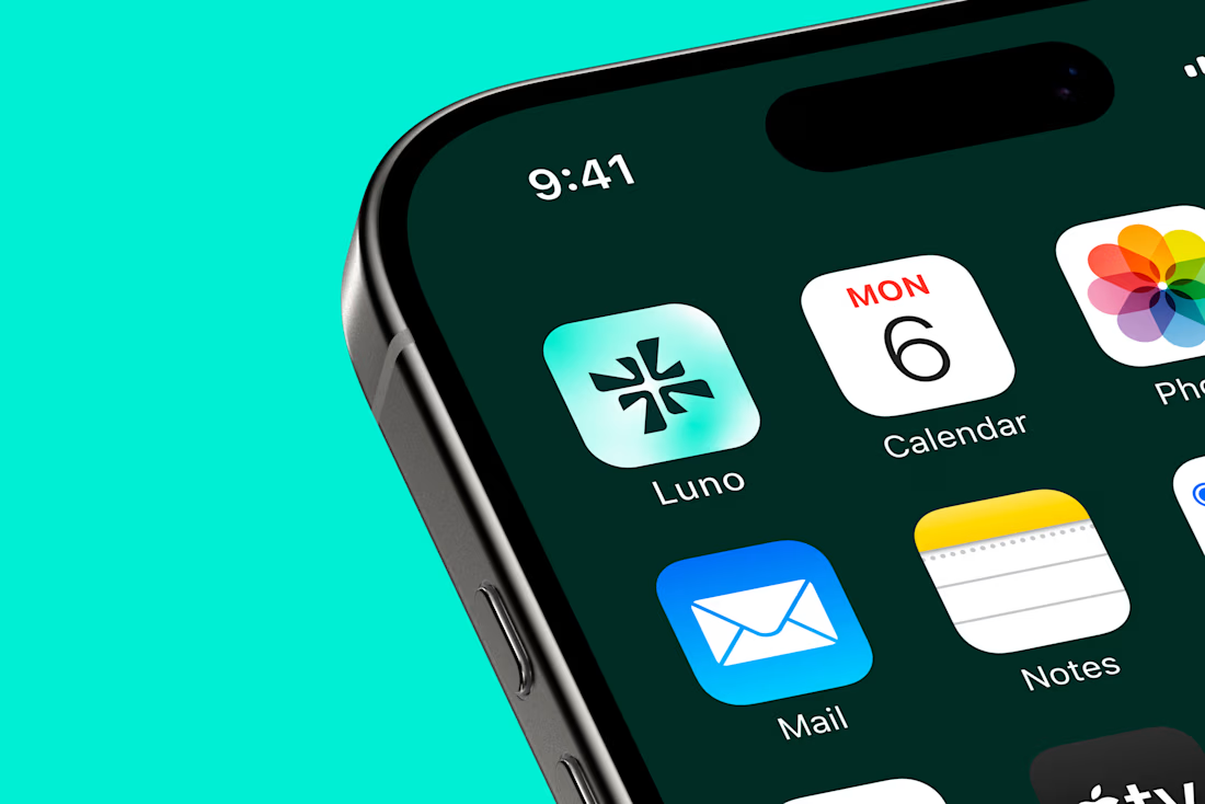
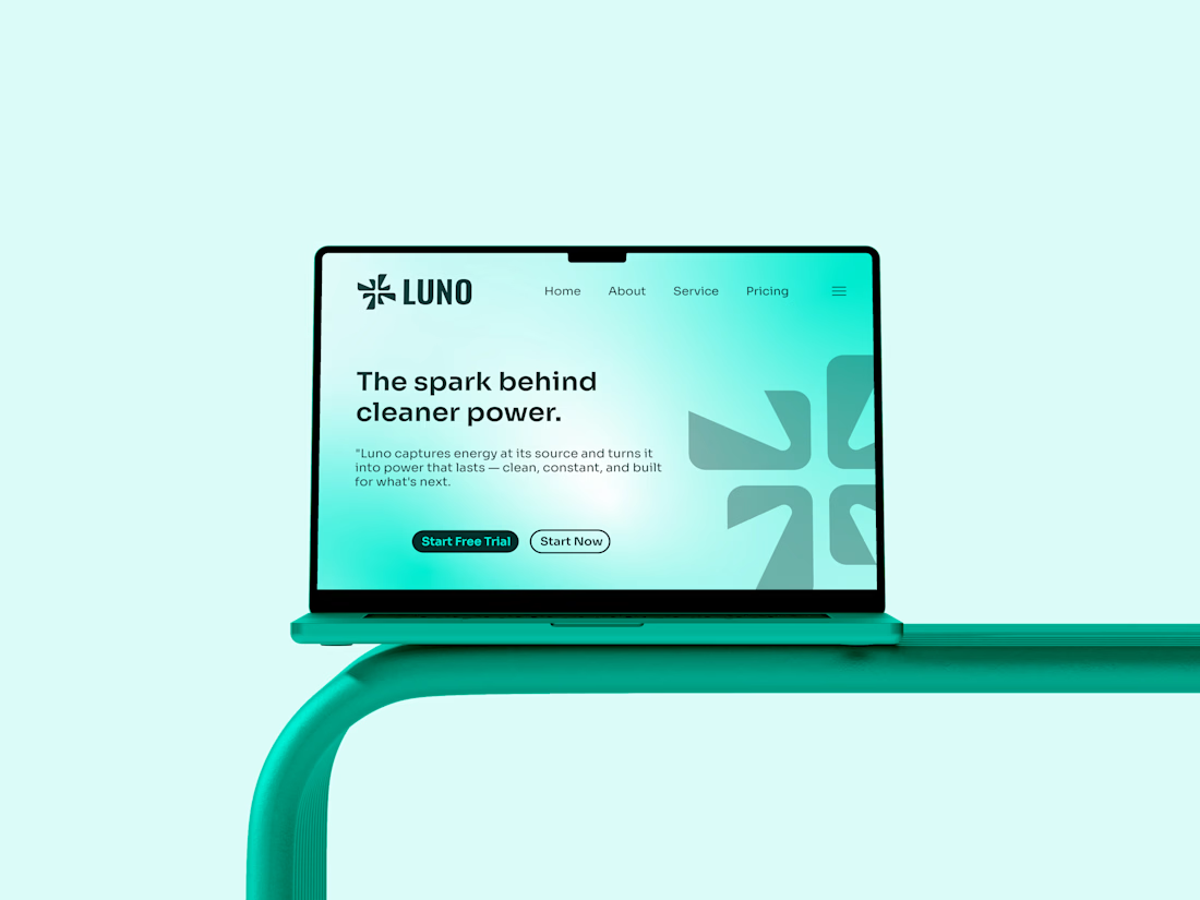
I noticed clean energy brands were either too crunchy, nobody made renewable power feel simple and exciting.
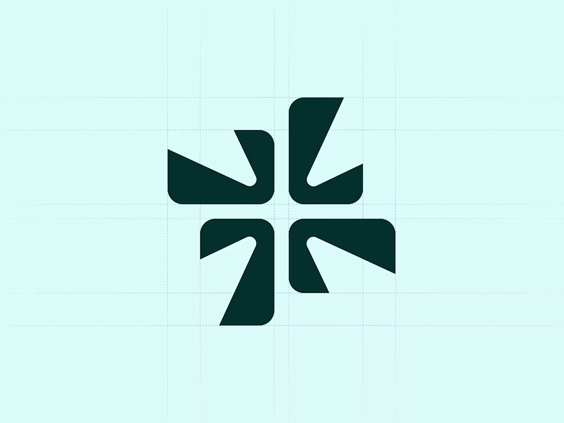
I designed Luno to be the spark that starts something bigger - clean, direct and confident. Energy without the noise.
I merged a spark with the letter "L". Four blades rotating outward energy caught mid motion, being captured and released.
I placed Luno in clean energy - solar, smart grids, storage - as the modern alternative to tired green washed branding.

So cool 🔥


I truly love the the illustration