The network for creativity
Join 1.25M professional creatives like you
Connect with clients, get discovered, and run your business 100% commission-free
Creatives on Contra have earned over $150M and we are just getting started
Back to feedPost
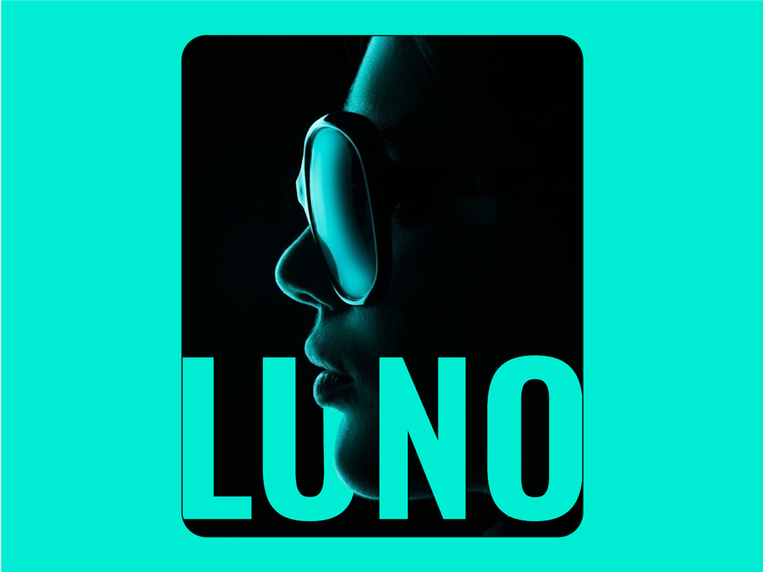
I noticed clean energy brands were either too crunchy, nobody made renewable power feel simple and exciting.
I designed Luno to be the spark that starts something bigger - clean, direct and confident. Energy without the noise.
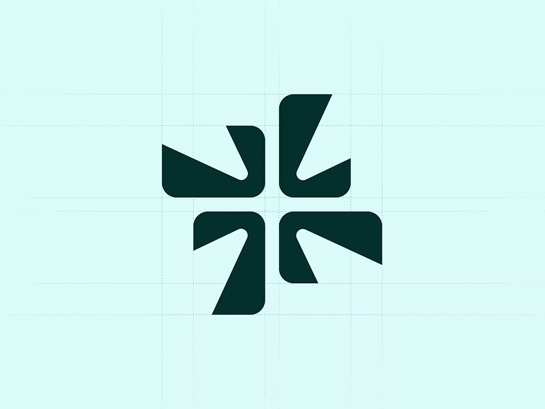
I merged a spark with the letter "L". Four blades rotating outward energy caught mid motion, being captured and released.
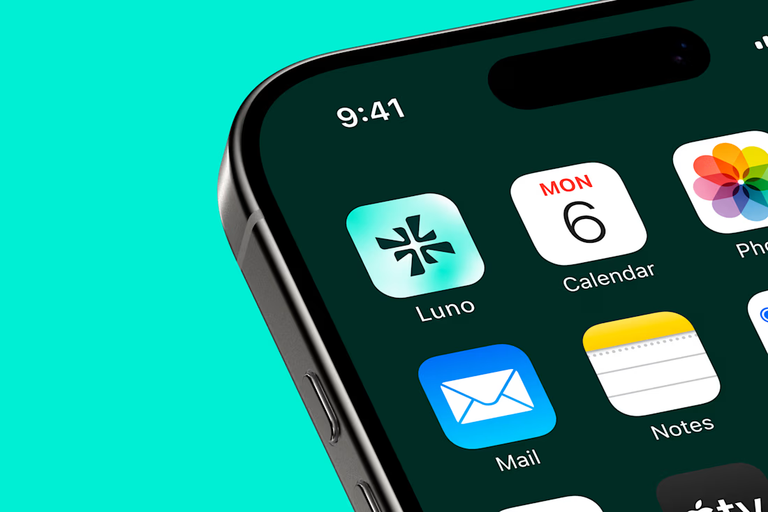
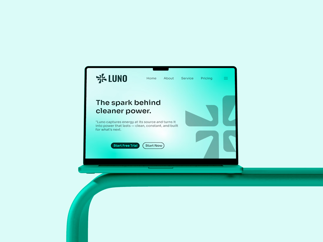
I placed Luno in clean energy - solar, smart grids, storage - as the modern alternative to tired green washed branding.



The spark + ‘L’ integration is really nice!

thanks

thanks.

So cool 🔥
Thanks.

Sick branding
thanks.
Welcome buddy

That's a clean mark. Well done
Thanks.
The network for creativity
Join 1.25M professional creatives like you
Connect with clients, get discovered, and run your business 100% commission-free
Creatives on Contra have earned over $150M and we are just getting started









Related posts


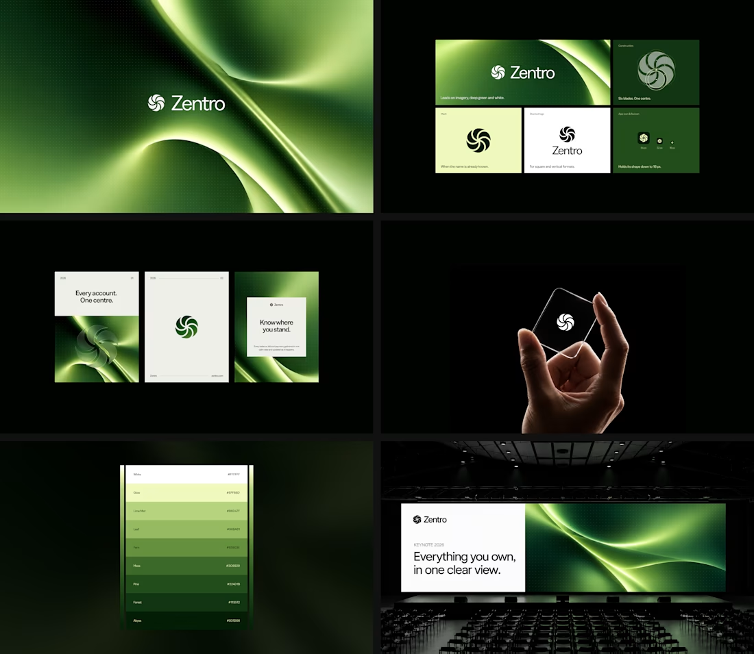

Clean and confident work! The green gradient with the mark feels very modern for fintech - trustworthy but not boring. The app screens look really polished. Curious how you landed on this mark, does it represent growth / movement?

A flower that inflates arrives in the mail.
Next month, a phone made of shell.
STILL LIFE SERVICE. Case study dropping soon.
Which object earns your shelf? Reply below.
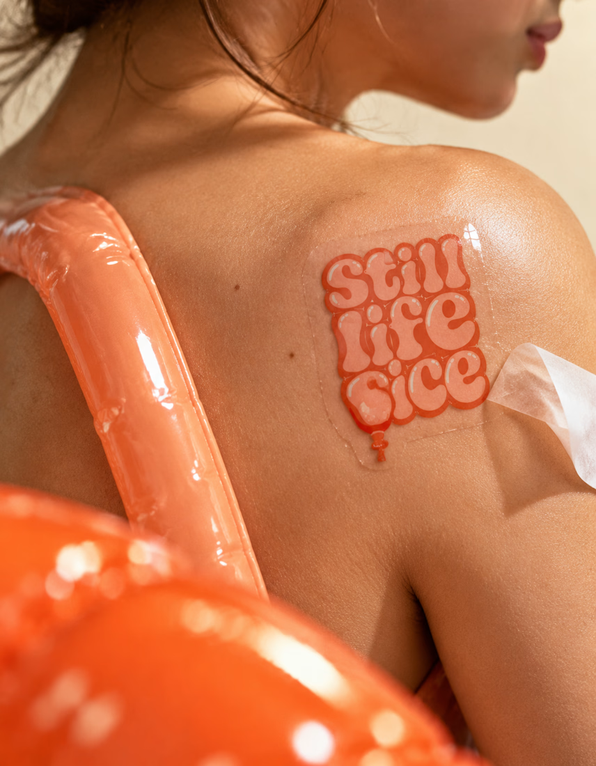
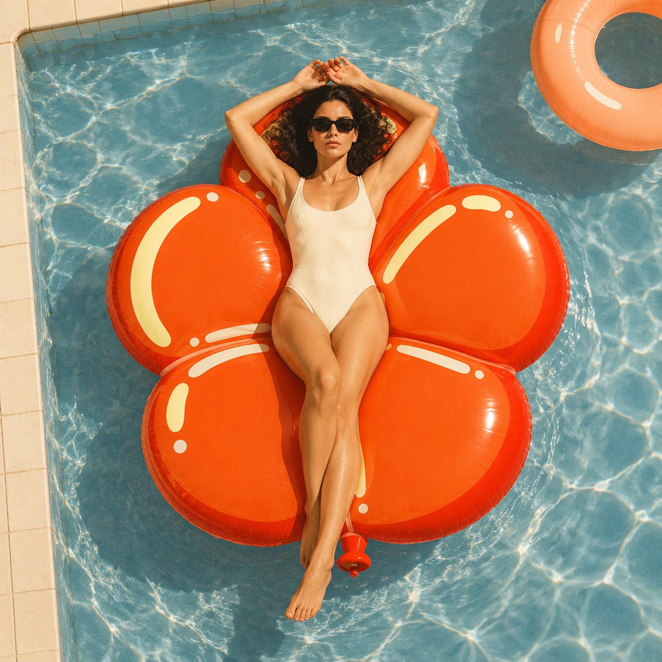
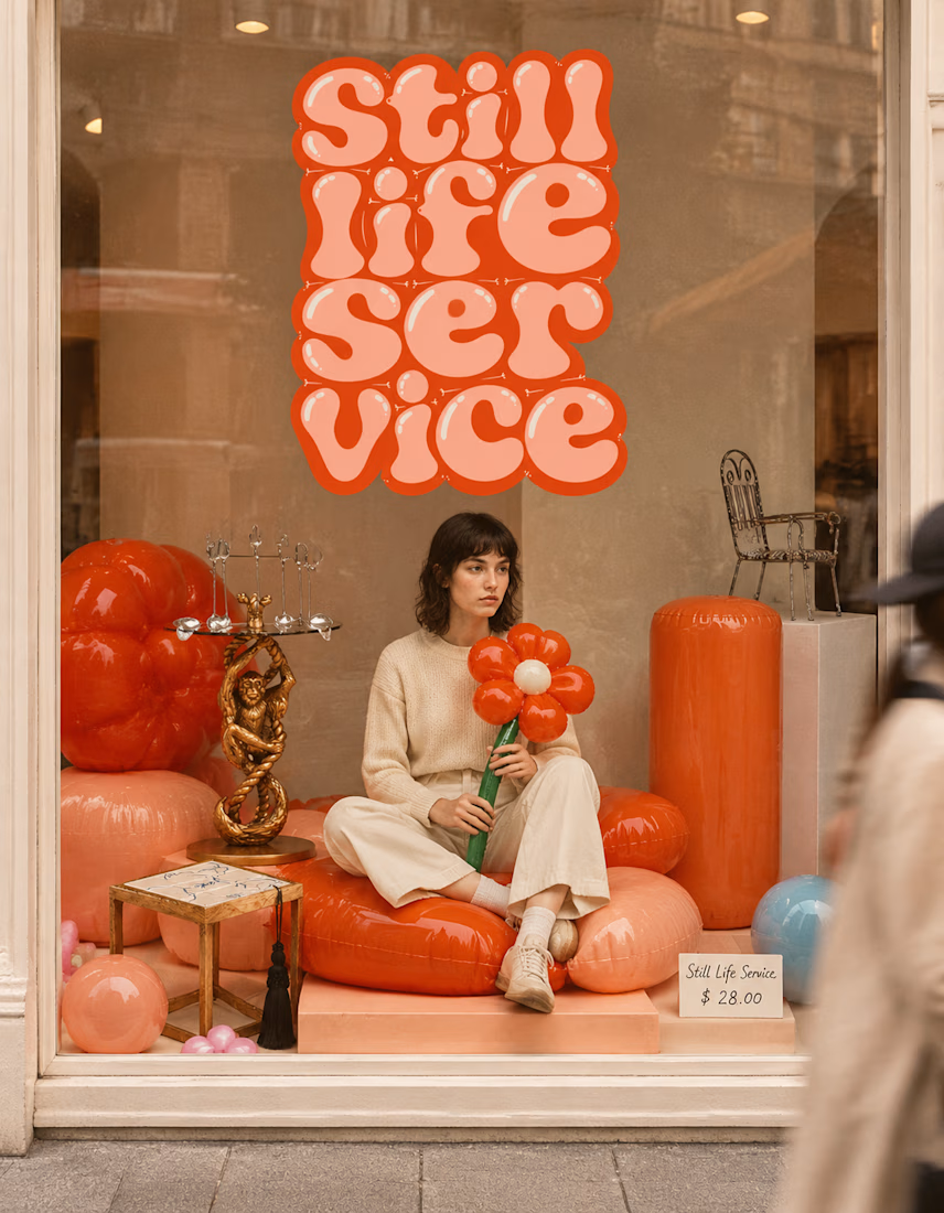

The inflatable flower. Only houseplant I'm guaranteed not to kill. Also, a new object every month is a sneaky good retention hook, people will stay subscribed just to see what's next.

HuroPay Branding for Fintech
We built its identity to feel the same way: fast, clear and human.
Need a branding? DM Now...
#branding #brandidentity #logo
