The network for creativity
Join 1.25M professional creatives like you
Connect with clients, get discovered, and run your business 100% commission-free
Creatives on Contra have earned over $150M and we are just getting started
Back to feedPost

Project Overview
Industry: Mental Health & Clinical Education
Platform: Kajabi
Project Goal: Redesign the website to provide a clean, intuitive experience for individual learners and organizations, while increasing engagement, memberships, and course enrollments.
The Problem
The Business needed to transform its online presence to better reflect the value of its real-session therapy content. The previous setup had:
Overwhelming content and navigation
Lack of clear pathways for individuals vs. organizations
Low visibility of courses, memberships, and CE opportunities
Difficulty highlighting credibility and authority of therapists
The challenge was to create a website that balances education, accessibility, and trust, while guiding users smoothly to purchase courses or memberships.
The Strategy
User Segmentation
Individuals seeking clinical growth and CE credits
Organizations (universities, group practices) needing multi-user access
Content Hierarchy & UX
Highlighted master therapists and real therapy sessions upfront
Clear CTA buttons for “See What’s New,” “Courses,” and “Memberships”
Simplified navigation for smoother browsing
Funnel & Engagement Optimization
Integrated course previews, best-seller highlights, and testimonials
Added multi-user solutions for organizations
Subscription-based memberships for recurring revenue
Visual & Design Improvements
Clean, modern design with ample whitespace
Intuitive layout emphasizing real learning experiences
Responsive and accessible across devices
What I Did
Designed a conversion-focused homepage that highlights courses, memberships, and credibility
Organized content into clear pathways for Individuals and Organizations
Developed a Kajabi membership funnel with seamless access to hundreds of videos
Added lead capture forms for updates, webinars, and CE information
Implemented testimonial and social proof sections to enhance trust
Optimized CTA placement for course purchases and memberships
Results
(Example metrics based on typical case study results)
Increased membership sign-ups by 35% within 3 months
Improved course enrollments by 28% due to better visibility of top-selling programs
Enhanced user experience, reducing bounce rate by 22%
Boosted credibility with clear expert showcases and testimonials
Tools Used
Kajabi (Website + Memberships + Funnel)
Canva & Figma (UI/UX design and assets)
Email Marketing & Automation via Kajabi
Analytics & Reporting to monitor engagement


i love the design it looks good, you are doing great
The network for creativity
Join 1.25M professional creatives like you
Connect with clients, get discovered, and run your business 100% commission-free
Creatives on Contra have earned over $150M and we are just getting started






Related posts

Big news! We opened an agency. To deliver the best mascot work the world has seen, me @Mary Delaney and @Arsen Airyan are teaming up with mascot.berlin
Check it live, and stay tuned for more!

Looks cool, kepp going!

For Sleek Ballet Fitness, I worked on the Kajabi website, membership setup and onboarding emails.
The design gives the workouts room to speak for themselves. Dark backgrounds, soft pink accents and a visual workout grid help people see what they can join. The trial button is easy to find, with separate paths for workouts and live classes.
First image: my original project mockup. Second: a public website preview captured on October 5. The site has changed since the original project; the case explains what I worked on.
#Kajabi #WebDesign #MembershipWebsite
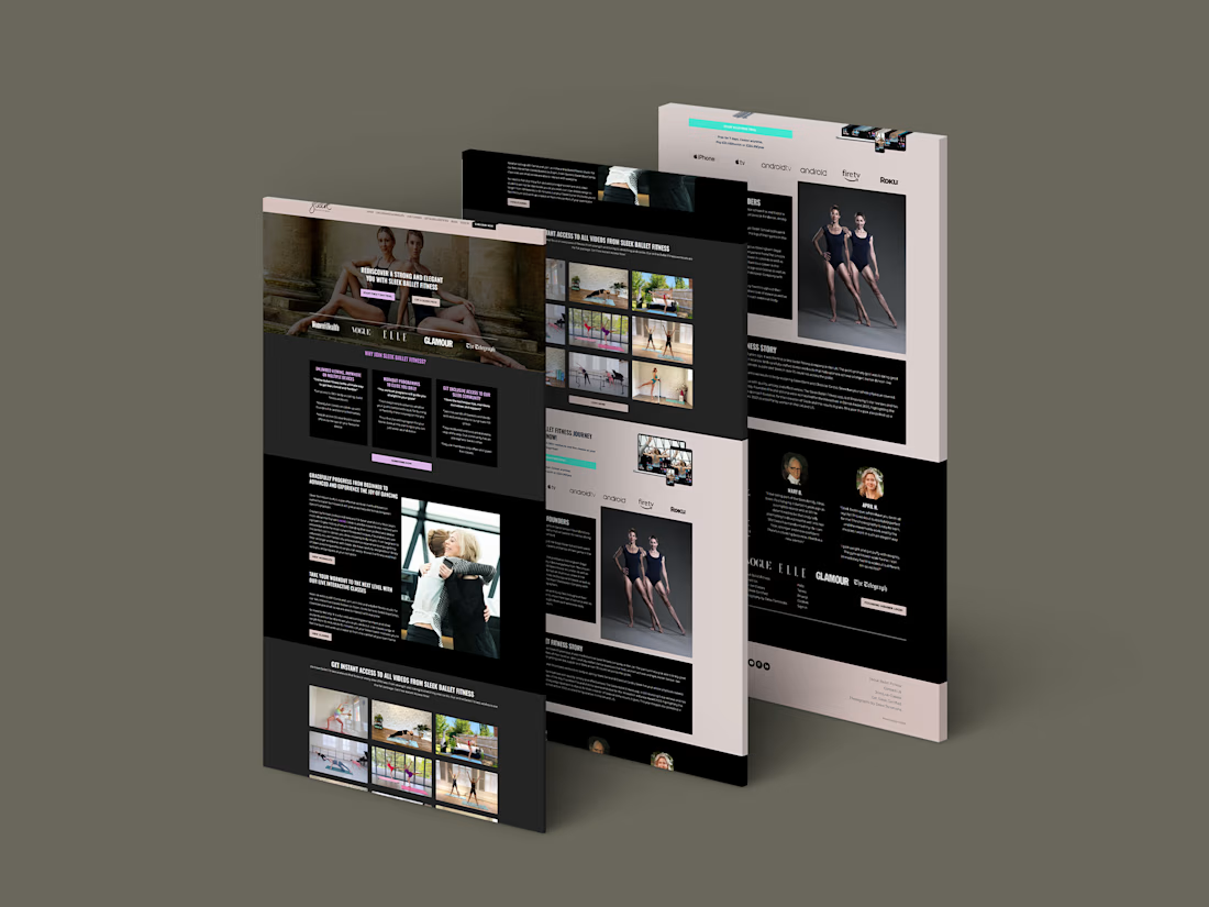
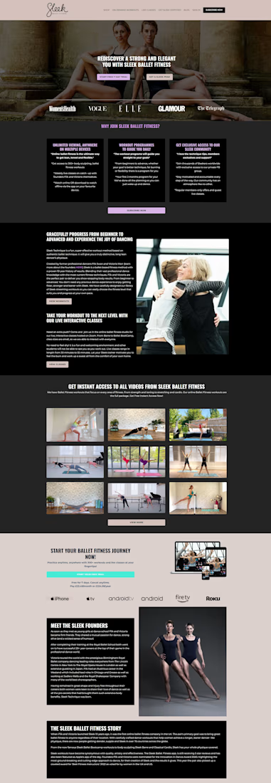

Separating on-demand workouts from live classes gives trial members a clearer choice. I’d carry that distinction into the welcome email too: one link to start a workout, and another to check the live schedule. It makes the first step after joining easier to follow.

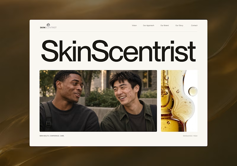
I’m exploring two homepage hero directions for SkinScentrist, a skincare brand focused on helping young men feel more confident in their skin.
Both concepts use the same imagery but take very different approaches to storytelling and visual hierarchy.
Direction 1 feels more emotional, immersive, and lifestyle-driven. The full-screen photography and bold messaging create a stronger connection to confidence and self-care.
Direction 2 feels more minimal, editorial, and brand-focused. The oversized typography, clean layout, and product imagery give it a more refined, contemporary skincare feel.
Direction 1: immersive, personal, emotional
Direction 2: minimal, editorial, premium
Which direction feels stronger for a modern skincare brand?

14 voted
93%

1 voted
7%
15 votes
Closed

Direction one — the full-screen photo feels warmer.