The network for creativity
Join 1.25M professional creatives like you
Connect with clients, get discovered, and run your business 100% commission-free
Creatives on Contra have earned over $150M and we are just getting started
Back to feedPost

Why do so many law firm websites look exactly the same?
Dark blue.
Courthouse imagery.
Scales of justice.
A serious-looking attorney standing in front of a city skyline.
It signals “law firm” immediately.
But does it actually make the firm more trustworthy?
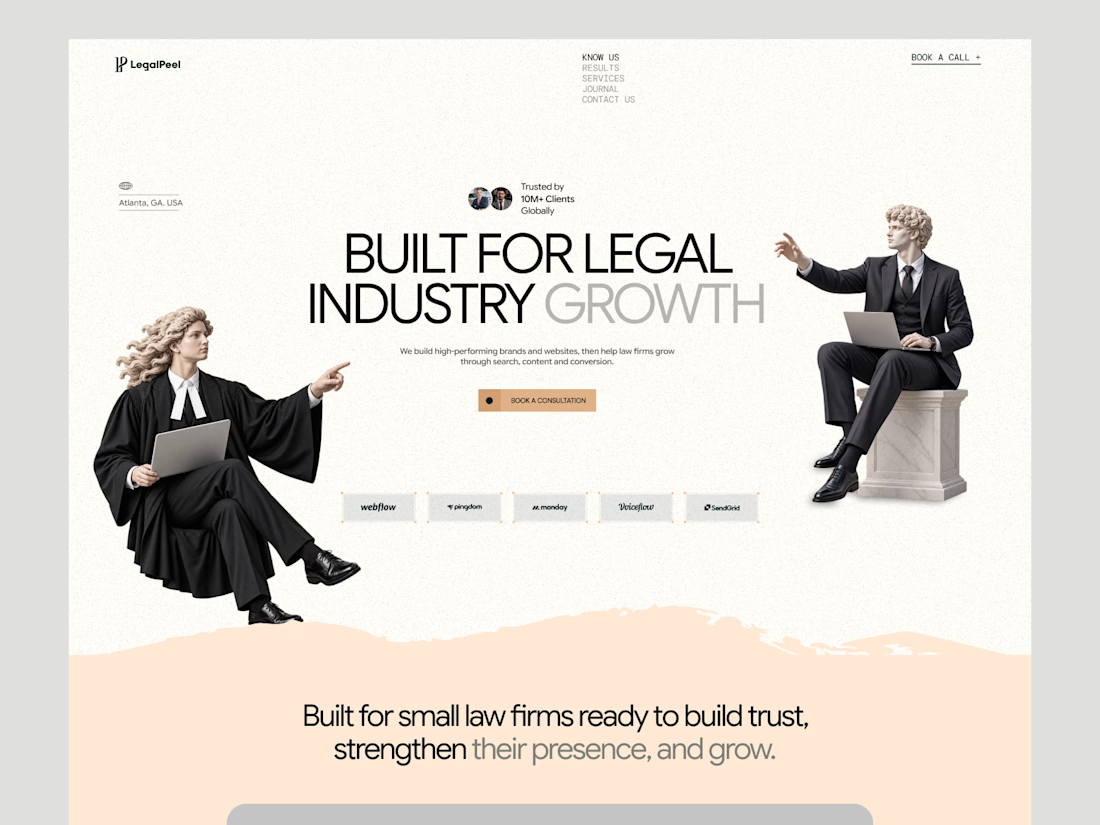
We’ve been redesigning LegalPeel, our studio focused specifically on the legal industry, and this is one of the directions we’ve been exploring.
The goal isn’t to make legal feel less professional.
It’s to see how far we can move away from the usual visual language without losing the credibility a law firm needs.
This is where the homepage is heading.
Would this direction make you trust a legal-focused company more, or has it moved too far away from what you expect from the industry?

because it should look very serious and professional

Luke this design

Love the cleanliness and visual balance

It works for me. The warm cream and statues feel approachable, and the line about small firms keeps it credible. I would add real lawyer faces lower down.

LegalPeel pushing past skyline attorney stock without losing credibility is the right tension. Curious which homepage direction tested as trustworthy for you.
The network for creativity
Join 1.25M professional creatives like you
Connect with clients, get discovered, and run your business 100% commission-free
Creatives on Contra have earned over $150M and we are just getting started





Related posts

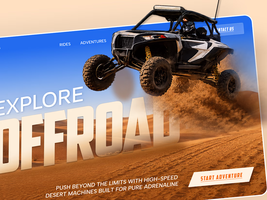
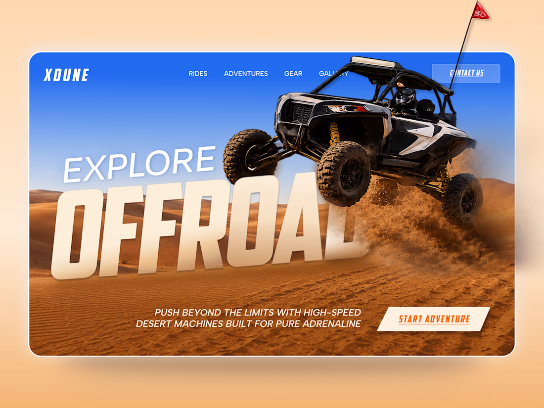
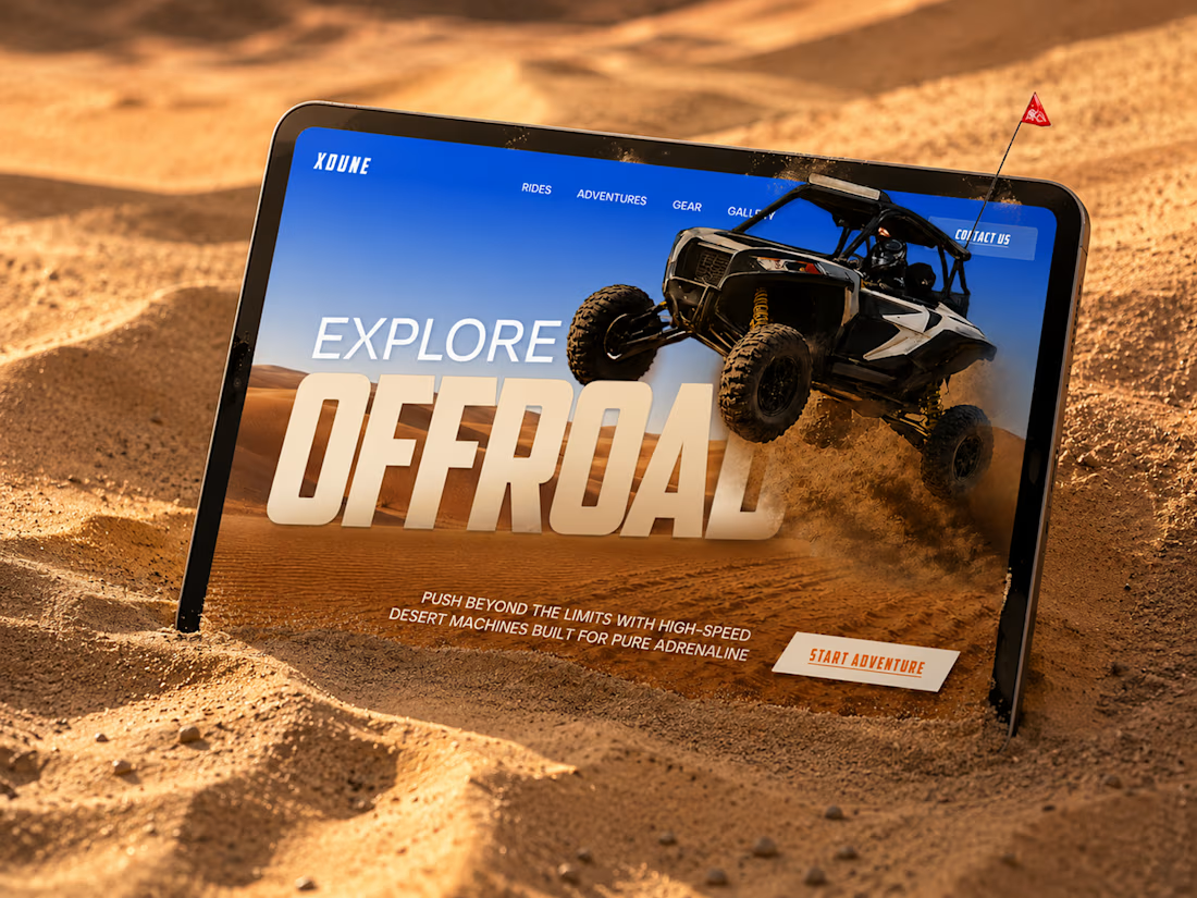
XDUNE — Off-Road Adventure Landing Page
A bold landing page concept built around speed, freedom, and off-road adventure 🔥
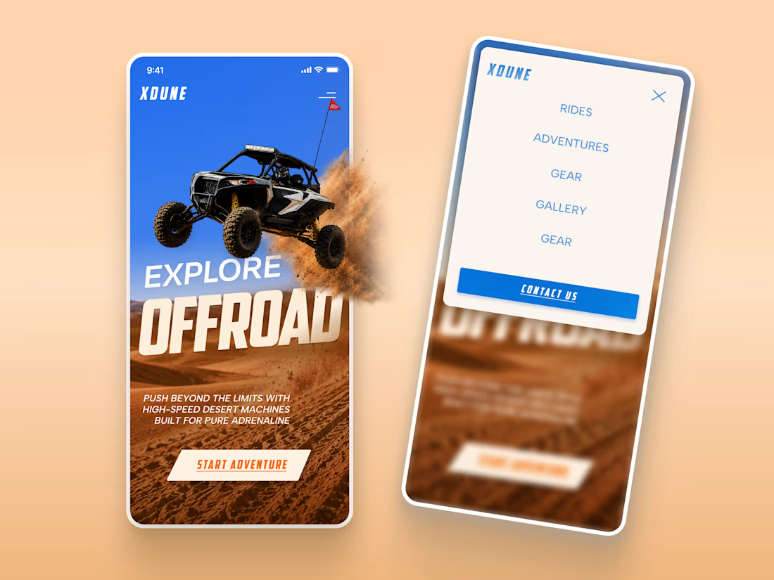
The visual direction combines desert landscapes, oversized typography, and a dynamic vehicle composition to make the experience feel energetic from the first screen
Special attention was given to:
• Strong action-focused hero composition
• Bold typography and clear hierarchy
• Desert-inspired visual atmosphere
• Adventure-focused CTA
• Responsive mobile experience
• Simple and clean navigation
The result is a high-energy landing page that feels fast, adventurous, and made for people who want to get off the road
Looking to create a bold website for an automotive, outdoor, or adventure brand? Let’s connect 🚀



love the vibe


Upgoating this..... Converting complex healthtech Figma components into a seamless, high-trust Webflow build is no easy feat—really smooth execution!

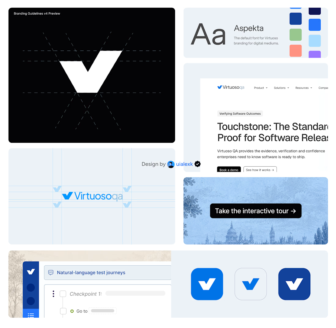
Branding v4 for Virtuoso
This design evolution, made an impact to the brand growth's by:
- Webflow to Framer migration of 150+ static pages and 500+ CMS
- Increasing website conversions
- Having consistent brand presence across digital mediums
- Increase brand awareness


Amazing!


