The network for creativity
Join 1.25M professional creatives like you
Connect with clients, get discovered, and run your business 100% commission-free
Creatives on Contra have earned over $150M and we are just getting started
Back to feedPost
Studio Alicia Vieira | Brand Identity Design
Delicacy, sophistication, and femininity brought together in a unique visual identity.
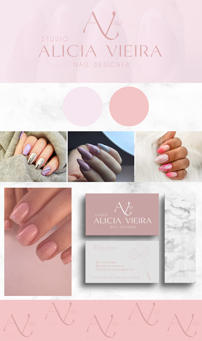
The brand identity for Studio Alicia Vieira, a nail design studio, was carefully developed to reflect elegance, professionalism, and attention to every detail.
The goal was to create a minimalist, modern, and timeless brand that highlights the studio's essence while building a meaningful connection with its target audience.
The custom monogram, combining the initials AV with a delicate floral element, symbolizes beauty, renewal, and self-confidence.
A soft pink color palette, paired with elegant typography, enhances the brand's feminine and sophisticated personality.
The result is a harmonious, versatile, and strategic visual identity designed to strengthen Studio Alicia Vieira's brand positioning and communicate professionalism across different touchpoints.
More than just a logo, this is a brand identity created to express personality, inspire connections, and celebrate beauty in every detail. ✨

Very nice

Thank you so much! I'm so happy you liked it! ✨
The network for creativity
Join 1.25M professional creatives like you
Connect with clients, get discovered, and run your business 100% commission-free
Creatives on Contra have earned over $150M and we are just getting started





Related posts

MODUS Build - Brand Identity & Web Design
Coming from an architectural background, I approached MODUS Build with a particular appreciation for precision, proportion, and thoughtful design.
The challenge was to create a distinctive identity that communicates these values without relying on conventional construction imagery.
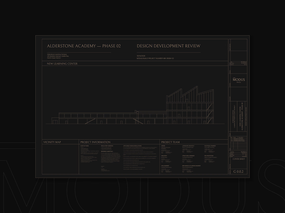
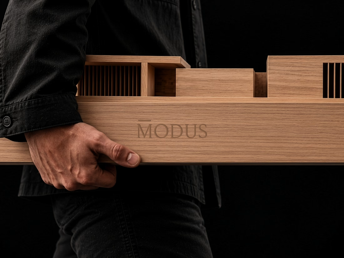
The concept was built around a simple typography idea: “The Measure of Good Building.” A small detail above the letter M represents a reference measure - a fixed length against which other dimensions can be measured. This subtle intervention gives the logo its meaning and connects it directly to the brand's philosophy.
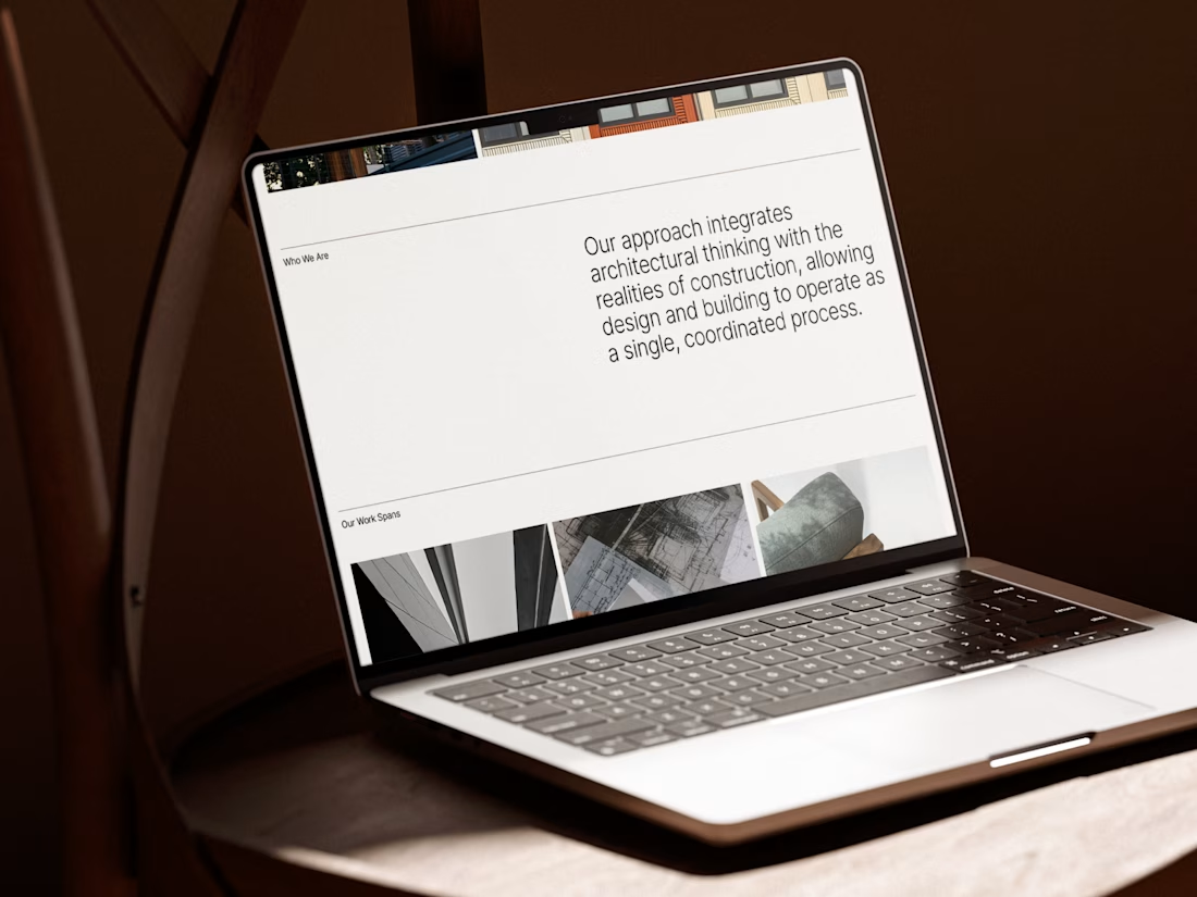
I carried this idea into a cohesive visual system, bringing together typography, graphic patterns, brand applications, and website design.
For me, the most rewarding part was creating something visually refined yet purposeful, where even the smallest detail has a reason to exist, keeping the same principle as in architecture.
#branding #logodesign #webdesign


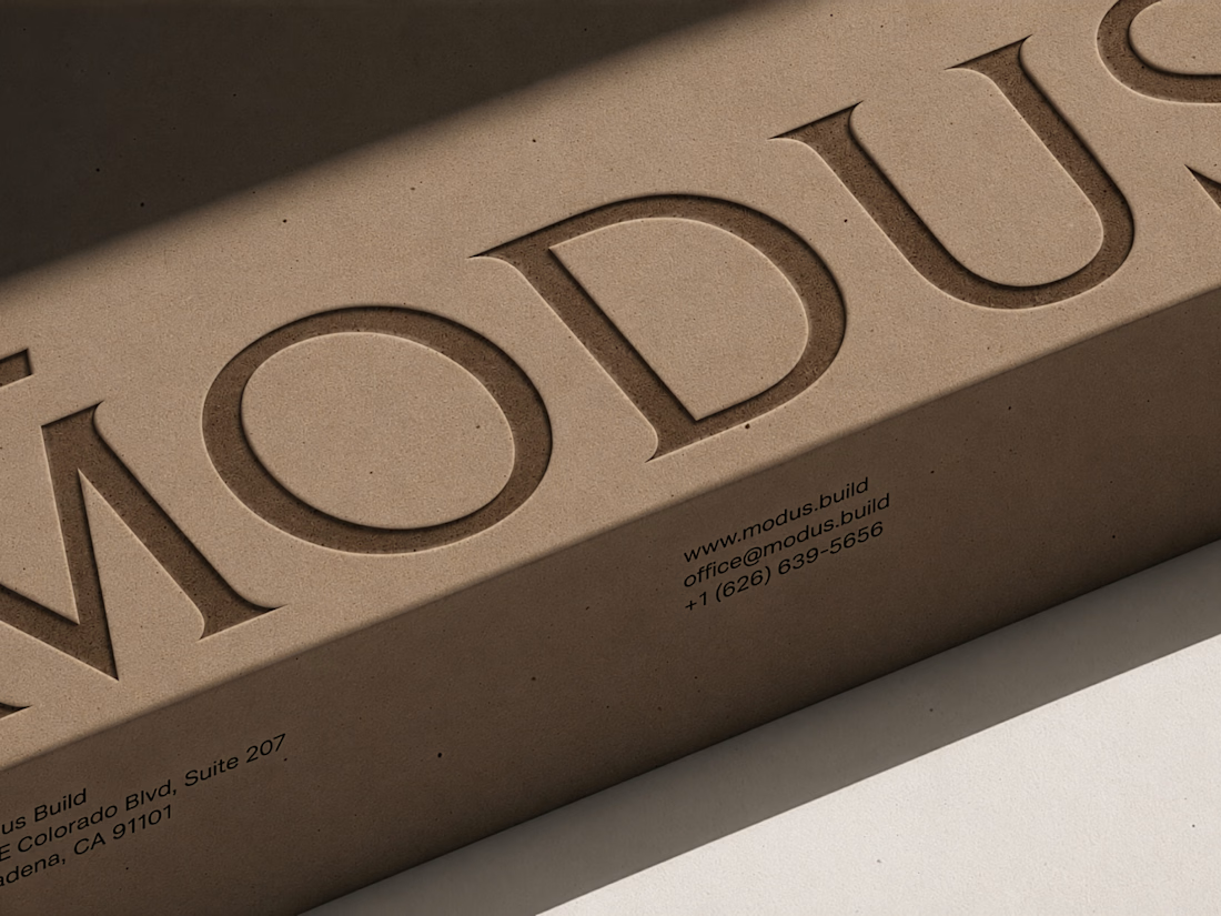

Great brand design Alexandar wooden style is so premium🔥🔥


New case study is up on my profile! A fun passion project I worked on earlier this year🚲

super cool project! the typographic work is impeccable and super interesting





I love a brand of HOES.

