The network for creativity
Join 1.25M professional creatives like you
Connect with clients, get discovered, and run your business 100% commission-free
Creatives on Contra have earned over $150M and we are just getting started
Back to feedPost

An architecture website should make you feel the space before you read a word.
Meet AUREL, my Framer template for architecture and interior studios.
I built the experience around immersive imagery, expressive serif typography, warm terracotta accents and generous space. The project gallery and service pages carry that same visual language beyond the homepage.
For this 32-second showcase, I gave it a more energetic edit: animated typography, moving mockups, architectural close-ups, confetti and an original music track, timed together in Remotion.
The motion here is part of the promo film. AUREL is a template demonstration; the architectural projects and studio content are illustrative.
Explore the live template → https://aurel-template.framer.ai/
Which detail catches your eye first: the imagery, the typography or the earthy palette?
Need a Framer website with a considered visual identity? Let’s talk here on Contra.

The network for creativity
Join 1.25M professional creatives like you
Connect with clients, get discovered, and run your business 100% commission-free
Creatives on Contra have earned over $150M and we are just getting started
Trending
retrofuturism
Share your favorite designs from the past exploring the distant future. Or your own take on the aesthetic 🚀
halftone
Dots. Texture. Grain. Let's see your designs using the halftone technique.

Midjourney
Creatives are showing off what they're making with Midjourney.
colorgrade
Video editors sound off: How do you enhance the mood of your video in color grading?





Related posts

New Framer Template: Outline Studio 🔥
A minimal, editorial portfolio template for agencies, creatives & digital studios.
→ 7 pages
→ 30+ sections
→ Case Studies CMS
→ Light & dark themes
→ Modular component system
→ 3D logo component
🔗 Available now on the Framer Marketplace


Great template

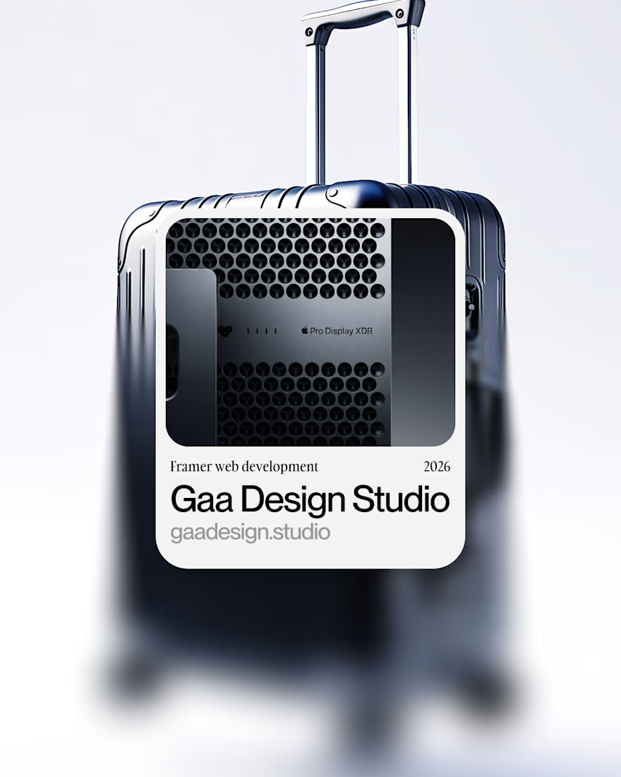
New client project → Framer development
For GAA Design Studio.
Earlier this year, I developed an MVP website for this studio, but this time we rebuilt it entirely for scalability, to optimize processes and client management inside the website.
I prepared this little video to showcase the project.
Hope you like it → Aspirational vibes only
Sound ON
FramerWeb DevelopmentaftereffectsFramer Website DevelopmentInteraction DesignAdobe After EffectsFigma



What if a design studio website didn't look like every other agency website?
I wanted this concept to feel less like a portfolio and more like a digital studio with a point of view.
Built around two simple ideas:
DESIGN. BUILD.
The goal was to create an experience that feels confident, editorial, and intentional from the typography and layout to the interactions.
Designed in Figma.
Built in Framer.
Still refining it, but I’m really happy with where it’s going.
What do you think?
#WebDesign #Framer #UIDesign #DesignStudio


the blurry people on the home page look great. what made you pick that effect?