The network for creativity
Join 1.25M professional creatives like you
Connect with clients, get discovered, and run your business 100% commission-free
Creatives on Contra have earned over $150M and we are just getting started
Back to feedPost
New Framer Template: Outline Studio 🔥
A minimal, editorial portfolio template for agencies, creatives & digital studios.
→ 7 pages
→ 30+ sections
→ Case Studies CMS
→ Light & dark themes
→ Modular component system
→ 3D logo component
🔗 Available now on the Framer Marketplace


Thanks @TRUEFRAME ! And yes, the theme toggle is just one click. A small code override could also make it switch based on the user’s system preference.

This template feels genuinely premium.
Thanks @Taimur Iqbal, appreciate it!

Beautiful 🔥
Thanks @Damilola Adelaja !

Clean & premium🔥
Thanks @Shubhang Chouhan !

Great template
Thanks @Prince Kenechukwu !

Awesome 🔥
Thanks!

Its pretty good. Instead of a static hero image, this would look awesome with a video/showreel of the studio's work.
Thanks! The hero background is a parallax custom component that accepts image and video.

Amazing🔥
Thank you!


Great work🔥👏👏
Thanks, appreciate it!

Great one!
Thanks!

Looks great! 🤩
Thanks you!

Looks Cool
Thanks!


Impressive !
Thanks!

So smoth 💯
Thanks, appreciate it!

This template is 🔥 🔥 !! Amazing job.
Thanks a lot!

This is absolute masterpiece
Thanks a lot, appreciate it!

Great attention to detail!
Thank you!

Thanks!

Awesome!
Thank you!

I have start working on it
Thanks a lot, appreciate it!

Good
Thanks!

Quite sleek and beautiful
Thanks a lot!
You're welcome

The kind of work that communicates it is premium instead of saying it out loud. Great Work.
Thank you very much, appreciate it!

Such a great visual direction
Thanks a lot, appreciate it!

looks minimal.
Thanks!

Thanks a lot!
The network for creativity
Join 1.25M professional creatives like you
Connect with clients, get discovered, and run your business 100% commission-free
Creatives on Contra have earned over $150M and we are just getting started











Related posts


Gorgeous 😍


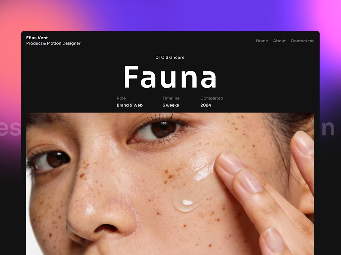
The Fauna project page in Elias Vent puts oversized type above a close portrait crop. The project details sit between them.
Framer template: https://startfrom.co/templates/elias-vent


Hourfield is a 16-second 16:9 launch film for products that organise people's time: calendars, schedulers, booking and reservation apps, planners. Retype a few short lines, drop in your logo and rename the calendar's days and tiles (meetings, table bookings, classes, shifts): the week re-plans itself on screen and the film lands on your logo lockup. Our second version, Maréva, a fictional table-booking app, turns the working week into an evening of reservations on the same animation and timing.
Built end-to-end through the SVGator MCP server. The calendar that re-plans its own week, the orbit that swirls into a single dot and the lines centred by their real letter shapes (fonts measured, not eyeballed) were computed in Python and written straight into a live SVGator project as 780 editable keyframes; I directed every note and finished it in the canvas. Maréva was made the same way, on the same timeline. Everything stays a real layer: 50 live text layers, named elements (headline, logo, product-name, tagline) and one logo image animated in two moments.
Yes, there is a lot to edit: every line of the story, a whole week of calendar tiles, a palette in nine roles. A full rebrand takes longer than five minutes, and that is the honest trade: it shows how much a single SVGator file can carry, and how MCP makes a detailed, story-driven film practical to re-make, not just to watch.
Links:
▶ Template (SVGator)
▶ Demo video, A → B


Love the smooth flow and the text animation! Good luck!