The network for creativity
Join 1.25M professional creatives like you
Connect with clients, get discovered, and run your business 100% commission-free
Creatives on Contra have earned over $150M and we are just getting started
Back to feedPost
What if a design studio website didn't look like every other agency website?
I wanted this concept to feel less like a portfolio and more like a digital studio with a point of view.
Built around two simple ideas:
DESIGN. BUILD.
The goal was to create an experience that feels confident, editorial, and intentional from the typography and layout to the interactions.
Designed in Figma.
Built in Framer.
Still refining it, but I’m really happy with where it’s going.
What do you think?
#WebDesign #Framer #UIDesign #DesignStudio


Impressive work

Thank you


Impressive work
Thanks

Good Work!
Thank you


the blurry people on the home page look great. what made you pick that effect?
Thank you!
I wanted the effect to create a sense of movement and energy while keeping the focus on the studio’s work. The blur also adds a bit of mystery and makes the people feel more like part of the atmosphere rather than the main subject. I felt it fit the bold, editorial direction of the site really well.
The network for creativity
Join 1.25M professional creatives like you
Connect with clients, get discovered, and run your business 100% commission-free
Creatives on Contra have earned over $150M and we are just getting started











Related posts

My portfolio, reimagined in Framer
The goal was simple: bring everything together in one place, from client projects and case studies to Framer templates and project videos, while keeping the experience clean and easy to navigate.
The entire portfolio fits within a strict 100vh viewport, so you can explore everything without scrolling.
Would love to hear your thoughts and feedback!
Portfolio link in the comments.


🌲 Nordhaus | Prefab Timber Homes Website (Framer)
Homes that grow quietly with the forest, now on the web. 🏡
Nordhaus is a website for a Latvian builder of prefabricated timber homes, created in Figma and built in Framer as a responsive site for desktop, tablet and mobile. It brings the brand's calm Nordic character through full-screen photography, a scroll-driven process story, a horizontal model gallery and interactive testimonials.
✨ Template coming soon to Framer.


Wonderful design man

Design Exploration: Hero Section of Architecture Website. Which one do you think much better?

12 voted
43%
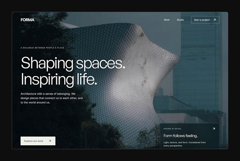
16 voted
57%
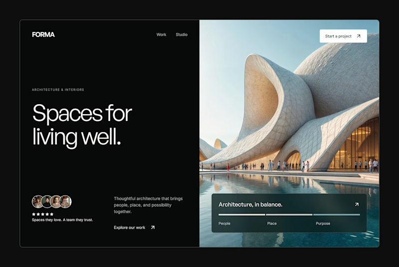
28 votes
Closed